Q U I
_______
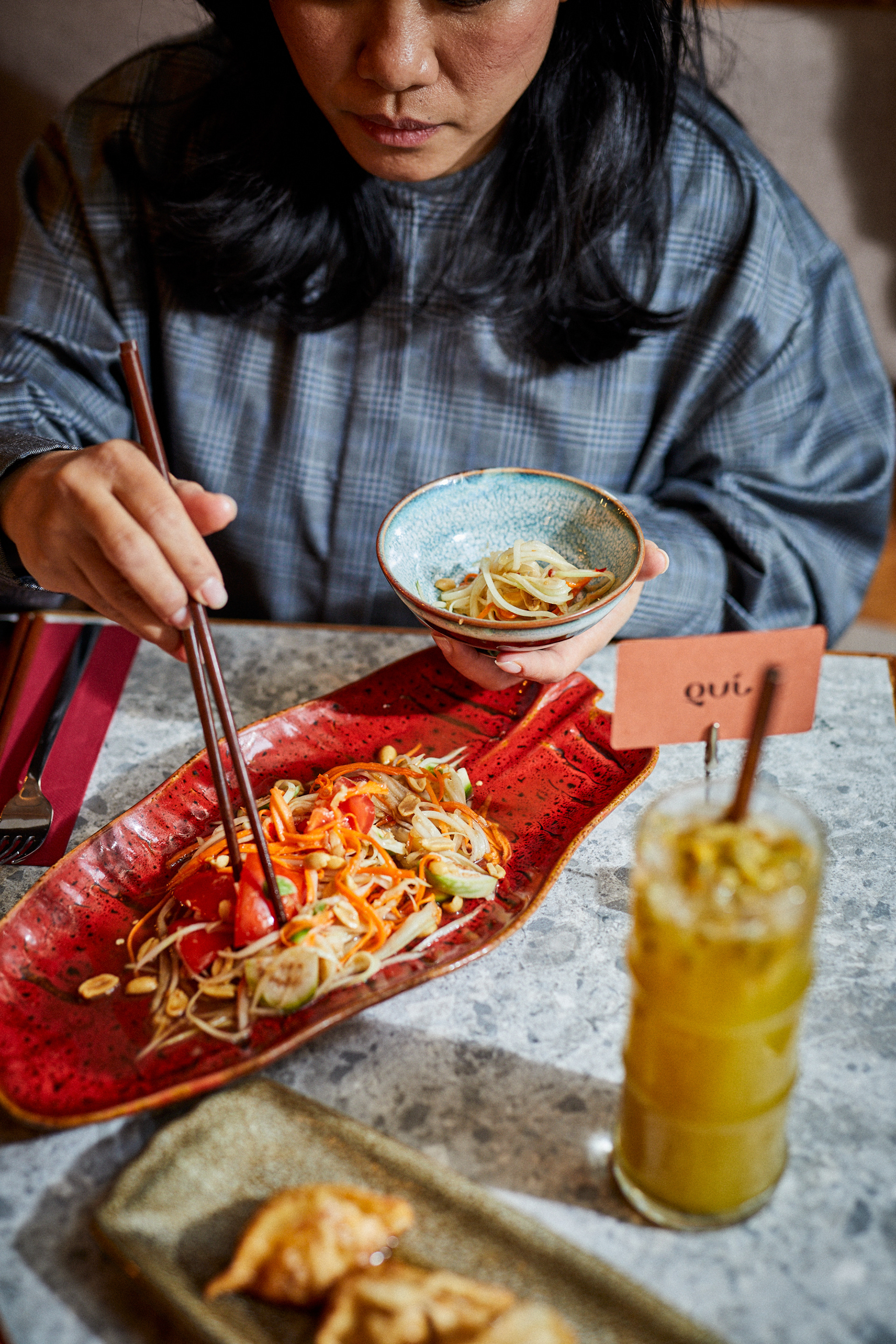
The brilliant trio behind Khan and Sao, both stylish staples of the Budapest gastronomy scene, have brightened the city with their latest venue, Quí. Offering Thai and Vietnamese cuisine, Quí is a shining gem, literally and figuratively, and we were thrilled for the opportunity to work on the latest dream-come-true project from our friends Phuong, Tuan and Tao, especially after such wonderful experiences developing the identities of their other establishments in Budapest, Khan and Sao.
Quí’s loveliness for us began with the name, meaning precious, because every aspect and element of this project can perfectly be described as such. From the way the venue warmly welcomes you in, the spiritual references incorporated with care and respect, the secret additions to their recipes that leave you longing for more, and the admirable attention to detail. We approached the identity with this in mind, from the logo to the production, every element is precious to us. When considering the typography, we decided to elevate the Asian identity of the restaurant. Our inspiration came from traditional calligraphy and ink lettering, with
a modern, minimalist touch. This style breathed life into the logotype, and delighted the guys as they saw symbols in every character. In the Q they saw a Buddha, which is an important symbol in the restaurant as well, represented there by a huge statue with a 100 hands, the U was like a coin that brings good luck,
and the Í looked like a fish that symbolizes wealth.
After the typography was developed, we decided to produce the labels and cards using letterpress to emphasize and give due attention to the characteristics
of the lettering. For the bottles we used pad printing. All the printing was done by our good friends at Inkredible Letterpress.
of the lettering. For the bottles we used pad printing. All the printing was done by our good friends at Inkredible Letterpress.
graphic design by Eszter Laki & Réka Imre
photography by Áron Erdőháti & Fazekas Nikoletta
printing by Inkredible Letterpress
_______


