H E L V E T I C O
_______
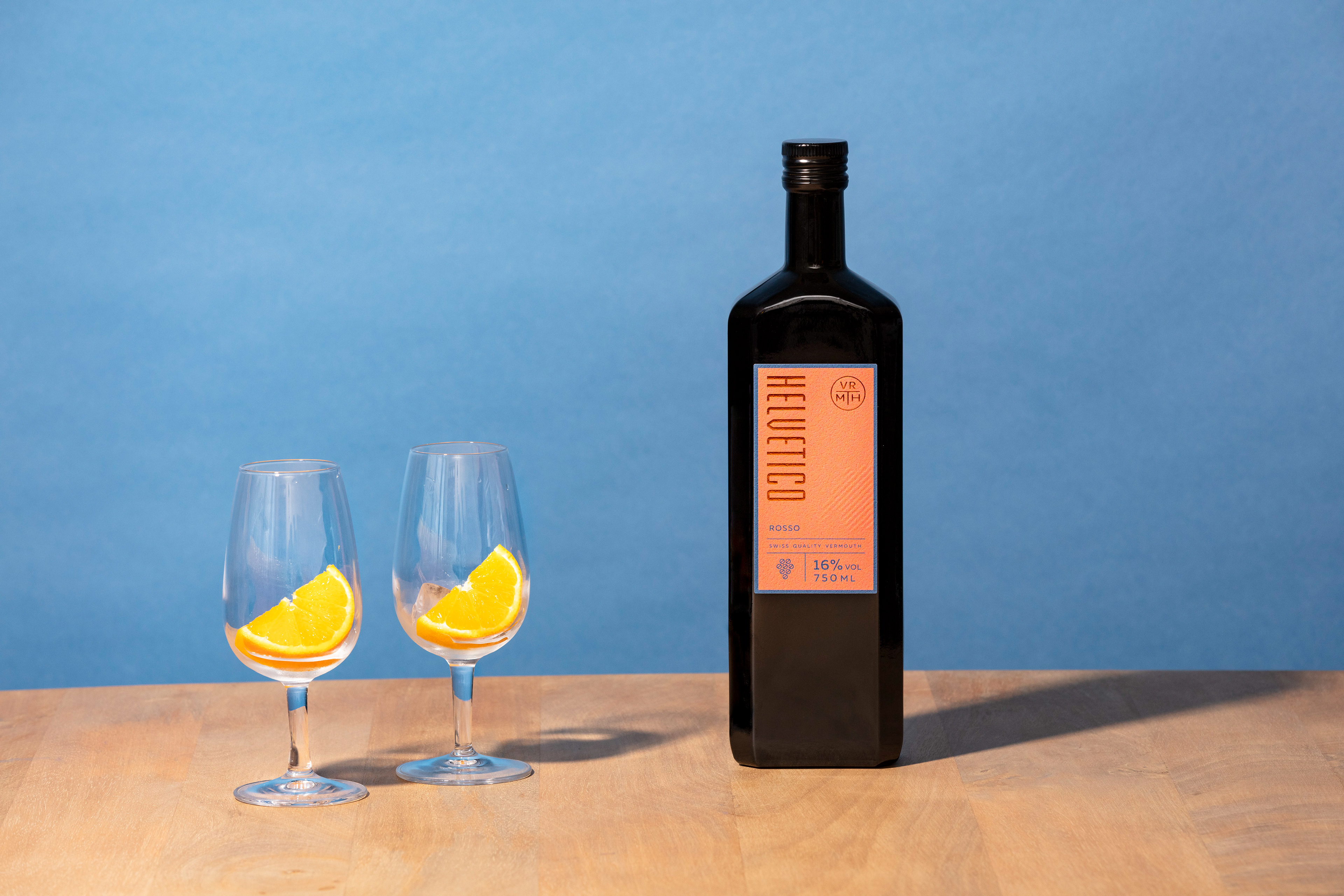
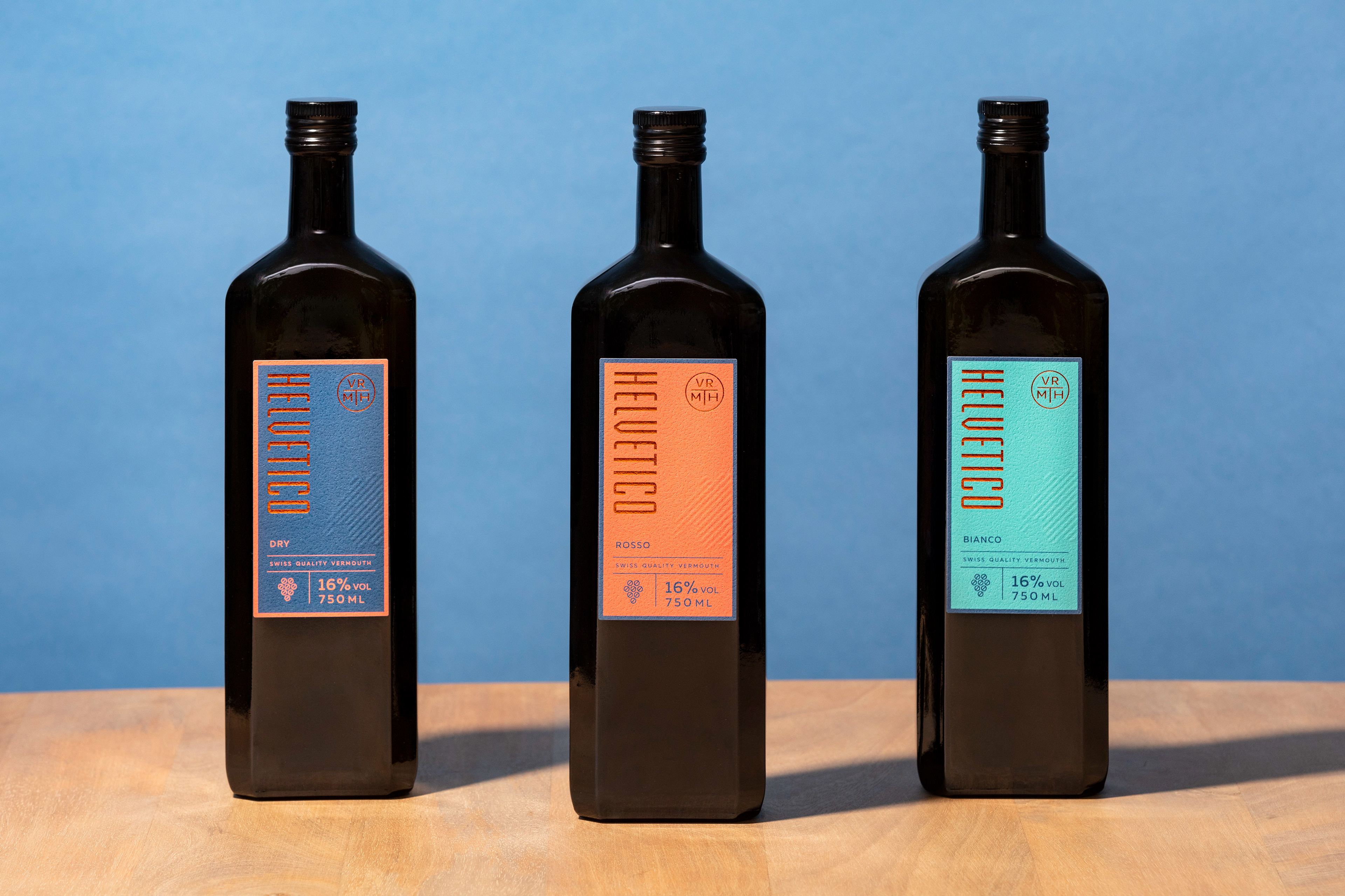
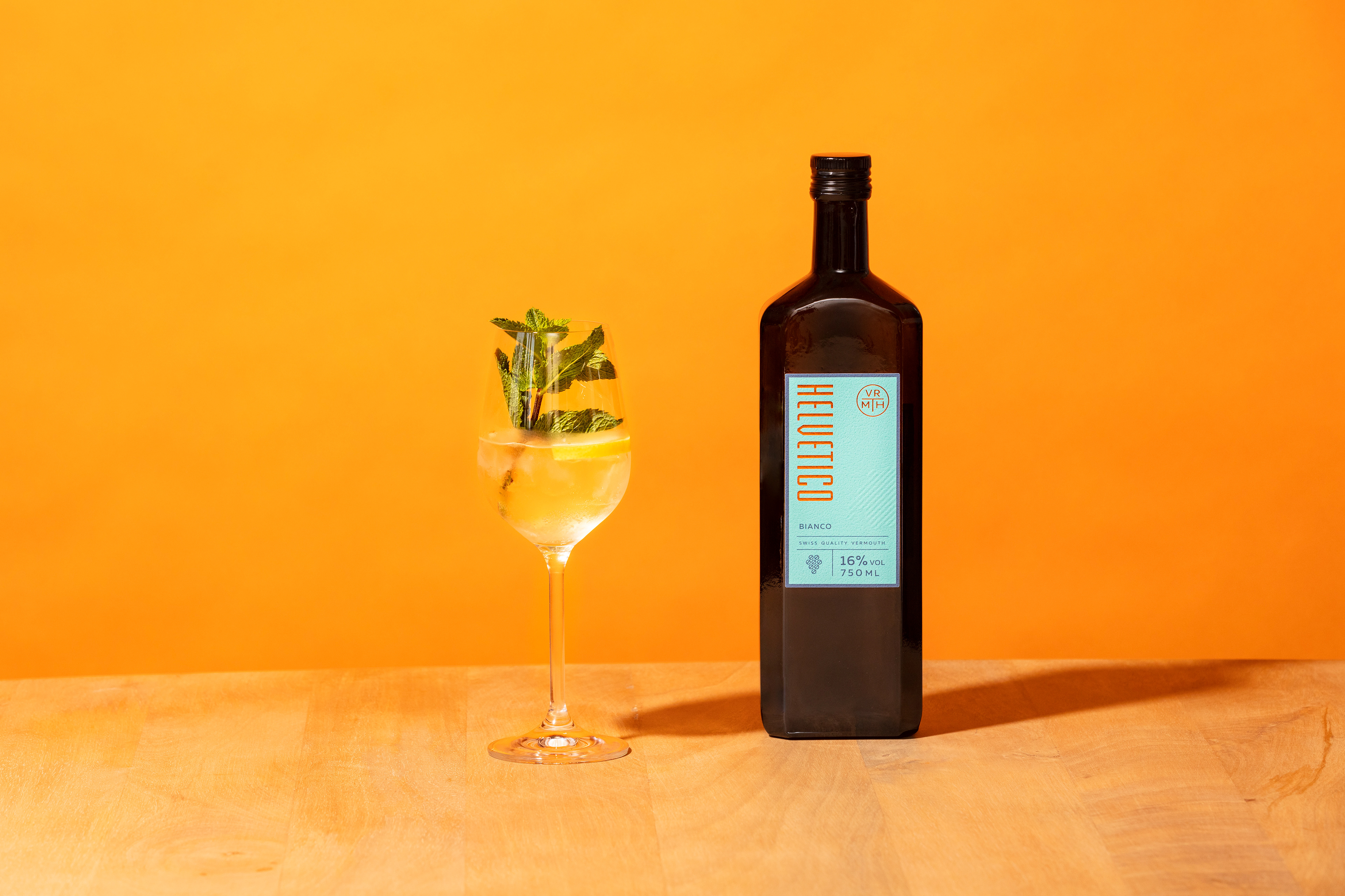
A few years ago, we had the pleasure of creating the identity of a high quality gin from the Swiss spirit makers Deux Frères. The founders are two brothers, as the name reveals, who have the ability to create extraordinary spirits. Gian and Flo have now teamed up with their good friend, gastronomy enthusiast, and marketing expert, Damian to create VRMTH, a vermouth produced locally in the country where it is sold. The first edition of VRMTH is Helvetico, a Swiss made vermouth, with rosso, bianco, and dry versions using grapes grown in Switzerland. Future vermouths made for different markets will use grapes sourced in their respective countries.
For this brand, it was important to create modular design that suited this contemporary vermouth, as well as to develop a framework for the identity that could be flexible enough to change for each market while remaining easily recognisable as part of a single brand.
To meet the needs of the brand, and also reflect the personality of its creators and the mood of the drink, we decided that colour should be a key player in the design, so we curated a colour range and repeated significant colours on all the bottles which created a flow between the various products and resulted in an easily recognisable identity.
Each bottle also features an abstract take on the Swiss map, to make a connection to the country where the Vermouth is produced, and gave us an element that could easily be replicated for different locations. We also employed a special copper hotprint technique which gives the design a touch of understated luxury.
Ph photography by Aladin Klieber
Gr graphic design by Eszter Laki
_______