D e u x F r è r e s G i n
Logo and labels for a handcrafted
Gin in Switzerland
_______
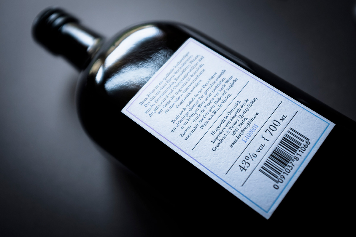
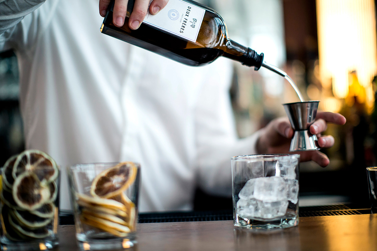
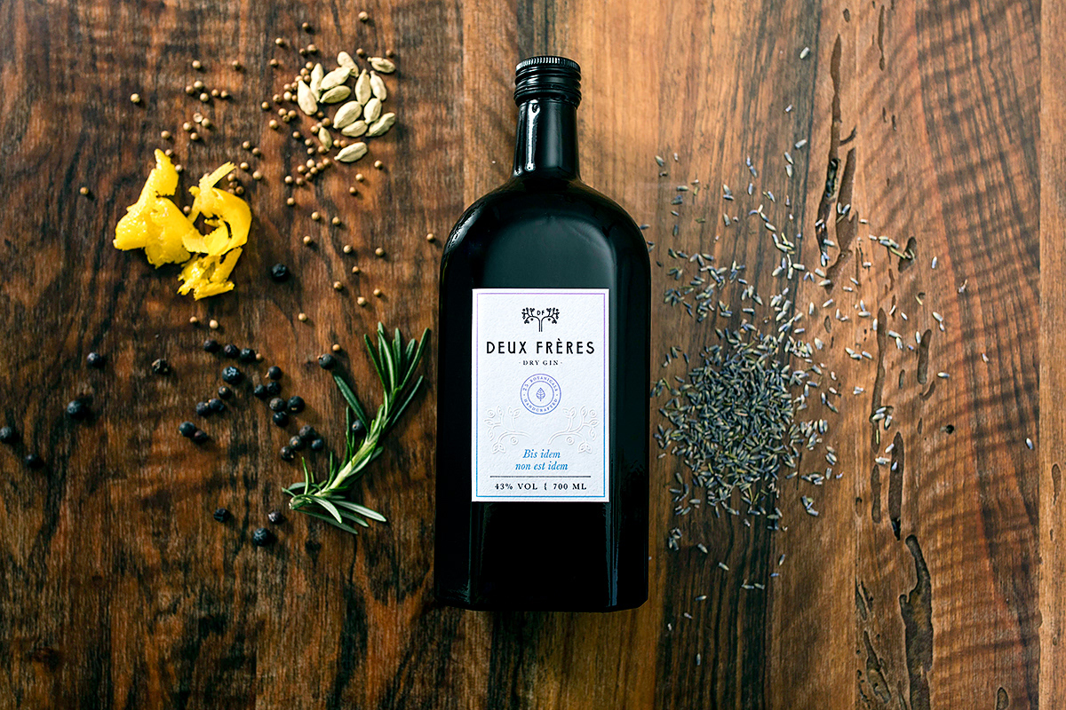
Deux Frères is a brand of two brothers who created a colourful spirit consisting 25 pure botanical elements. The production takes places in a 400 years old distillery where the skills of the Tyrolean masters and the copper cauldron technology resulted in a superior quality and an exceptional taste of gin.
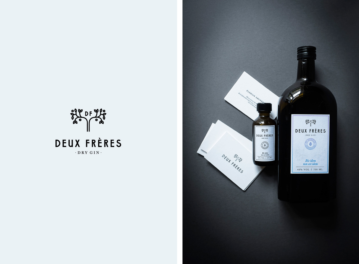
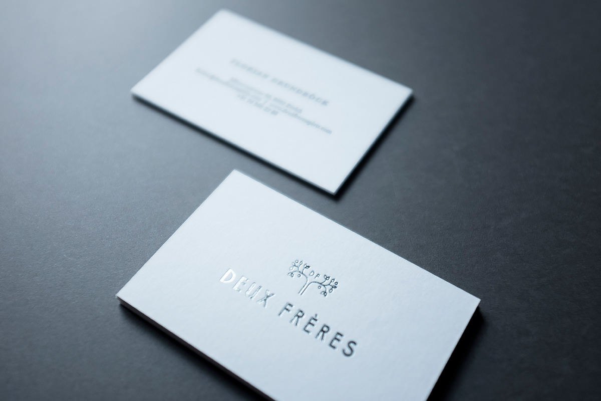
The two brothers, Gian and Florian are coming from a different background but their reunion in this project is a major element of the identity. This is the idea behind the tree fork motif which emphasises their strong bond with different skills and experiences. At the centre of the tree crown sits the DF monogram which is the fruit of this cooperation.
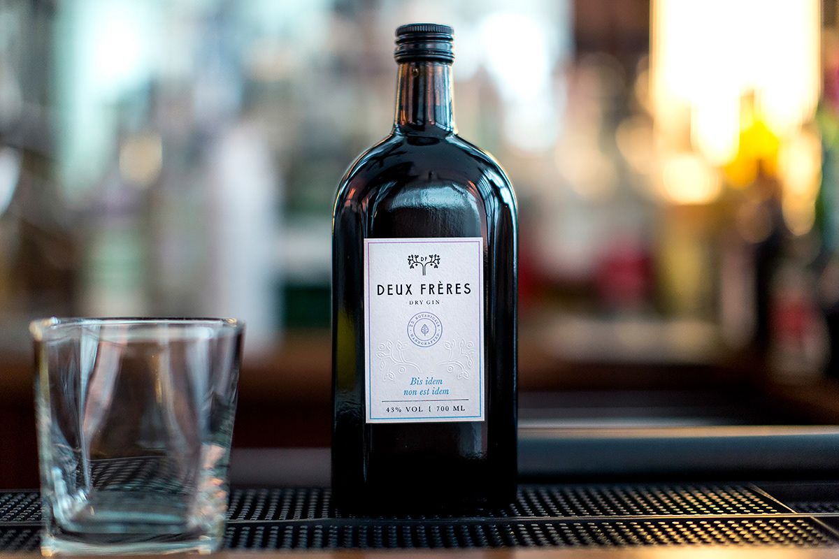
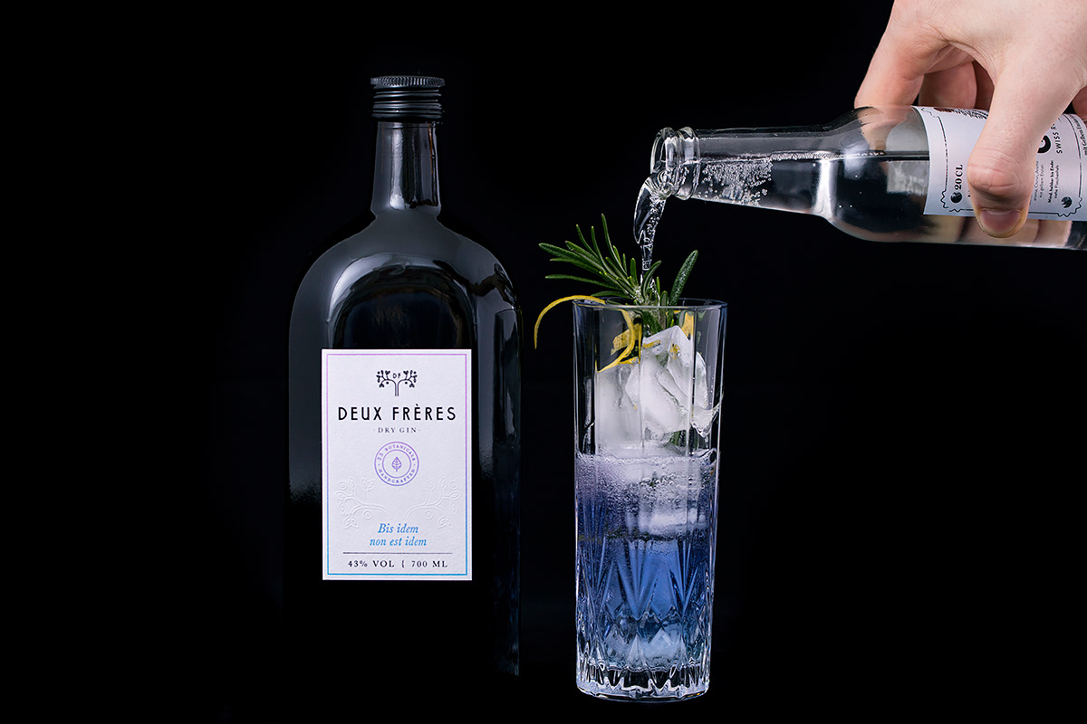
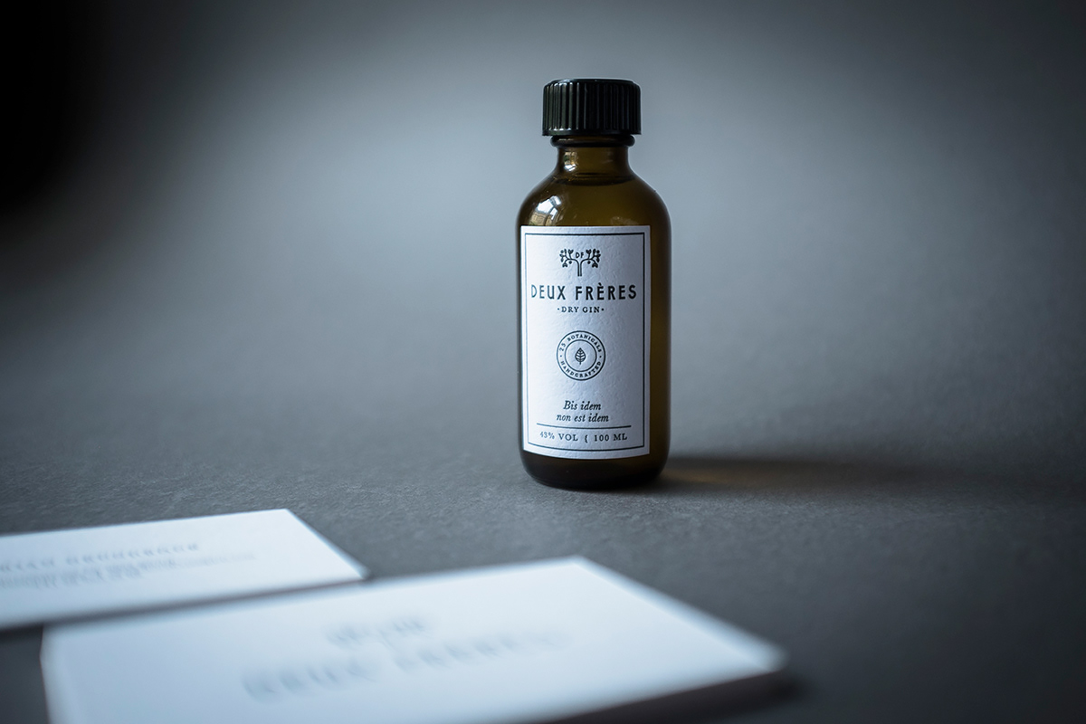
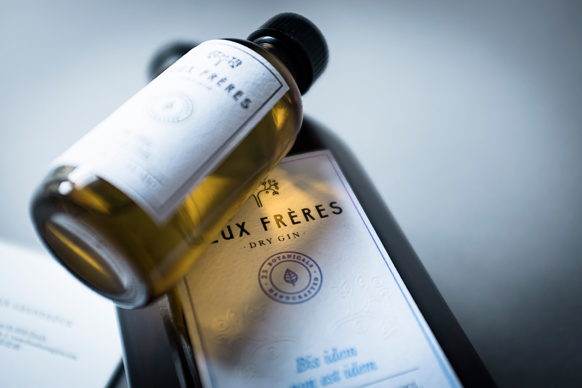
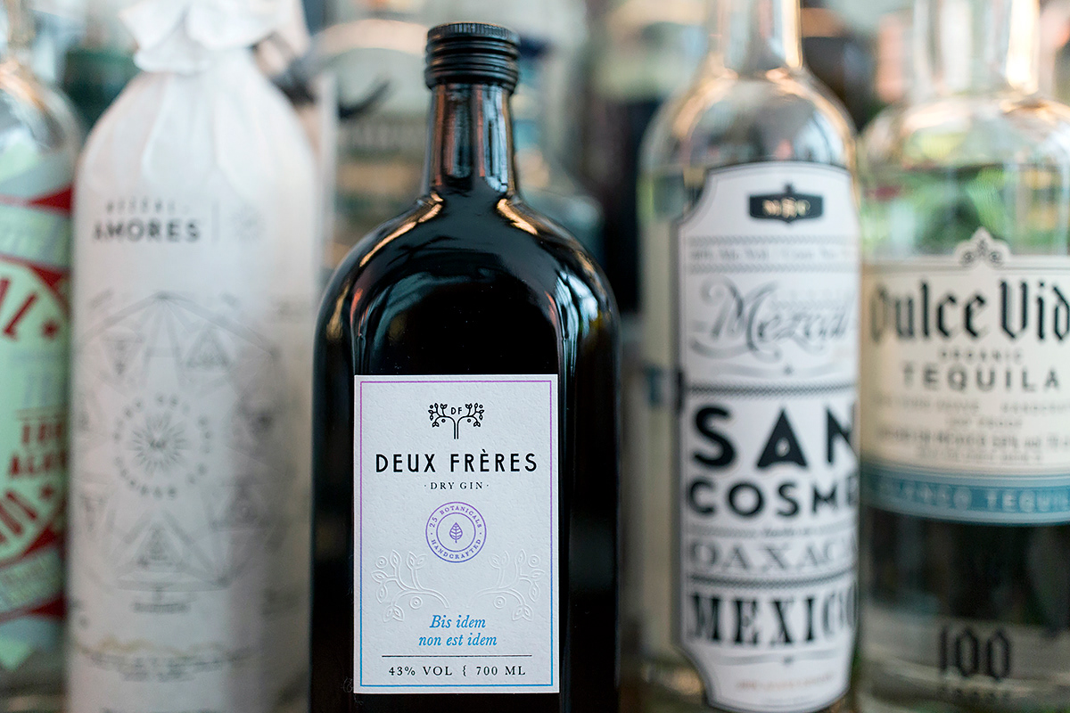
The dark glass evoke the classic pharmacy bottles and it protects the gin from the sunlight indeed which is needed because of the botanical components.
The spirit contains one secret ingredient which if tonic water added, turns the spooky light blue coloured beverage into a lilac one. No chemicals were added to perform this stunt, which is pure botanical magic.
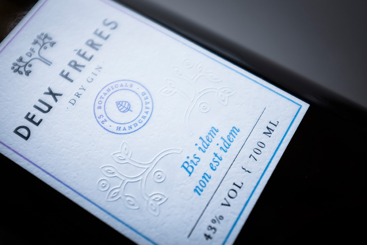
The thin gradient frame on the label captures this peculiar moment when the tonic changes the full colour of the gin. Therefore we’ve chosen letterpress printing method which enables 3 different usage: black and iris letterpress and blind emboss. The printing was made by Inkredible Letterpress.
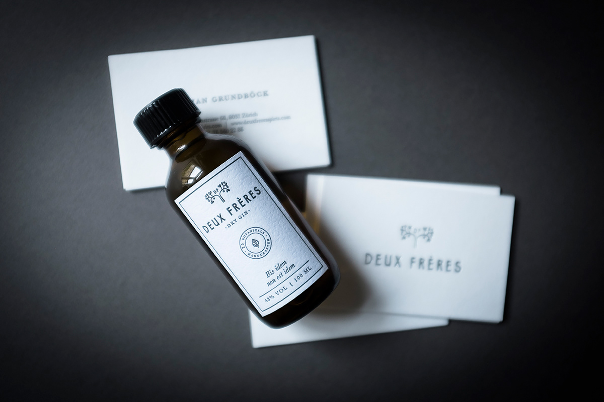
A tiny short drink version and a business card is also part of the the visual identity. The tiny bottle has a simplified label however on the business card a new element shows up, a silver hot-foil printed logo.
F photography by Aladin Klieber & Eszter Laki
_______