V I E
Branding for a natural skincare line
based in the United States
based in the United States
_______
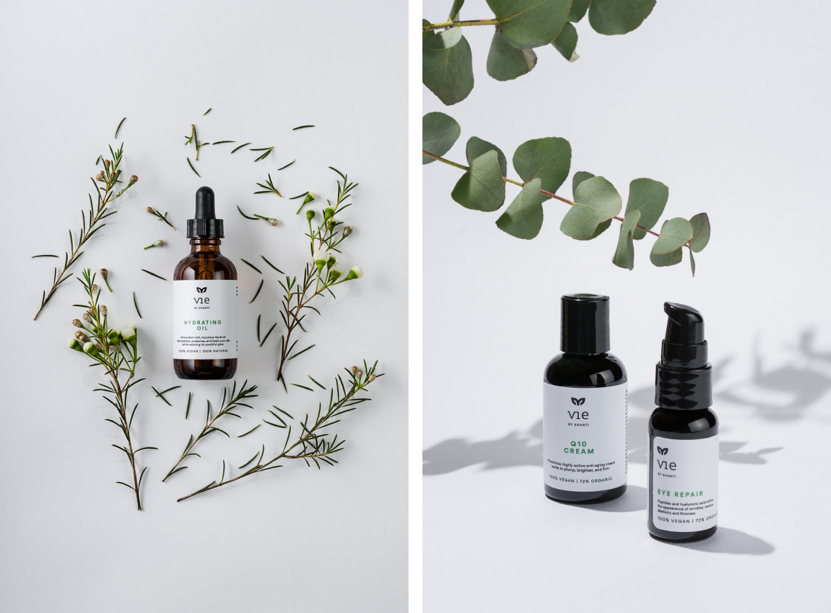
VIE by Shanti is a USA based skincare line using natural, ethically harvested, responsibly sourced ingredients for their products. The traditional manufacturing techniques are combined with state of the art technology resulting in a modern, eco-conscious brand. The products are 100% vegan, organic, cruelty-free, manufactured in an ethical and eco-friendly way so the identity has to reflect this philosophy.
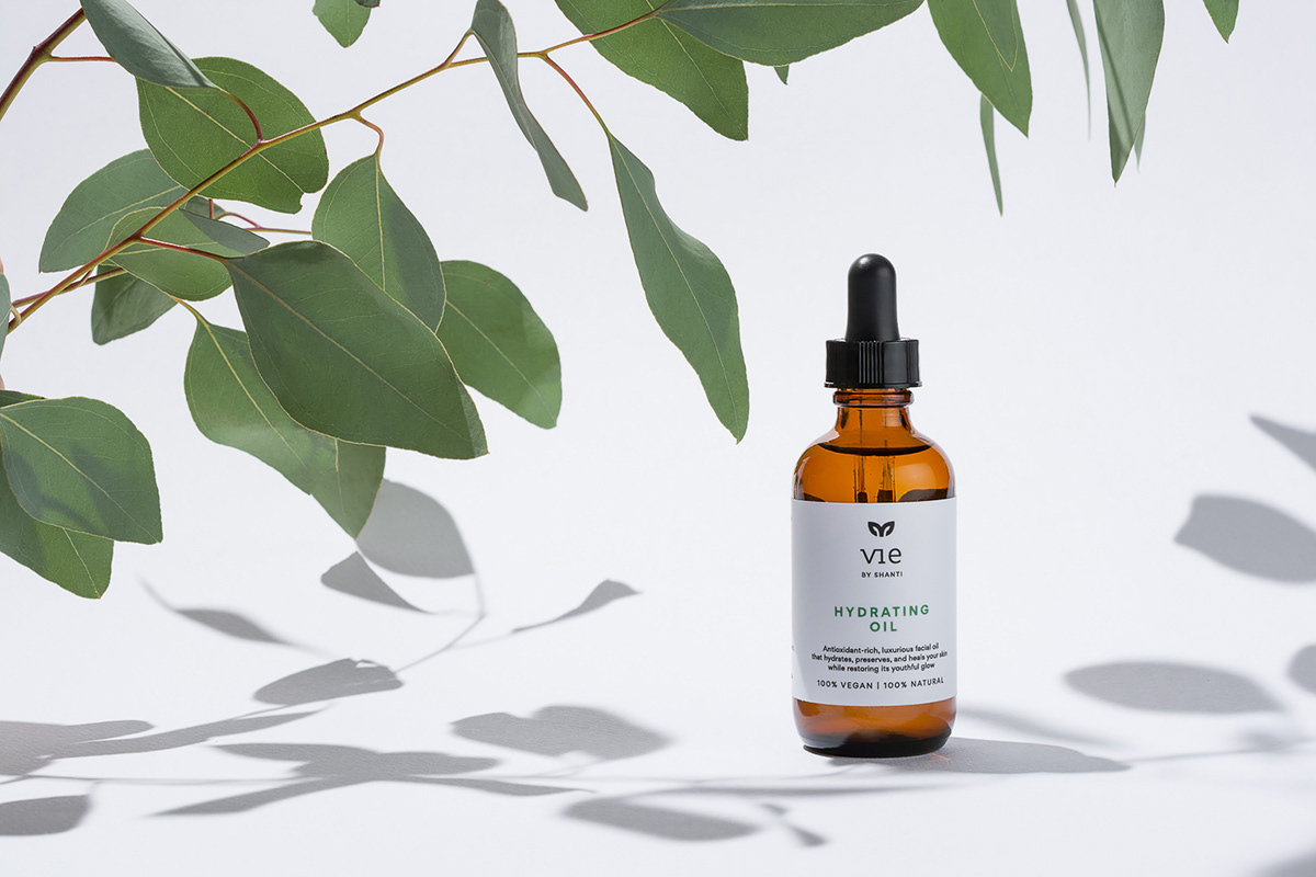
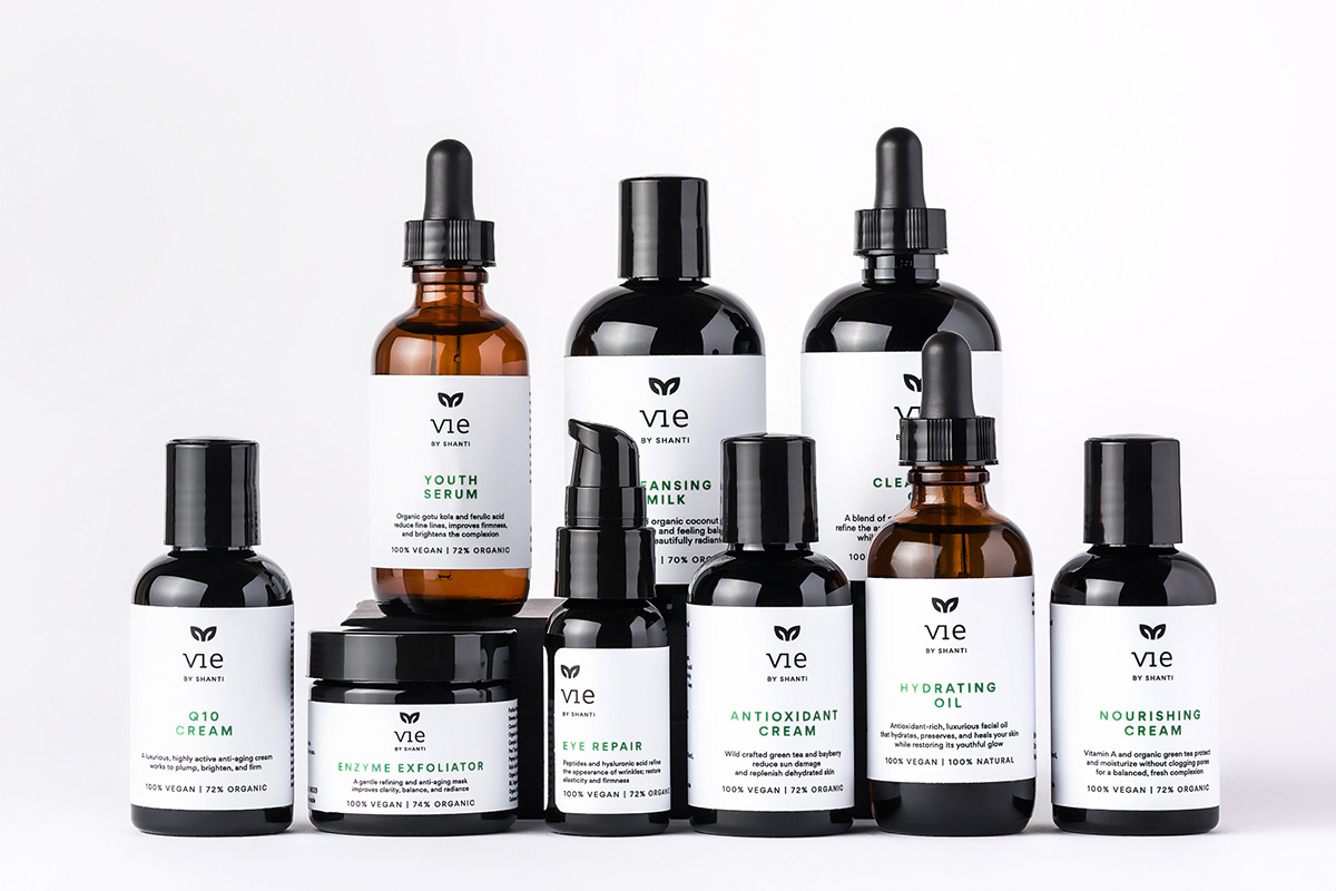
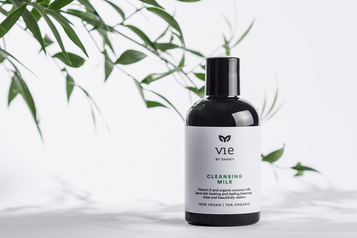
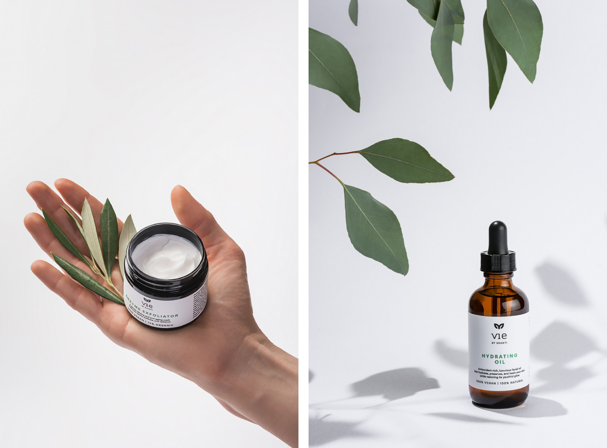
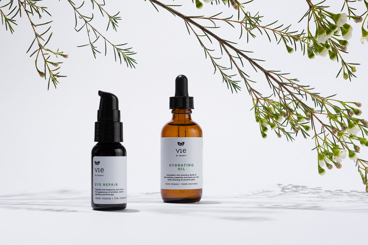
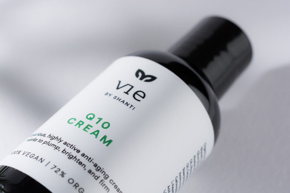
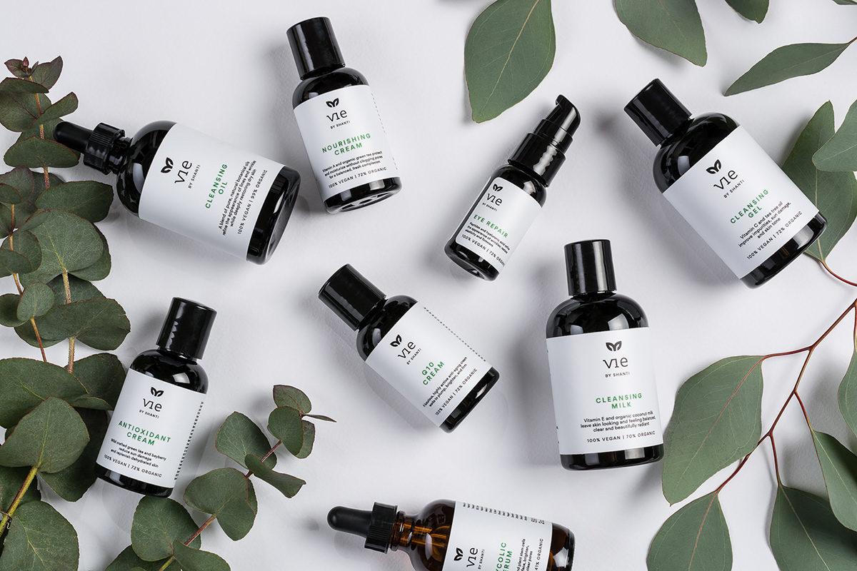
I was commissioned by Shanti to rebrand the package design, more precisely the product labels. All of the packages are from recycled materials and they use UV-protective bottles which is important for preserving product quality.
The new design aims to signify the pure, organic ingredients treated with high-tech expertise so the labels are very minimalistic, dominated with clean white surfaces. The label has to specify all the important features and ingredients of the products so it is the most challenging task to keep it simple and smooth while paying attention to stay readable.
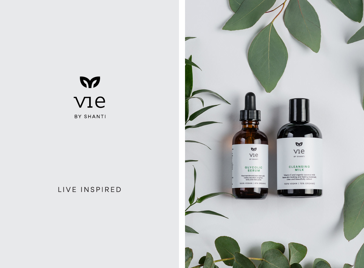
The founder of Vie called Shanti is a waxing and skincare expert who believes in holistic approach to health and well-being. Shanti means peace, calmness and bliss in Sanskrit language so this nature of her inspired the logo as well. Therefore the little V shape logo forms angel wings implying the caring and loving attitude of the brand.
I was commissioned by Shanti to rebrand the package design, more precisely the product labels. All of the packages are from recycled materials and they use UV-protective bottles which is important for preserving product quality.
The new design aims to signify the pure, organic ingredients treated with high-tech expertise so the labels are very minimalistic, dominated with clean white surfaces. The label has to specify all the important features and ingredients of the products so it is the most challenging task to keep it simple and smooth while paying attention to stay readable.
The founder of Vie called Shanti is a waxing and skincare expert who believes in holistic approach to health and well-being. Shanti means peace, calmness and bliss in Sanskrit language so this nature of her inspired the logo as well. Therefore the little V shape logo forms angel wings implying the caring and loving attitude of the brand.
P photography by Peltan-Brosz
A art direction, graphic design, styling by Eszter Laki
W viebyshanti.com
_______