V A L M O R E
Identity design & packaging
for a Sicilian olive oil brand
for a Sicilian olive oil brand
_______
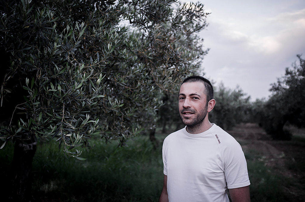
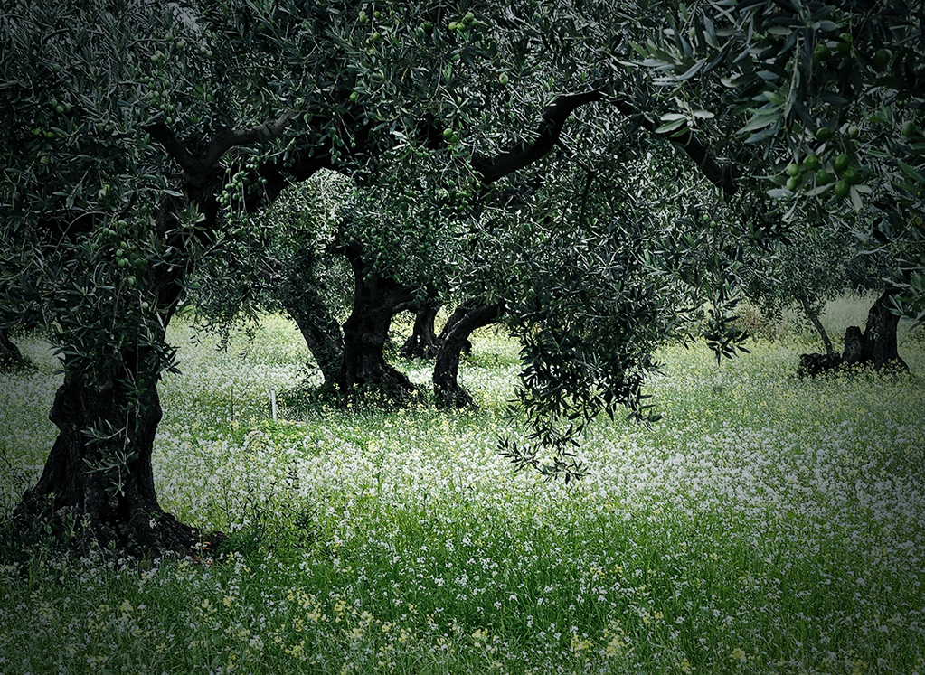
Along landscape the ruins of ancient beam, ultra secular olive trees and a small wood virgin cork oak immerses us in our Mediterranean maquis. Where Sicilian stories meet with the bond of love for the memories. The company cultivated with dedication centenarian olive trees in Castelvetrano producing oil for its family. Thanks to Nicolò, founder of the Valmore brand, was rediscovered the beauty of this old farm by crossing a new path to the future. With the most modern techniques of extraction and storage, to produce a product that combines the taste of a long tradition, the know-how of the team closes in bottles work of each season.
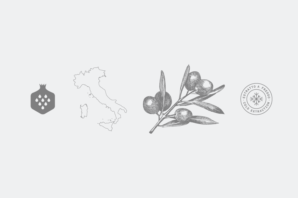
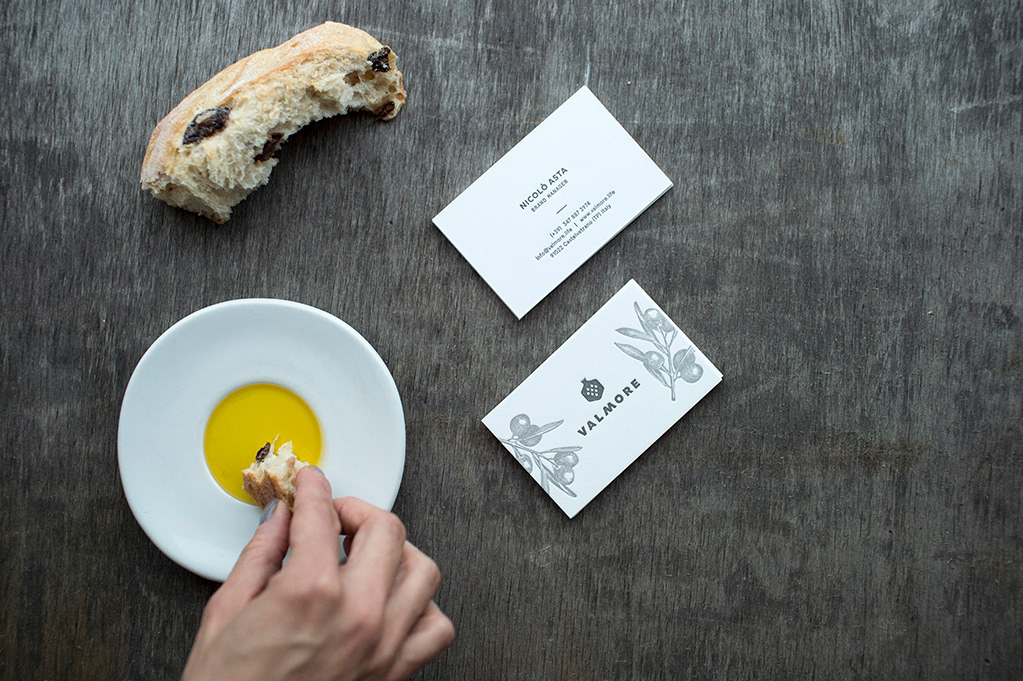
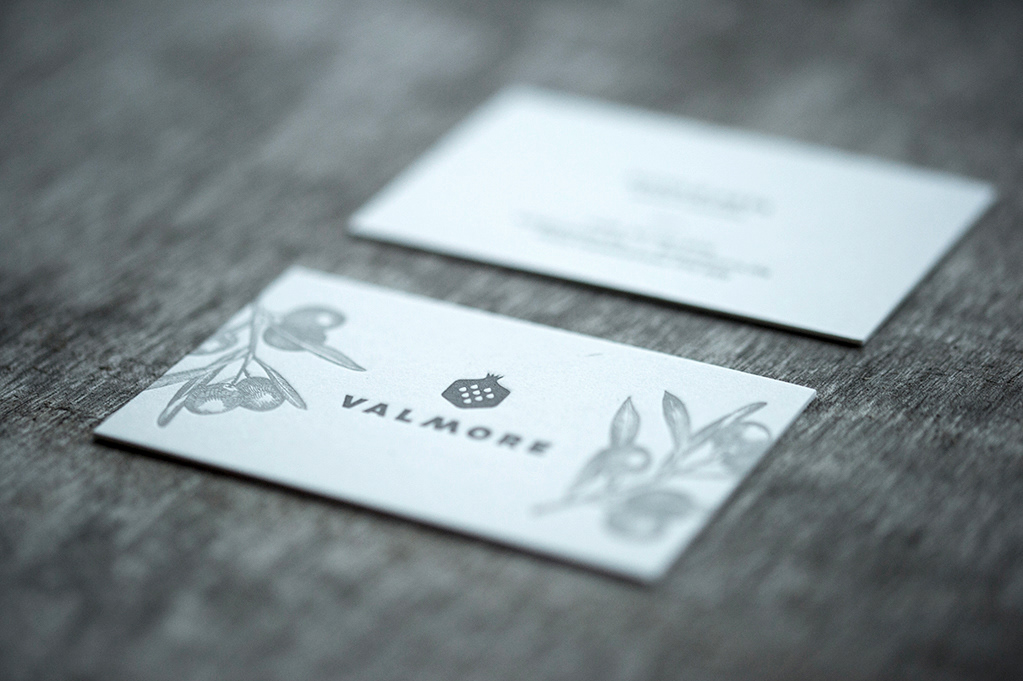
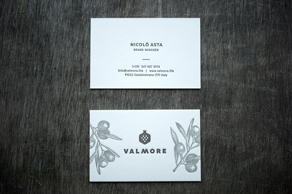
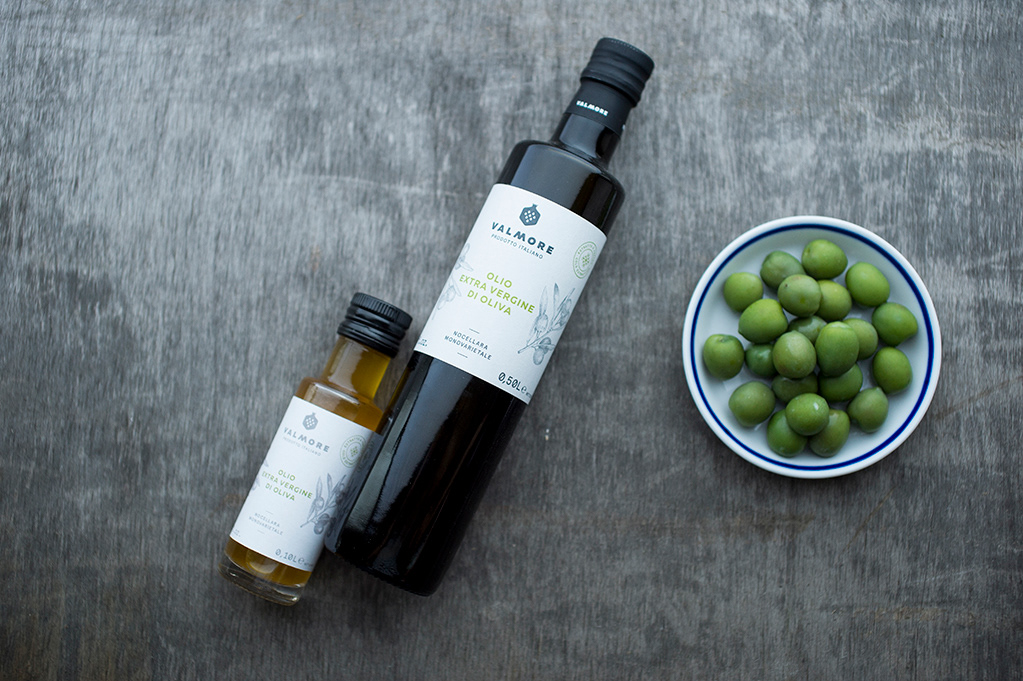
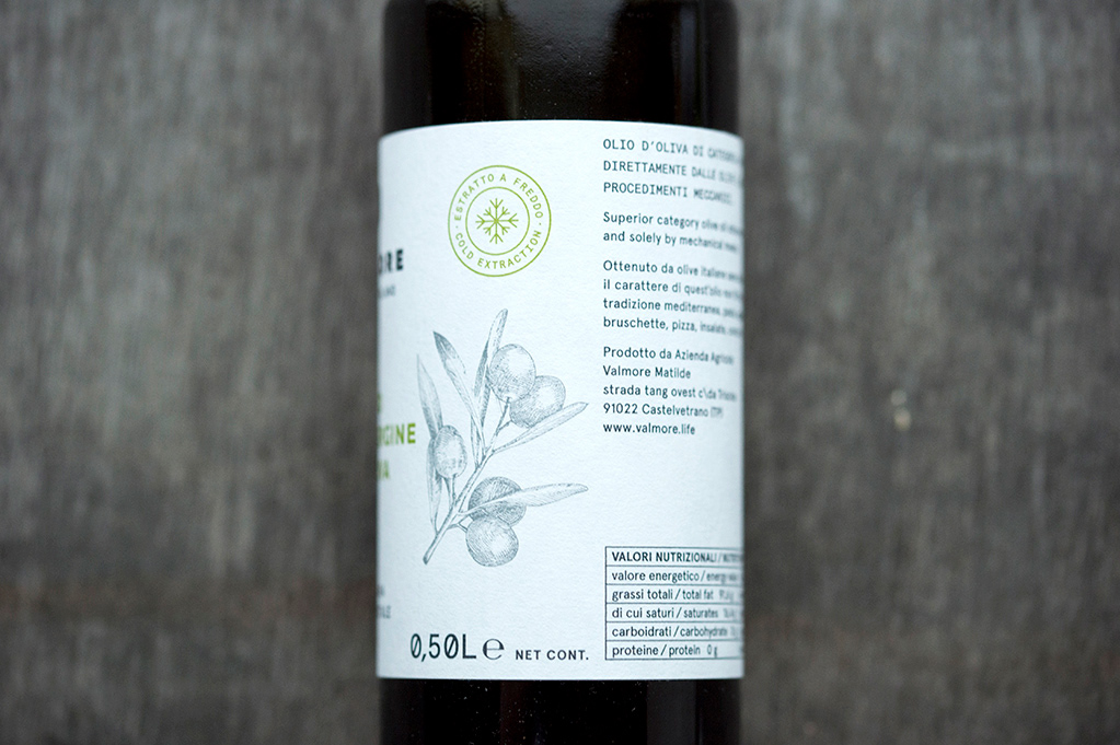
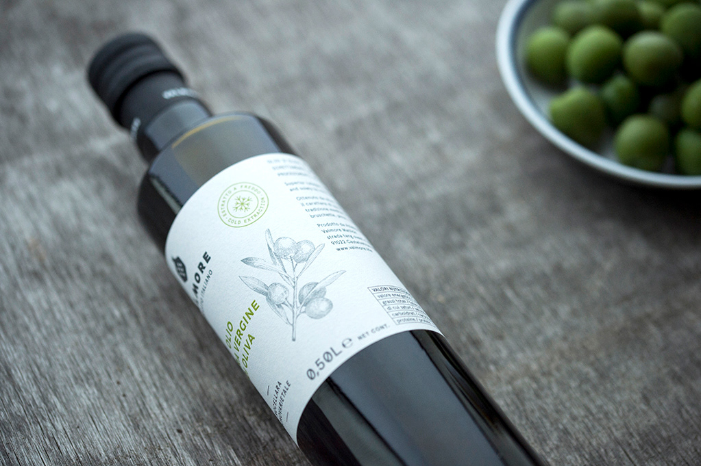
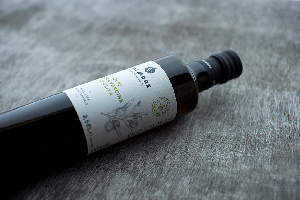
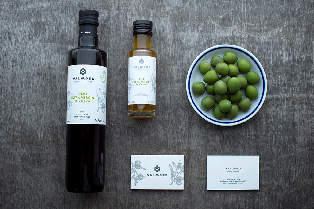
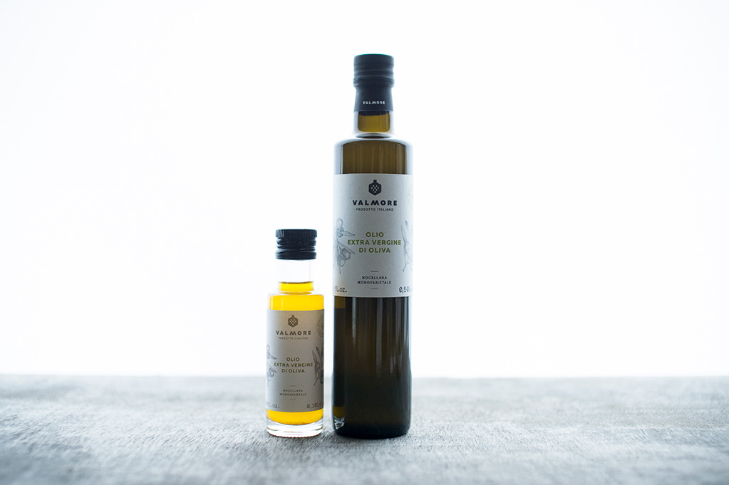
The enthusiasm of Nicolò was integrated in the identity design. The olive branch is hand drawing. The business cards were printed with letterpress technique. The logo symbolized a pomegranate with V-shaped seeds.
W www.valmore.life
P photography by Balázs Glódi
P photography by Balázs Glódi
L letterpress by Inkredible Letterpress
_______