S O I
branding for a Thai streetfood
canteen in Geneva, Switzerland
canteen in Geneva, Switzerland
_______
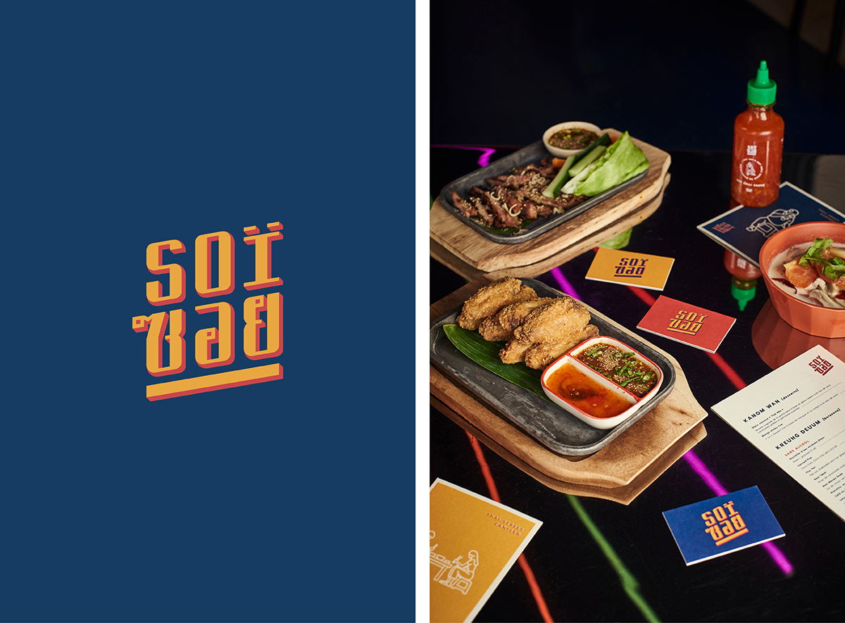
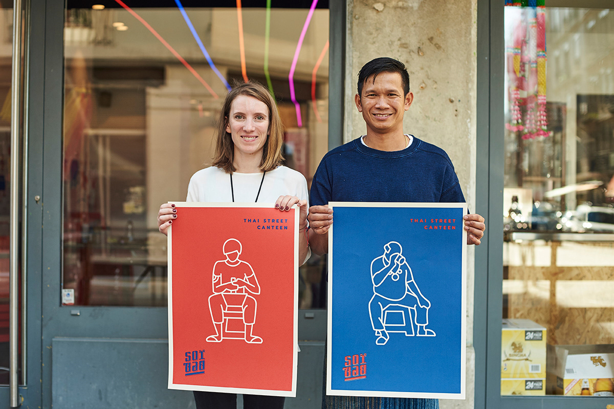
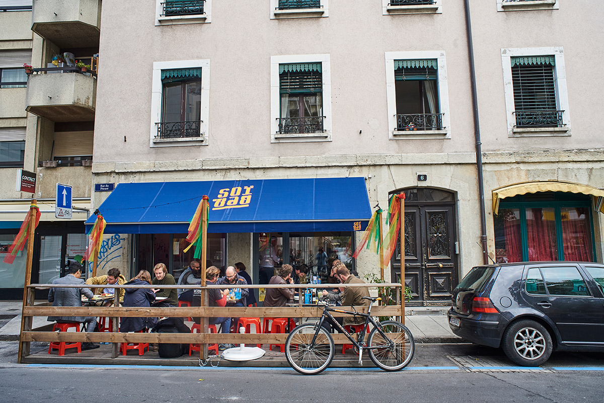
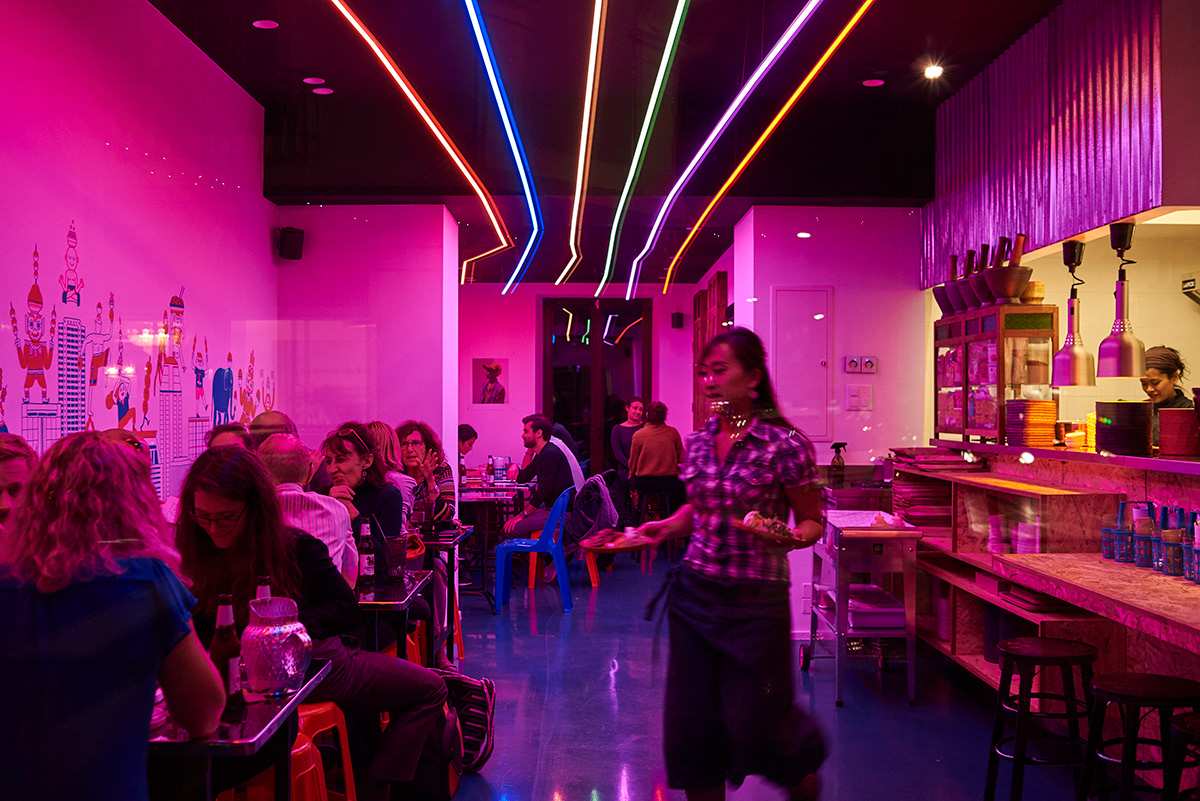
Soï canteen is a result of a lucky encounter of a Thai chef and a Geneva native crossing each others path in Thailand. After having several dinners at local street vendors together they became determined to bring that atmosphere of little red plastic chairs and the rainbow of neon lights to Geneva to keep people happy with Thai food.
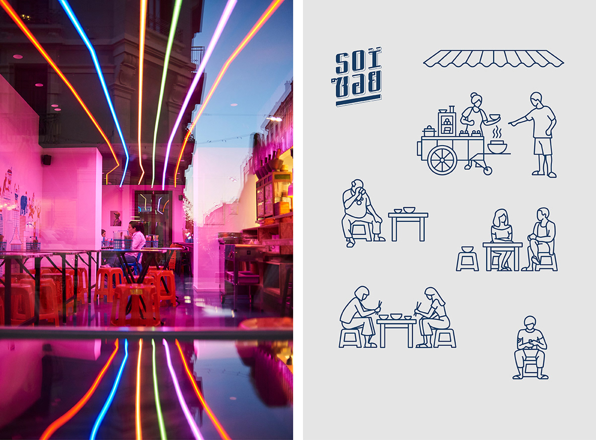
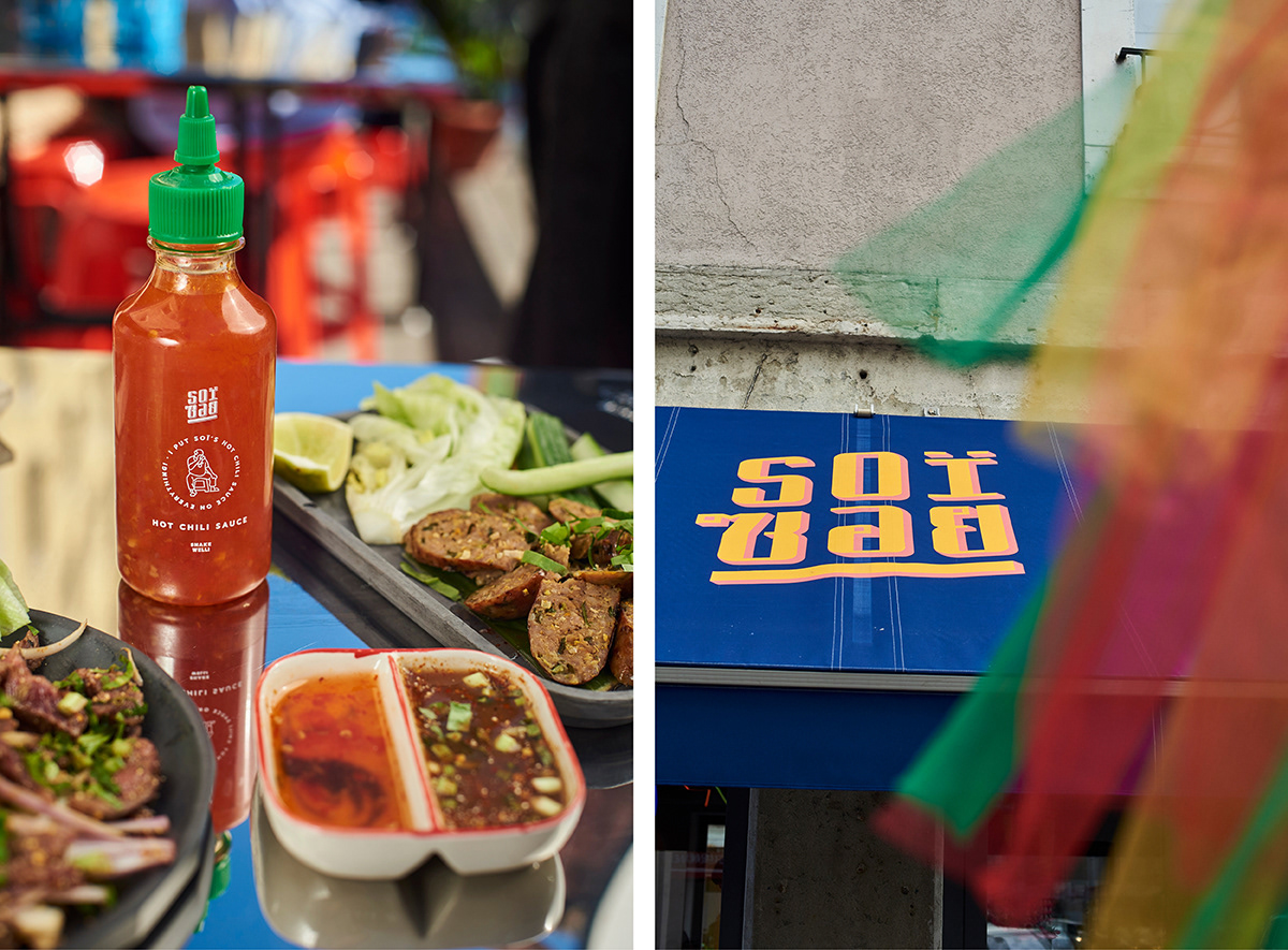
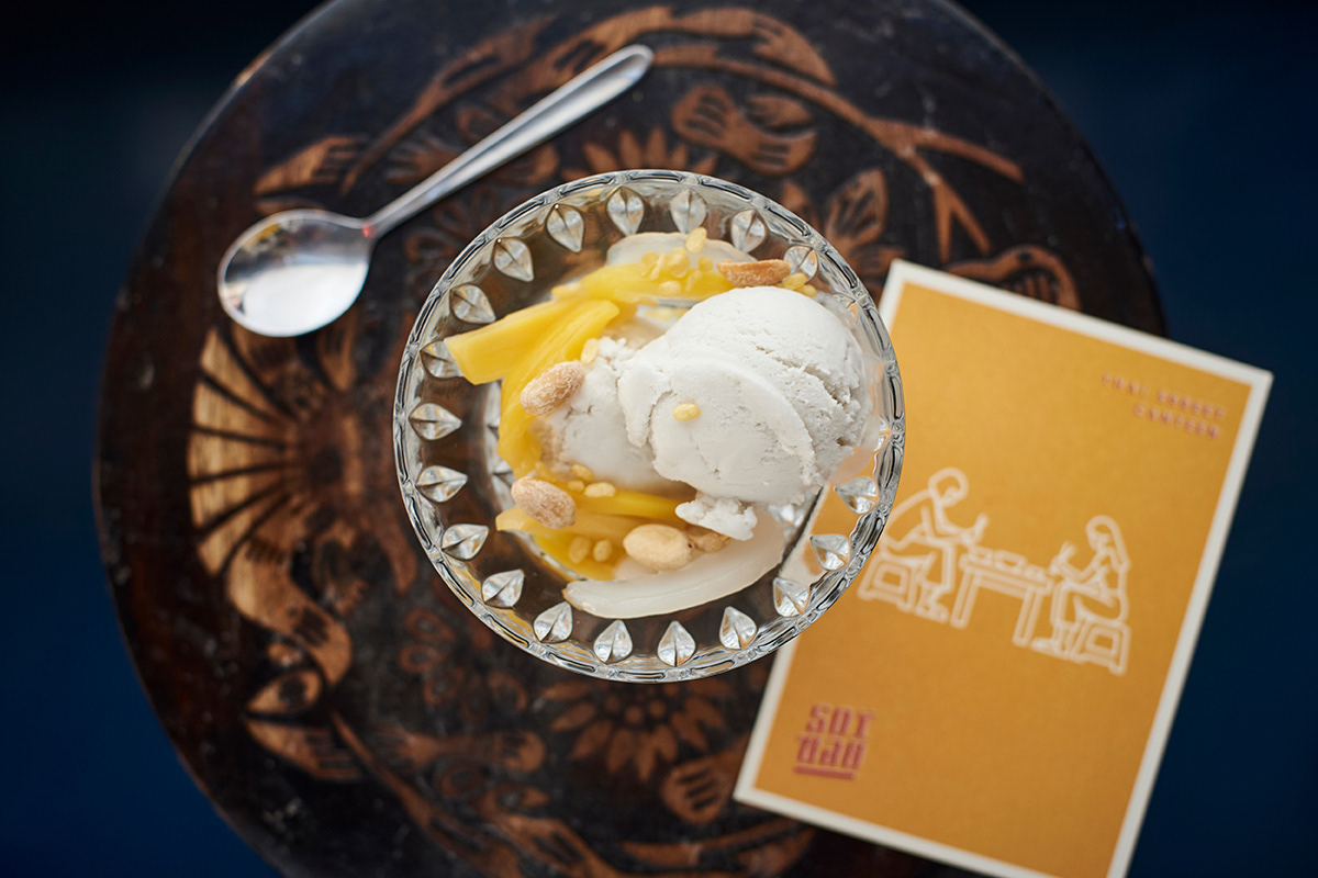
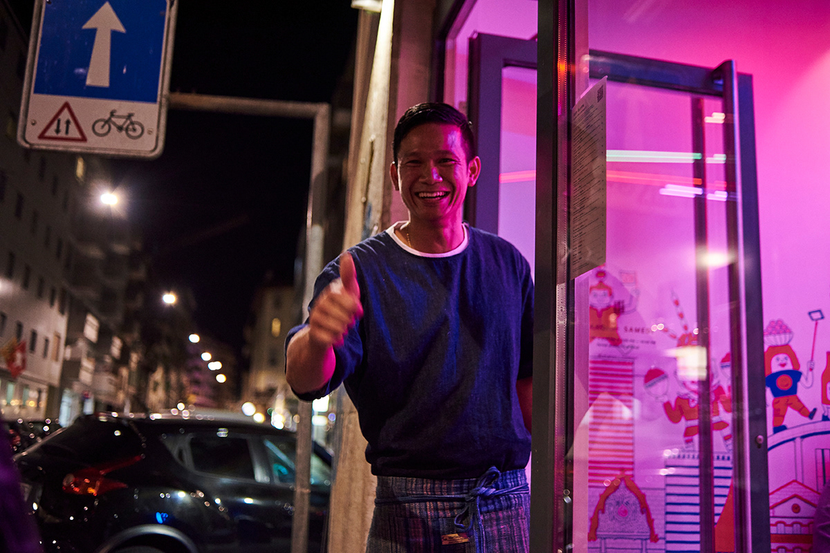
Soï means “street” in Thai language which refers to the main idea: to keep everything in a puritan, street food style by evoking the magical, luminous mood of Thai street food and the typical utilitarian environment. They were eager to keep the homely street vendor scale so they’re operating a micro-enterprise where they are present and responsible for the food day by day.
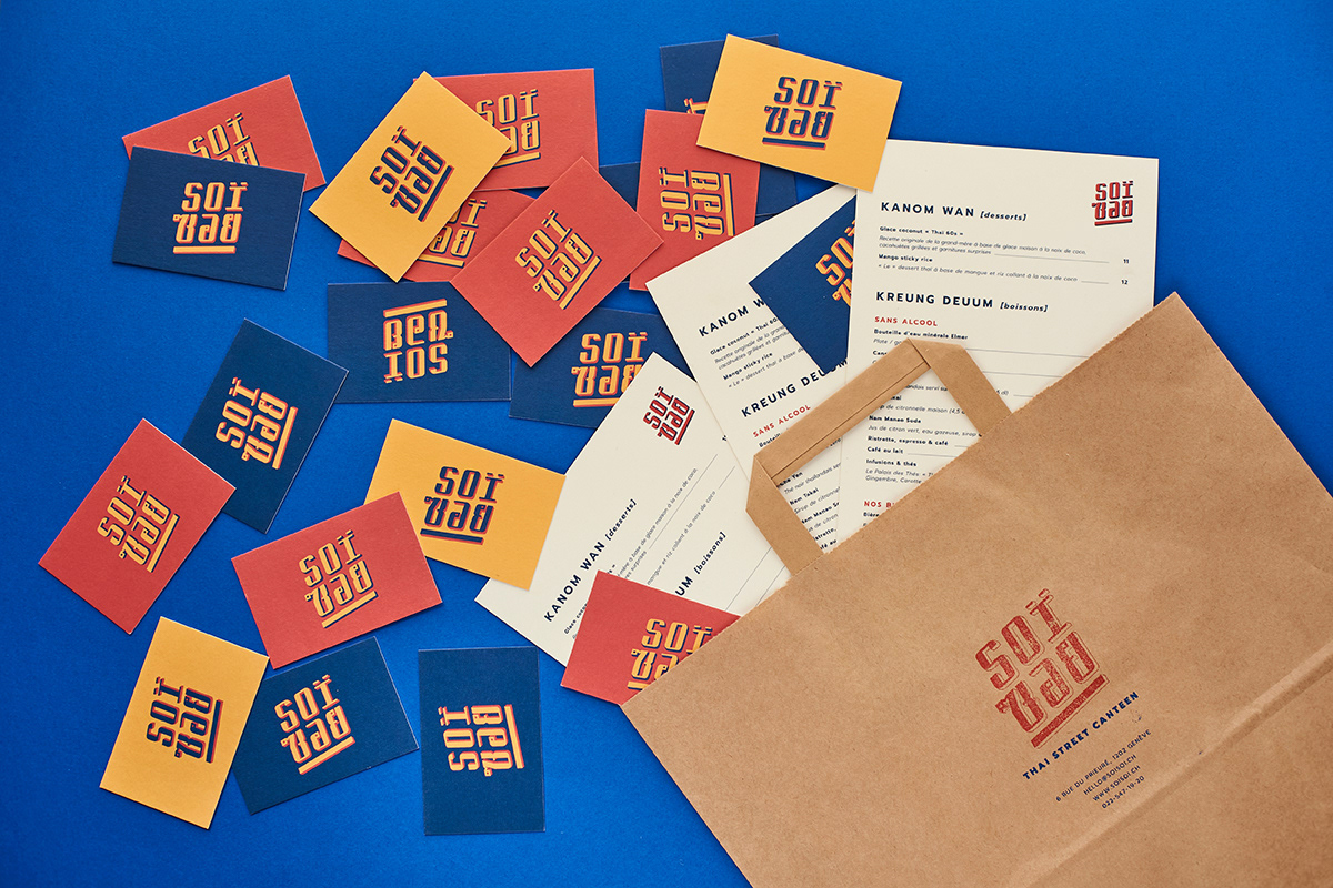
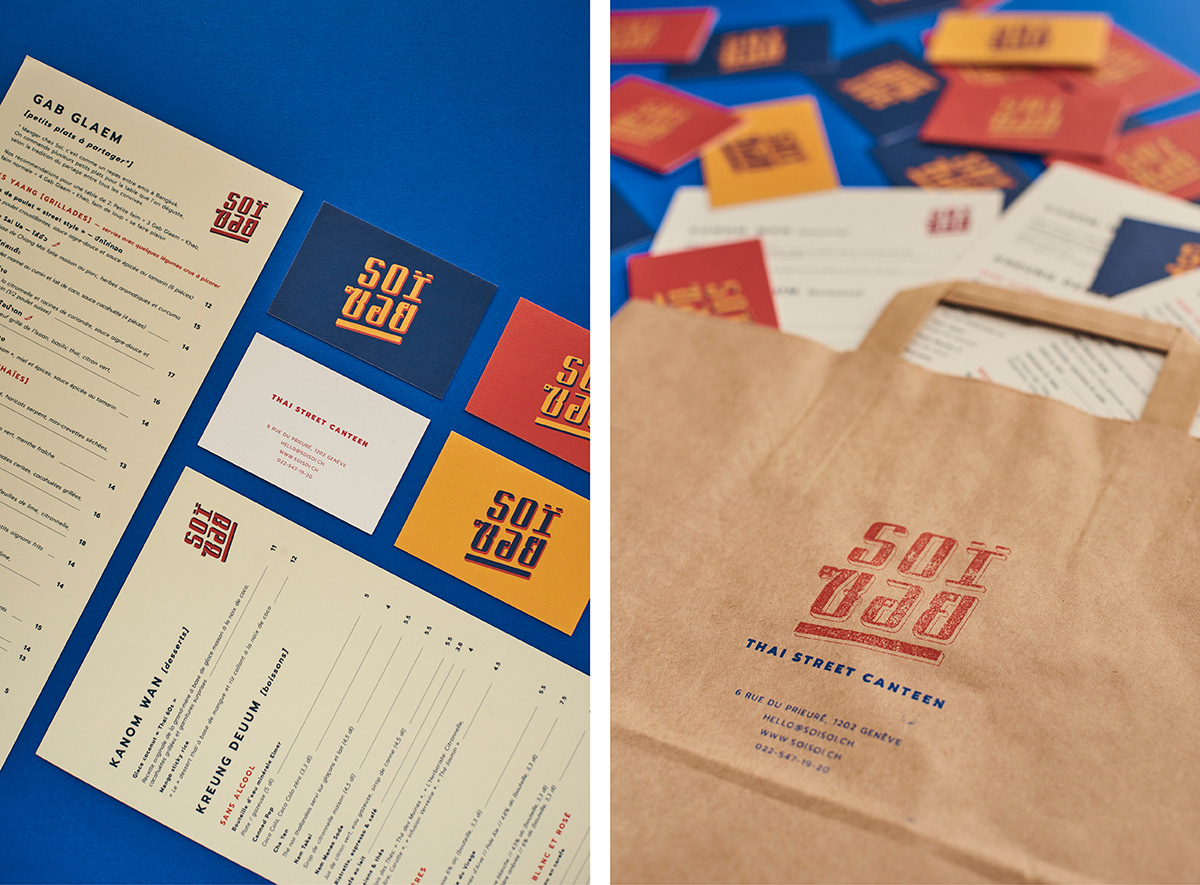
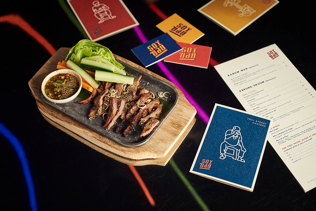
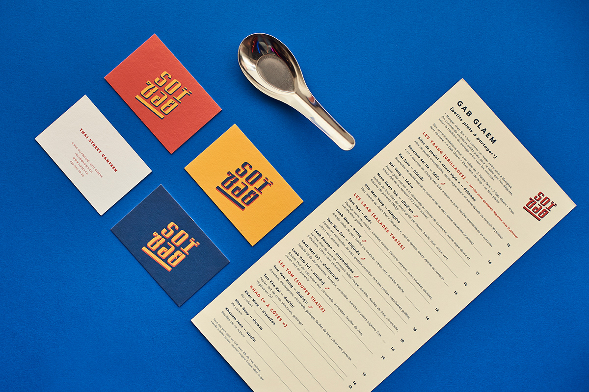
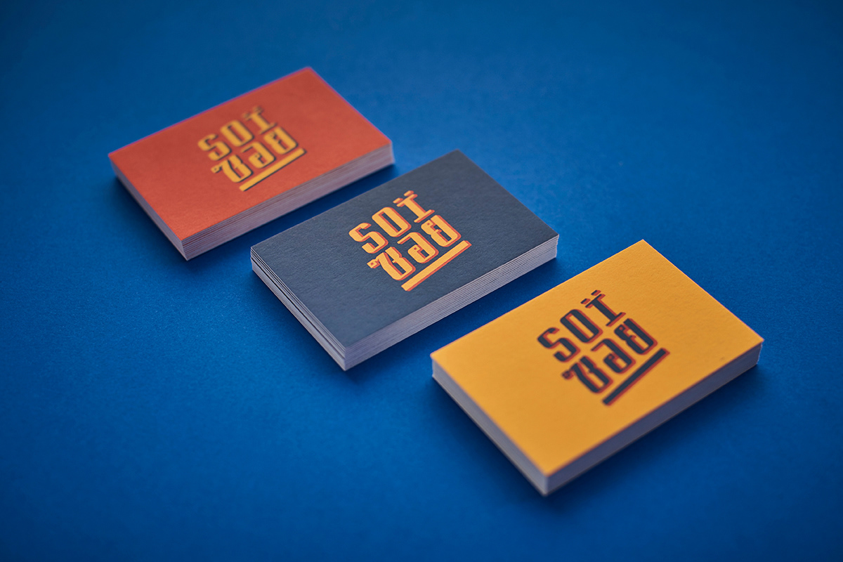
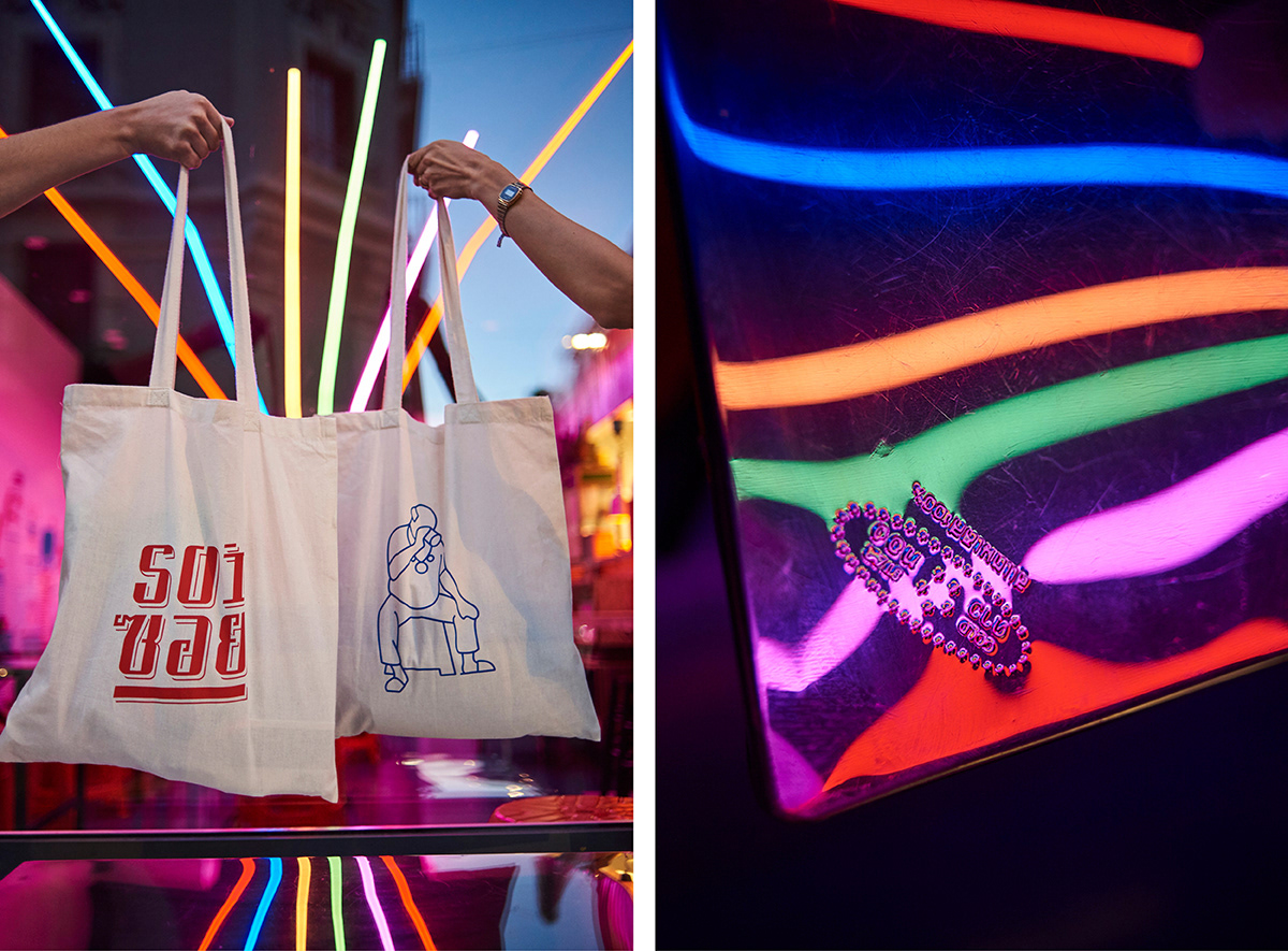
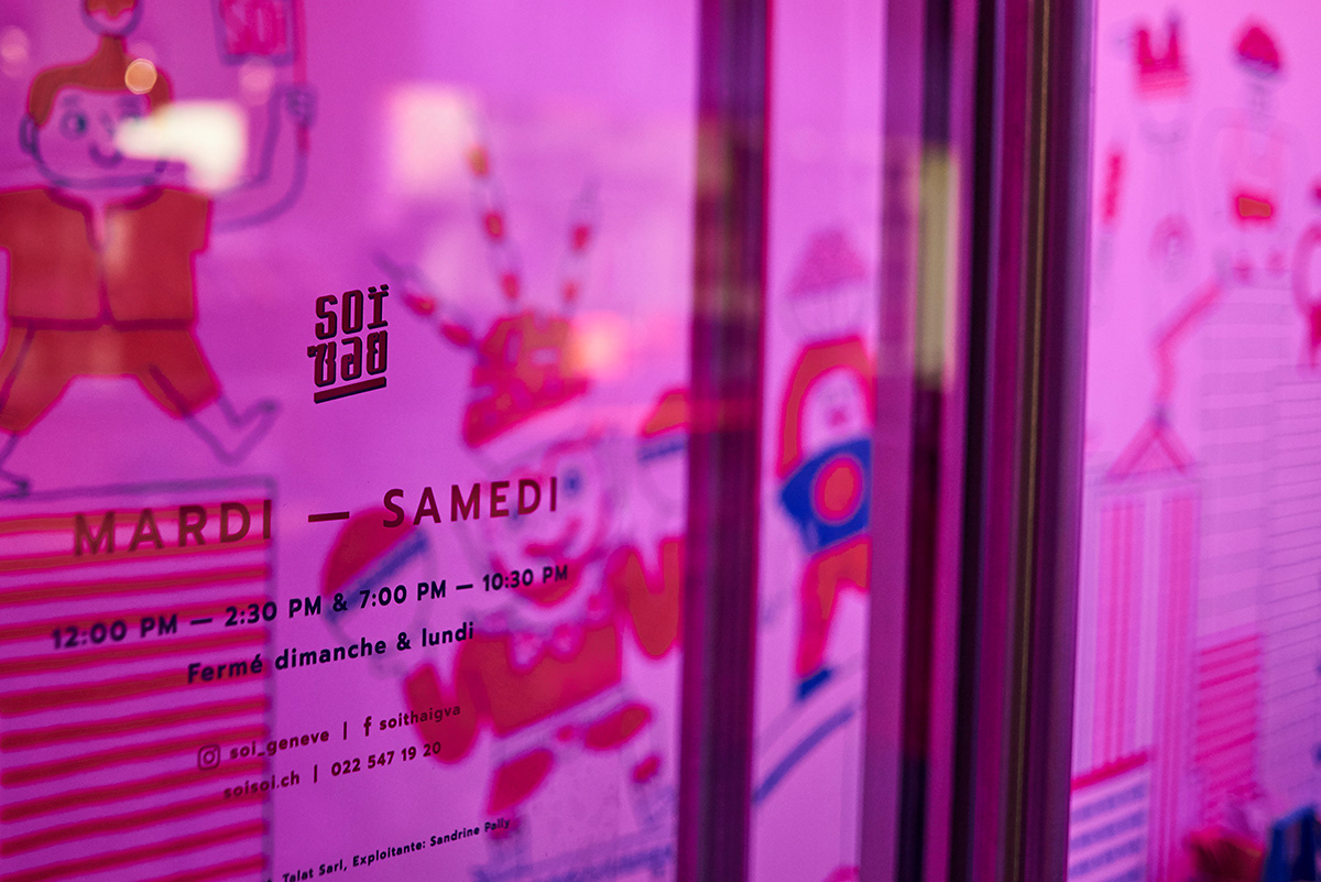
For the logo we wanted to use the colours of the Thai flag and added some faded yellow which all recall the hand painted signs and the lividness of old posters on the streets of Bangkok. The comic strip-like letters have very special characteristics: the Thai translation of Soï contains uniquely designed details, a one-of-a-kind font which is a full modification of the original latin letters.
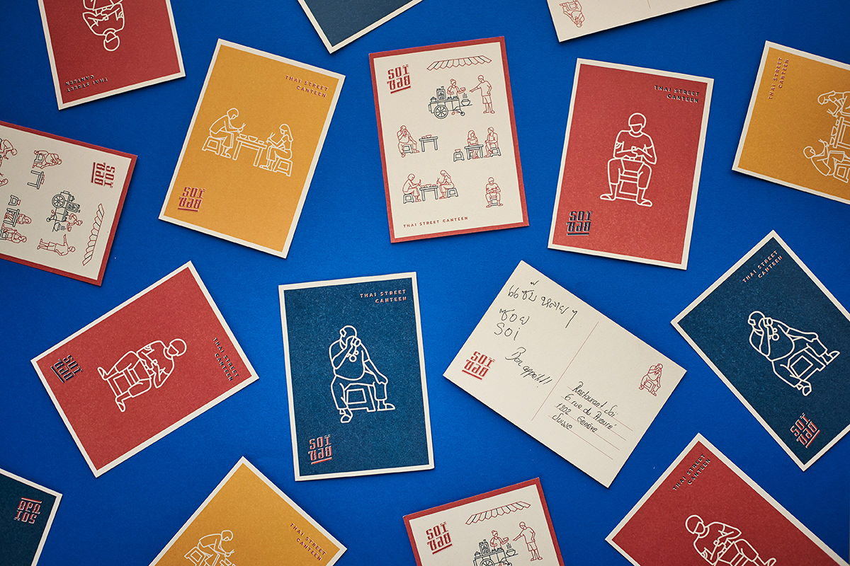
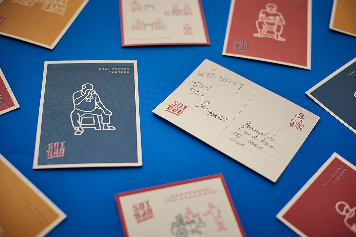
For postcards and posters we used iconic figures inspired by the streets of Bangkok as well: an old chap drinking on a chair, a young worker using a mortar and other typical food scenes.
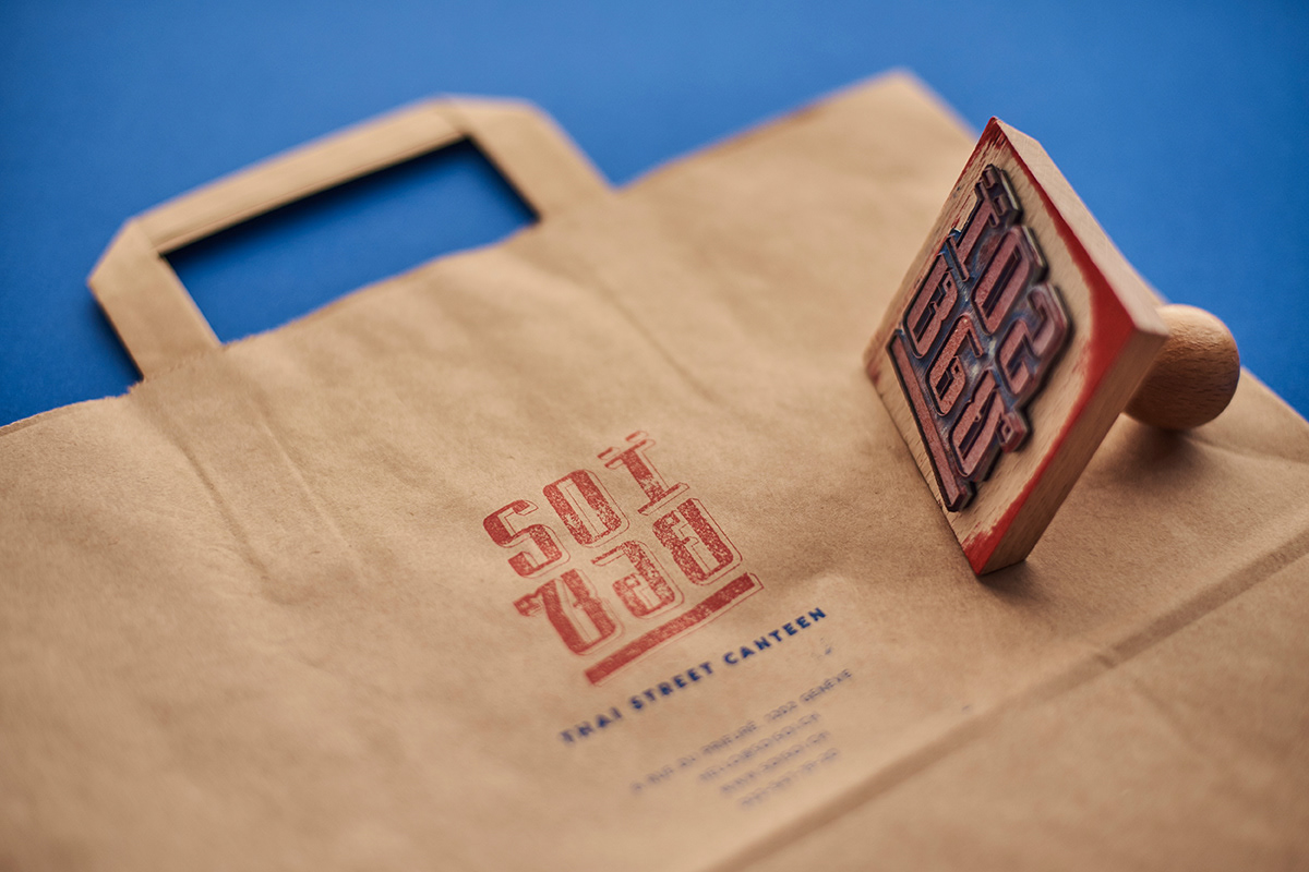
We made two different wooden stamps for branded takeaway paper bags and the homemade chili sauce features a special emblem made for the prototype.
P photography by András Zoltai
A art direction: Eszter Laki
G graphic design by Réka Imre & Eszter Laki
_______