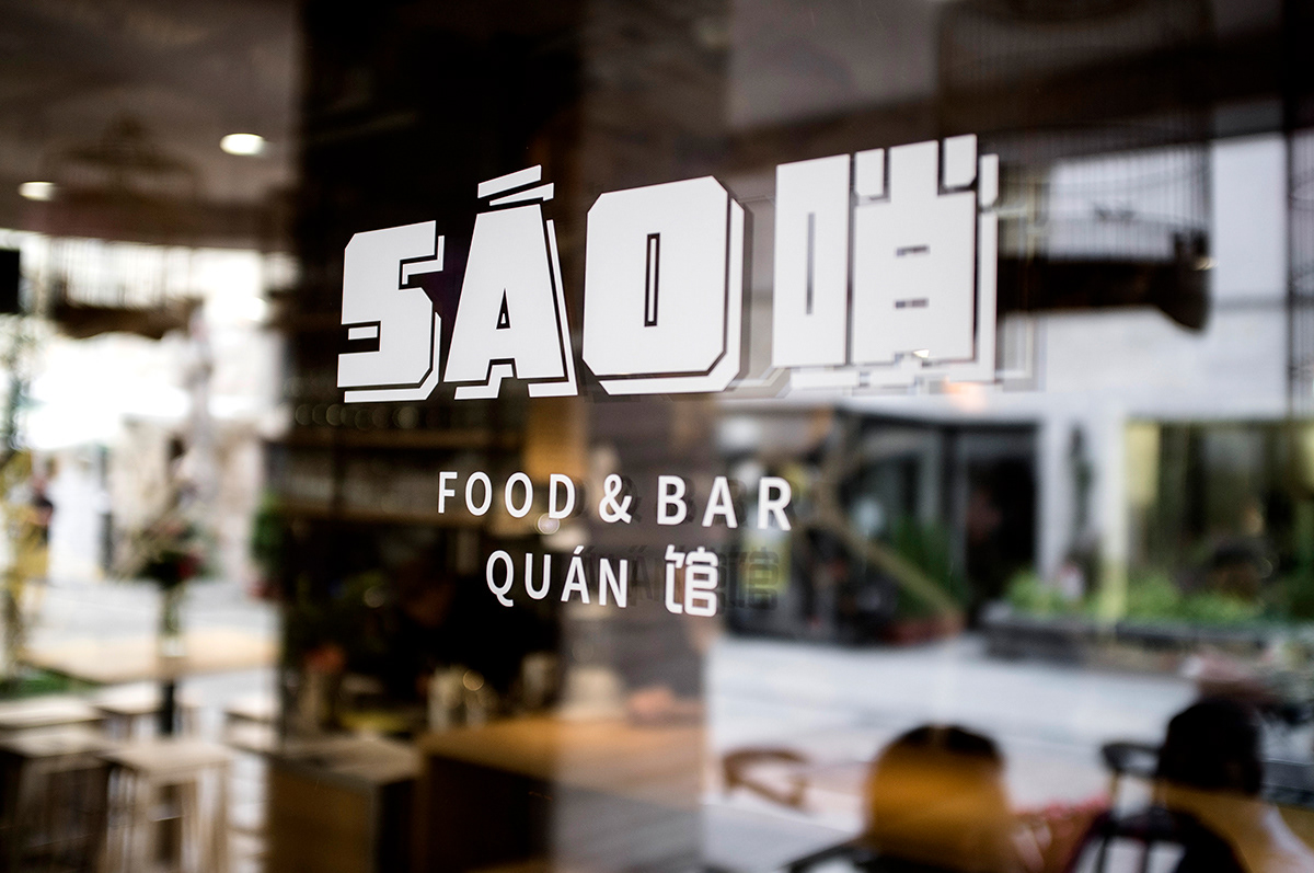
S Á O 哨
branding for a Vietnamese
& Chinese restaurant
& Chinese restaurant
_______
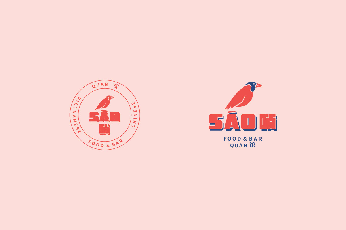
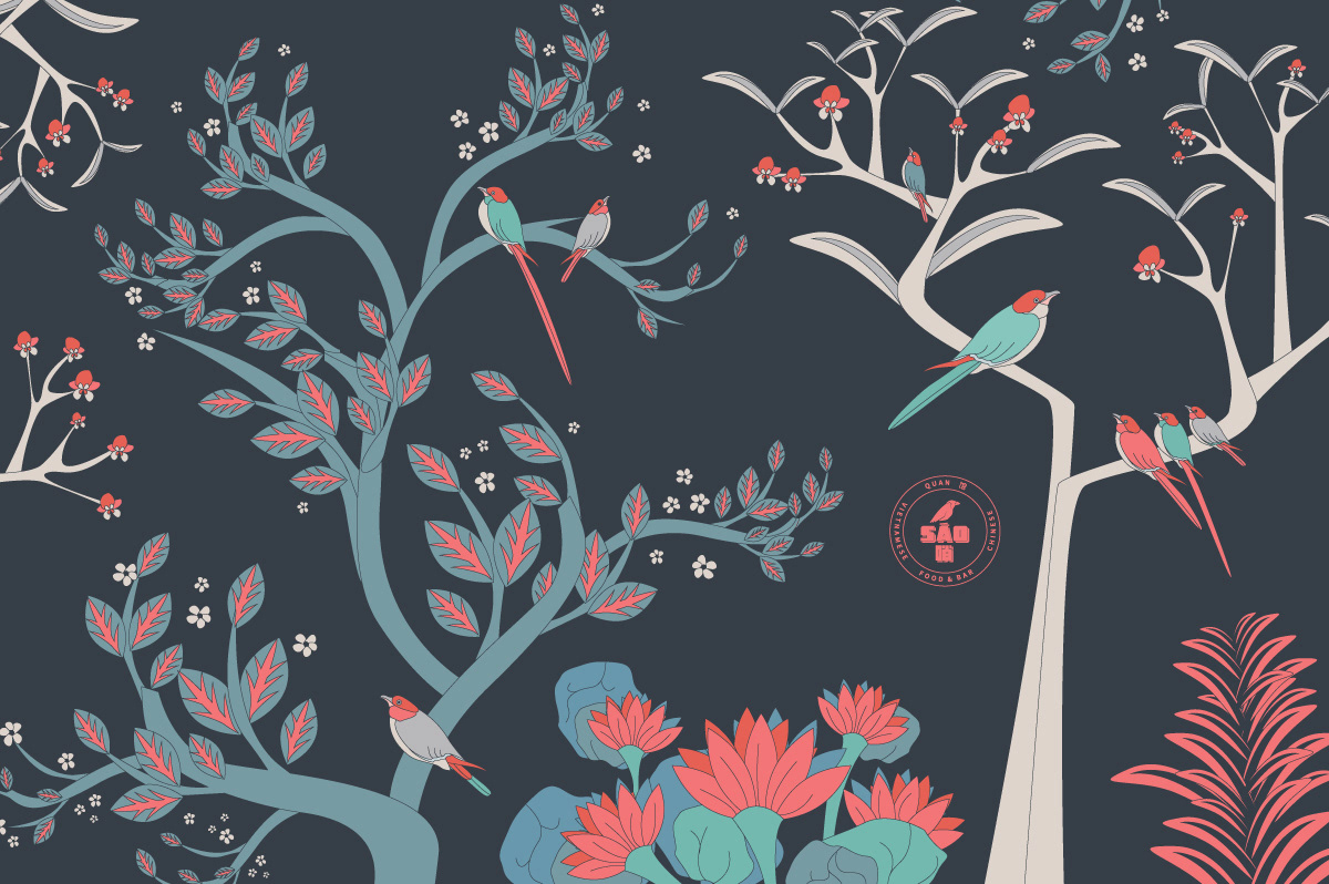
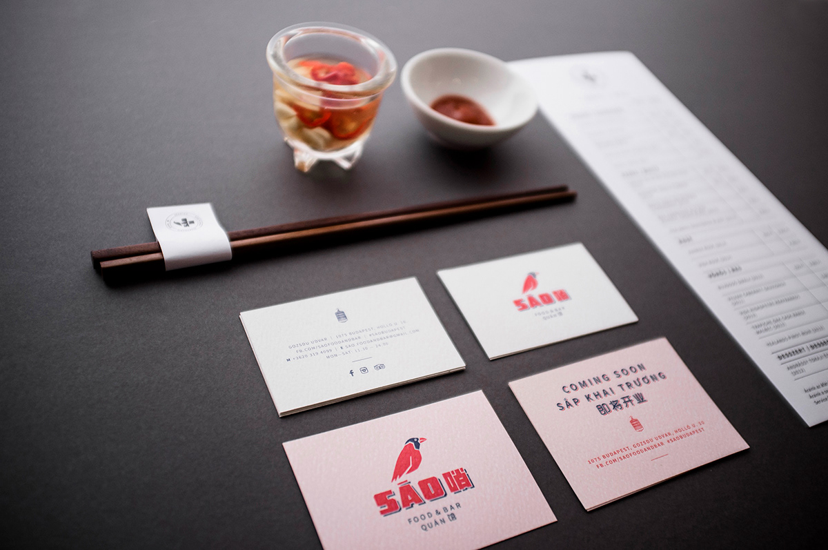
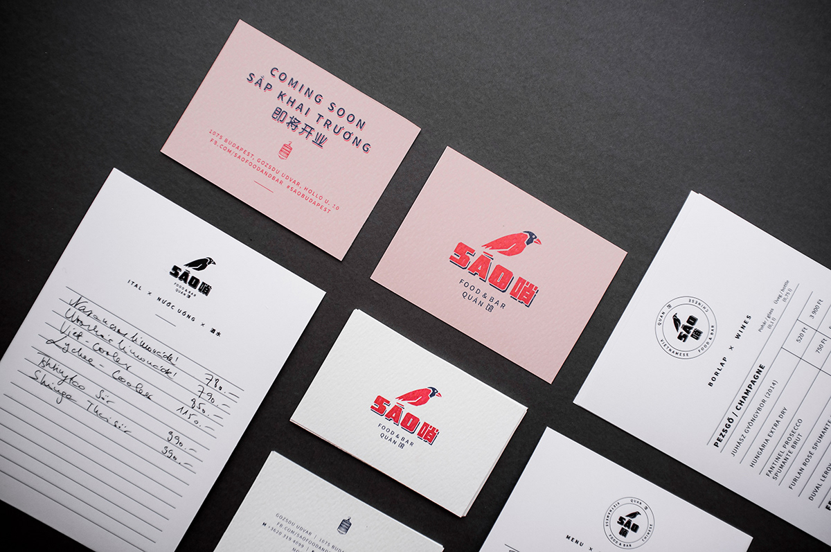
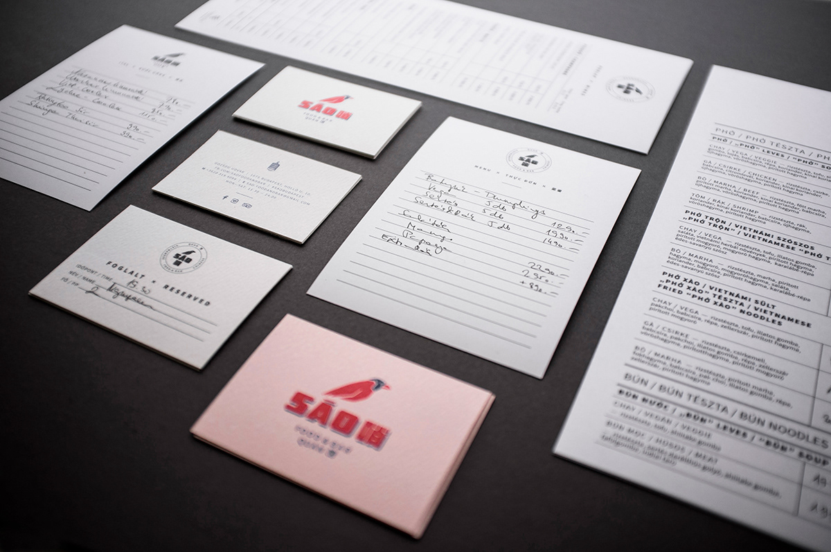
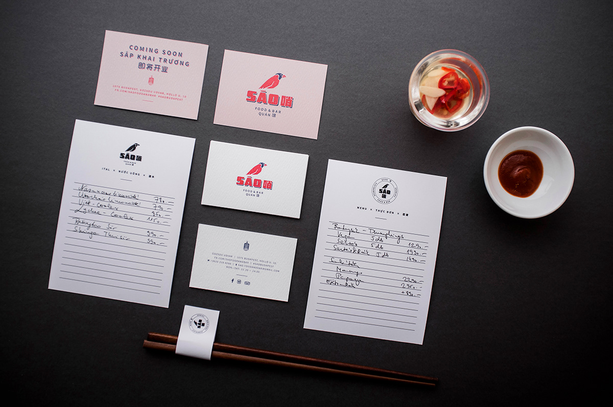
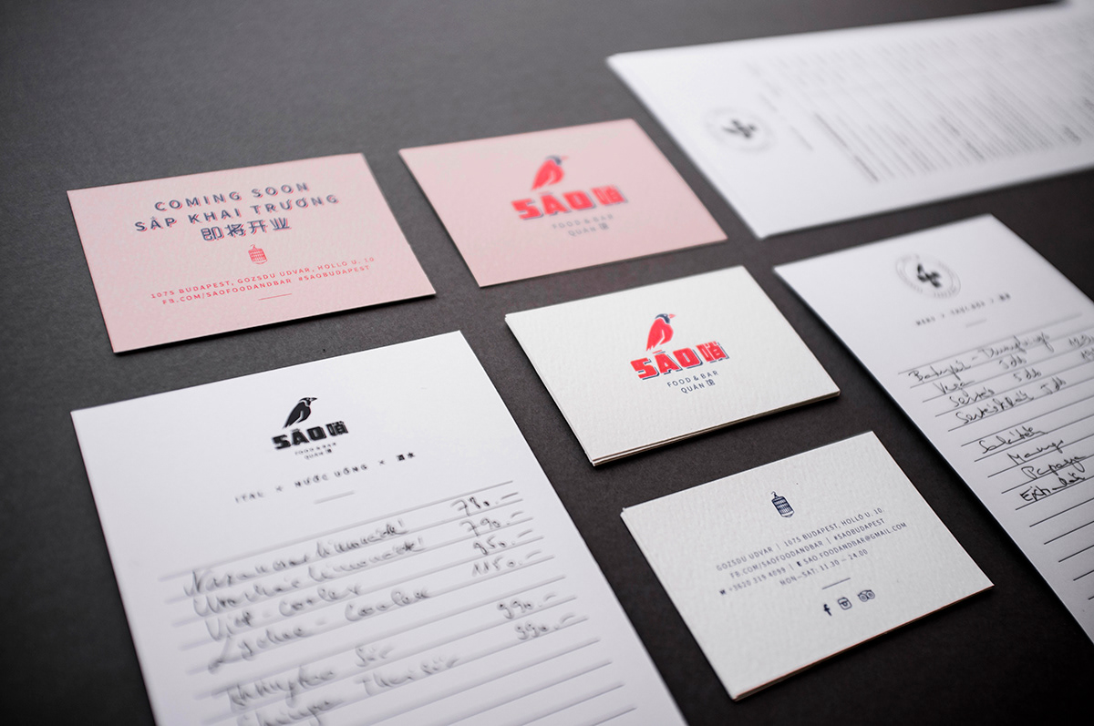
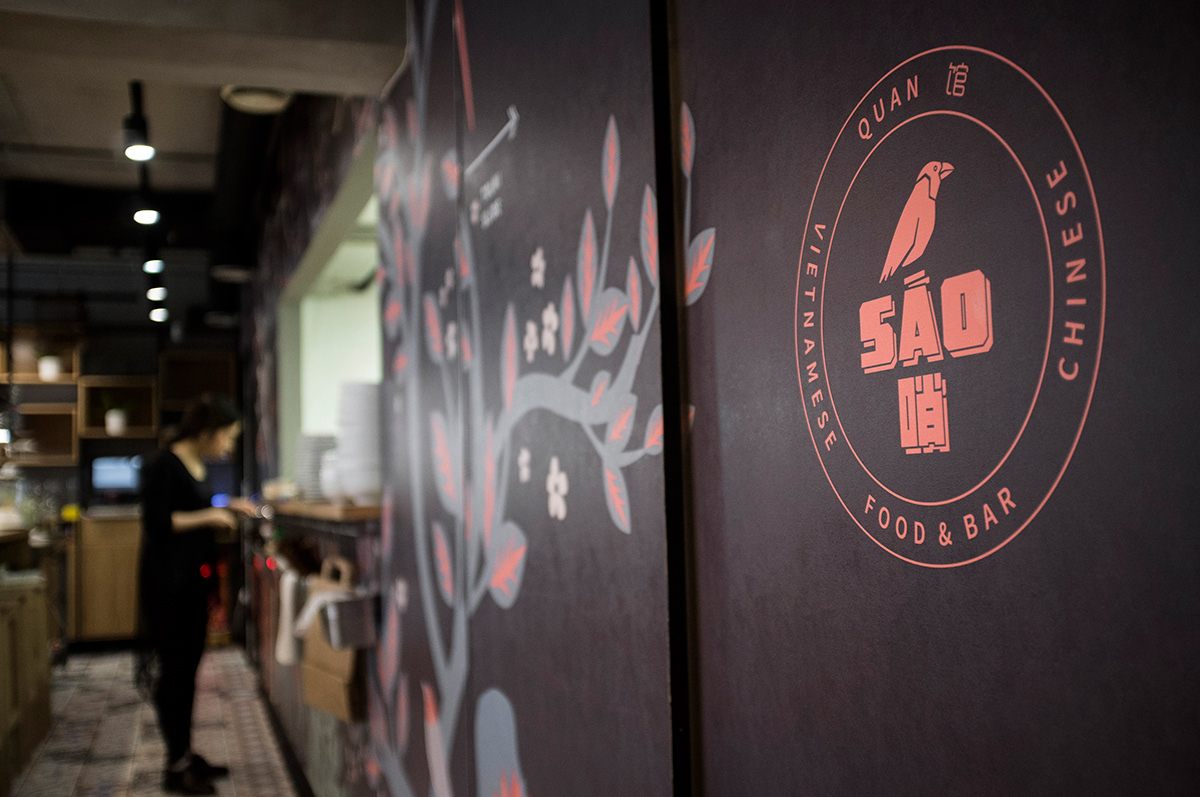
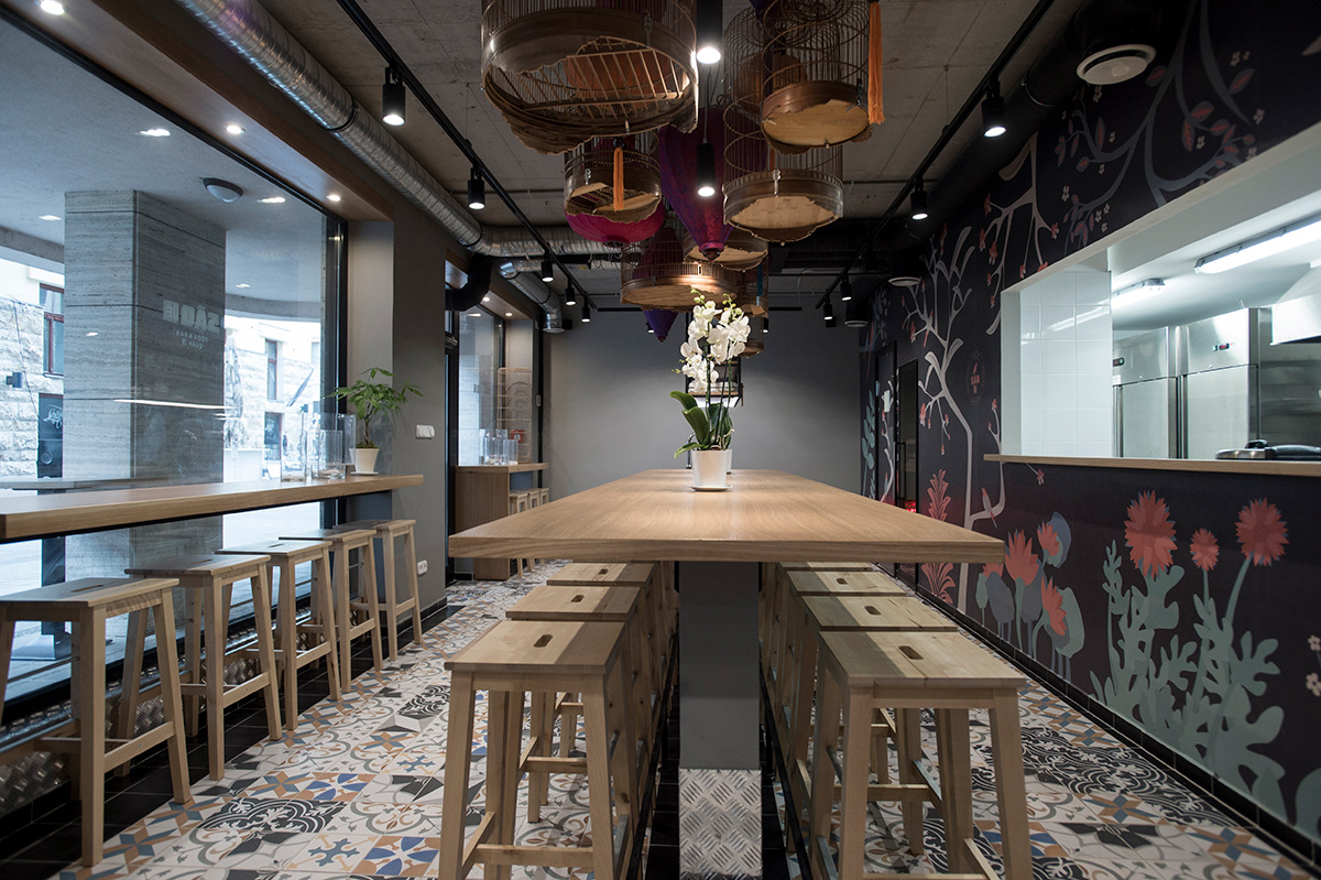
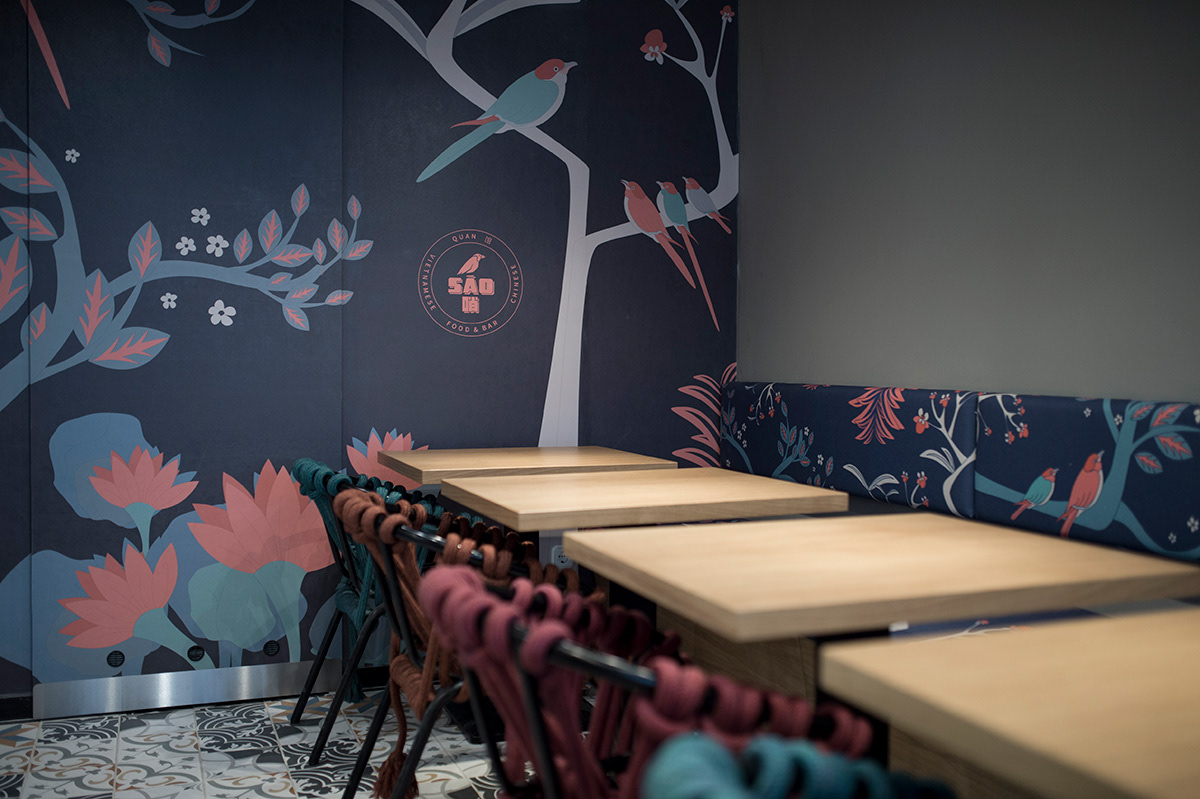
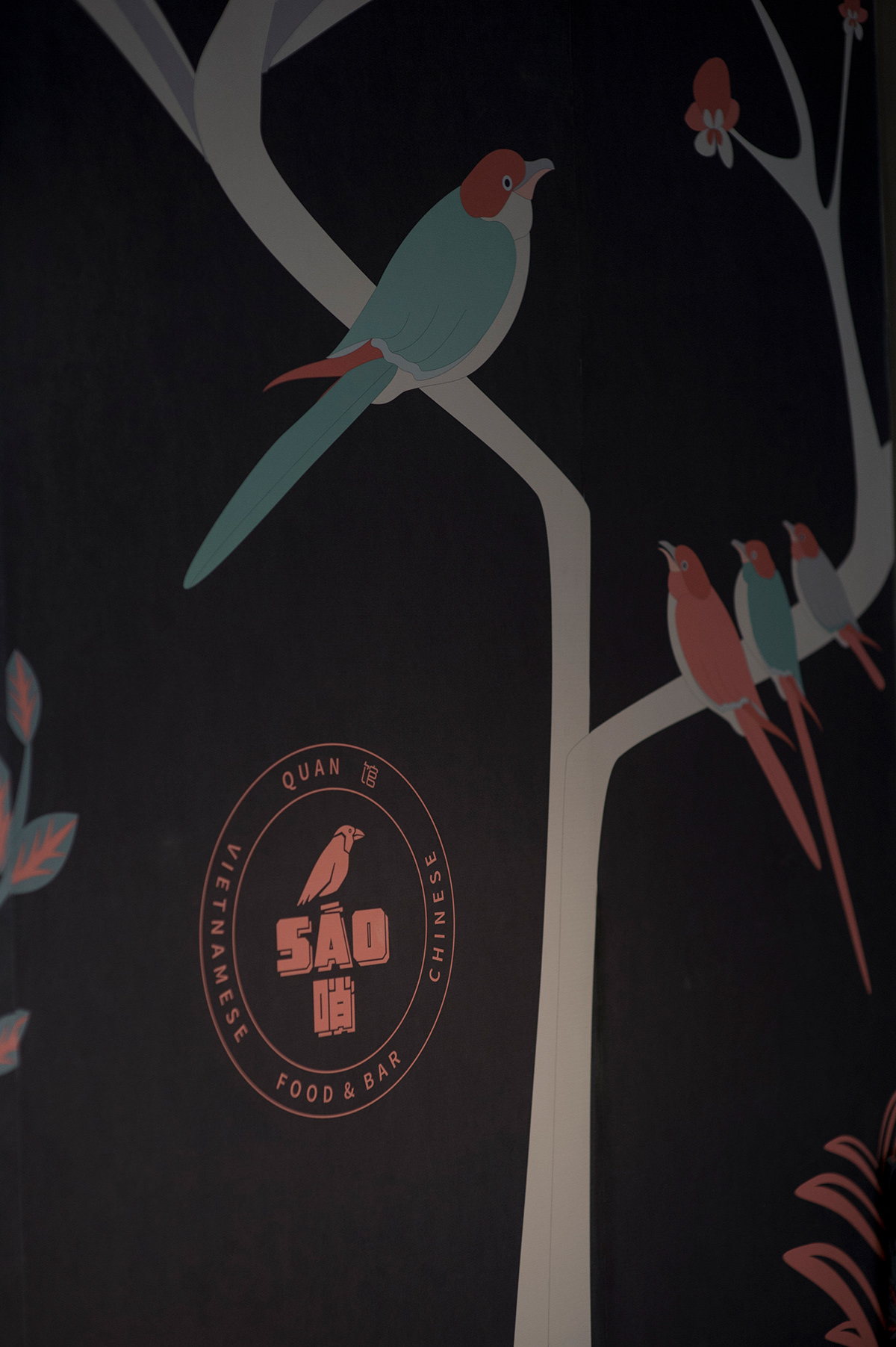
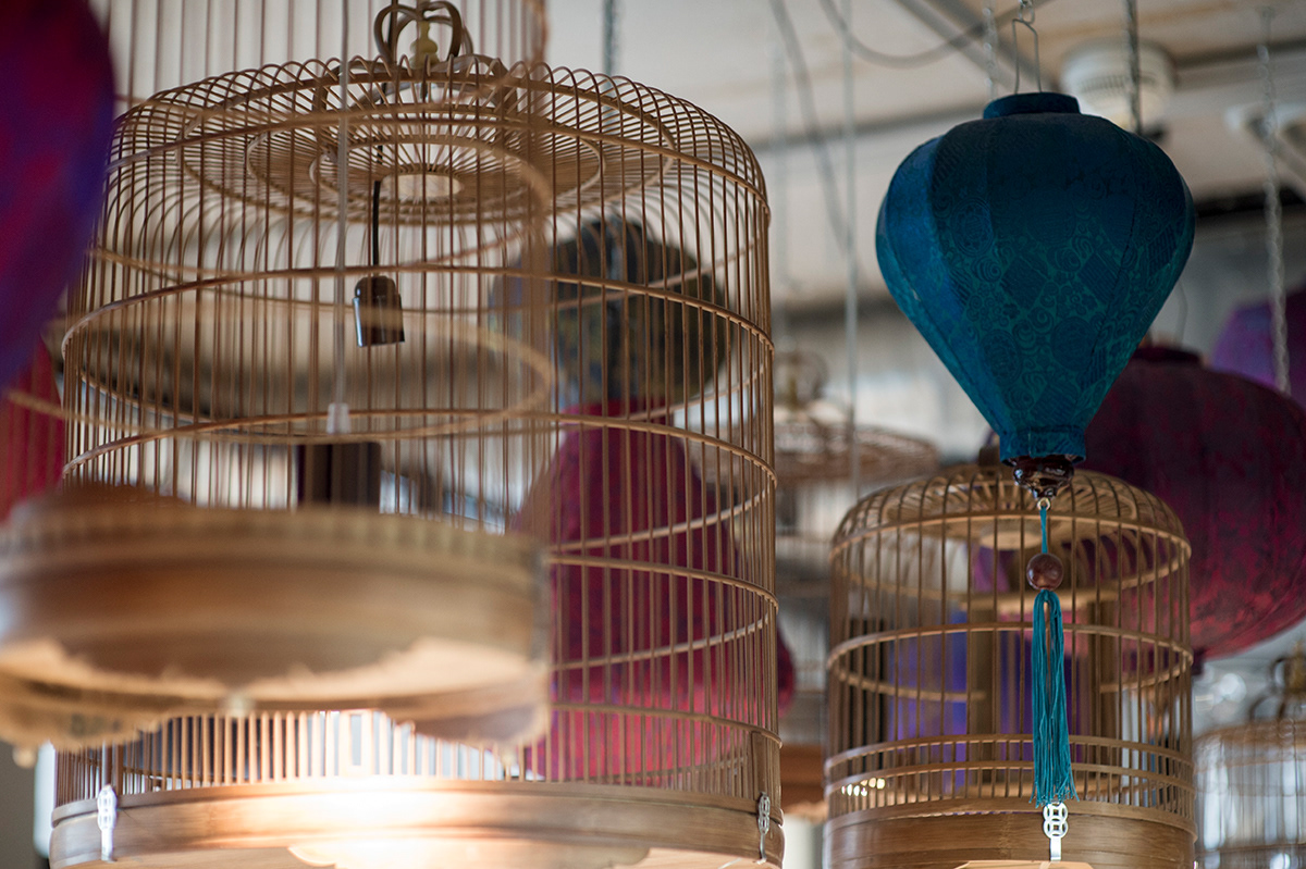
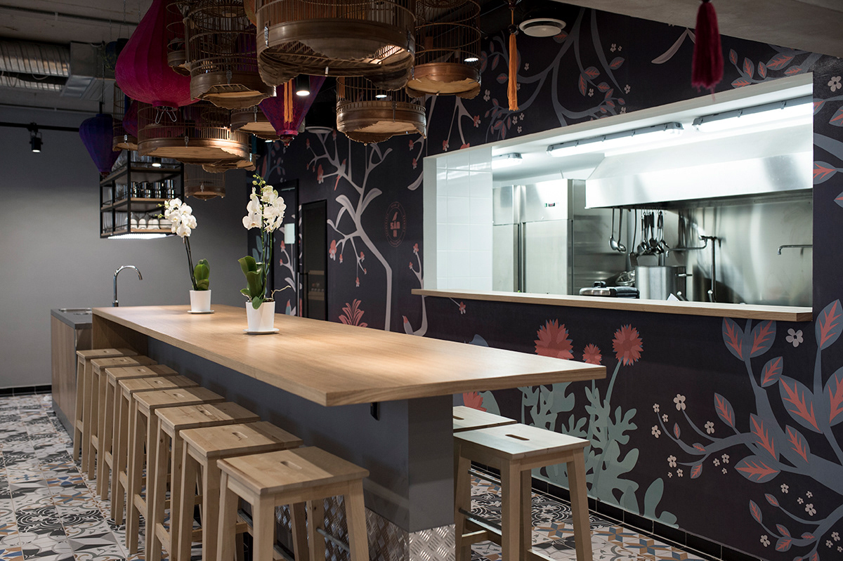
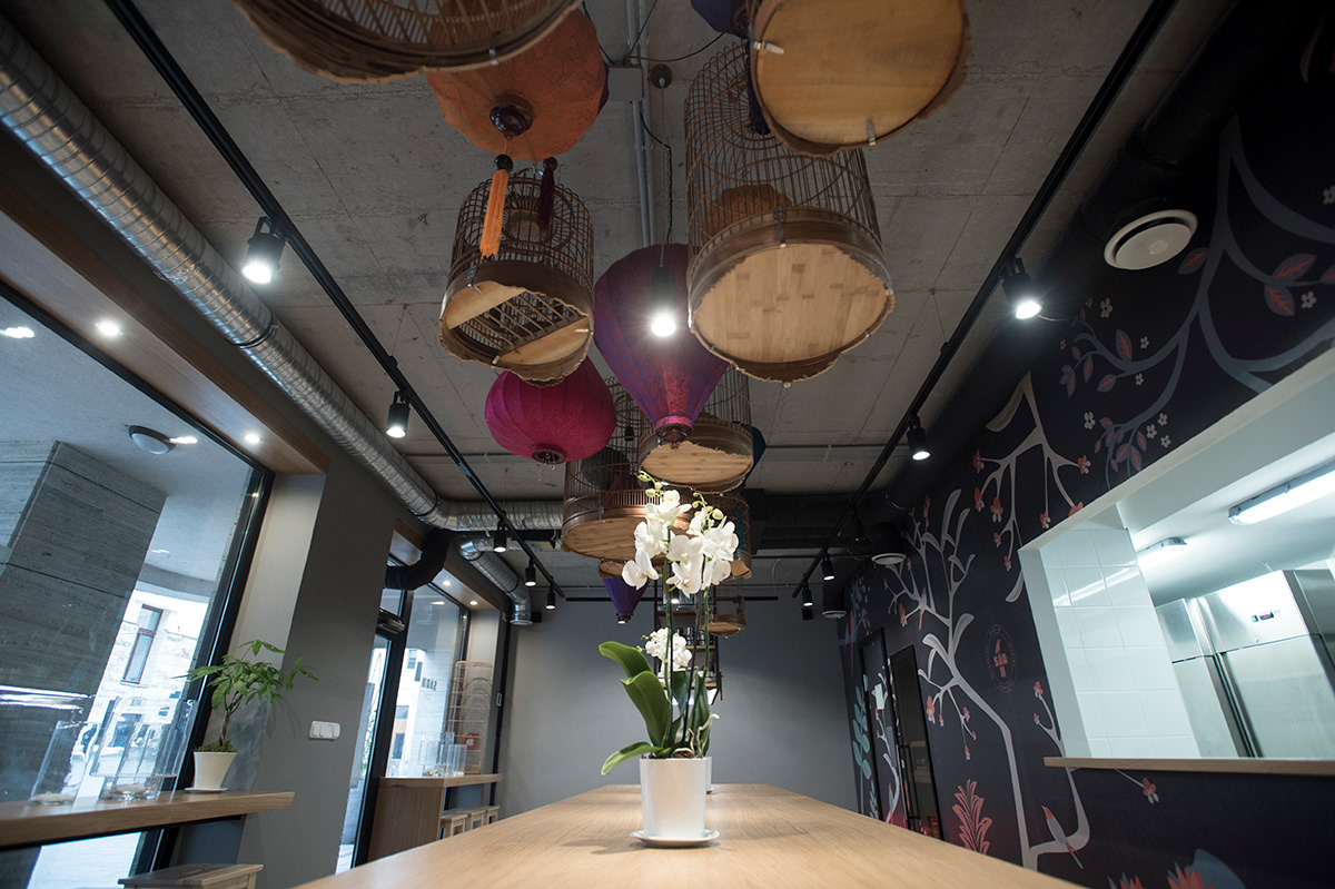
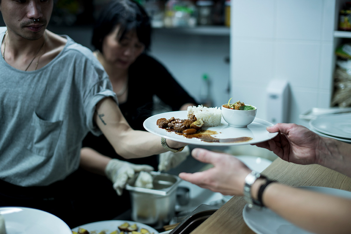
The SÁO哨 food & bar is the result of a long lasting friendship between the two Vietnamese and one Chinese owner, a special partnership which is nourished by the same gastronomical fascination and the appreciation of Asian home cooking. This connection is emphasized by the chosen name Sao, which has synonymous meanings in Chinese and Vietnamese culture: bird, whistle and all the positive associations coming with it. According to this the menu cards use Chinese and Vietnamese typefaces as well. The colourful song birds are the promise of good fortune and prosperity and they kept in cages in Asian households. This fortune bird appears on the logo and it brings along cages as well. Little cages turn up on the printed cards and they form a floating cloud in the interior – fragile beauties from Vietnam are hanging from above at the central community table. The wallpaper features four plants which symbolise four seasons – it is a cultural reference and some kind of blessing as well which is reinforced by fresh flowers in the space day by day.
I interior design by Position Collective
P photography by Balázs Glódi & Eszter Laki
_______