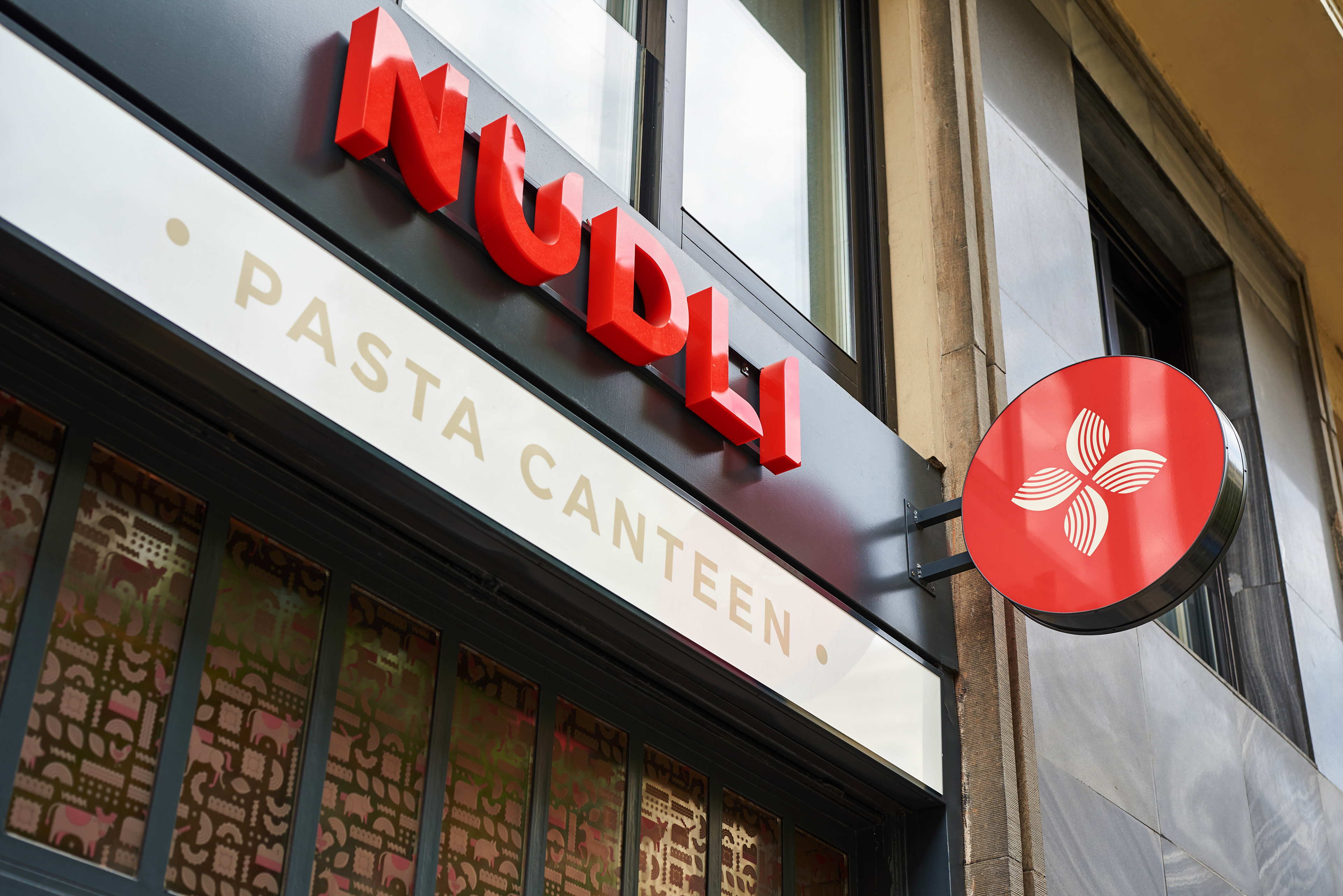
N U D L I
Branding for a Hungarian pasta canteen
_______
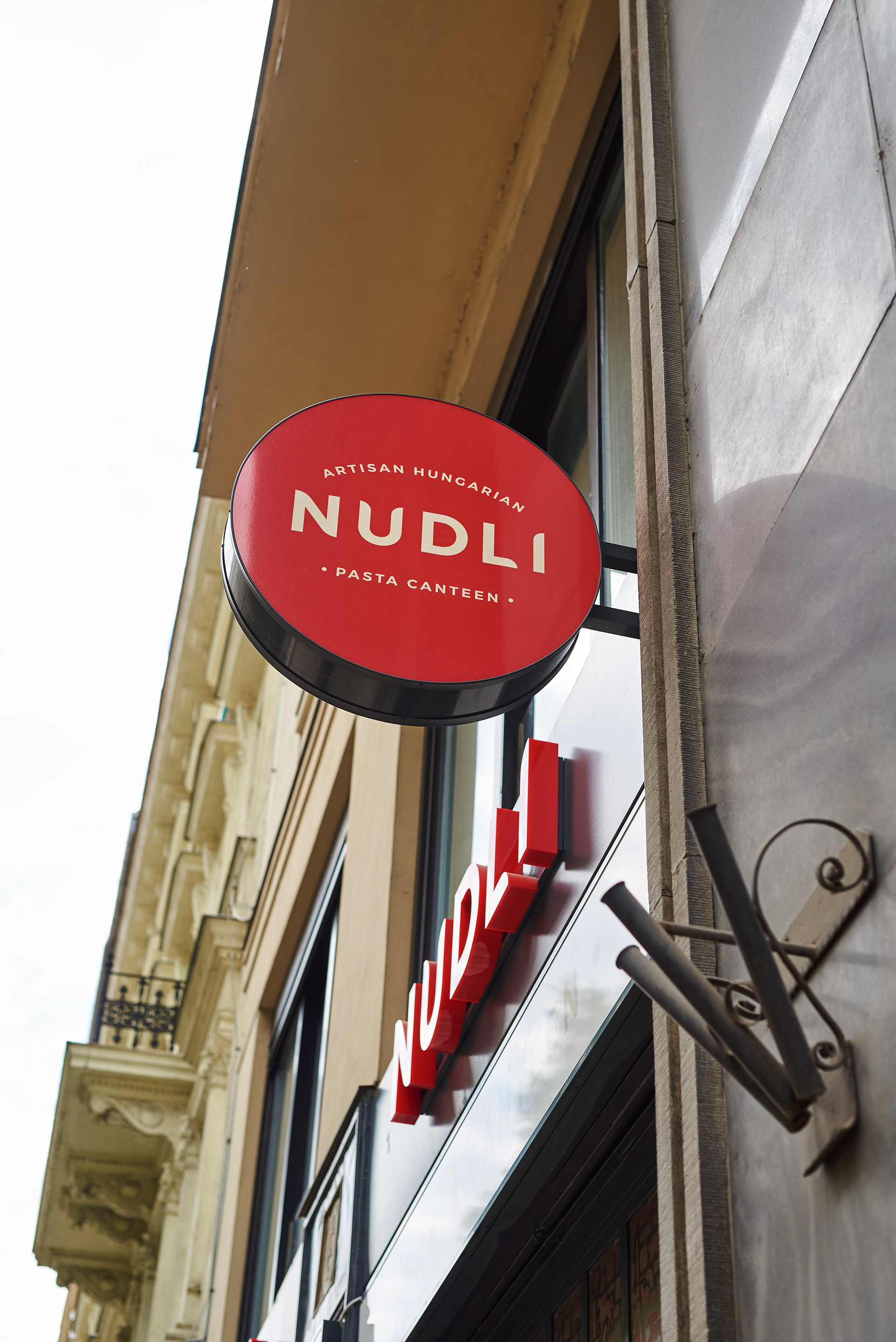
Nudli is an artisanal Hungarian pasta canteen, serving traditional recipes that many of us grew up with. Although there are, of course, many Hungarian restaurants in Budapest, they often limit their offerings to the most well-known dishes, such as Gulyás and Halászlé. To offer a more in-depth take on Hungarian cuisine, the founders of Nudli, Károly Gerendai and Hungarian gastro-blogger András Jókuti (Világevő), came up with the idea to elevate the nostalgic pasta dishes every Hungarian knows and loves, such as Mákos Nudli (noodles with sweet poppyseeds) which the restaurant is named after.
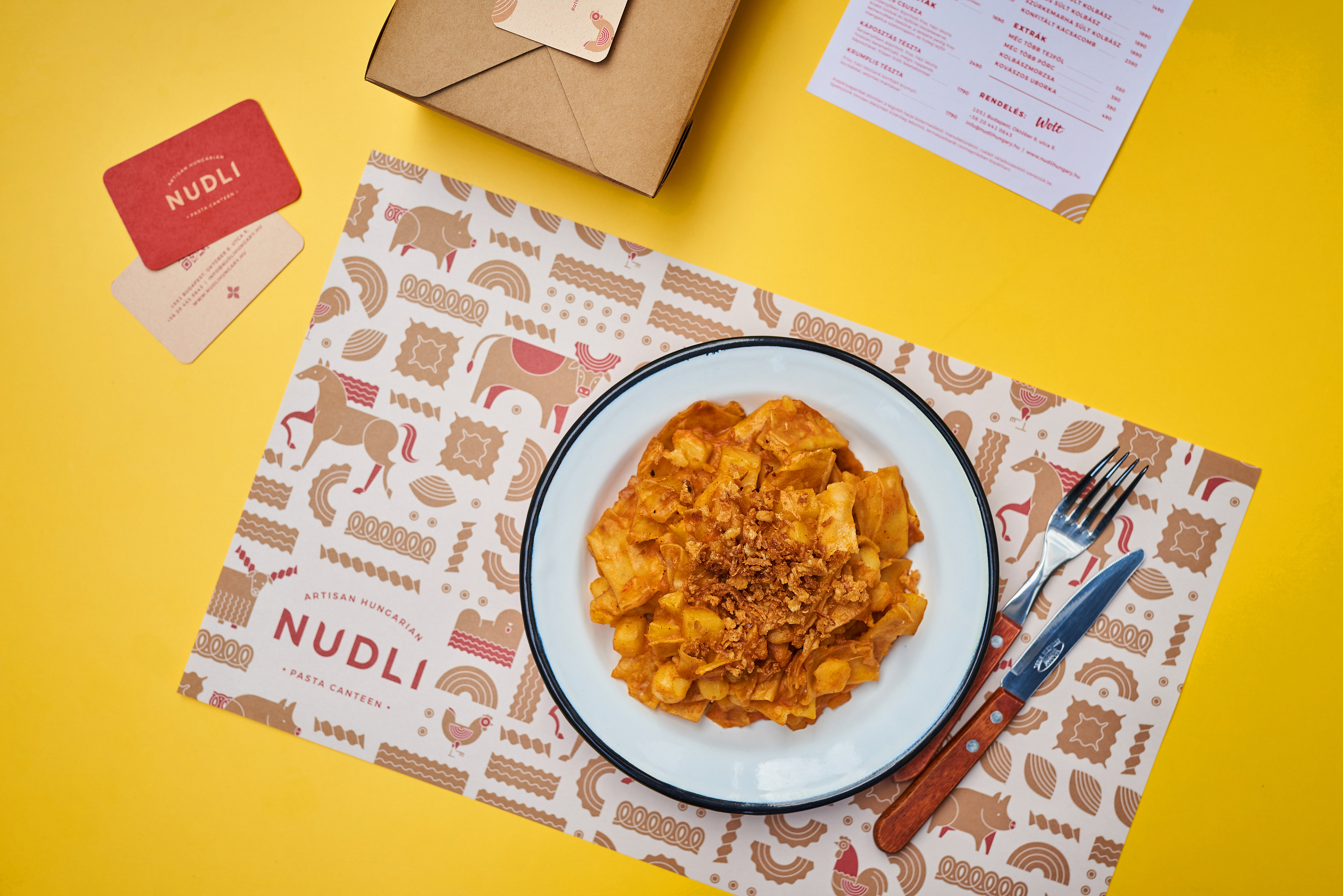
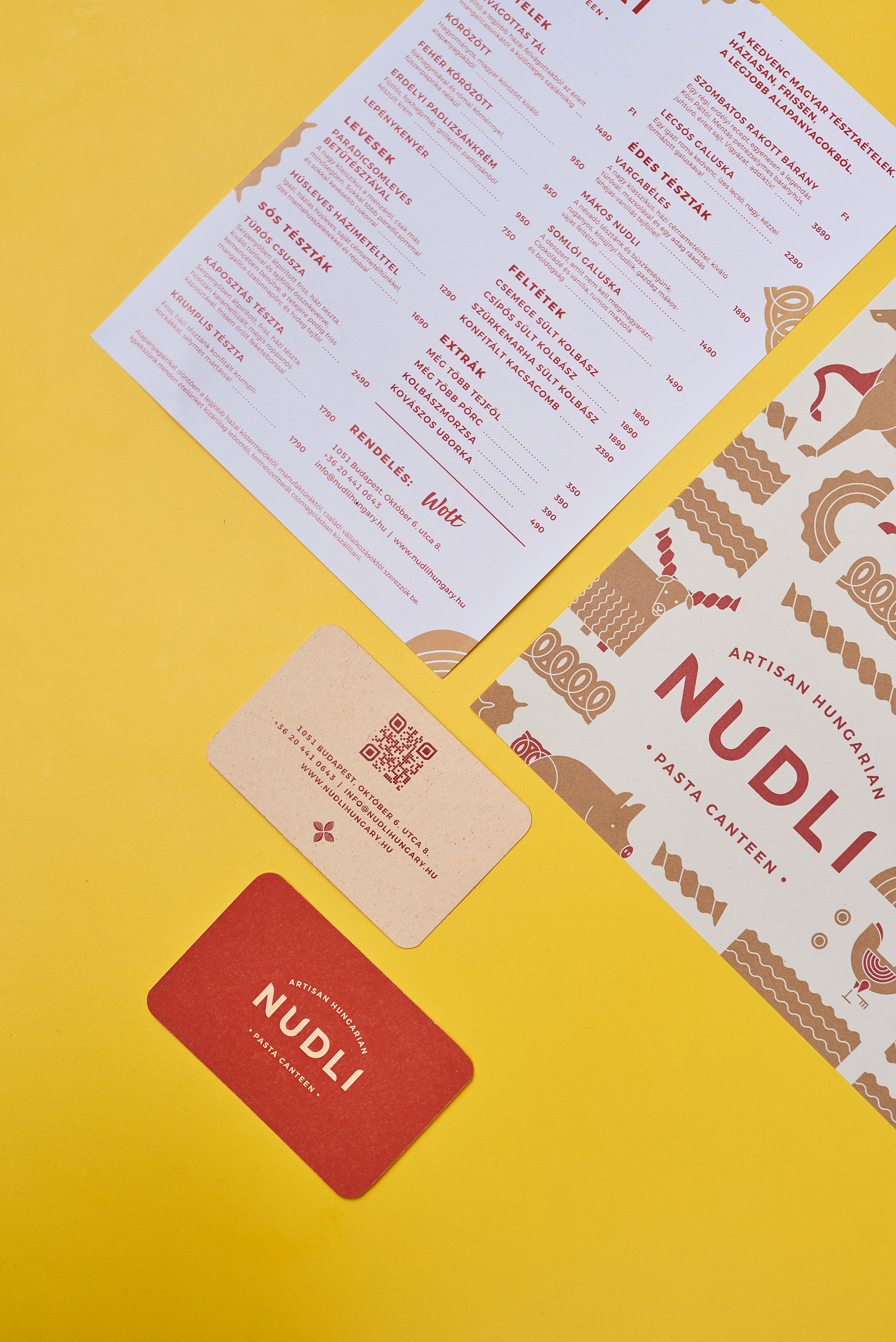
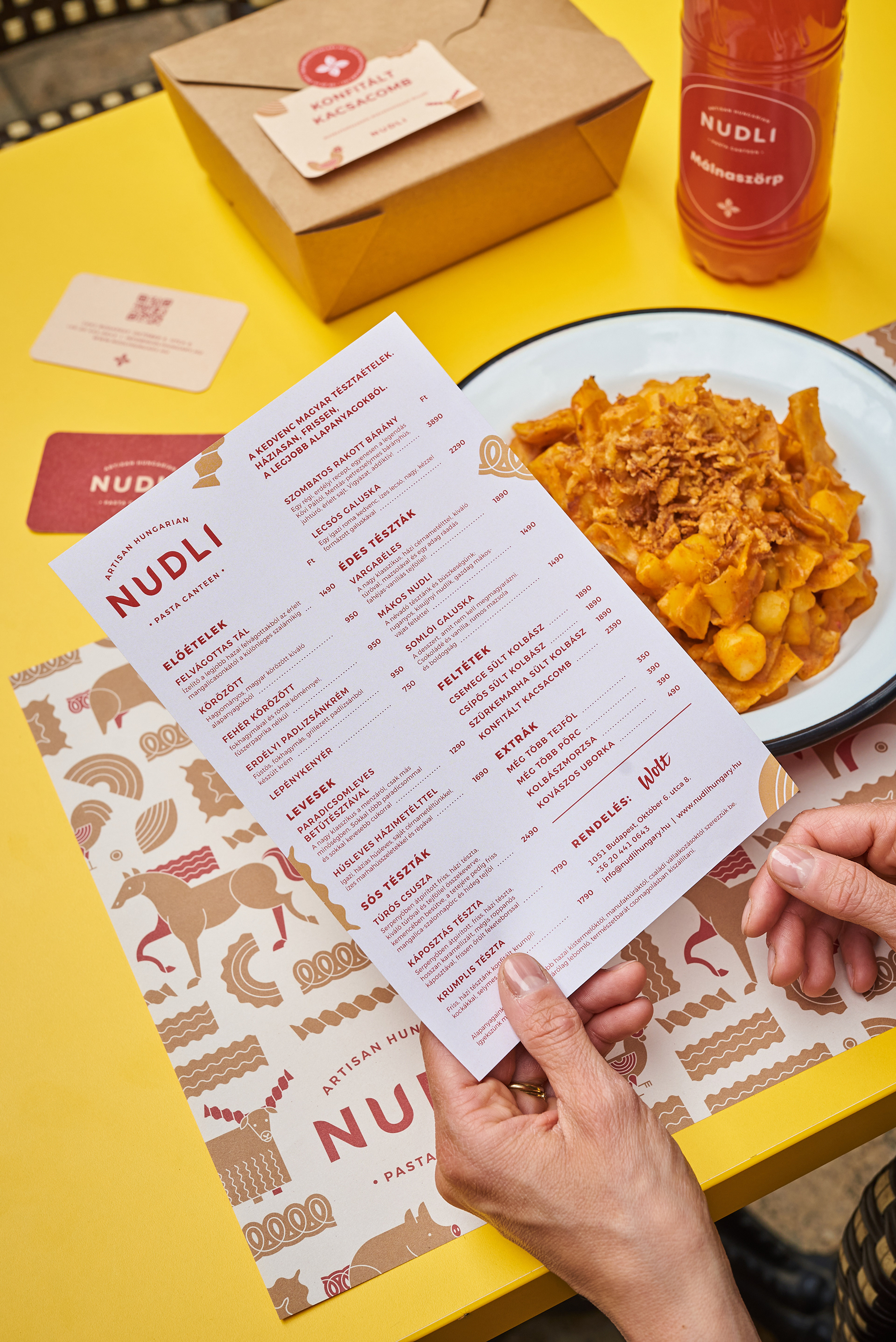
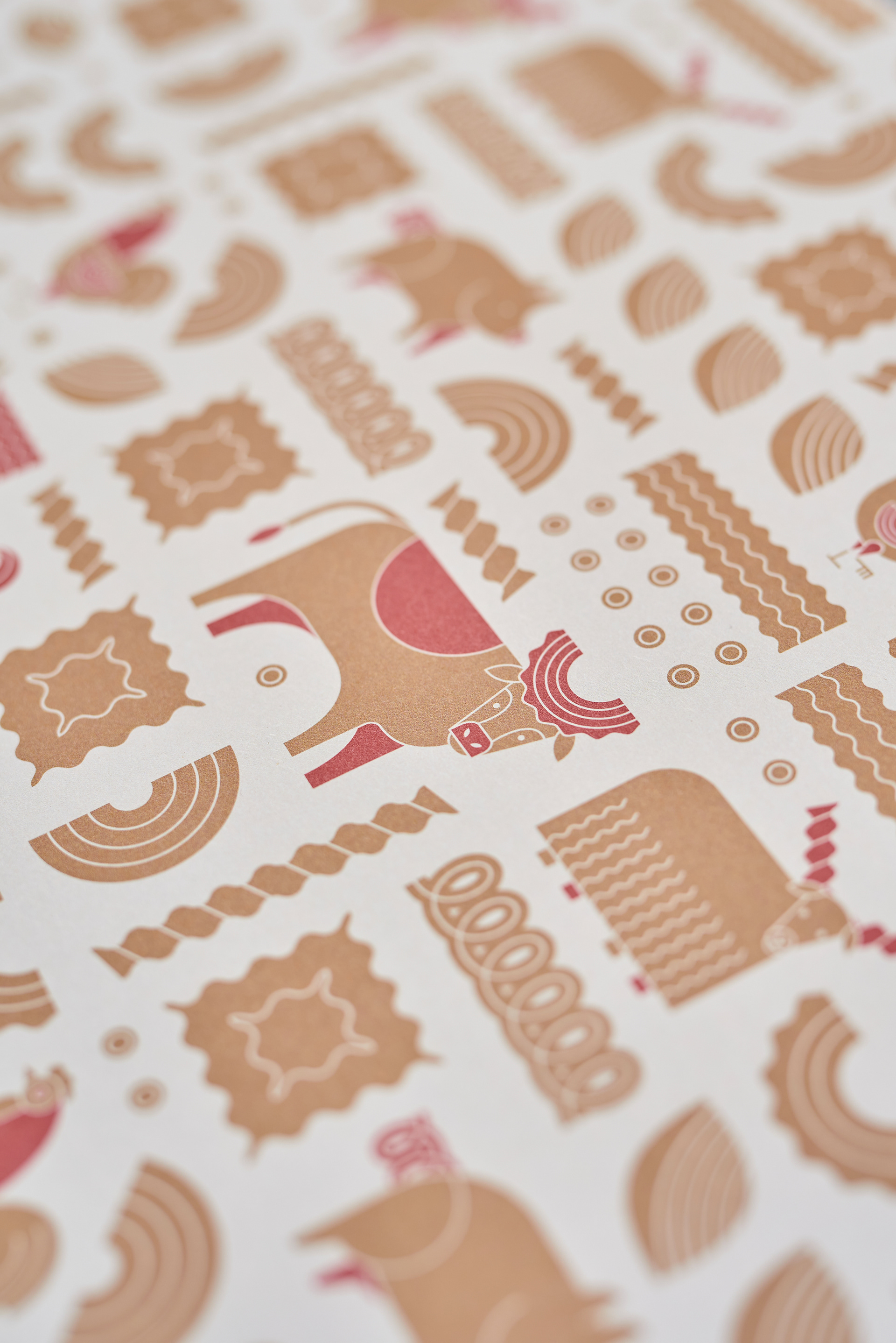
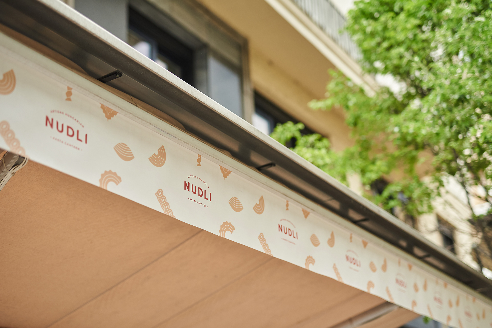
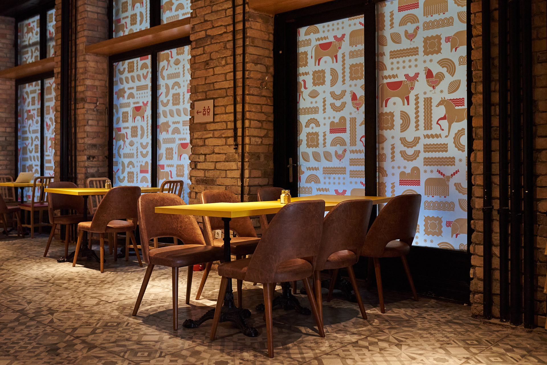
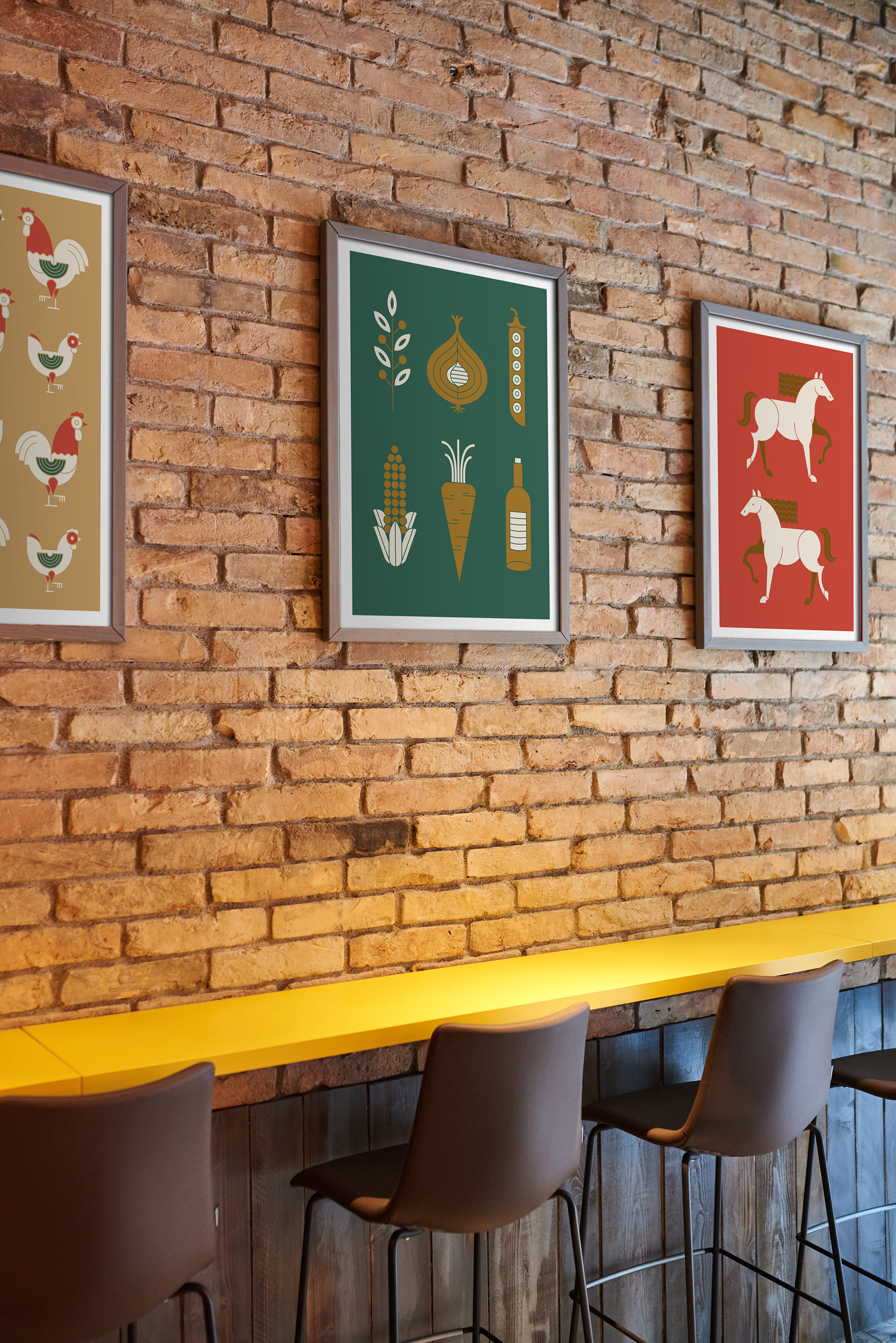
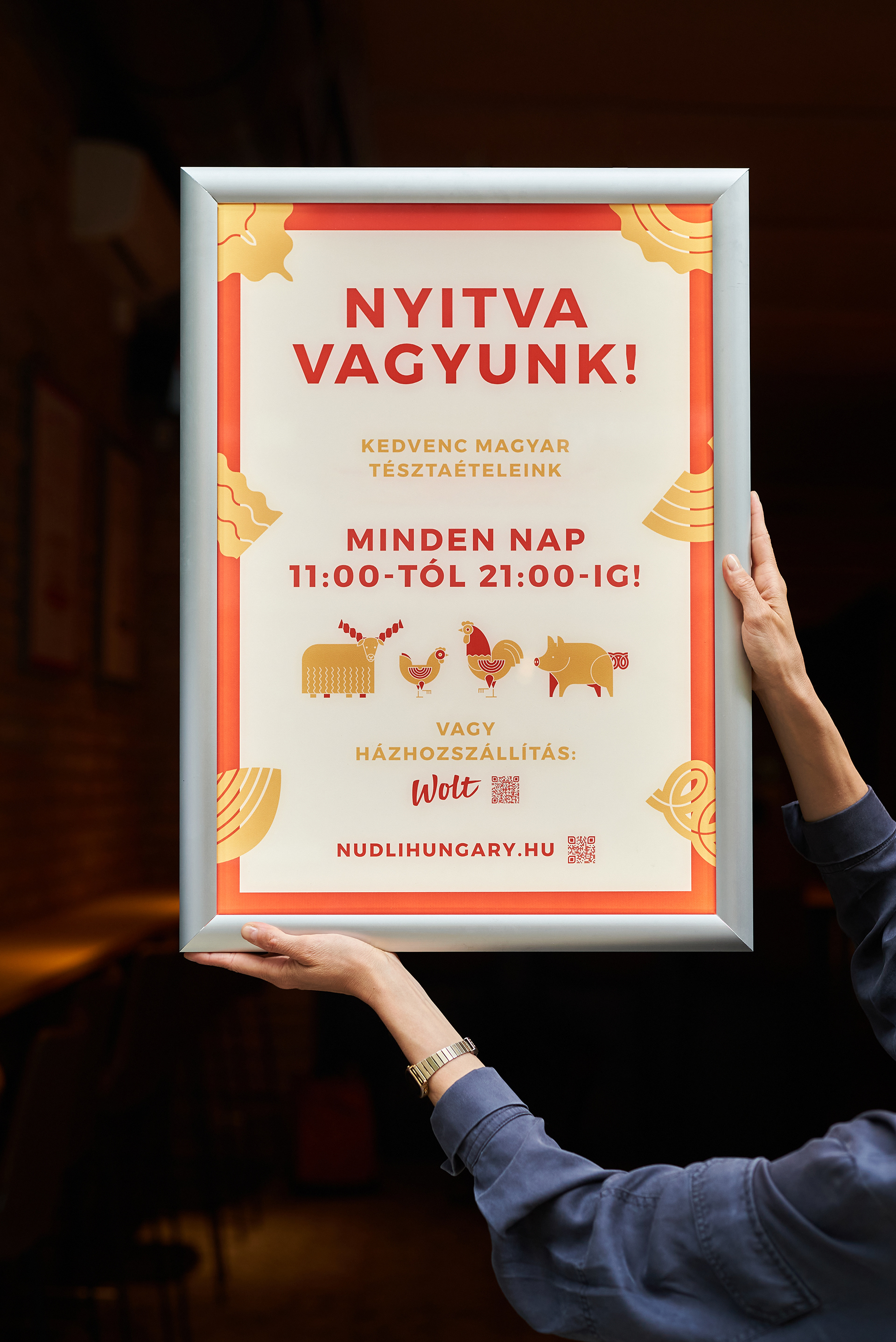
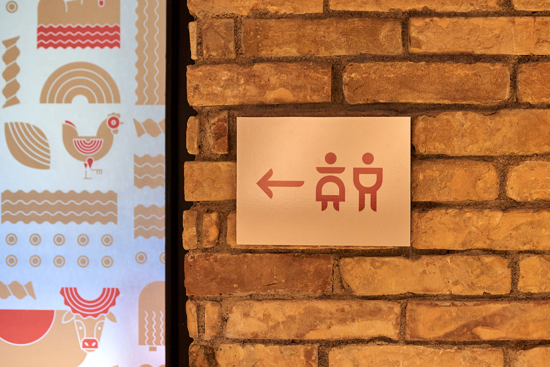
The logo is inspired by the star ingredient - the simple logotype features rounded edges that remind us of many Hungarian pastas such as the name, and the symbol is a flower made of rounded pasta shapes. For the pattern, we created funky animals with hidden pasta shapes, such as a pasta wing for the chicken and a pasta horn on the bull). This pattern appears in the interior design, window decorations, and packaging.
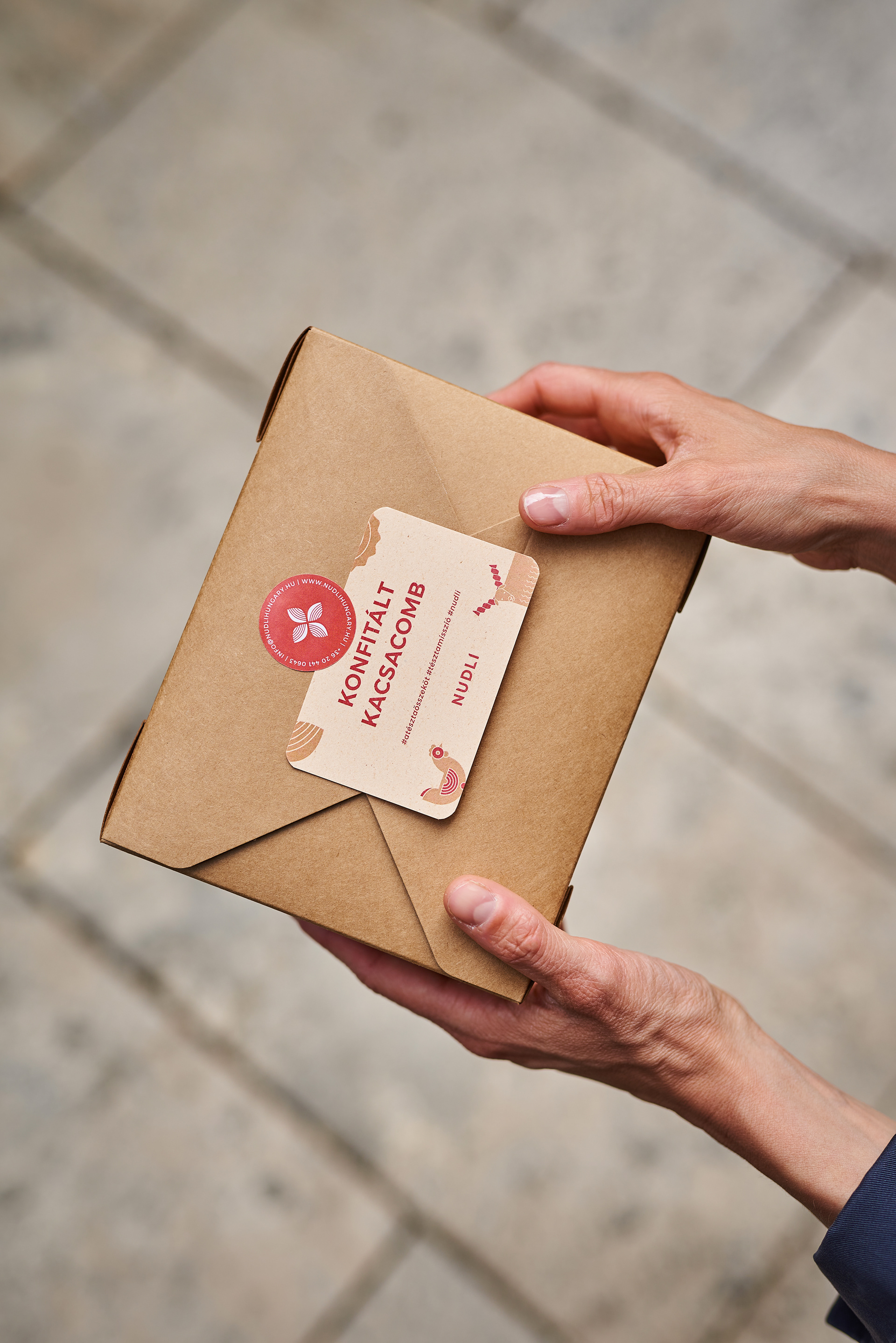
Due to Covid lockdowns, take-away packaging was a crucial part of the design. A lot of attention was given to the elements of the packaging, including food cards with the Hungarian names of the dishes, stickers, boxes, and wrapping paper.
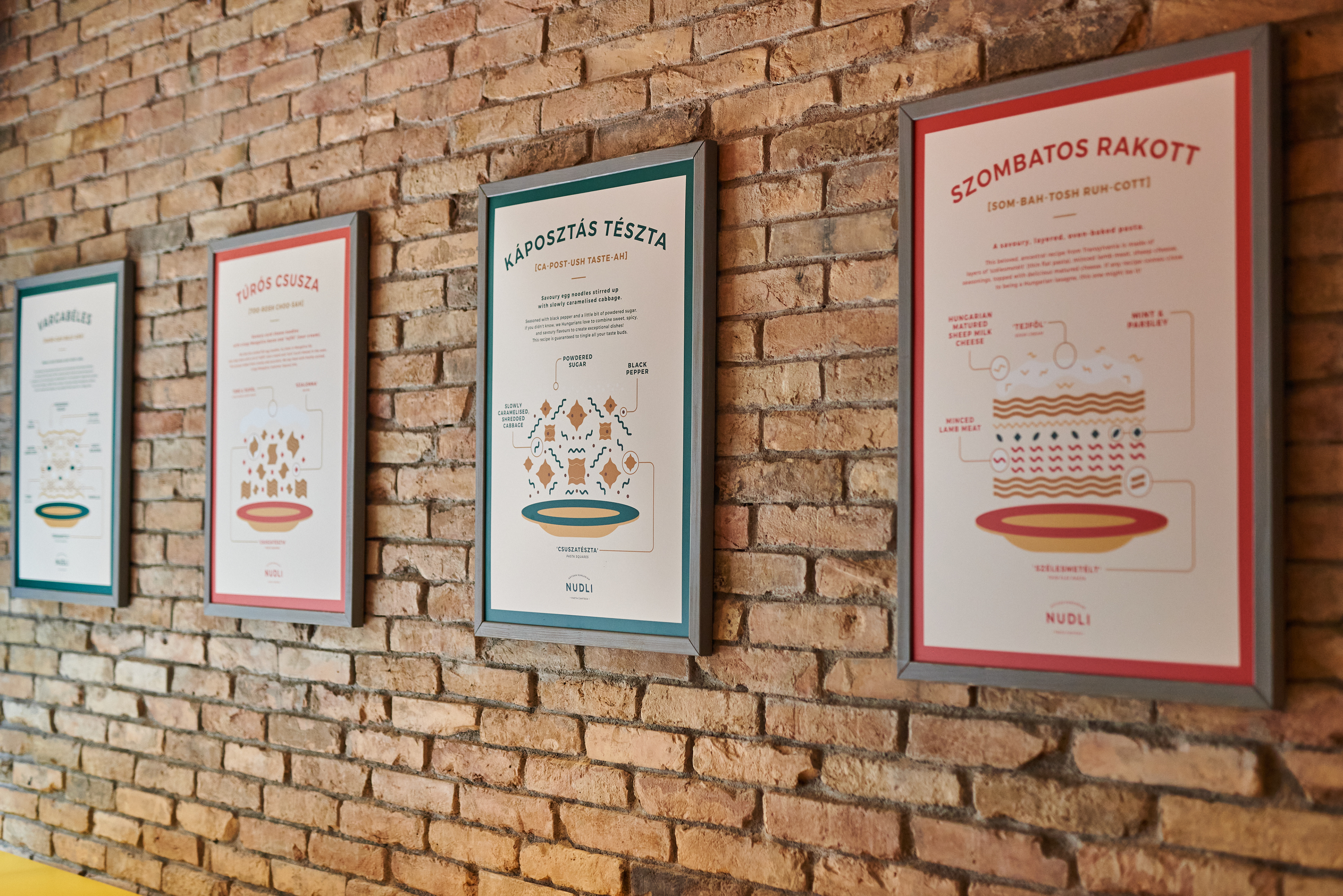
To explain the dishes and their ingredients more clearly, we designed posters with ‘exploded’ illustrations that resemble scientific diagrams, breaking down the dish so the viewer can understand how it is assembled and what it includes. The posters include descriptions of the dishes, the names in Hungarian as well as how to pronounce them, and the names of the ingredients in both Hungarian and English. We really enjoyed creating these ‘guides’ to some of our most loved meals!
Ph photography by Andras Zoltai
Ad art direction by Eszter Laki
Gr graphic design by Eszter Laki & Réka Imre
_______