M O U N T A I N S H O T E L
Branding for a Tyrolean hotel in Seefeld, Austria
_______
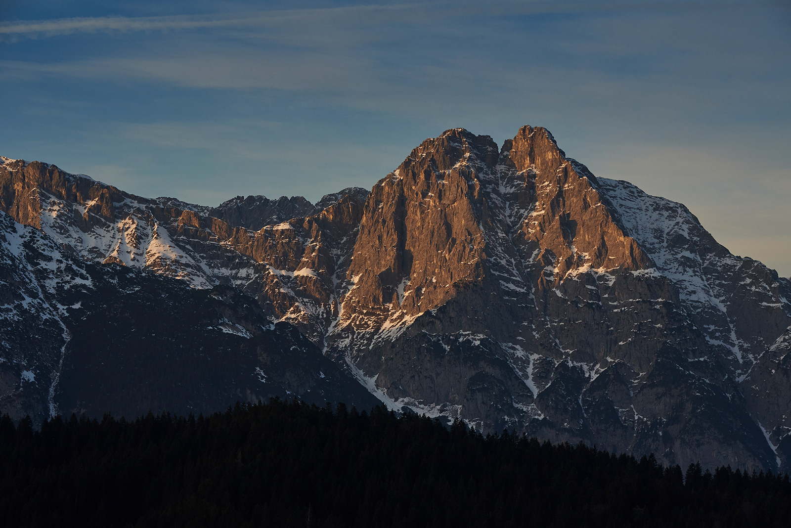
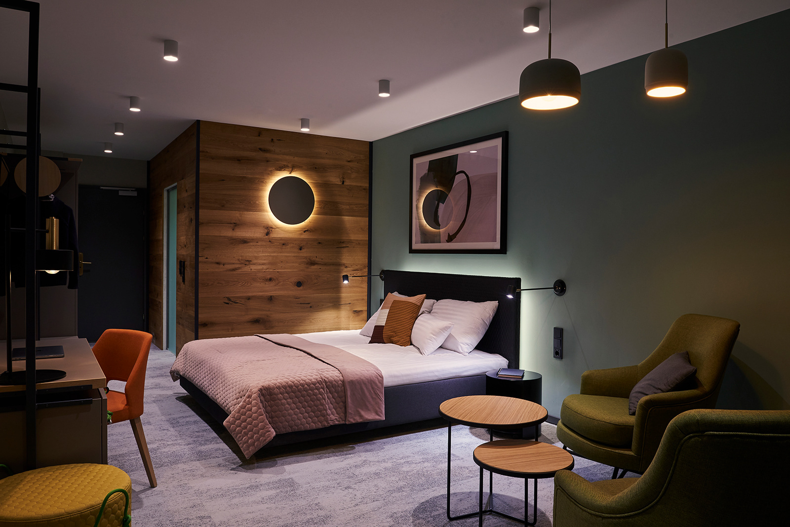
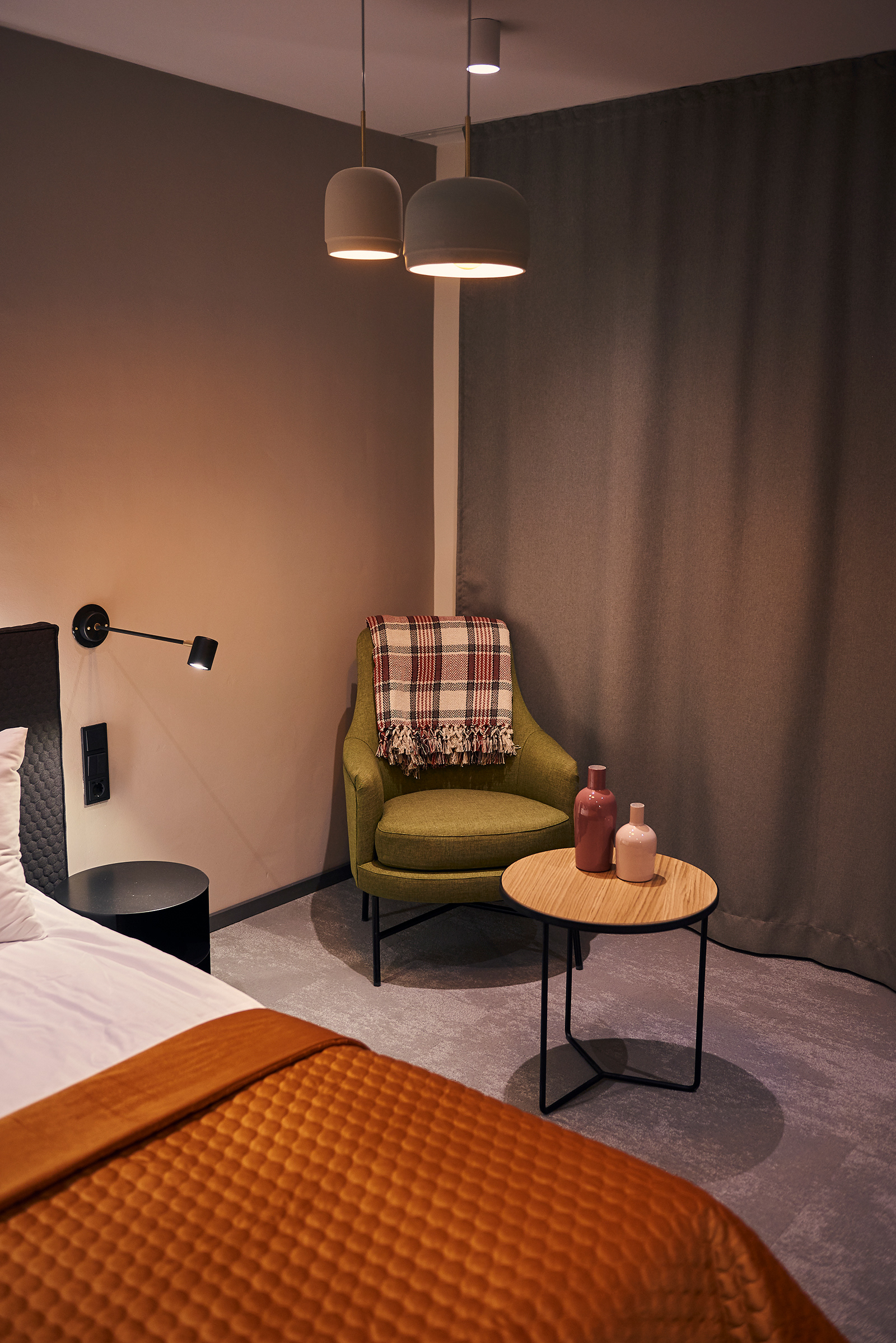
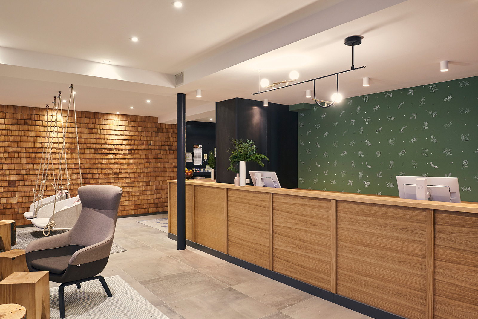
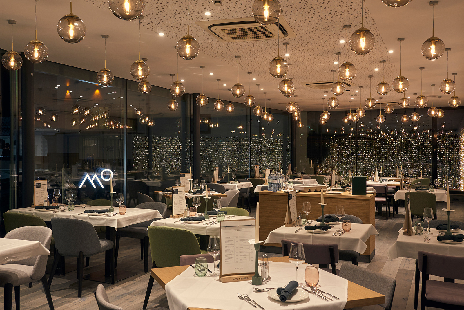
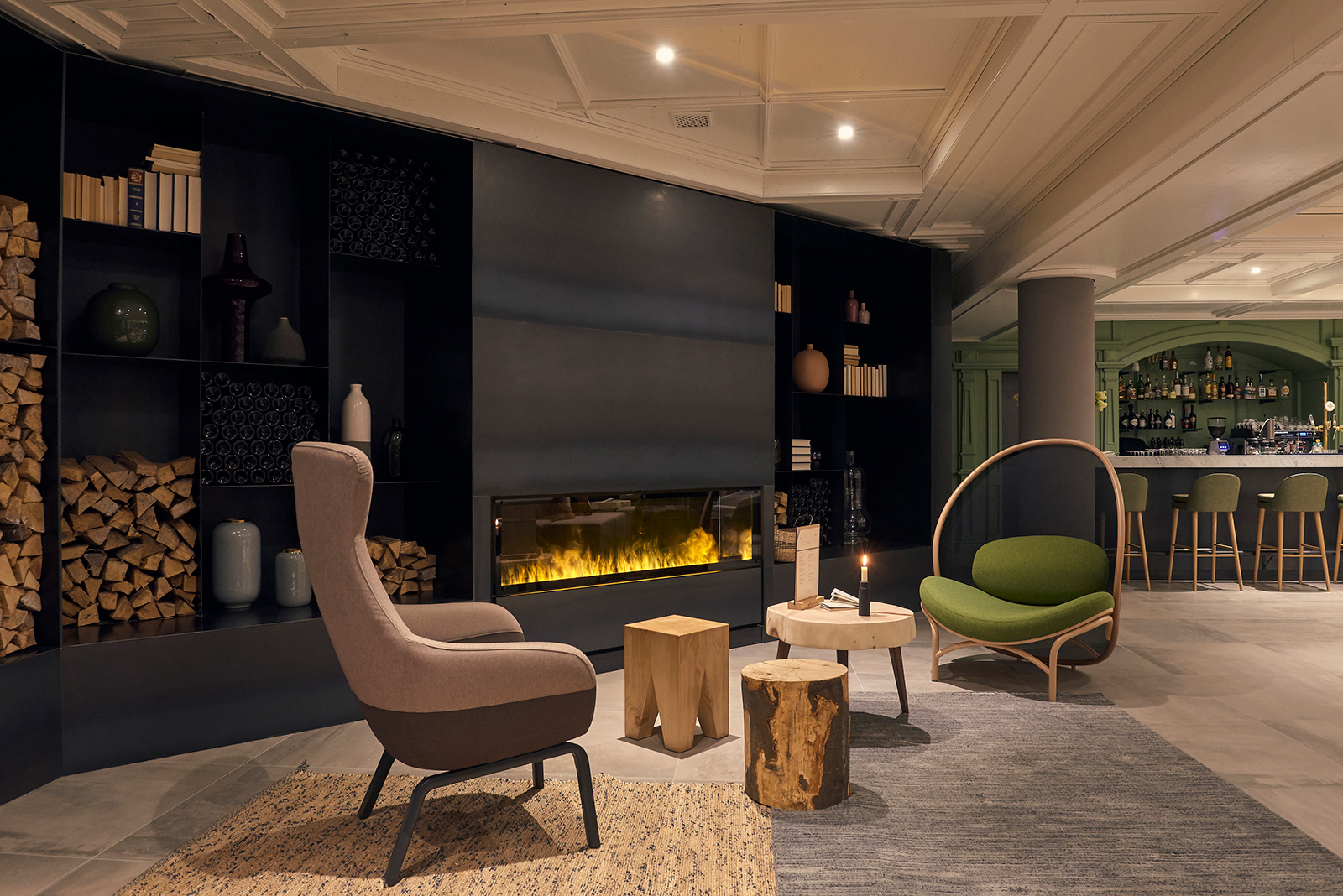
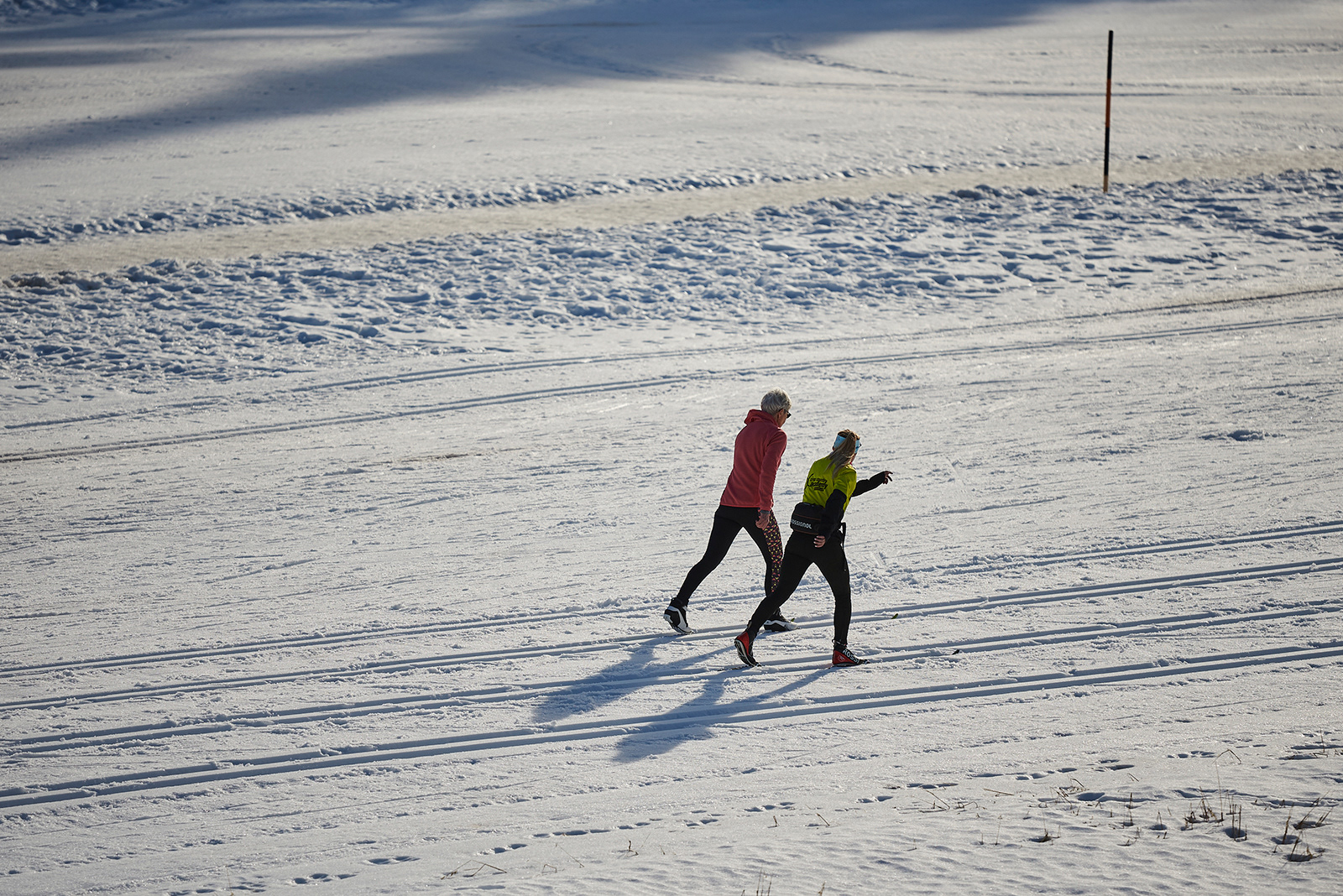
Set against a backdrop of the pristine Tyrolean Alps, the aptly named Mountains Hotel was established in a traditional Tyrolean hotel called St. Peter, in the renowned winter sport town of Seefeld. Guests can enjoy the town’s long cross country slope system, and also partake in Mountain Hotel’s many sports and recreational activities, as well as a variety of wellness options for all seasons. The sprawling property has been updated with a new name, brand, and beautifully renovated interiors, bringing together the best of the past and the present to create a timeless, minimalist identity that stands out from the rest.
The brand design and interior design are inseparable, and when done right, can result in a lasting, impactful atmosphere and identity. We were very happy to work on the interior design concept and furniture and lamp designs with Budapest-based Position Collective, a talented and lovely group of designers who are often featured at international design exhibitions for their unique product designs. Our collaboration with Position Collective was a source of endless inspiration as we brought all of our ideas and skills together for a seamless brand and interior design concept that shows in every thoughtful detail of this stunning hotel. Their trademark clean lines, subtle colours, and focus on harmony perfectly suited this project, as we aimed to reflect the serenity of the stunning surroundings, and welcome guests to a cozy atmosphere that is enhanced with some playfulness and exquisite taste.
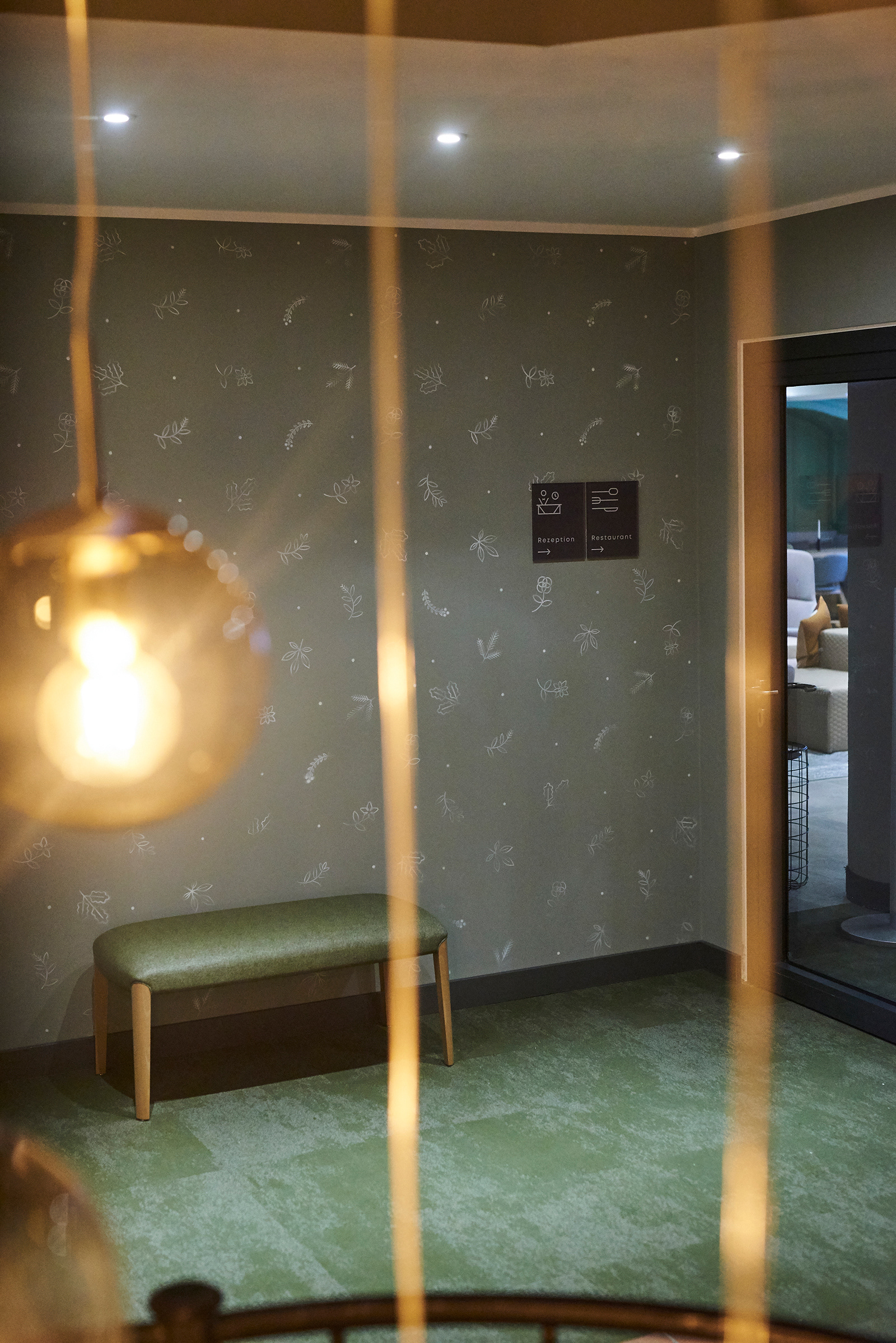
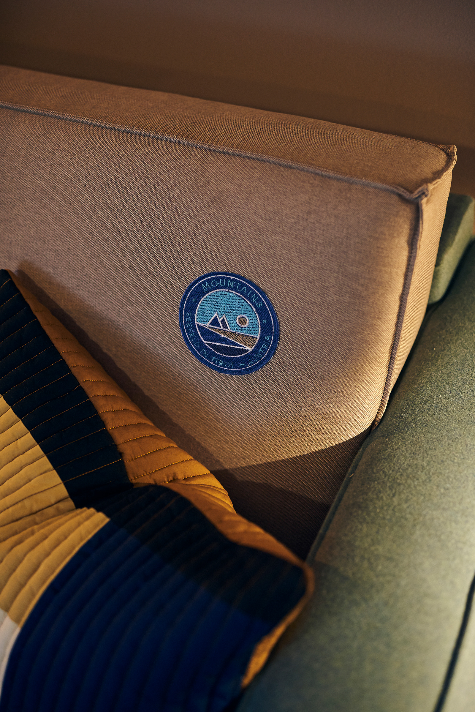
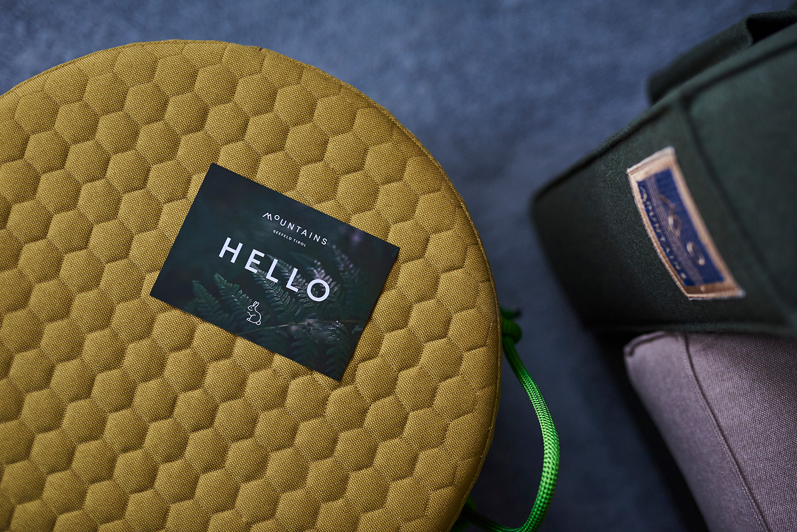
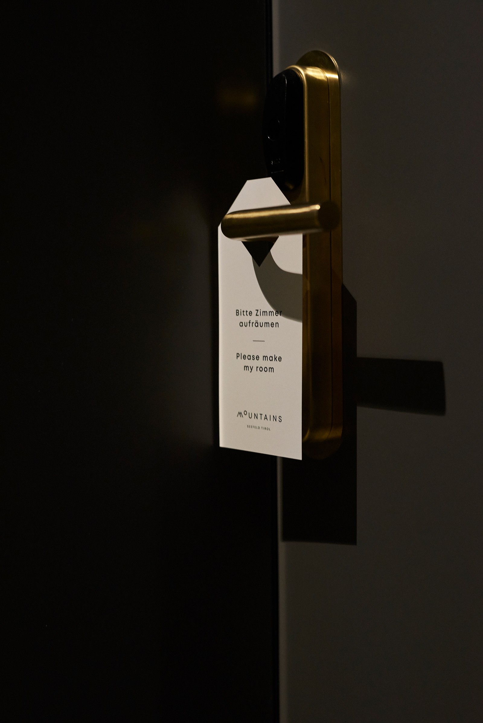
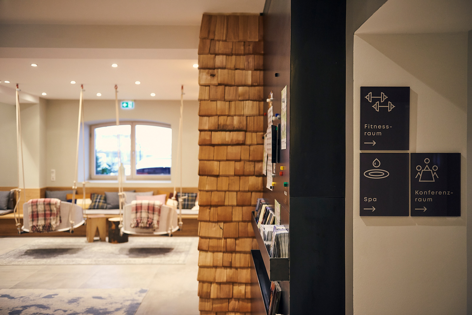
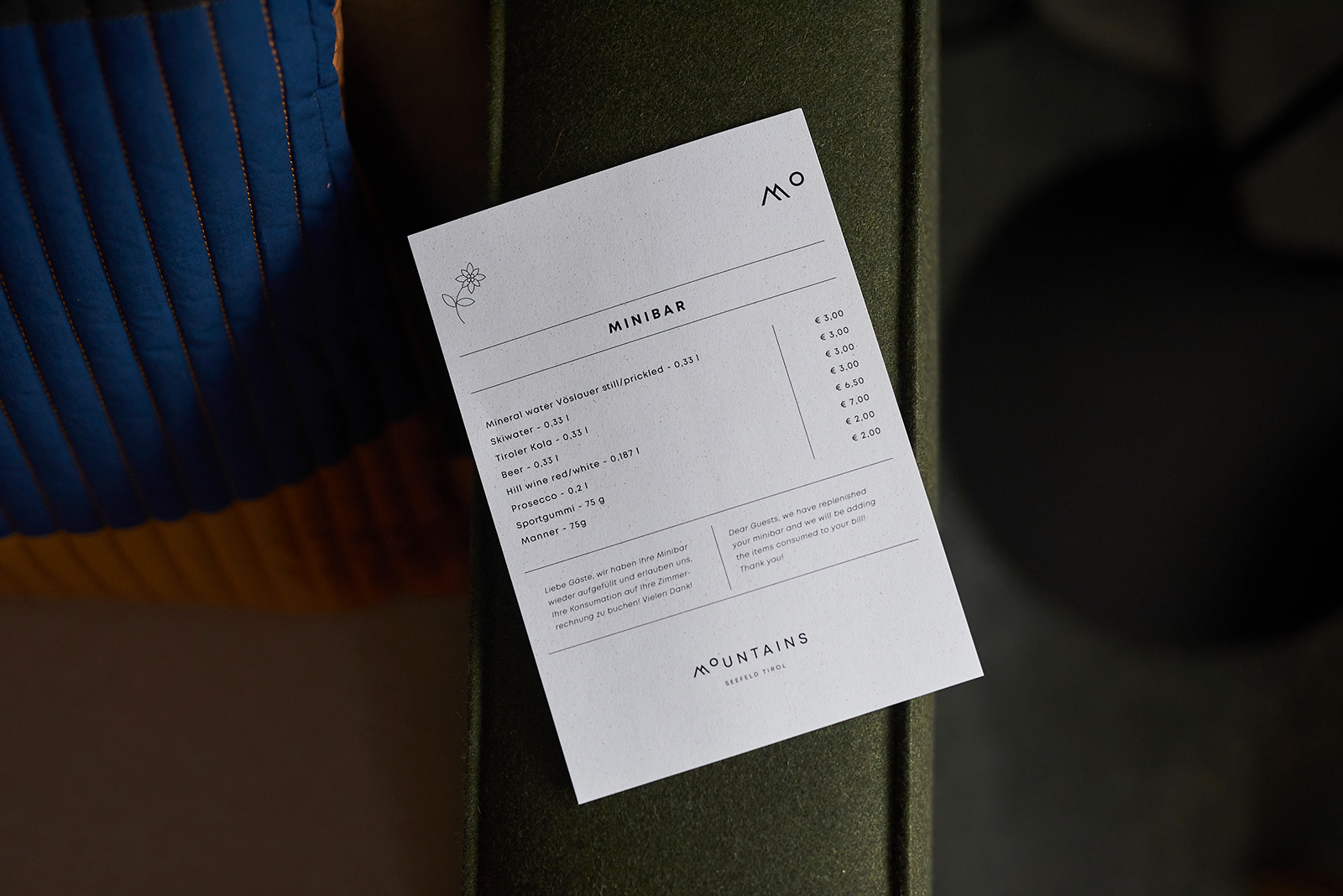
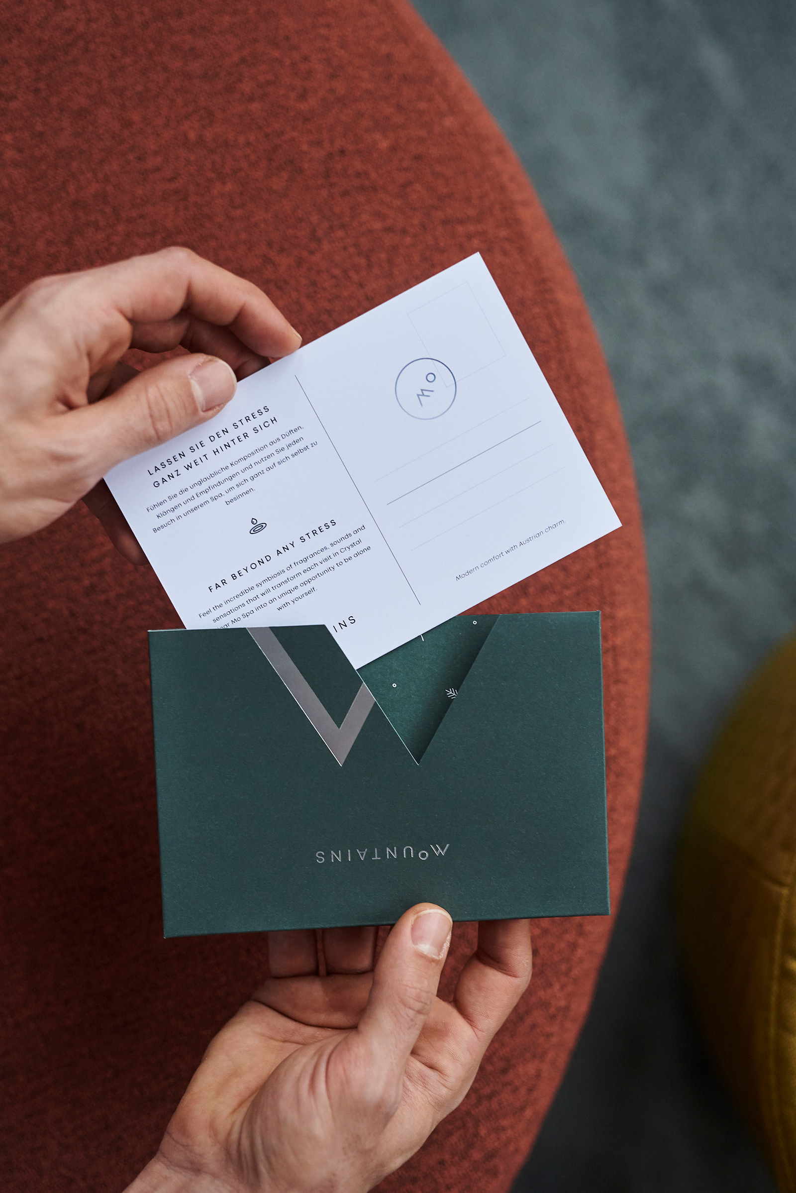
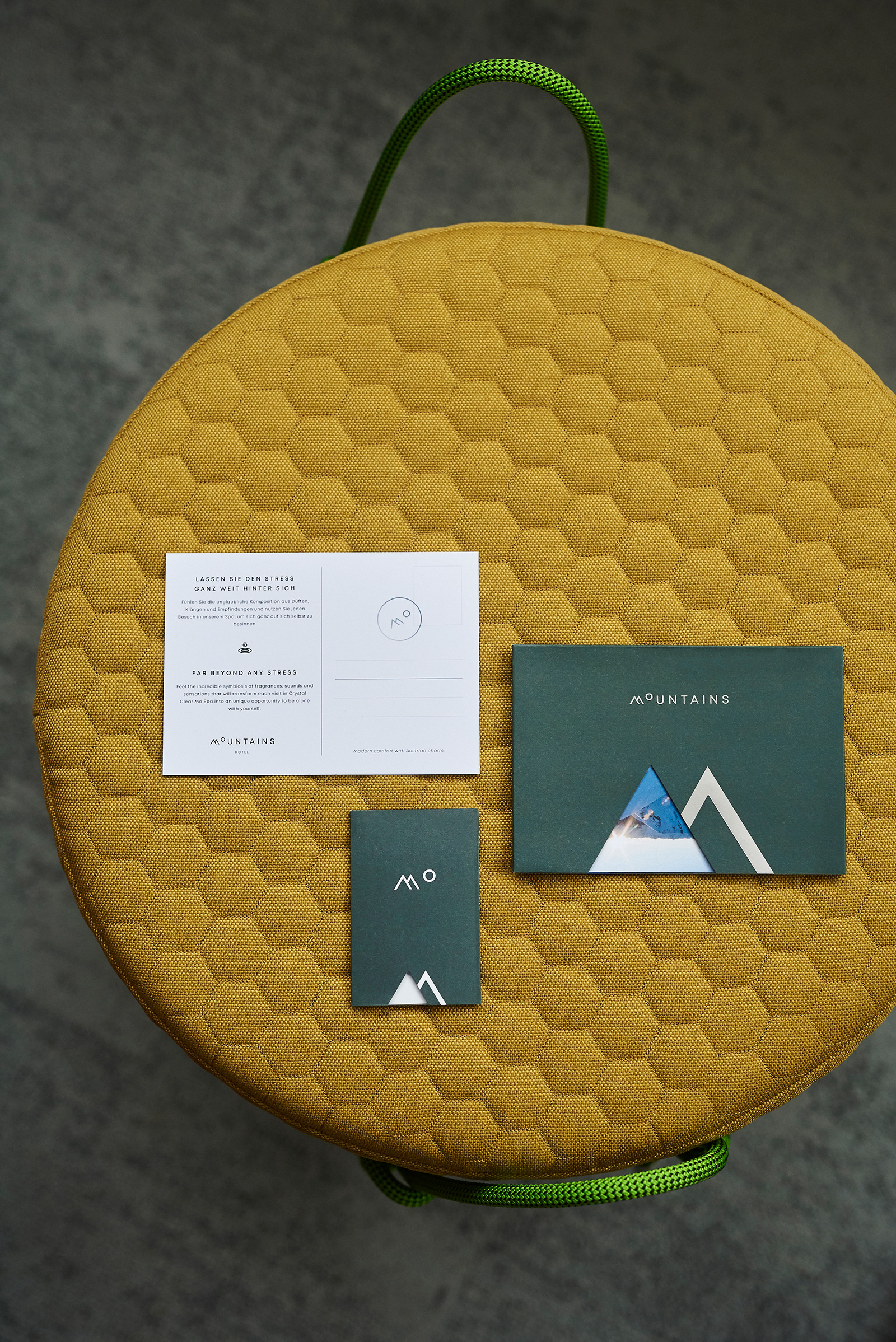
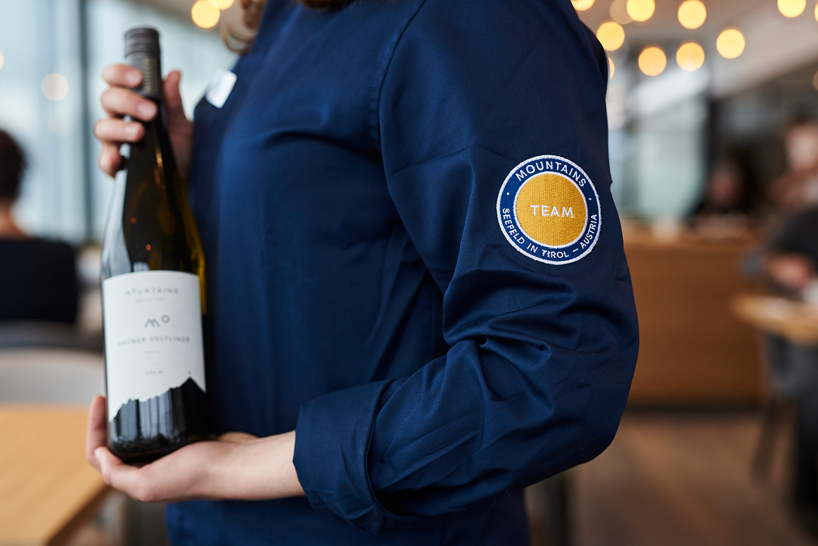
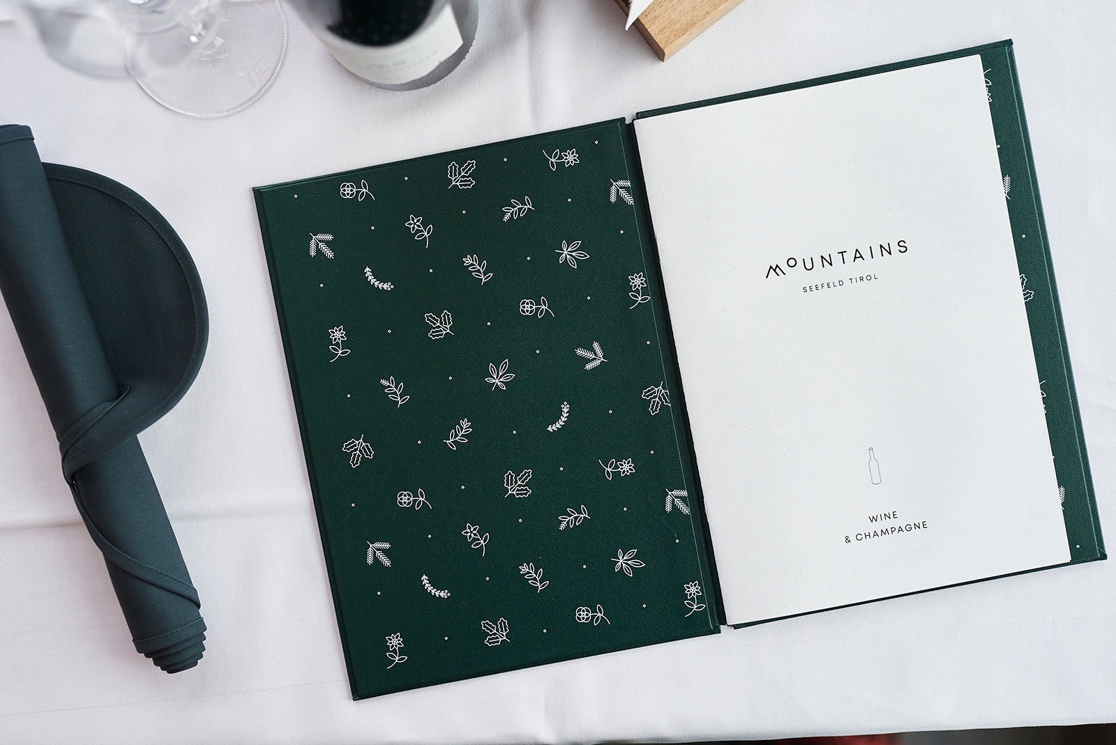
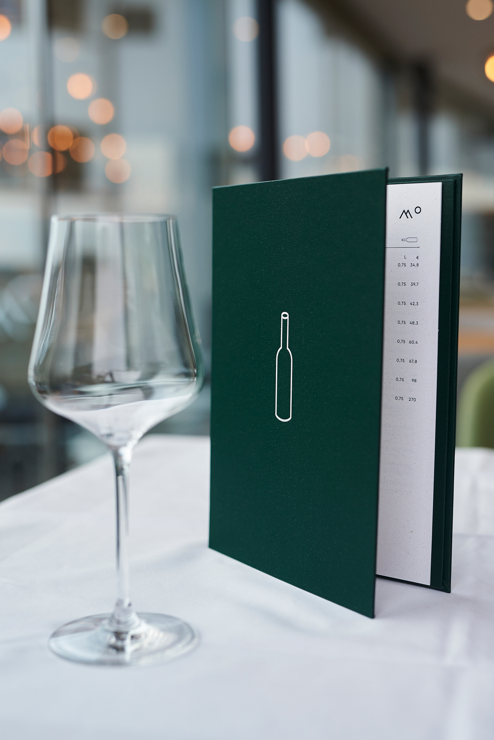
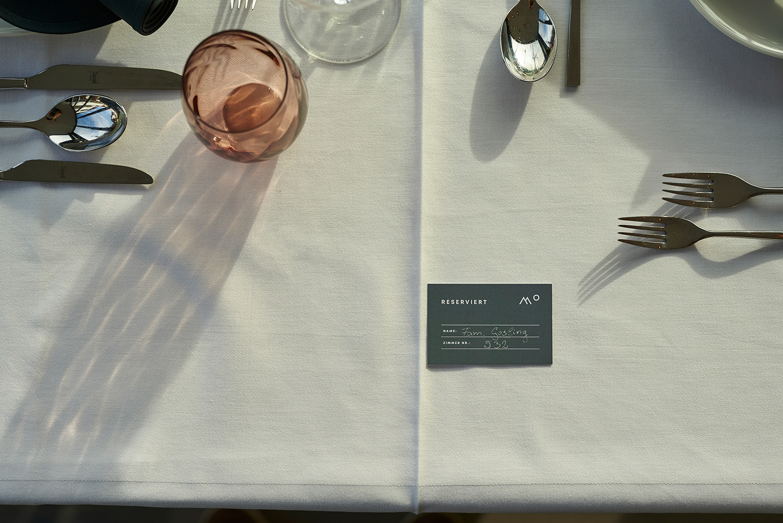
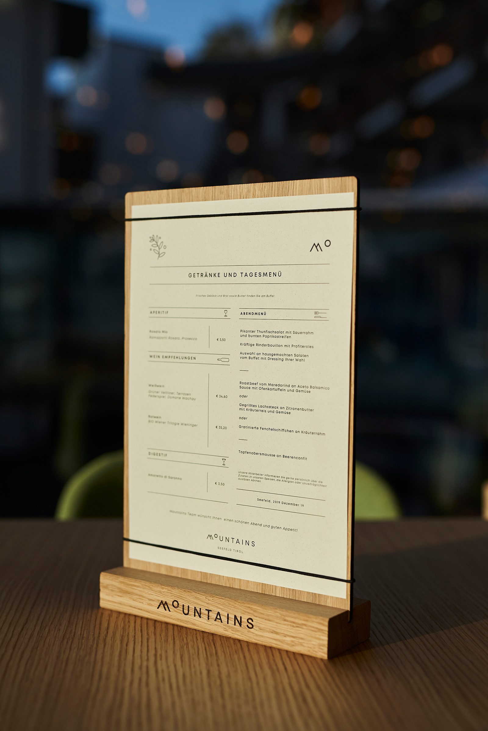
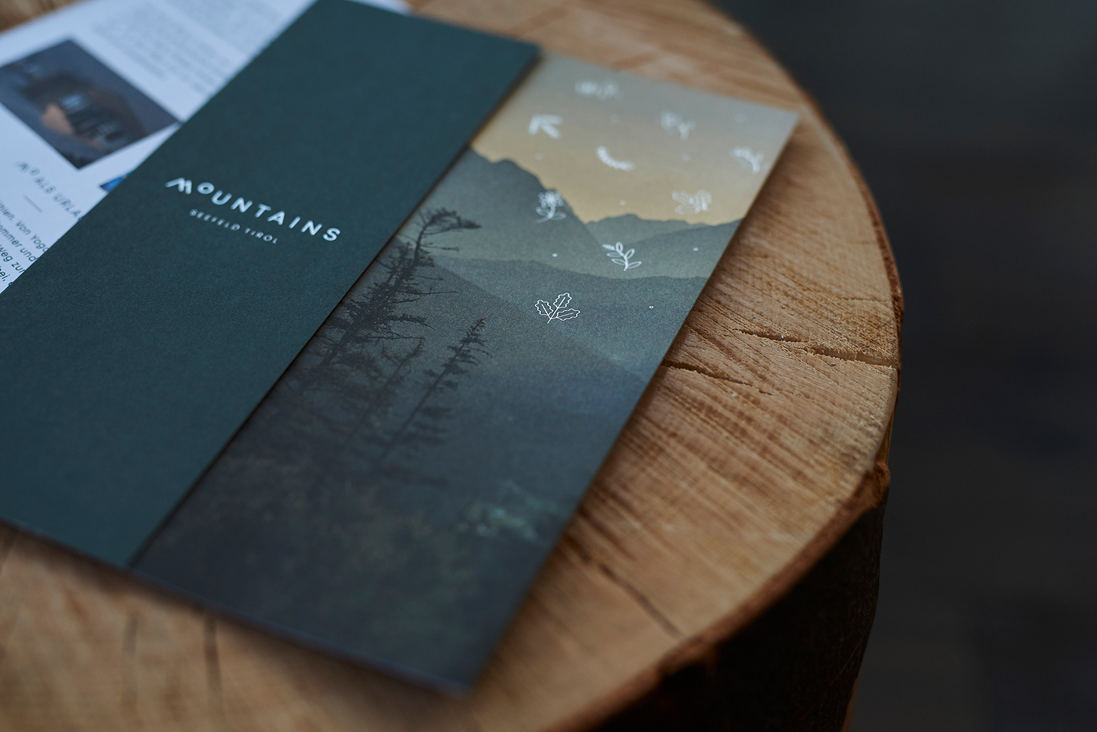
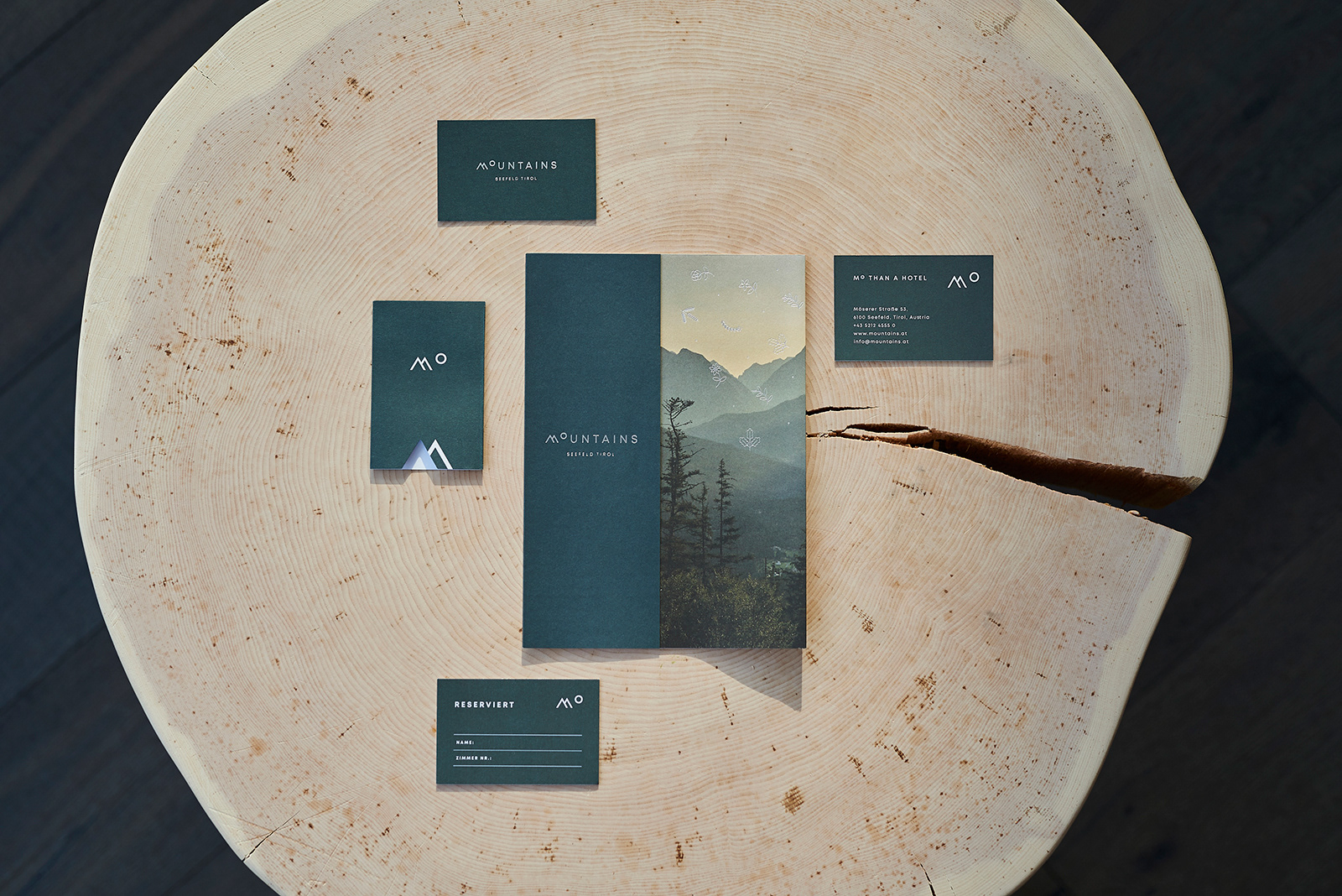
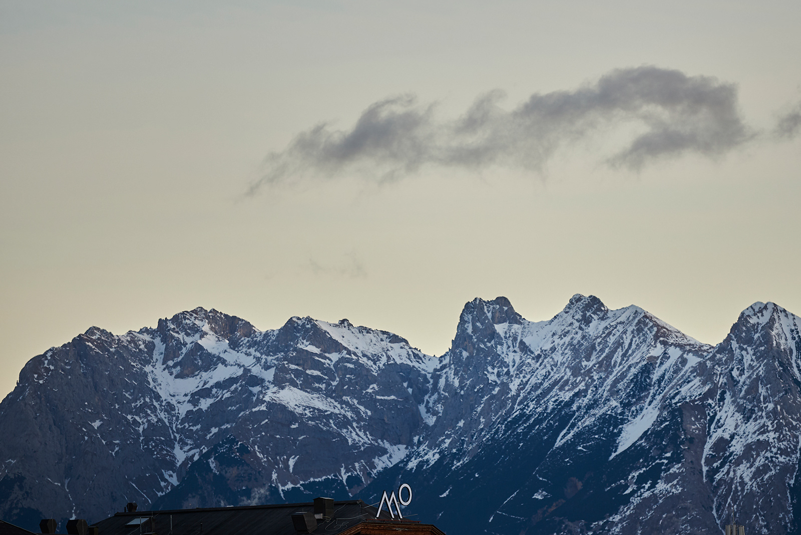
Our design concept was inspired by the aesthetics and the special feeling of being in the mountains. The stunning surroundings, crisp, clean air, serenity, exhilaration, and a true appreciation for the beauty of our world and the people around us. As we dreamed up a new identity for Mountains Hotel, we focused on these elements, and kept in mind the history of the place, the incredible nature, and the feeling of enjoying time with loved ones. We chose a clean font that offers peaks on the letter M, and from there developed the logomark which is a play on the letters M and O, to reference a mountain and a rising sun on the horizon. We also created minimal and playful nature and sport icons, and used them to make patterns which appear on the wallpaper and printed materials. Minimalist, clean signage help guests find their way around the hotel, while the matching icons add some whimsy and impart the personality of the hotel.
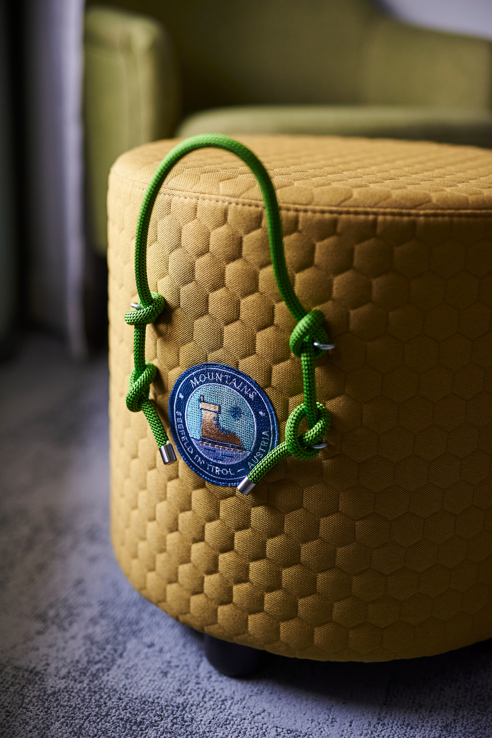
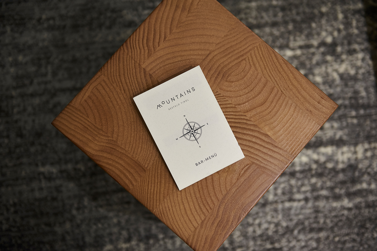
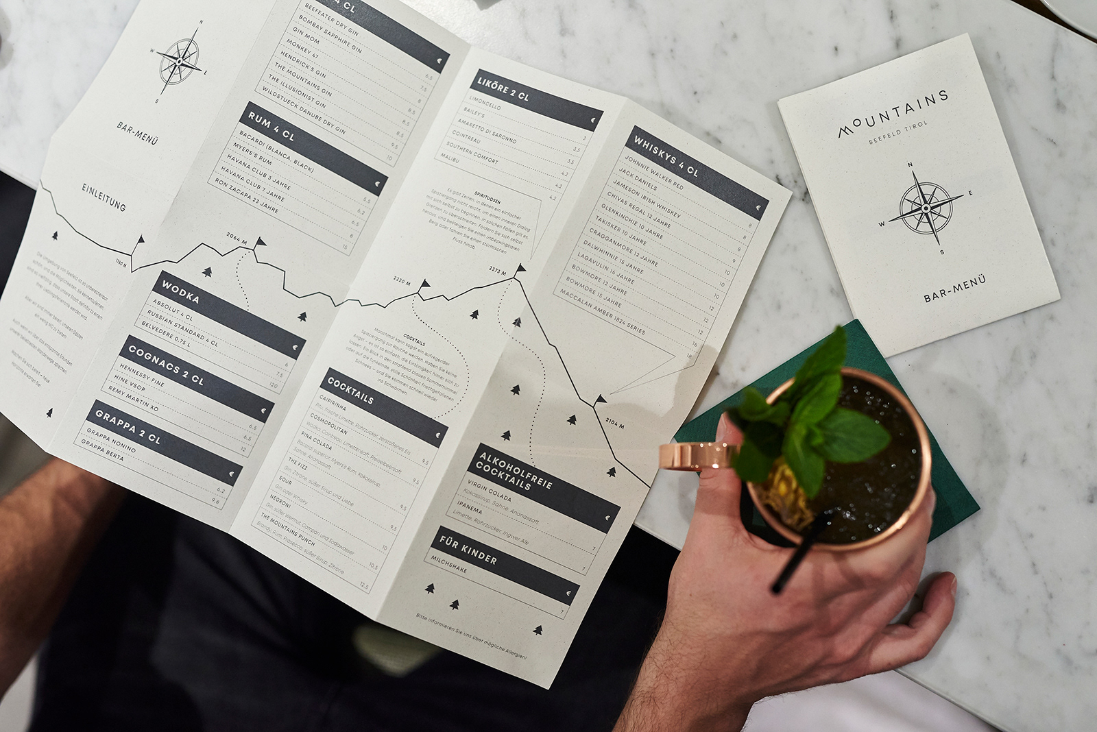
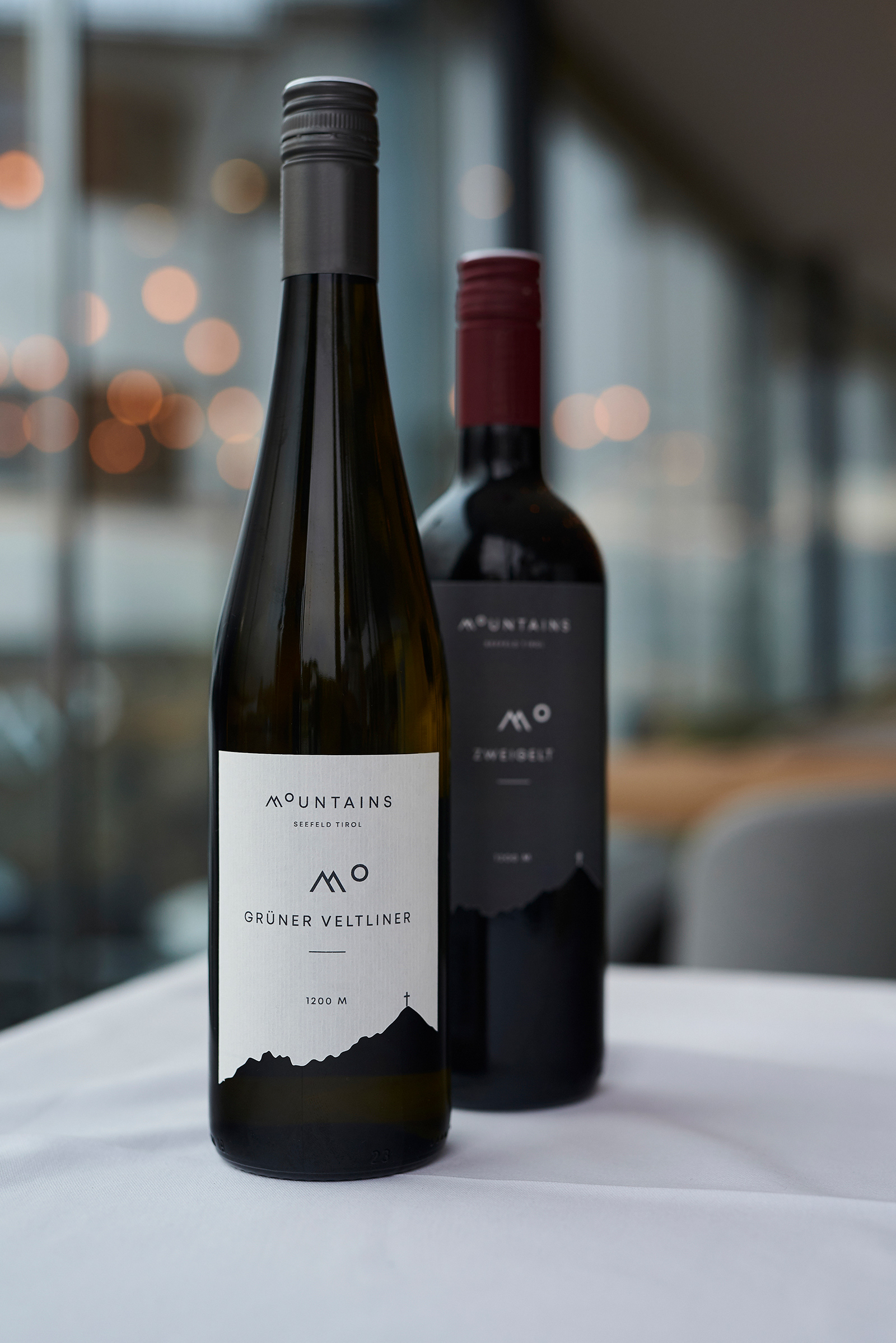
These small details can be found throughout the hotel, such as on the “Bar Hiking Map” we created as a playful take on a bar menu, embroidered badges which are featured on the team uniforms and furniture, and unique house wine label designs.
Ph photography by András Zoltai
Id interior design by Position Collective
Ad art direction by Eszter Laki
Gr graphic design by Eszter Laki & Réka Imre
_______