H Ü B R I S B E E R
Branding for a Hungarian brewery
_______
We love finding ways to elude trends and show that the best work results from being true to your brand’s identity. When the lovely guys behind the Hungarian craft beer brand Hübris approached us to develop their brand, we were filled with excitement and enthusiasm to buck the trends, and create a craft beer brand that was down to earth, fun, and spoke to a wide range of people.
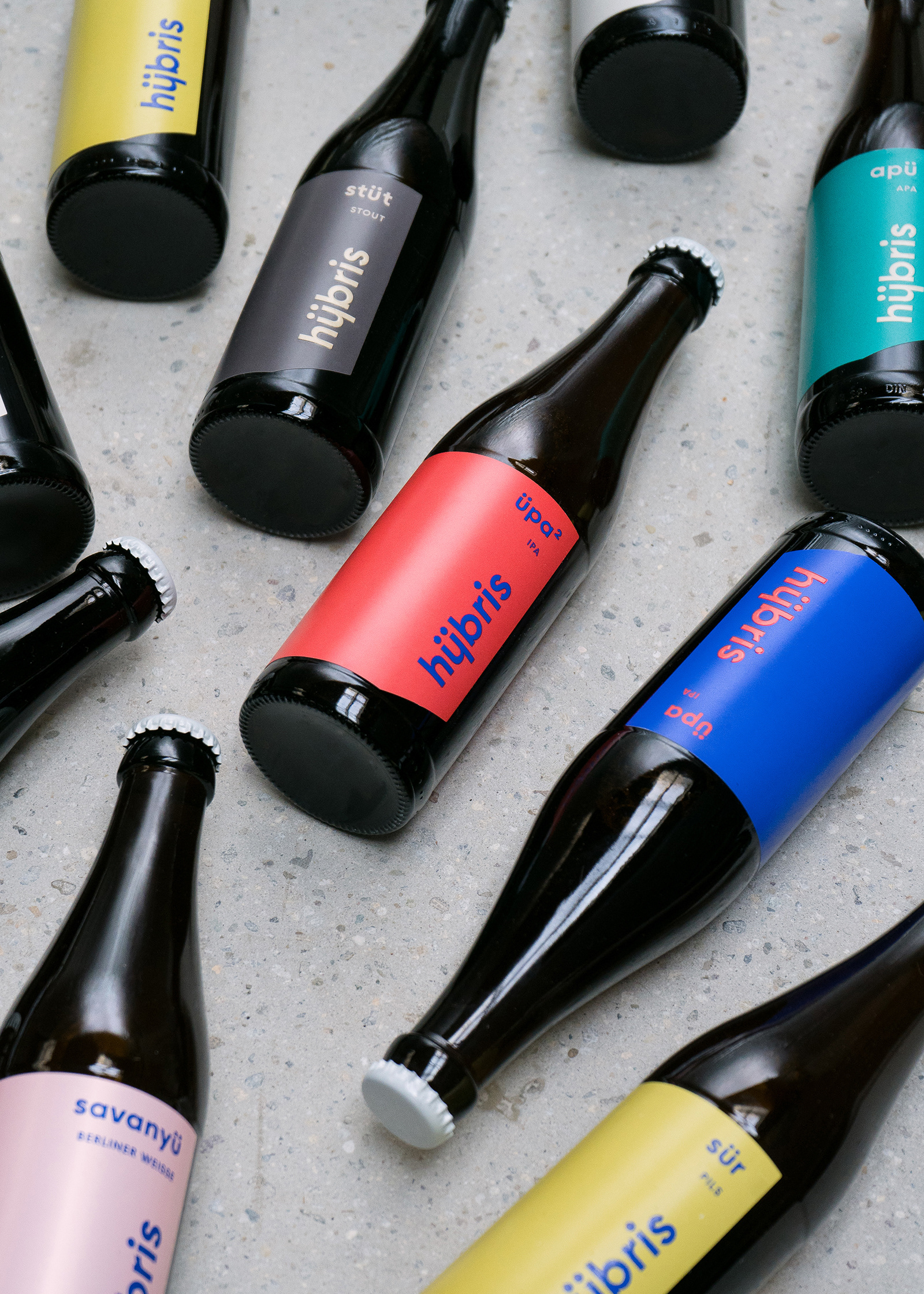
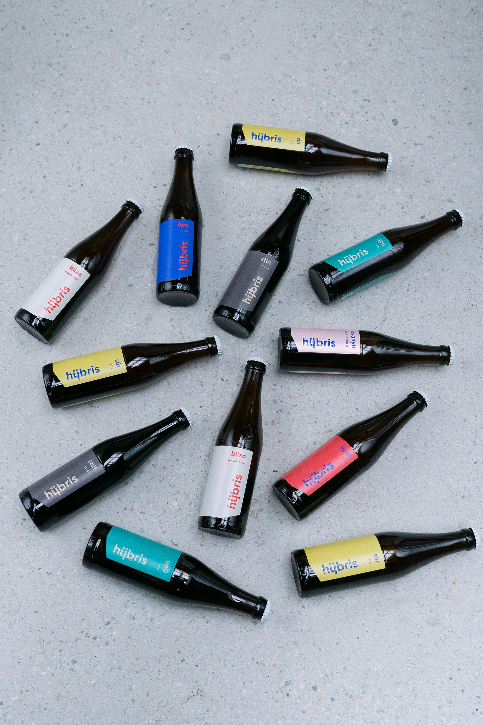
With slogans like “Hübris is a craft beer without ‘craft’” and “Hübris is the new classic”, it was clear to us that Hübris is looking to separate themselves from the rest of the craft-beer crowd, and all its negative connotations. As the “new classic” beer, Hübris expresses that beermaking doesn’t have to be trendy to be great, but rather it should follow the same ethos as the classics. They’re here to make great beer that they want everyone to drink, whether they give a hoot about craft beer or not.
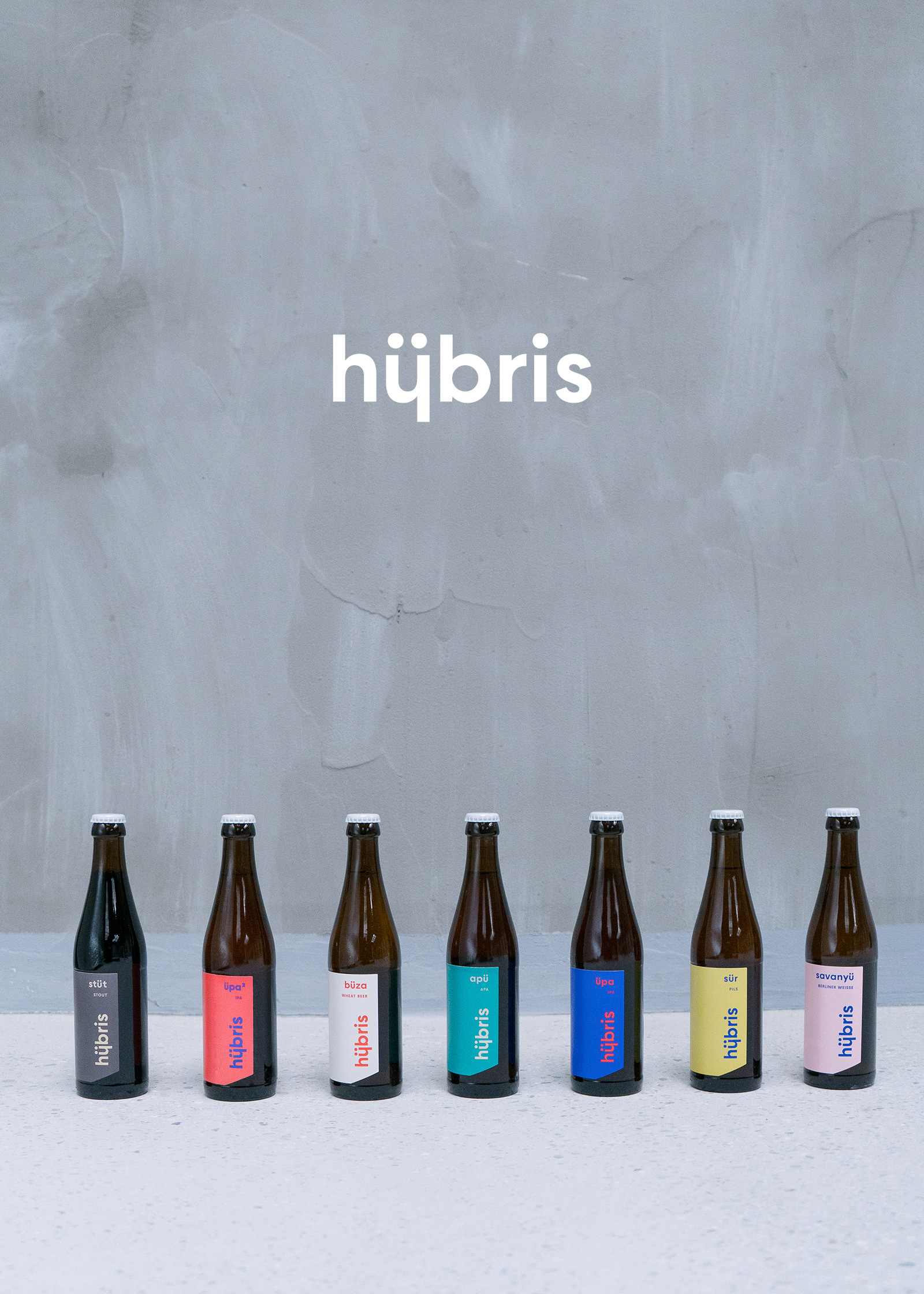
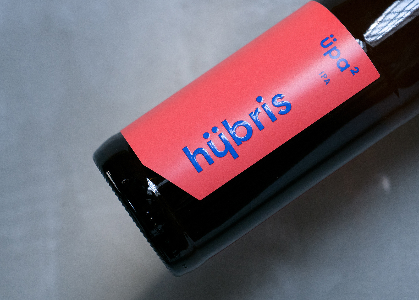
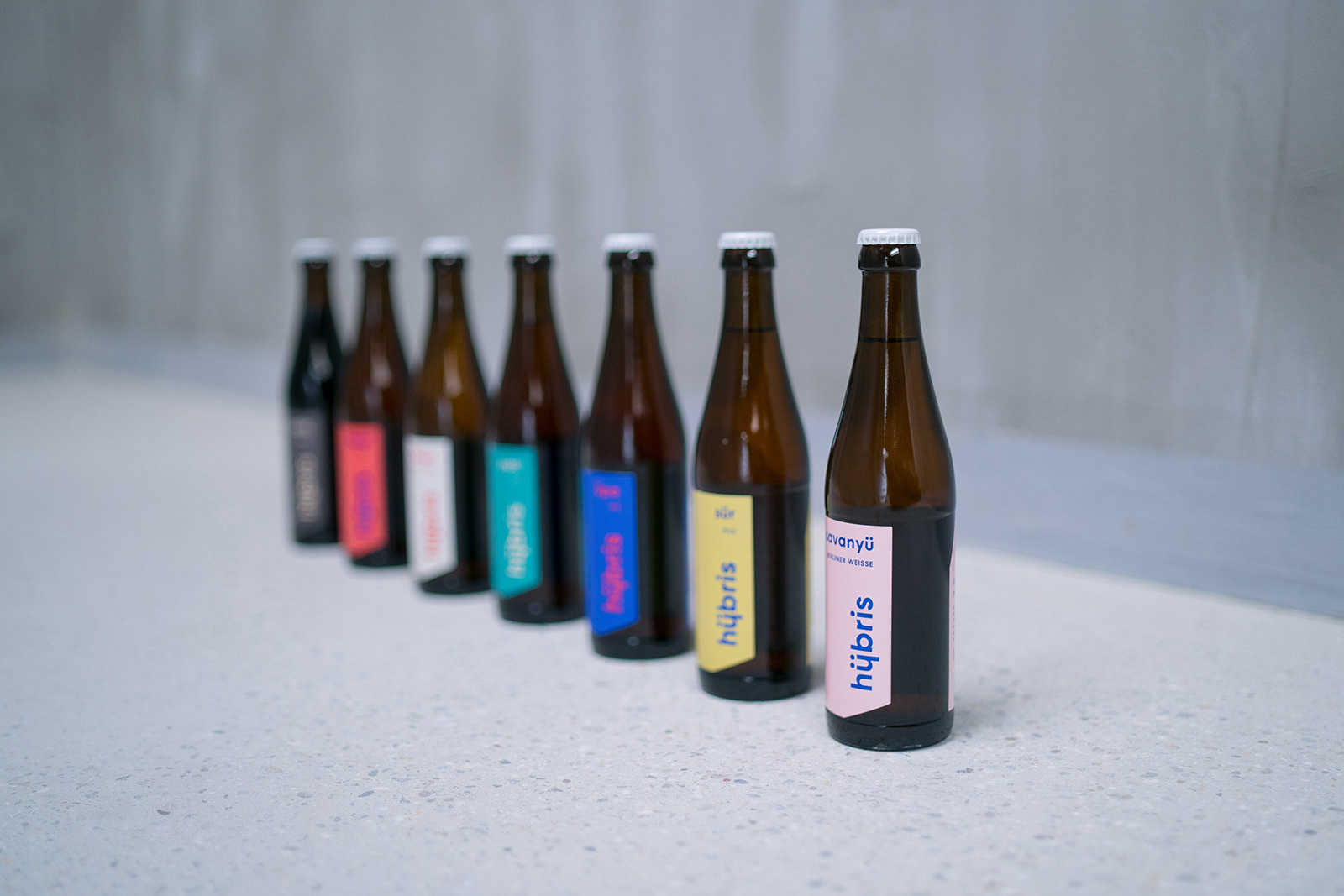
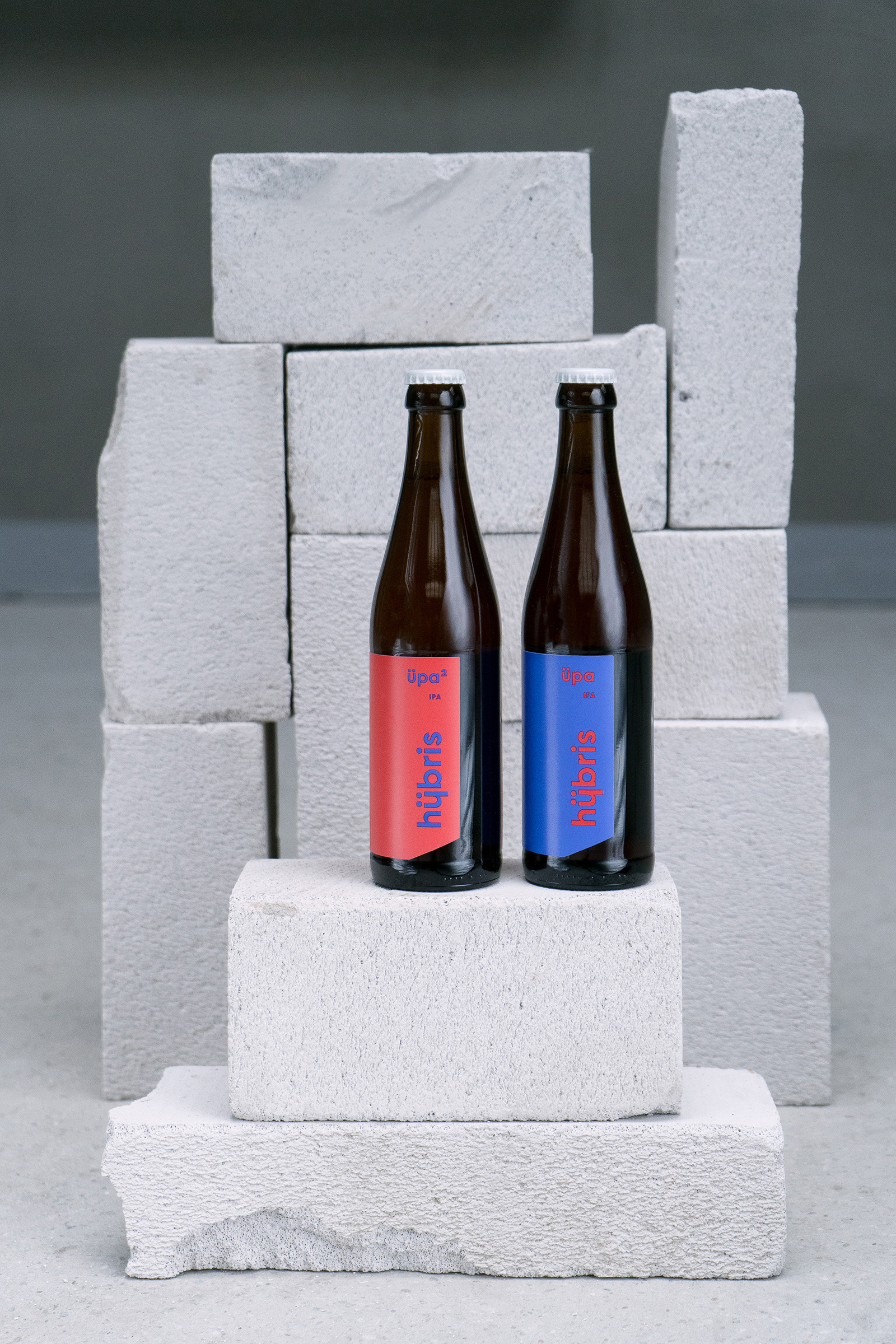
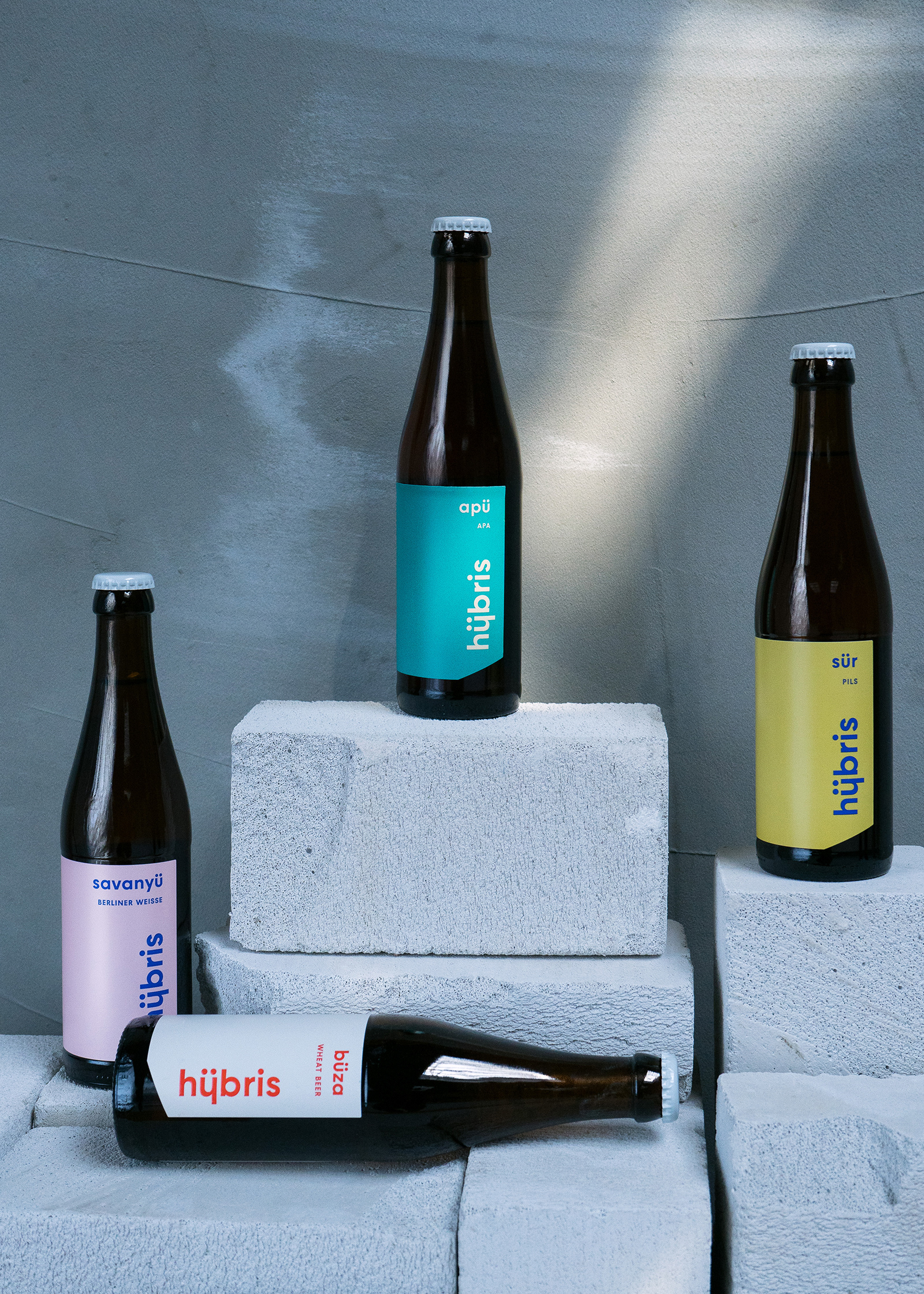
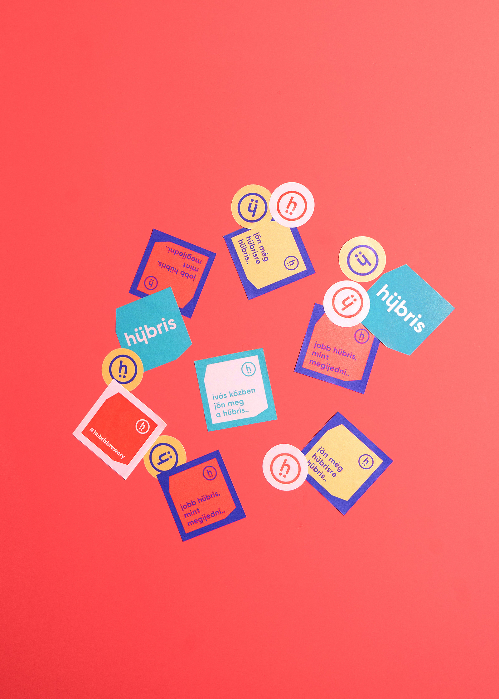
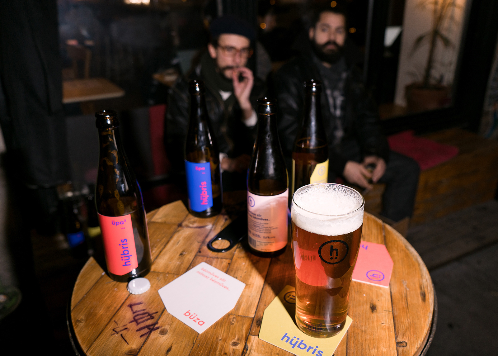
We all agreed that we didn’t want to design another comic book-like, over-illustrated craft beer label, which was omnipresent in the market. Instead, we wanted something that would set Hübris apart from the rest, and be visually arresting enough to jump off the shelves. It was also important to reflect the meaning of the name. Hybris is an ancient Greek word meaning pride and immodesty. It also means transgression and entering someone else’s sphere. Although the meaning may seem negative, we thought it was also very cool.
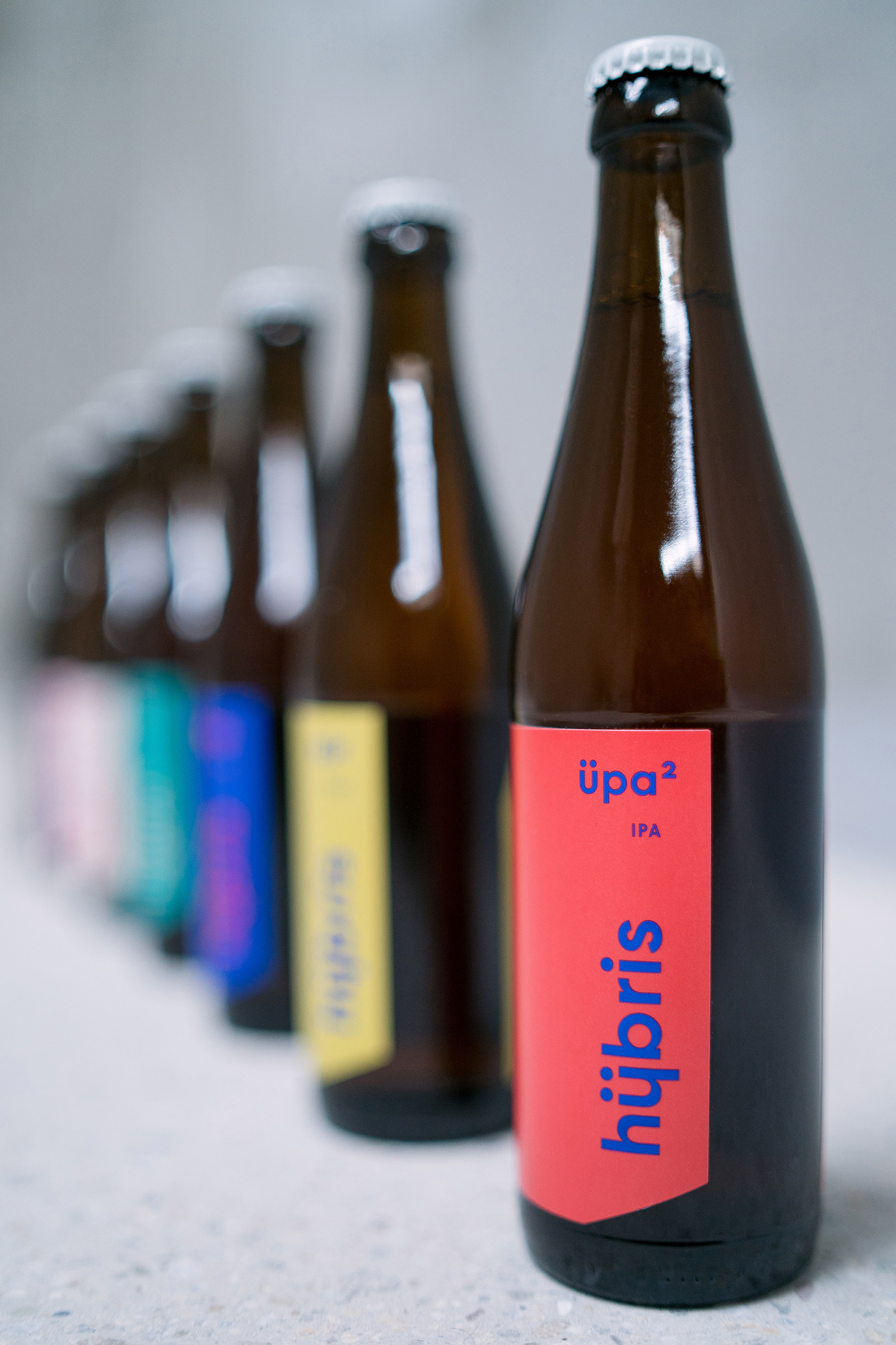
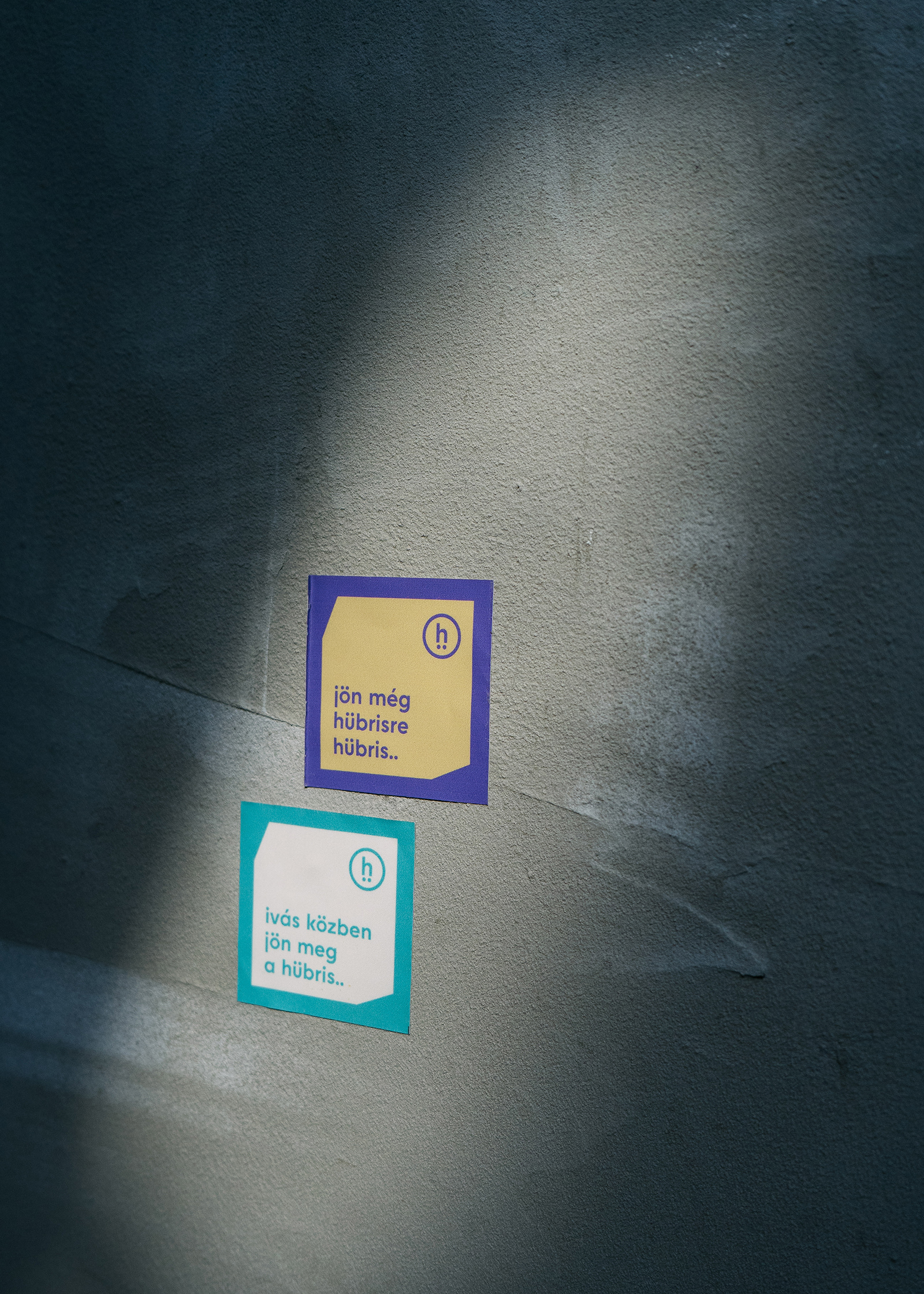
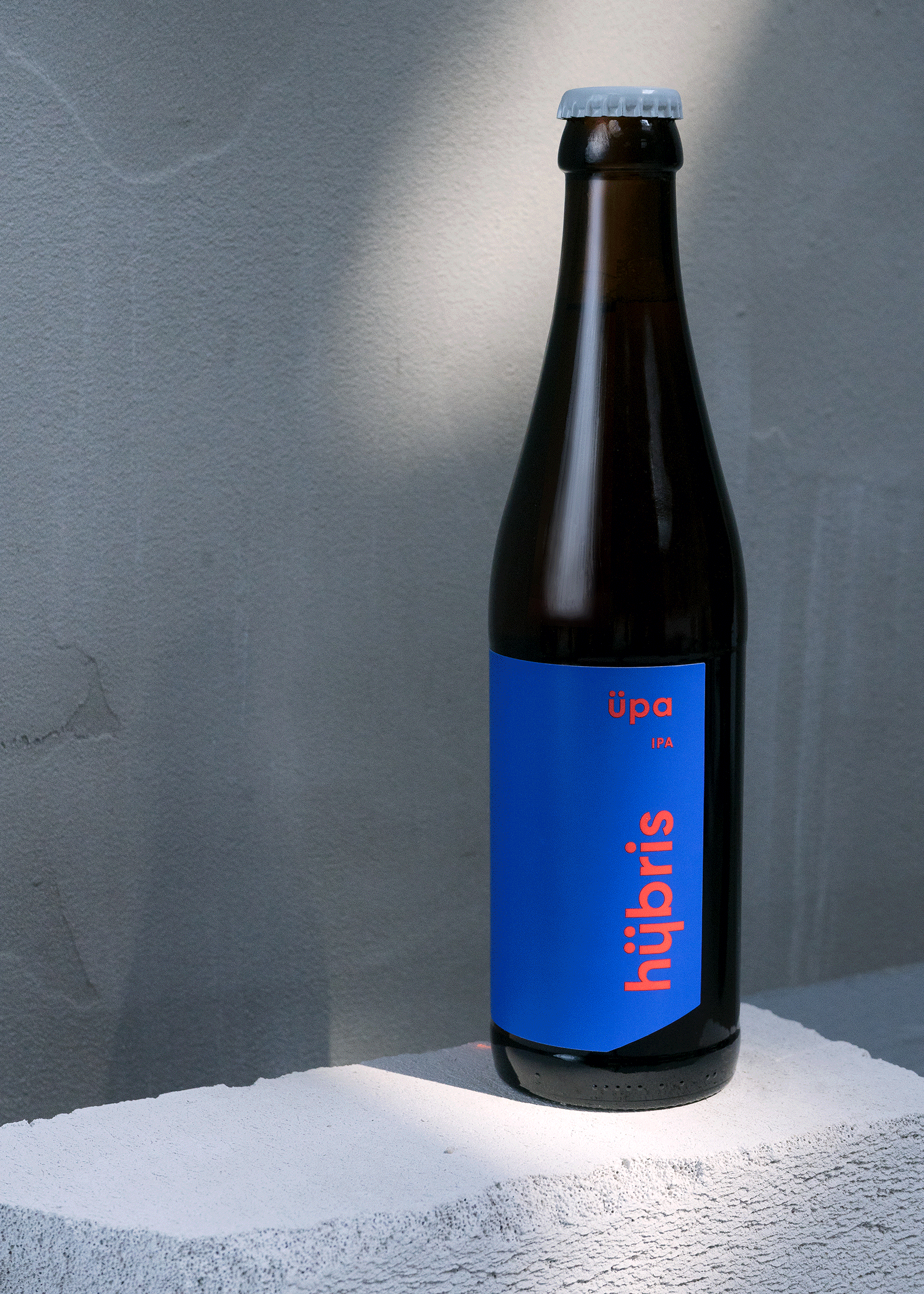
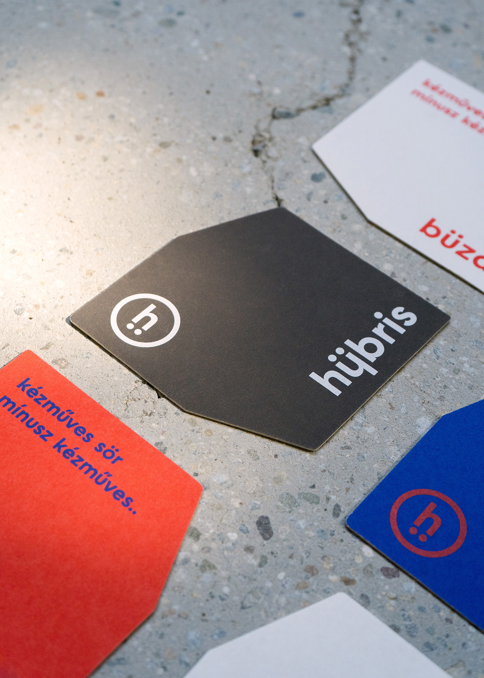
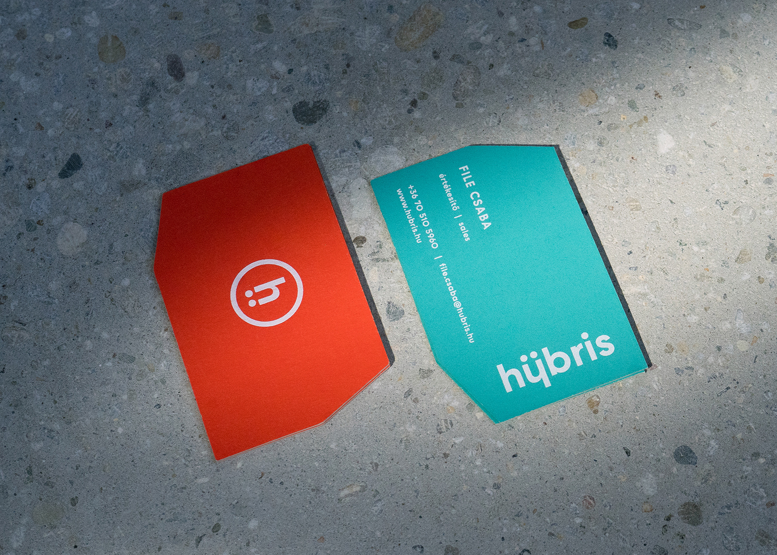
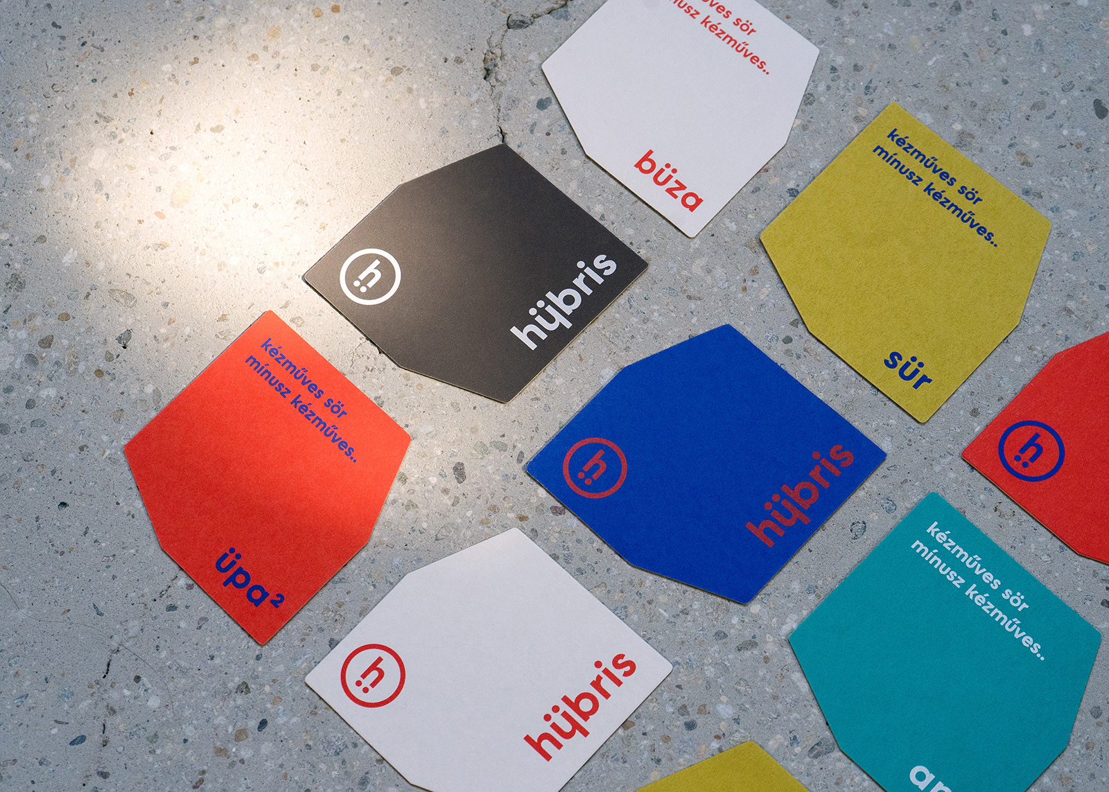
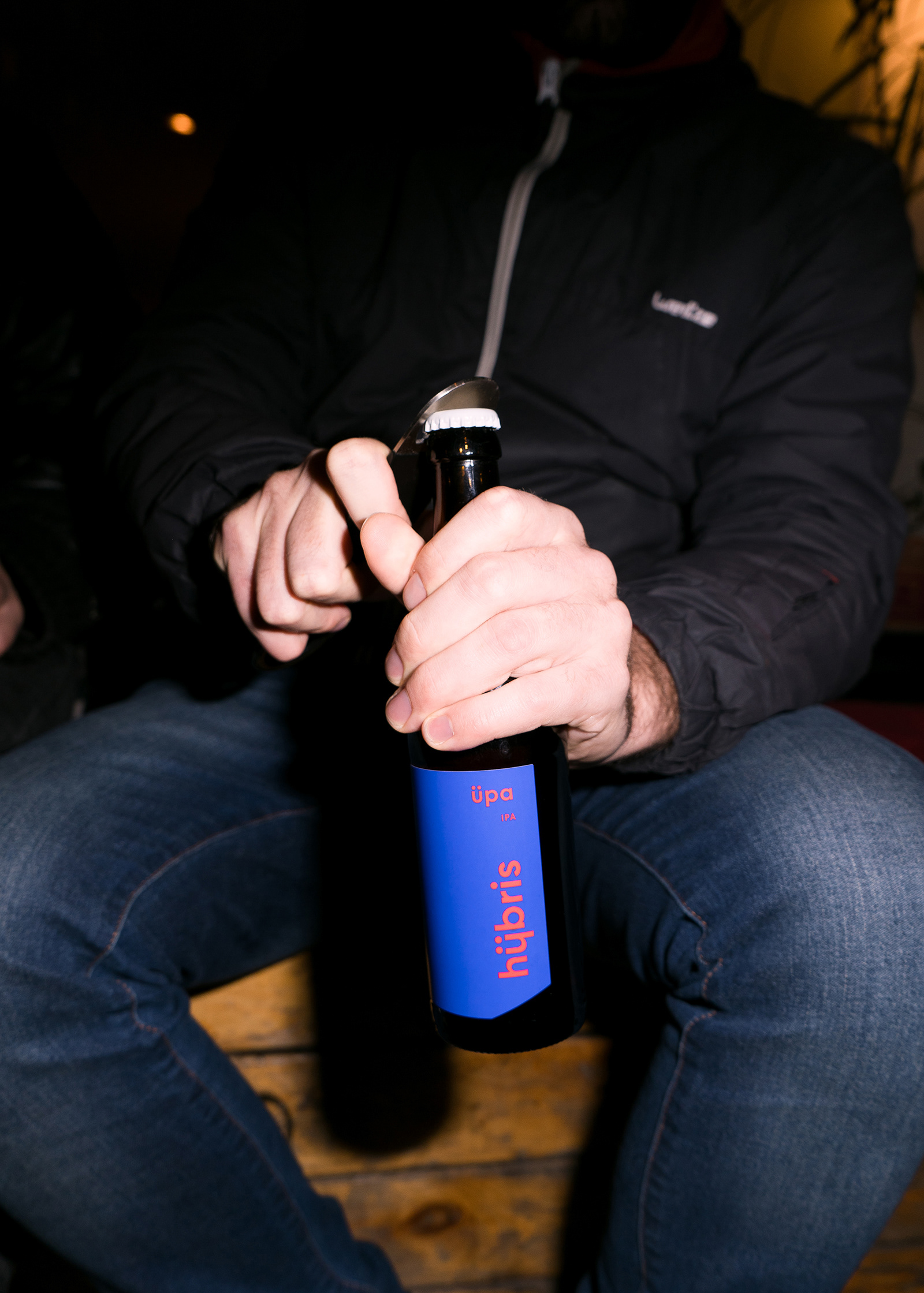
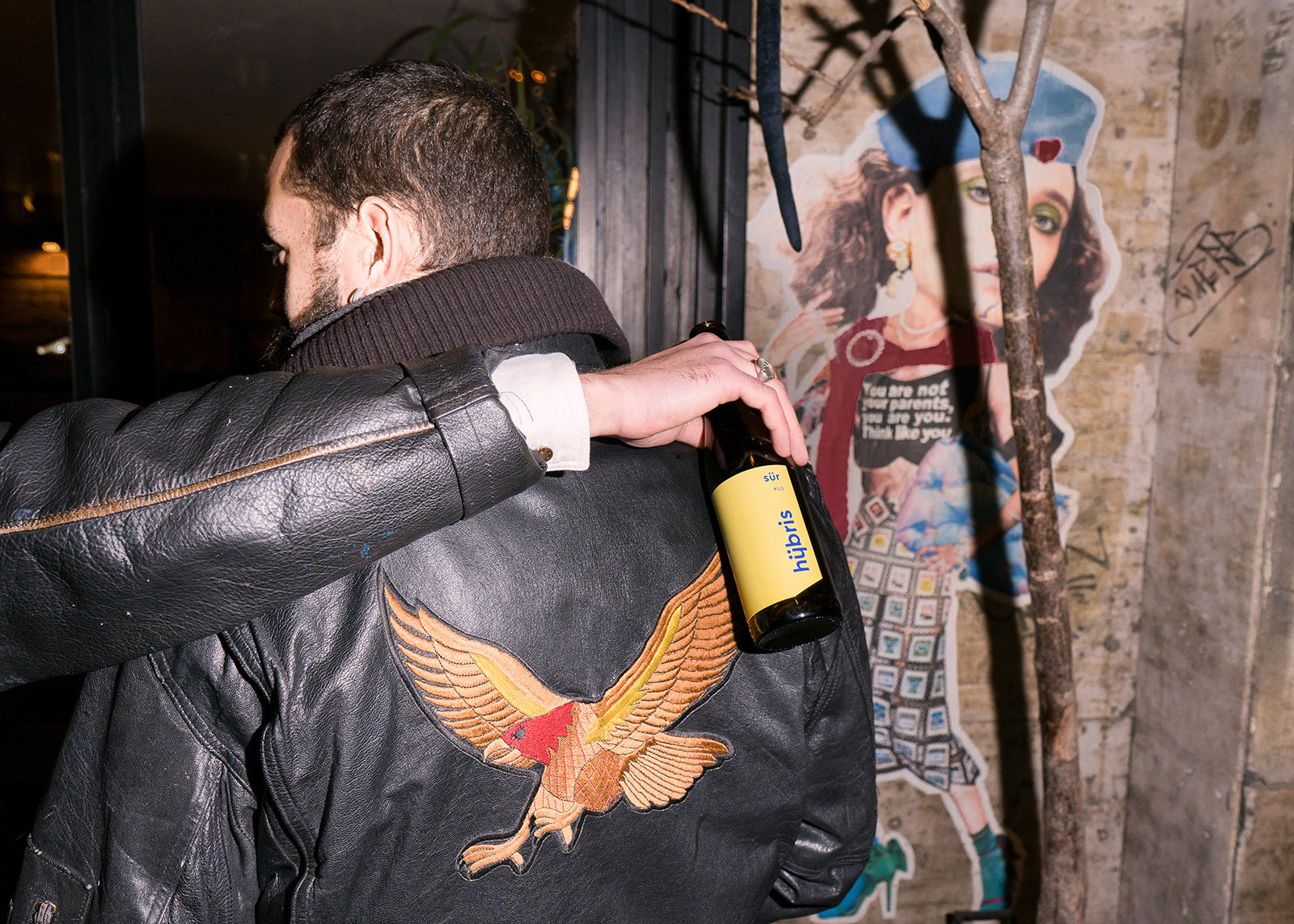
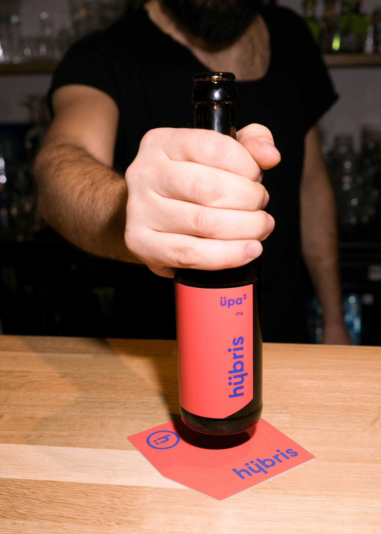
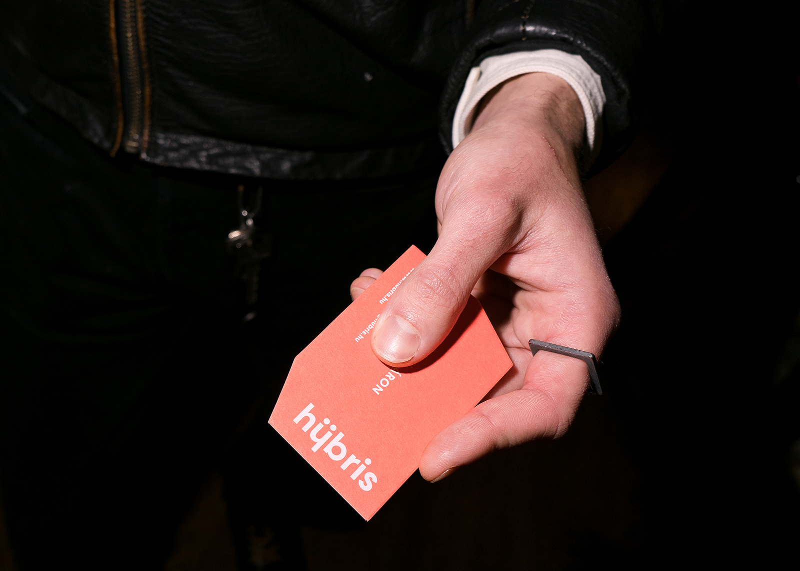
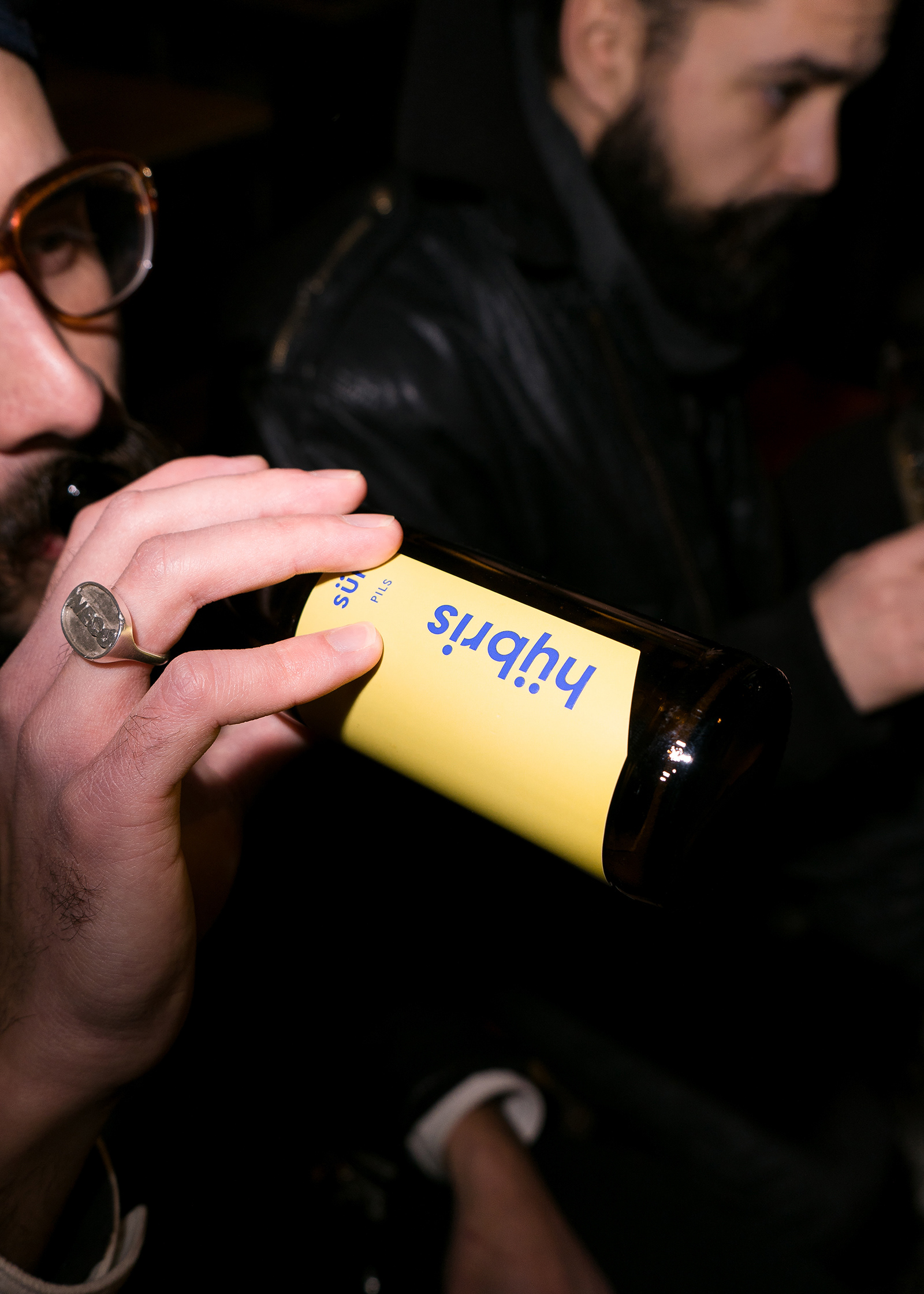
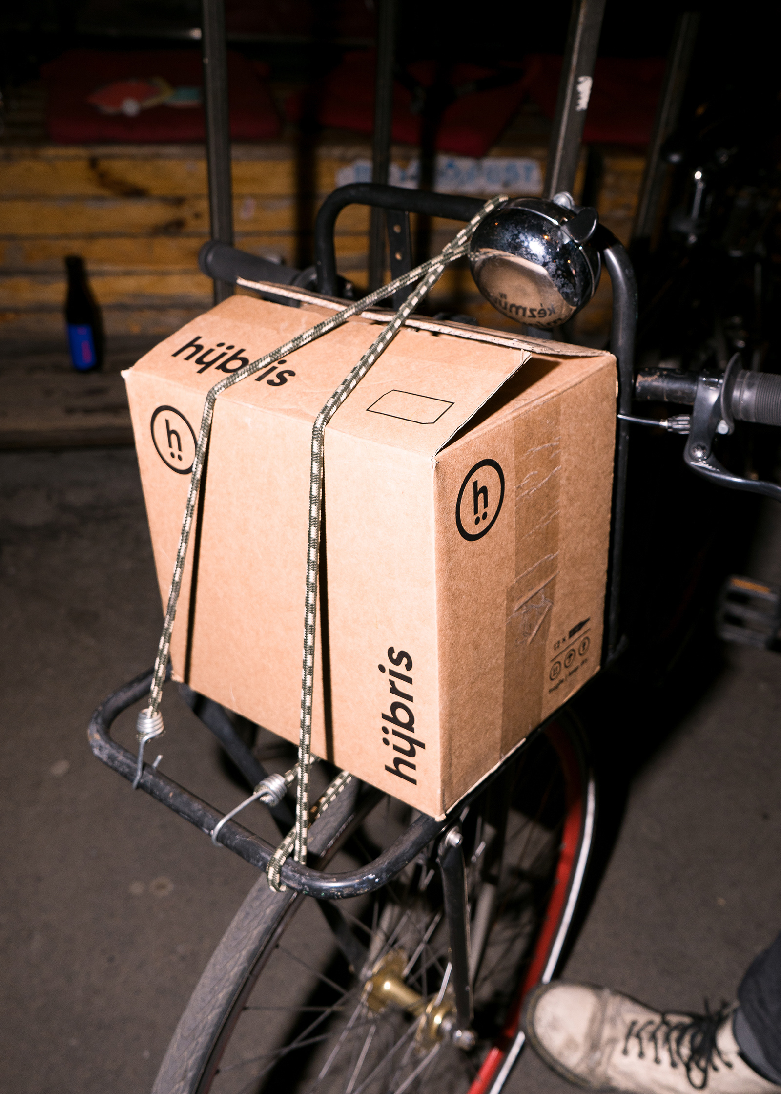
We alluded to this prideful and big personality with the bold colours, large colour blocks, and minimalistic typography. In the logotype we played with the shapes of ü and y to refer to the ancient Greek bonding (the letter y can be pronounced as “ee” or “ü”). We added another twist in the story by rotating the y with the two points on it to get the logotype, which is the h with two dots under it. The two dots became a secondary graphic element in the whole brand, along with the cut corners of the label. The letter “Ü” also plays an important role in the communication, as they included “ü” in the names of all their beers – for example, Sür instead of Sör, Stüt instead of Stout, Büza instead of Búza, etc. This idea came from Áron Csernenszky (head of marketing) and Mátyás Ónodi Szabó (copywriter and creative) with whom we had a great time working and brainstorming together.
We also had the chance to work with one of our favourite Hungarian type designers, László Naske (Naske Studio), and we were very excited to use one of his fonts. We chose Moholy Sans, but without its characteristic angular shapes, so it became a nearly new version of the original font, which Laci dubbed “Hübris Sans”.
Ph photography by János Szabó R.
Ad art direction by Eszter Laki
Gr graphic design by Eszter Laki & Réka Imre
_______