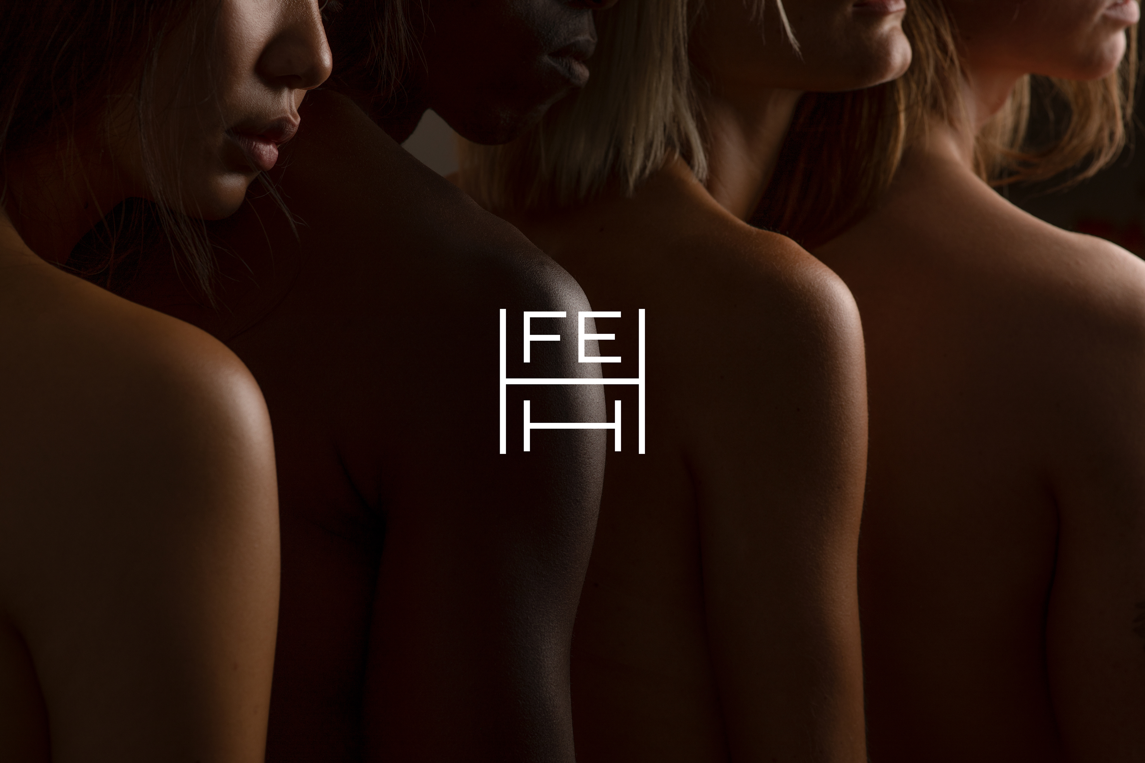
F E H H
Branding and package design for a Swiss beauty company
_______
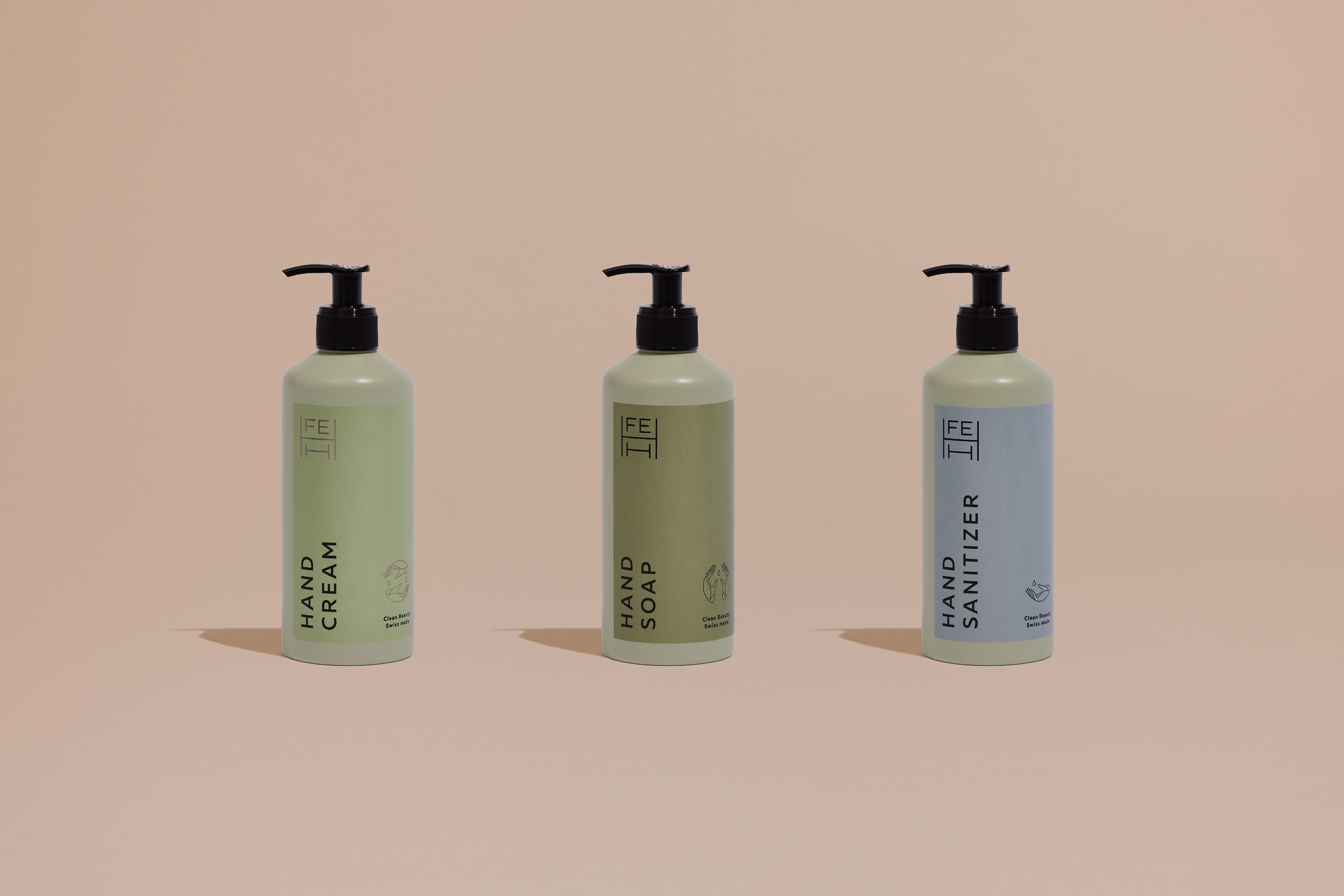
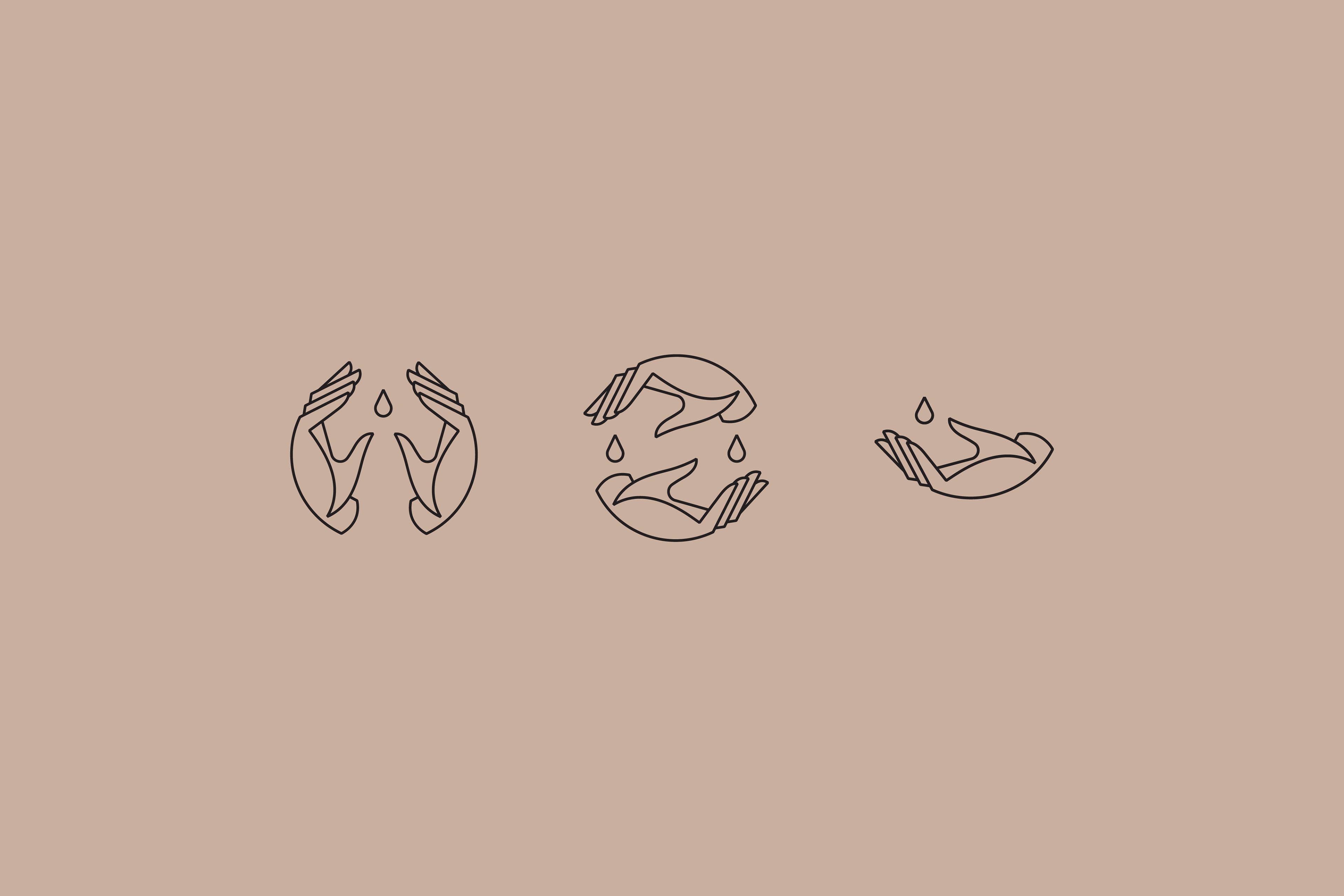
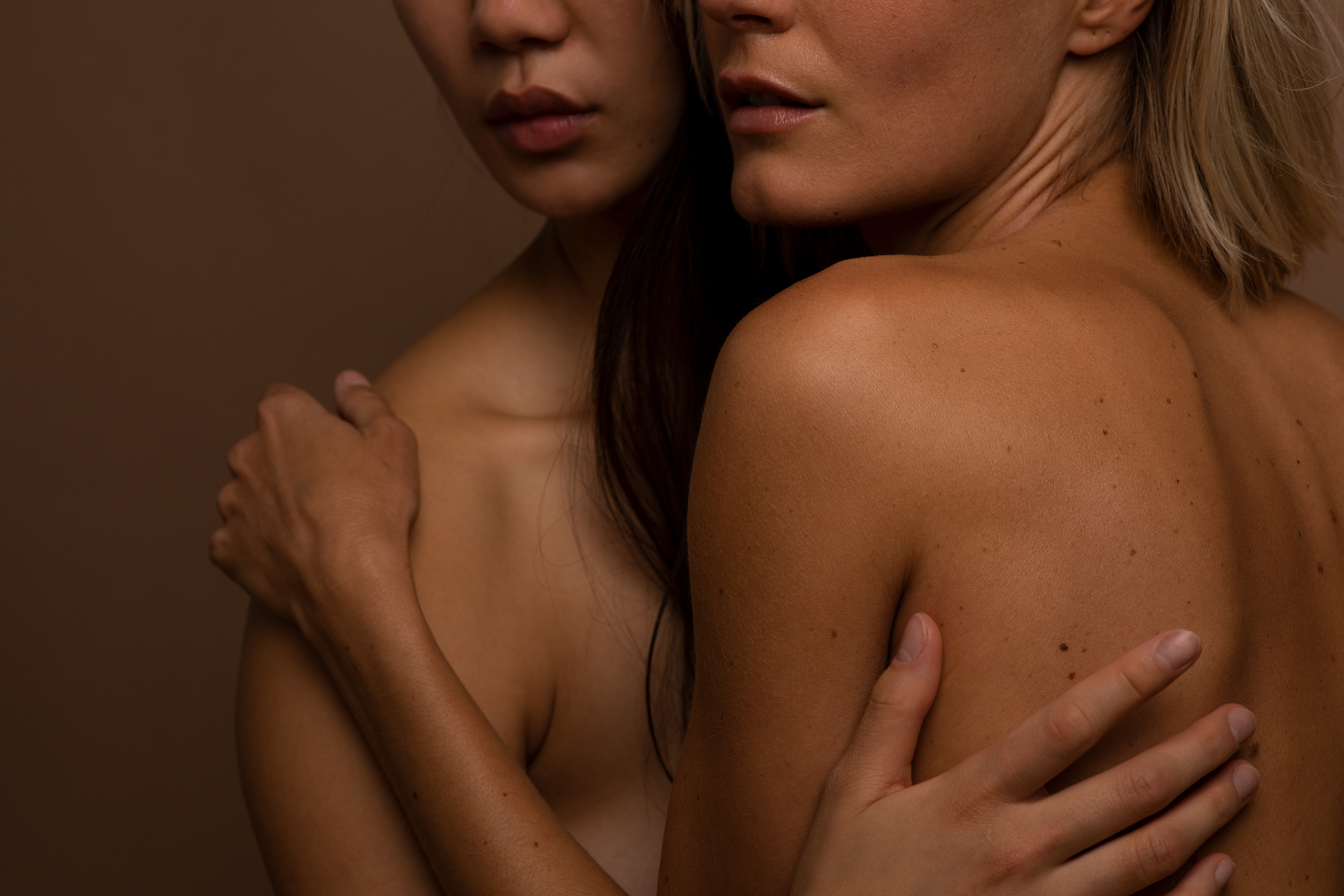
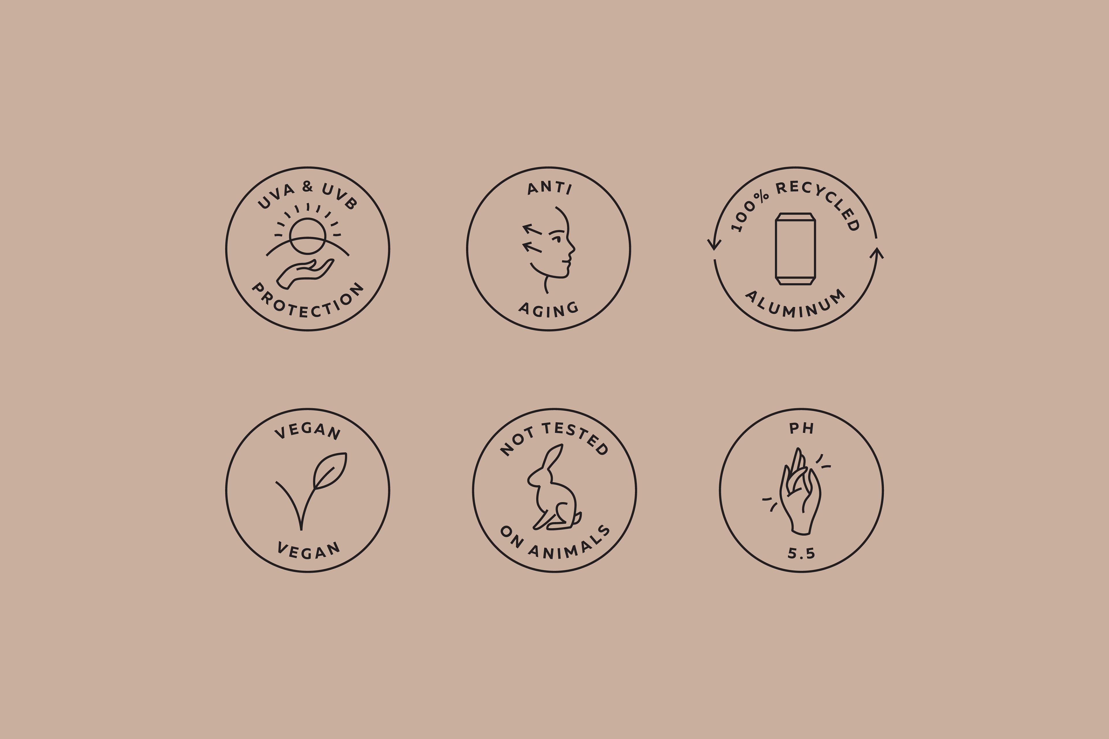
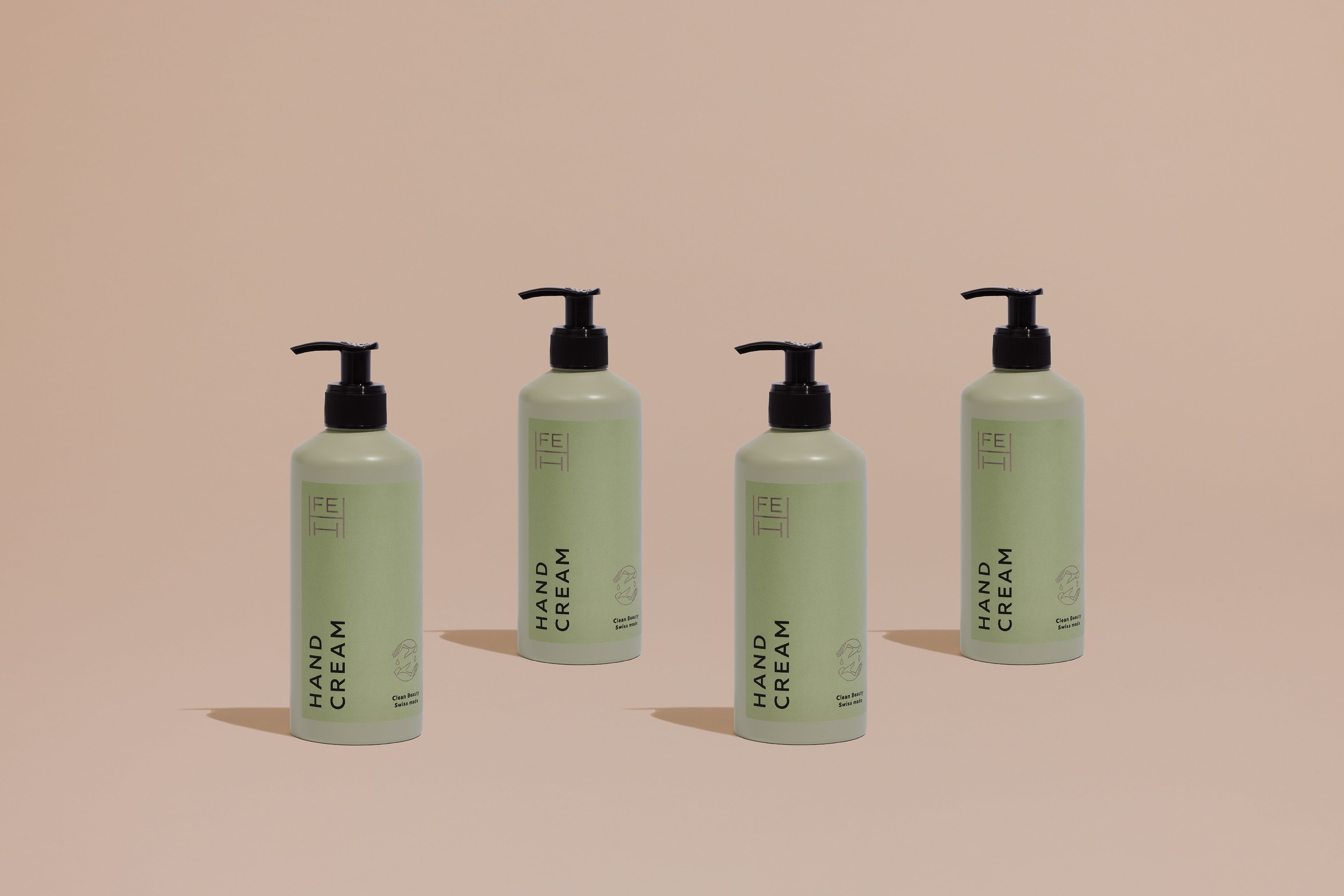
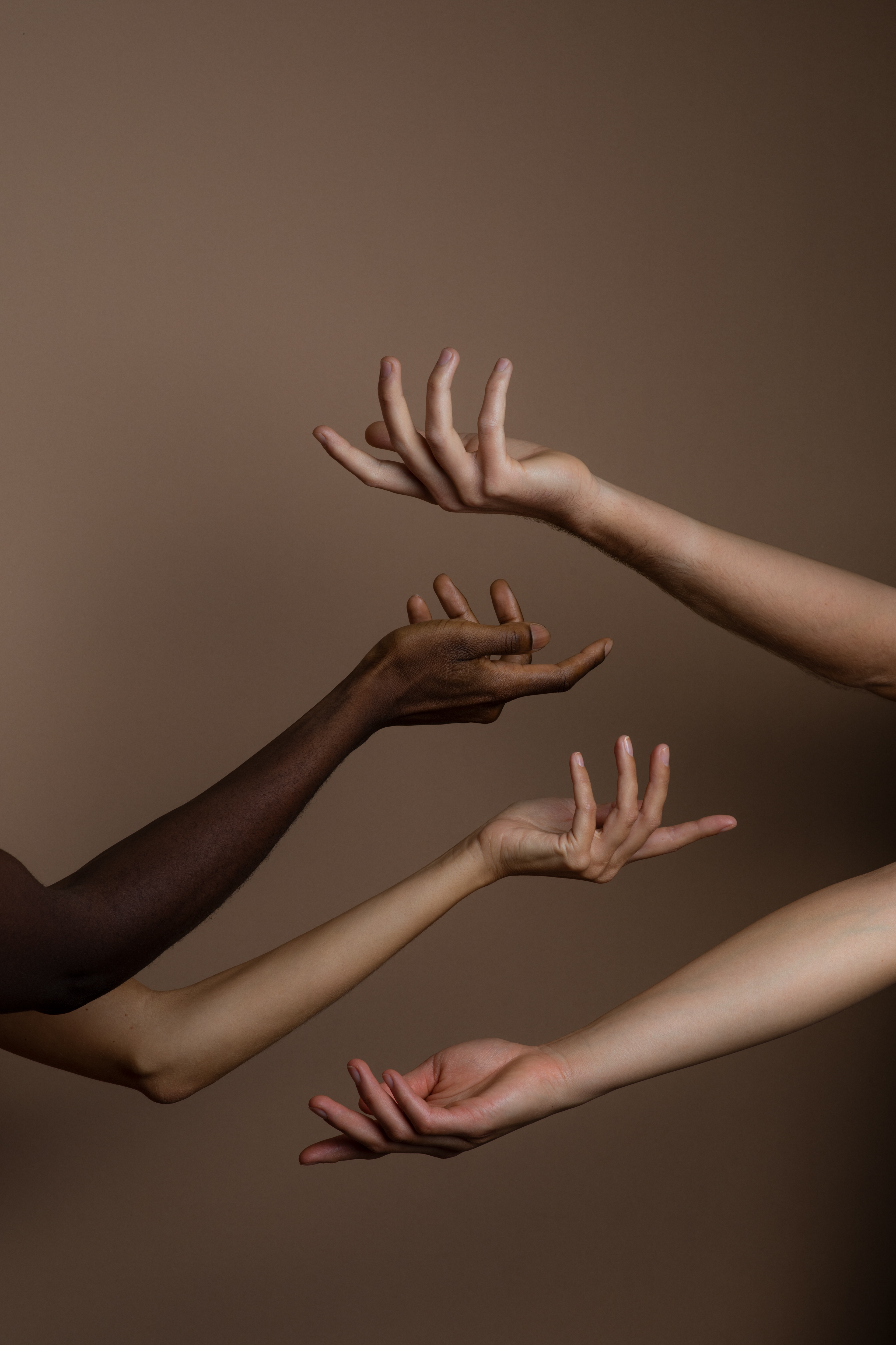
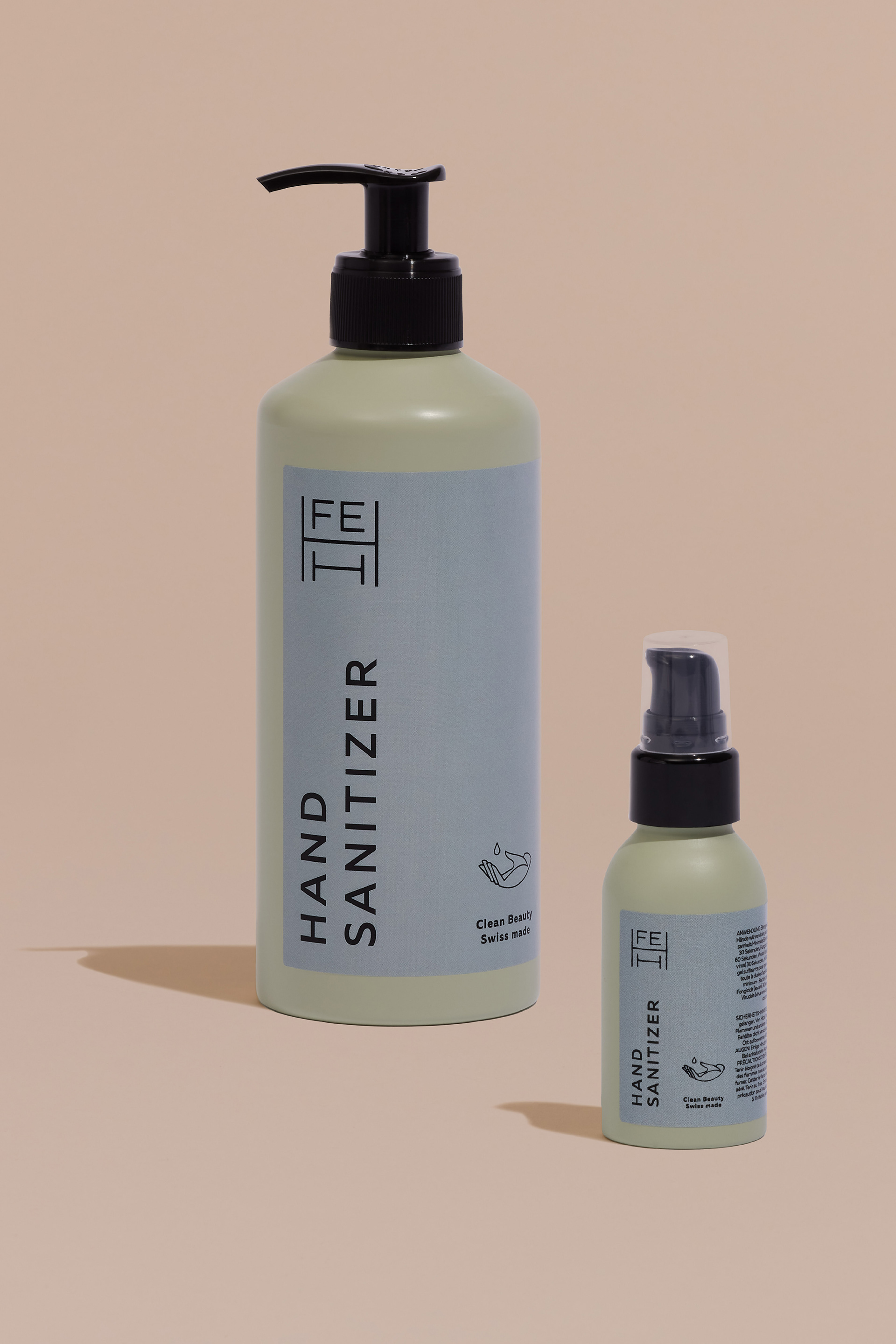
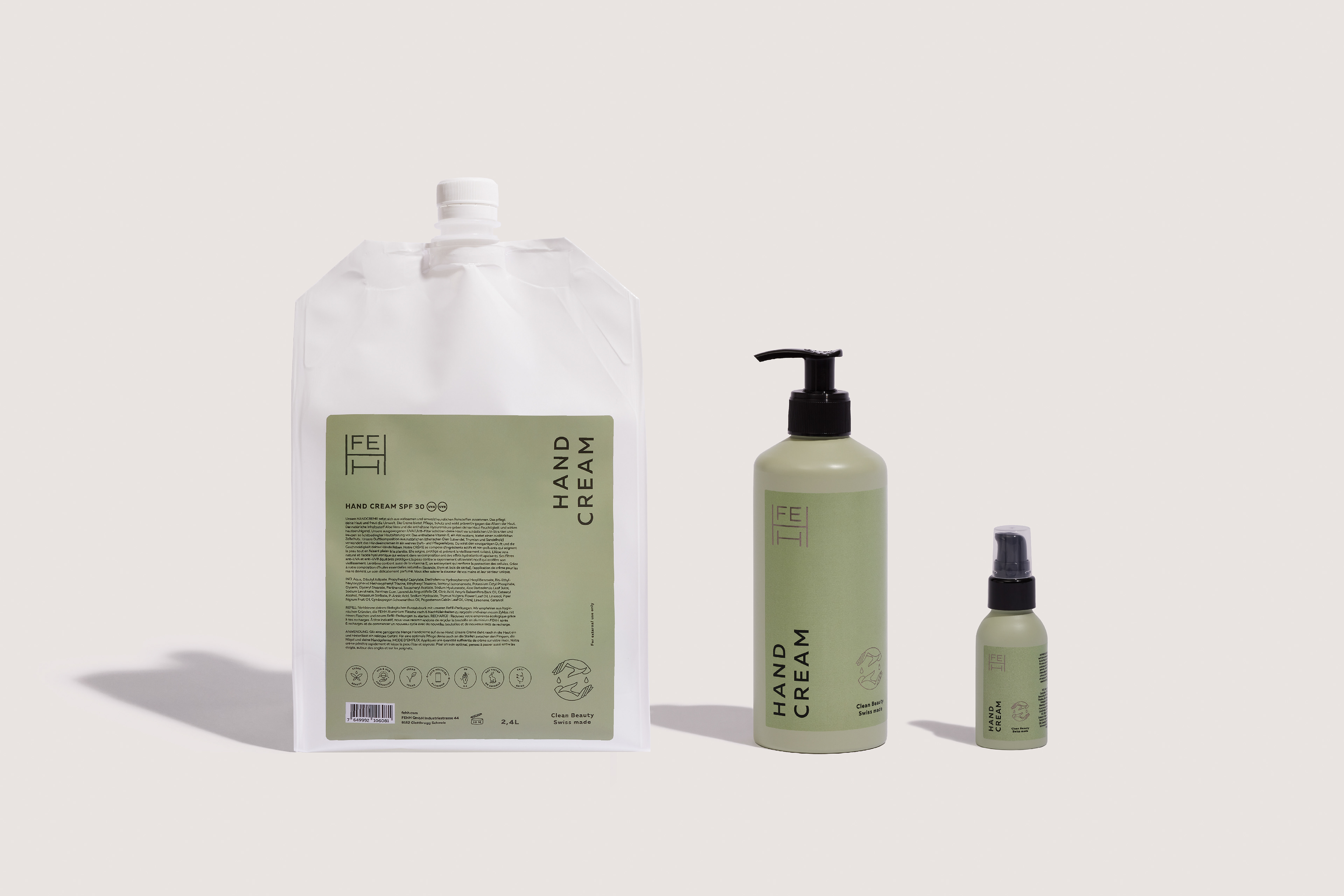
The founders of FEHH felt regular beauty products are tainted with a lack of pureness. They thought that every beauty product should be just as healthy as they are effective and decided to create a brand that focuses precisely on that. As a result, FEHH products embrace clean beauty, sustainability and pure minimalism. The graphic identity and packaging design reflect simplicity and clean lines to maintain the brand’s strong ethos. FEHH stands for Femme Étoile Homme Humain and is a proud beauty brand for all – hence we aimed to create an elegant but unisex outlook for the brand. We sought to catch the meaning of clean beauty in its purest form and provide FEHH with a visual identity that perfectly shows what they stand for.
Ph photography by FEHH
Ad art direction by Eszter Laki
Gr graphic design by Eszter Laki & Réka Imre
_______