C A S I N O M O C C A
Re-branding & package design for a Hungarian coffee roastery
_______
Casino Mocca is a proudly local Hungarian kávépörkölő (coffee roastery) that has changed the coffee game since coming on the scene in 2013. The barista champion founders of Casino Mocca were among the first to bring high quality coffee to Hungary, and while they receive recognition around Europe, they remain true to their roots and dedicated to their identity and values.
Thanks to their efforts and the passion they bring to their work, we can purchase and enjoy incredible coffee that has been ethically sourced from all over the world. Casino Mocca sources their coffee from Colombia, Brazil, Burundi, Rwanda, Kenya, and Indonesia, only working with small farms.
Afterall, we had been fans for a while. We’re happy subscribers of the Casino Mocca monthly coffee pack. The guys taught us what good coffee really is, how to make a proper v60, how to use aeropress, and much more. To put it simply, they took us from regular coffee drinkers to coffee aficionados, or even addicts, with refined taste and the skill to make a great cup of coffee in a dozen different ways.
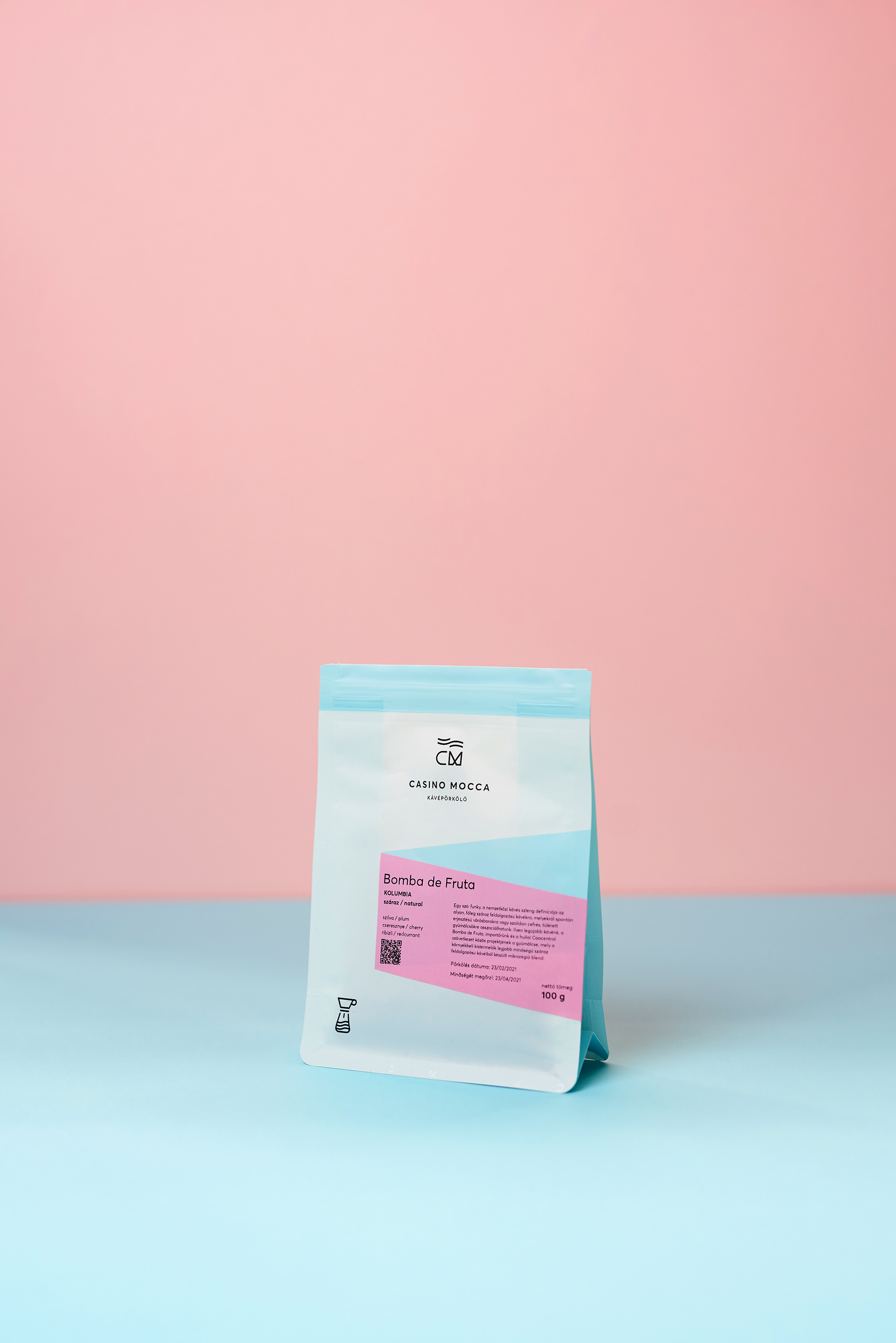
Our work with Casino Mocca began with a slight facelift to their logo. We wanted to bring a fresh, clean, and iconic look to their identity so that their logo would be instantly recognisable while remaining timeless.
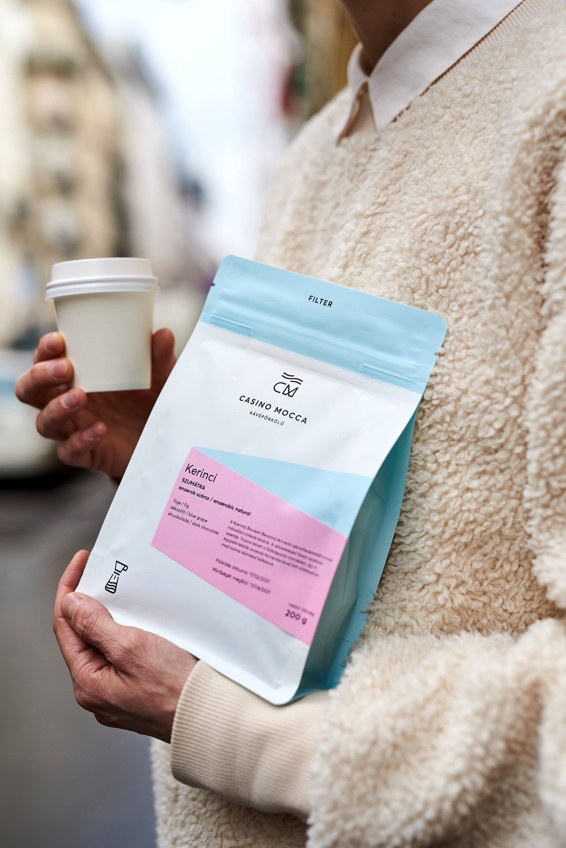
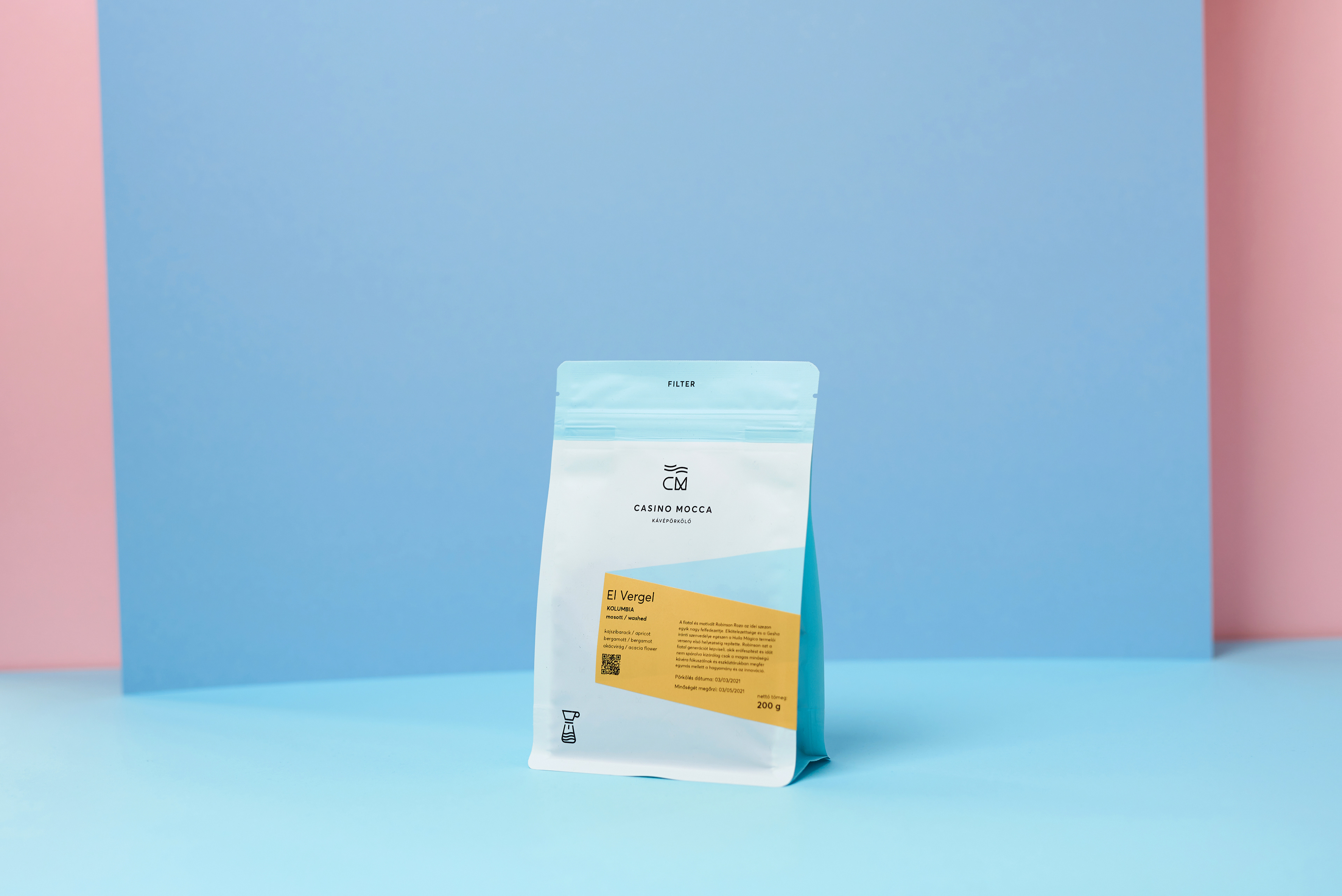
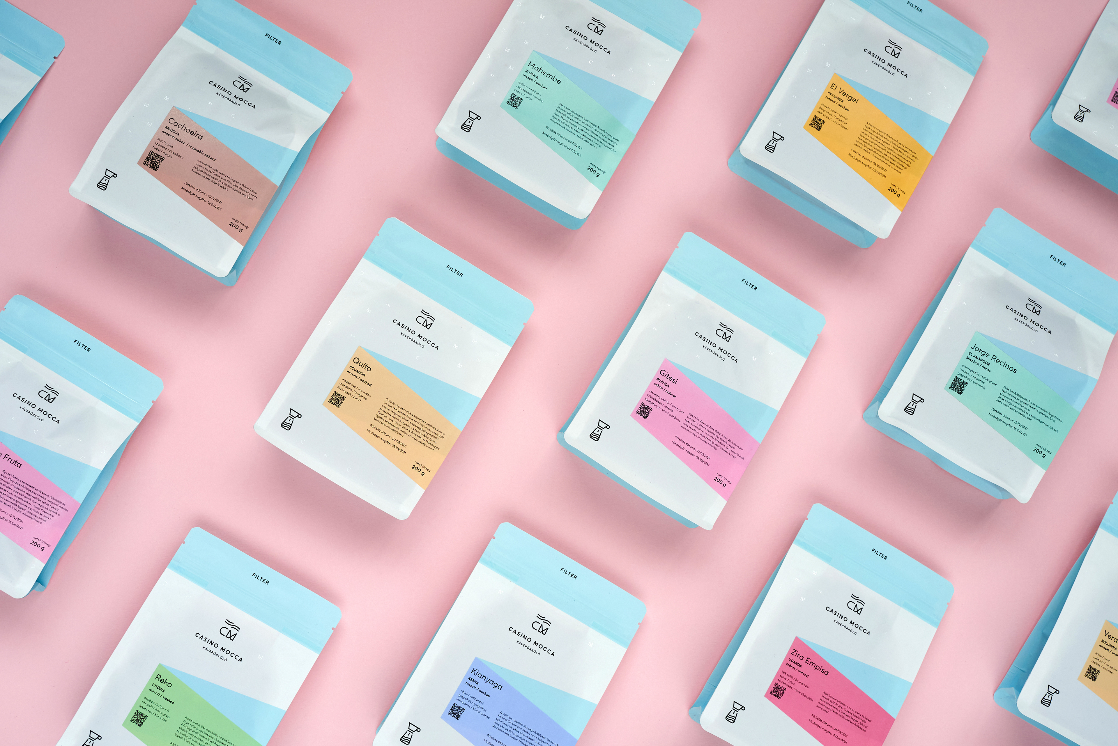
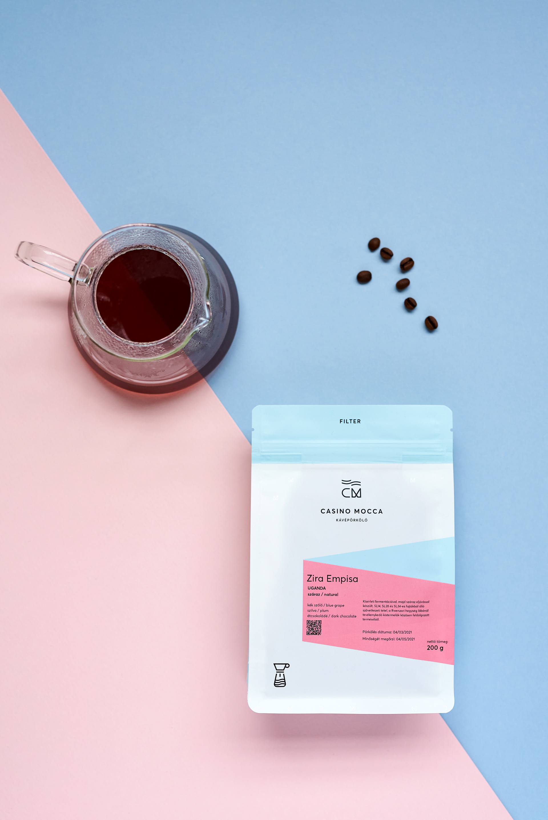
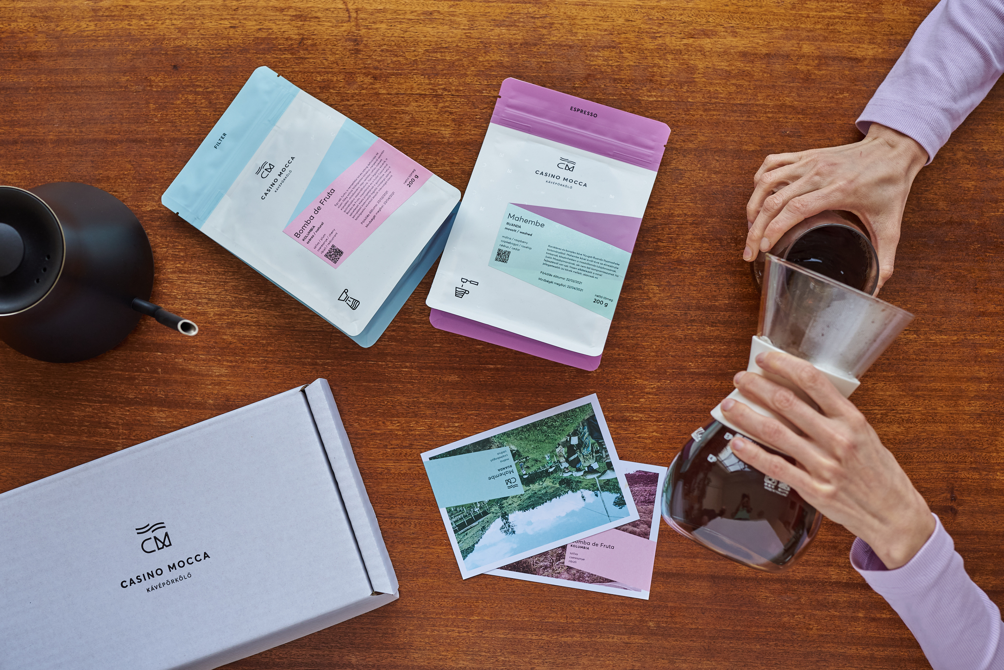
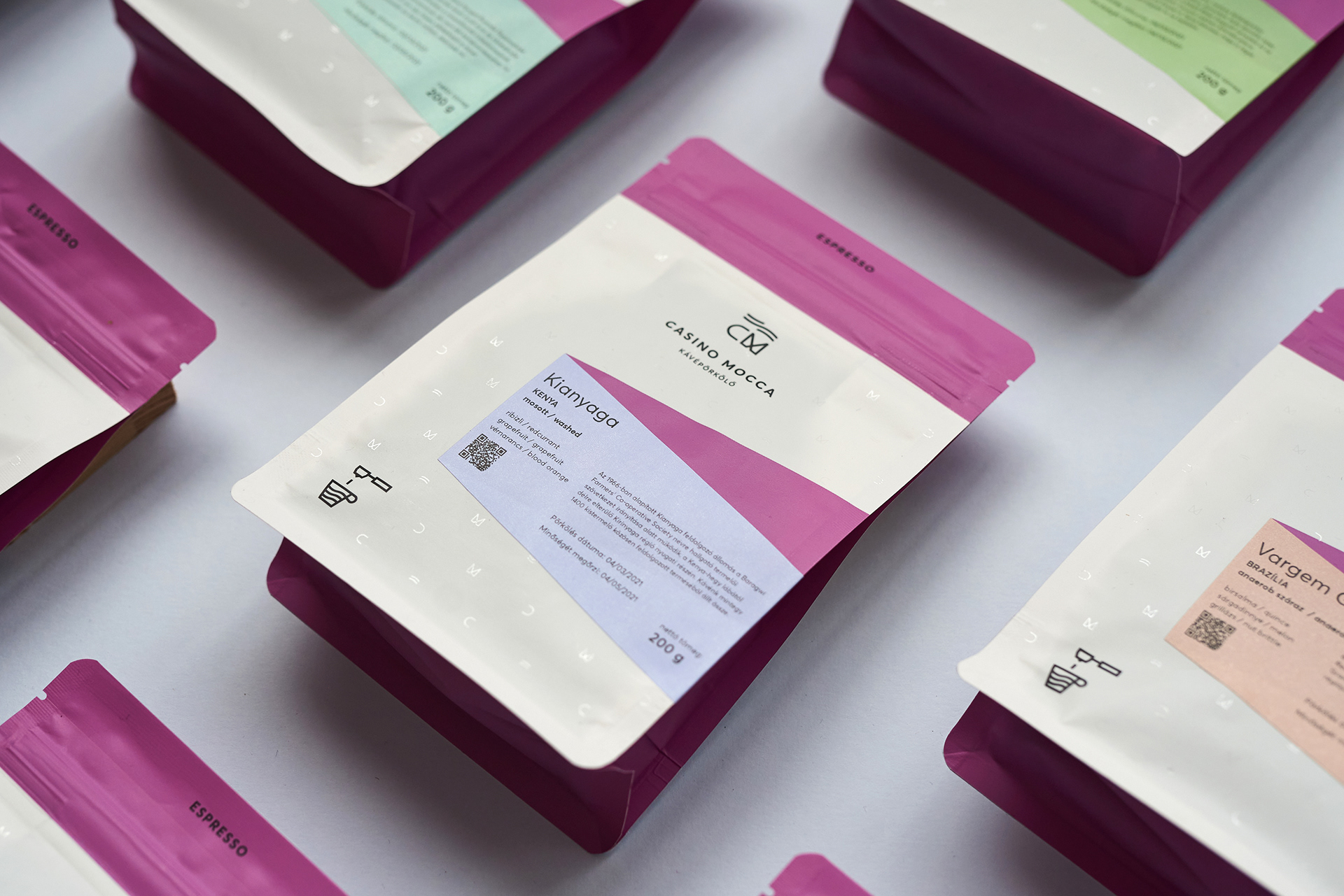
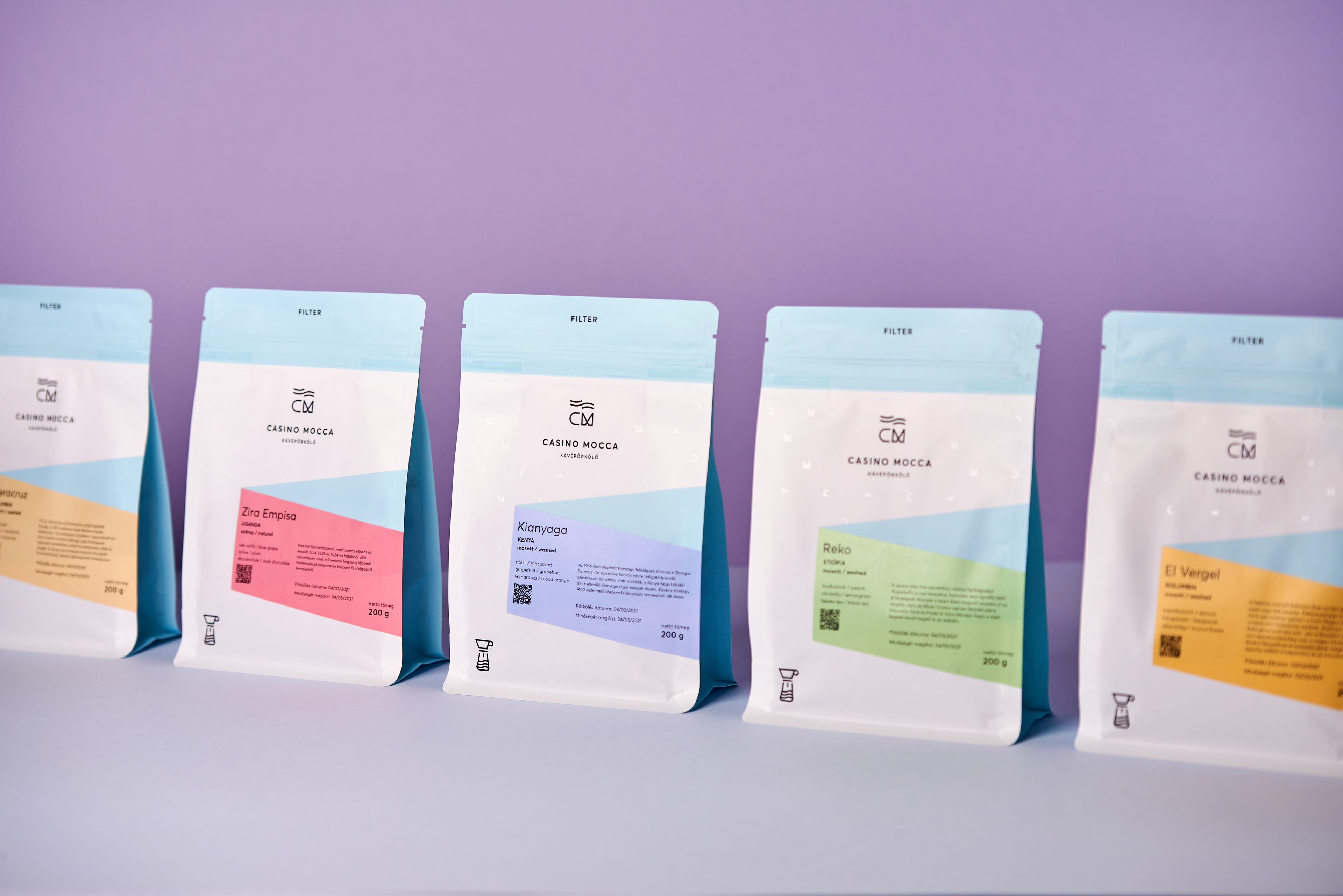
Next, we began our work on updating the brand with new materials and a visual system that could be applied across their communication platforms and packaging. First, we created a pattern, which can be seen as the glossy background of the matte finished bags of coffee. The pattern uses the elements of the logo to create a clean, minimalist backdrop to support the other elements of the brand.
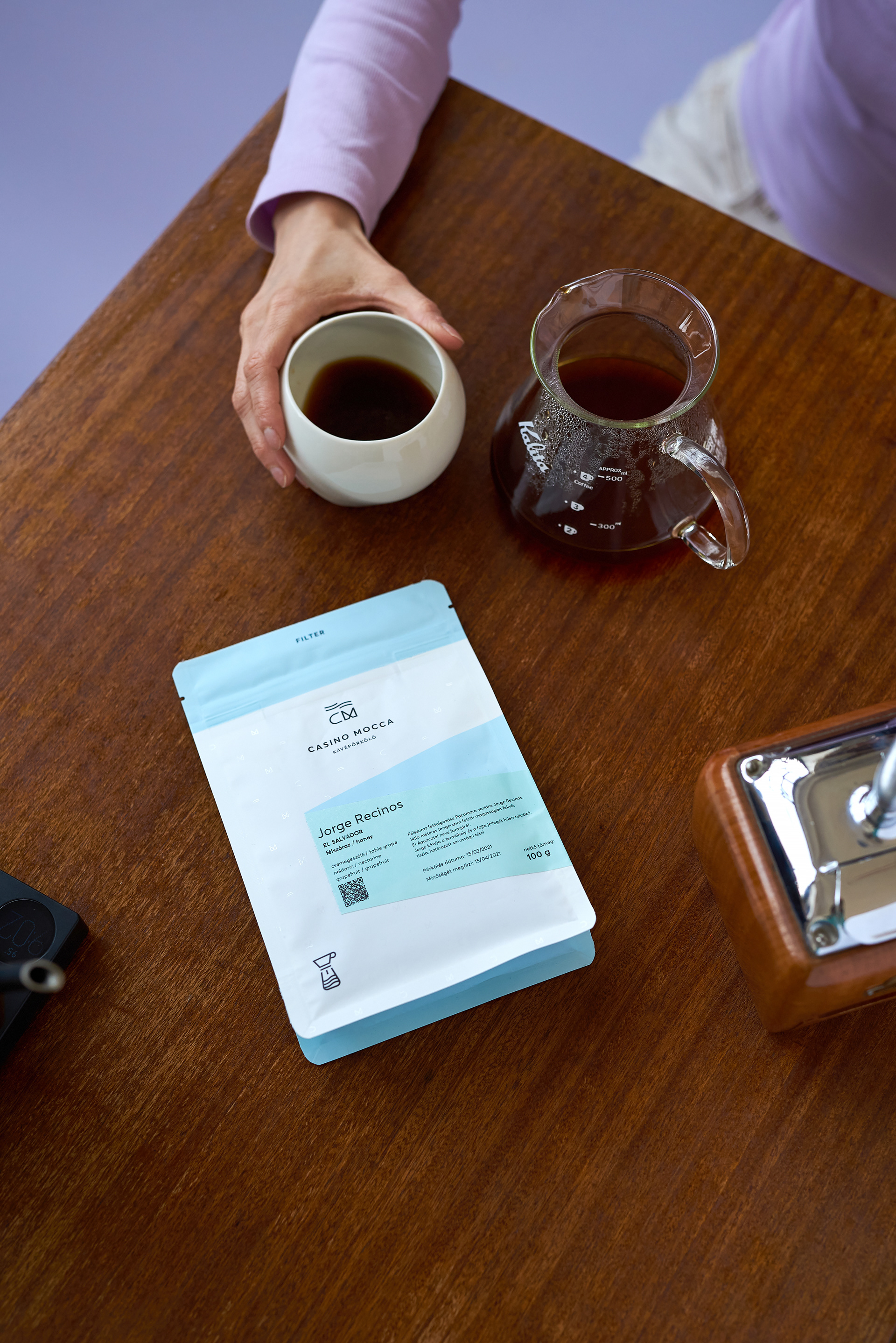
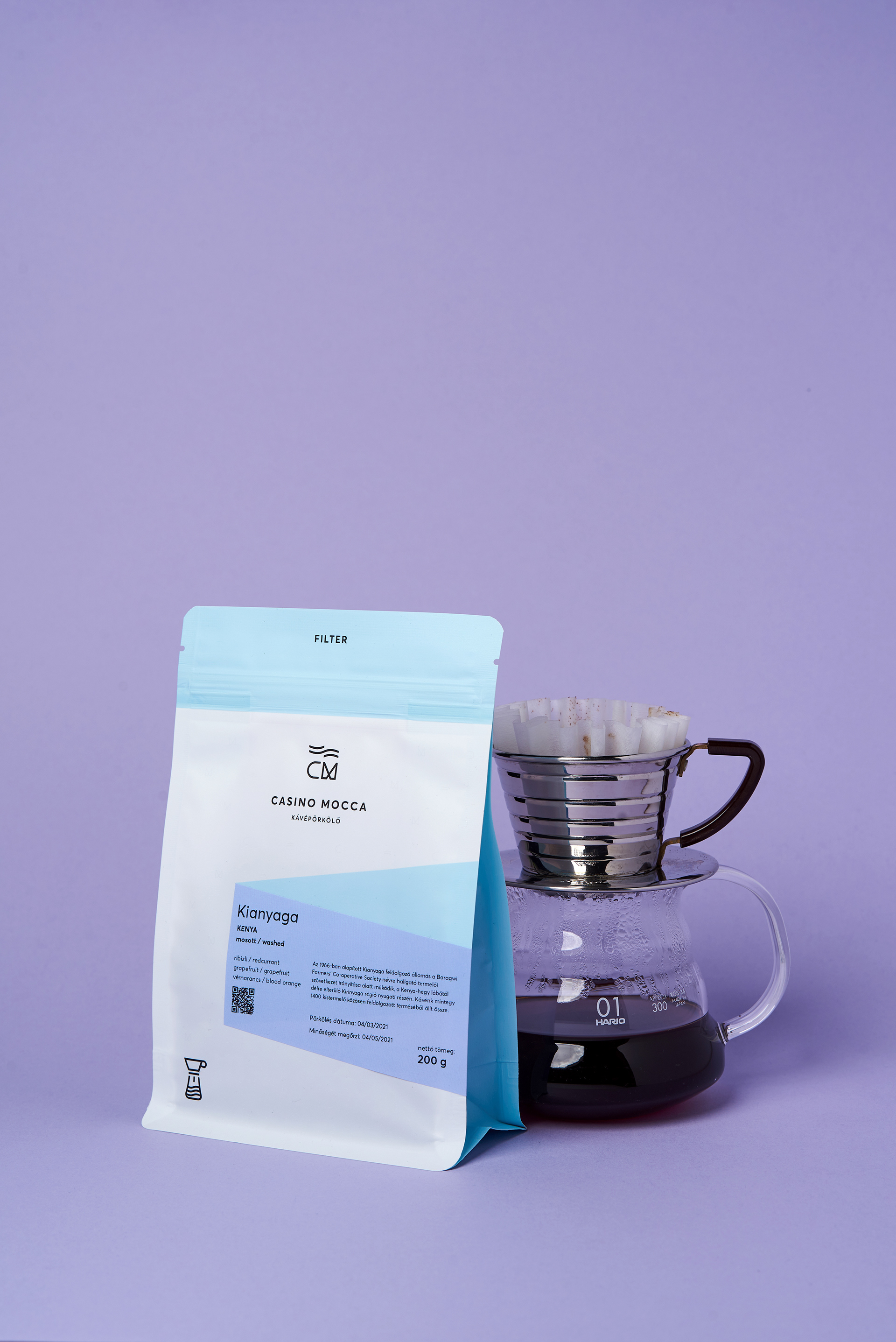
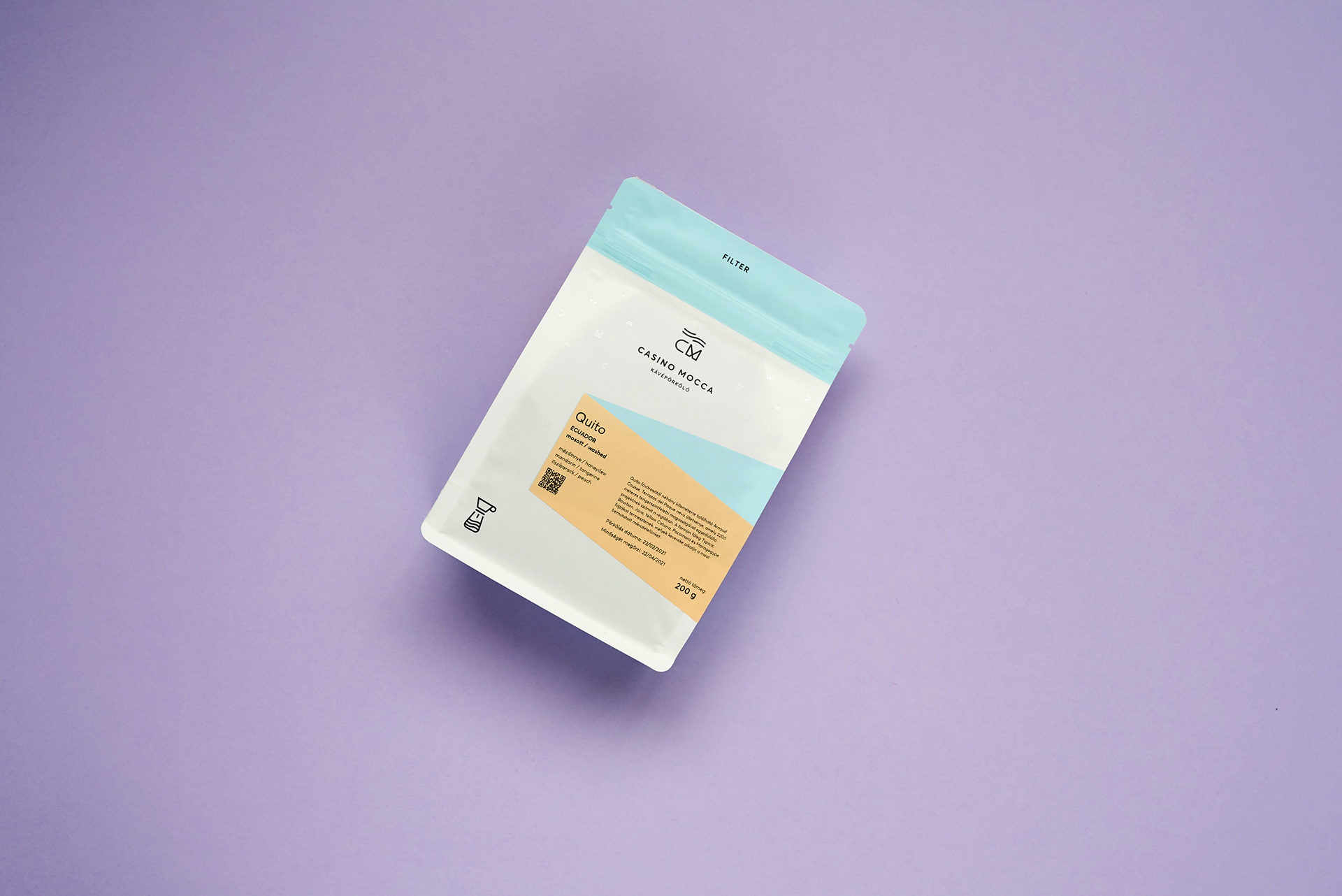
Considering the variety of products and their classifications, we used colour codes to differentiate between the types of coffee (blue for filter coffee and purple for espresso, for example), and between different tastes and flavours. We also added two icons to the package to help differentiate between express or filter coffee, making it easier for customers to select between products.
The goal was to create clean, visible packaging that is easy to update for new batches of coffee.
In other words, the design needed to communicate clearly and consistently in order to provide the customer with the information they needed and also catch their attention for new offerings.
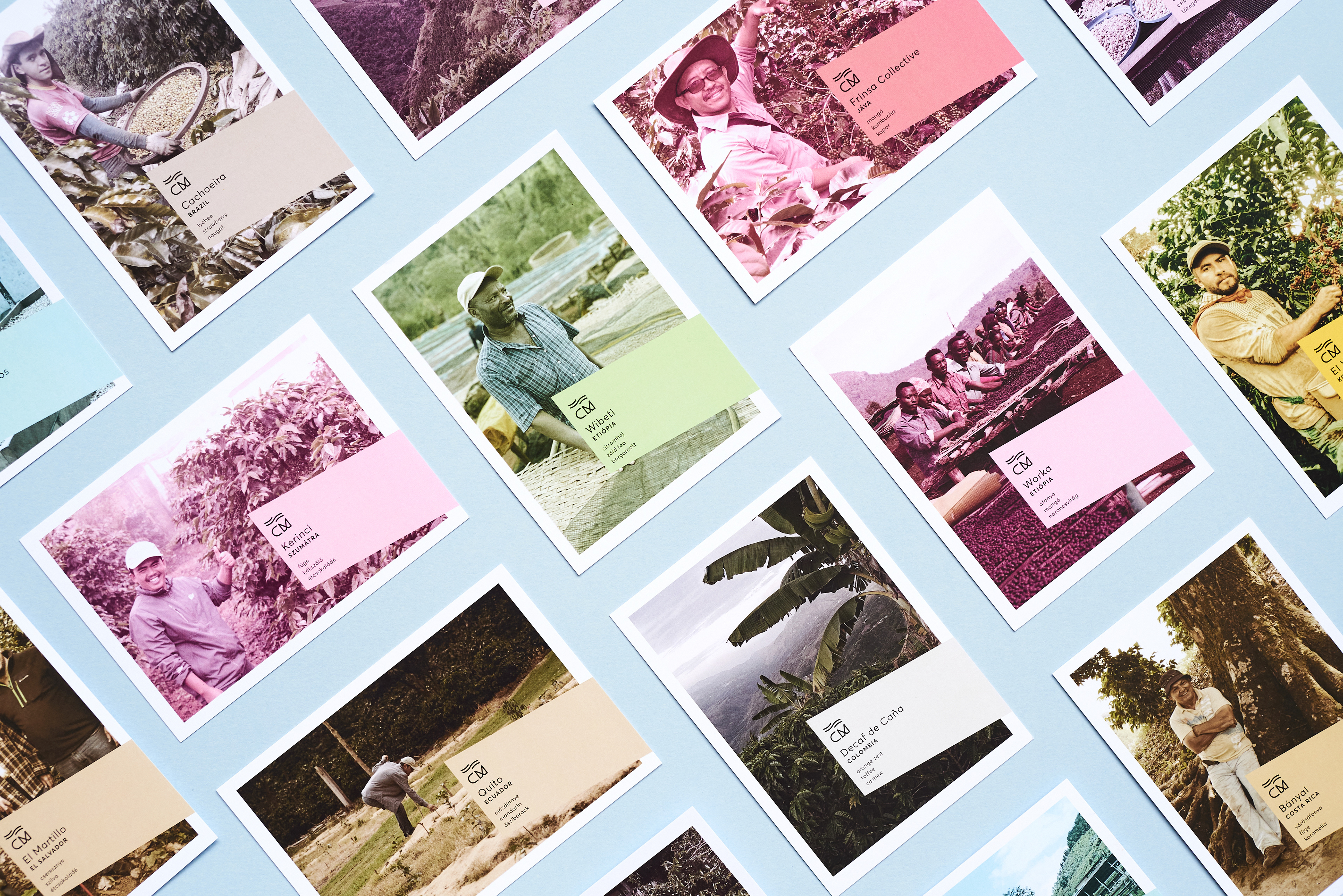
We also created postcards to help CM share the stories behind the different coffees they offer. The postcards feature photographs of the farms, and short stories about the farms and the people whose hard work, skill, and passion results in the incredible products we get to enjoy in our own homes.
Ph photography by Andras Zoltai
Gr graphic design by Eszter Laki & Réka Imre
_______