B E L L I D I M A M M A
_______
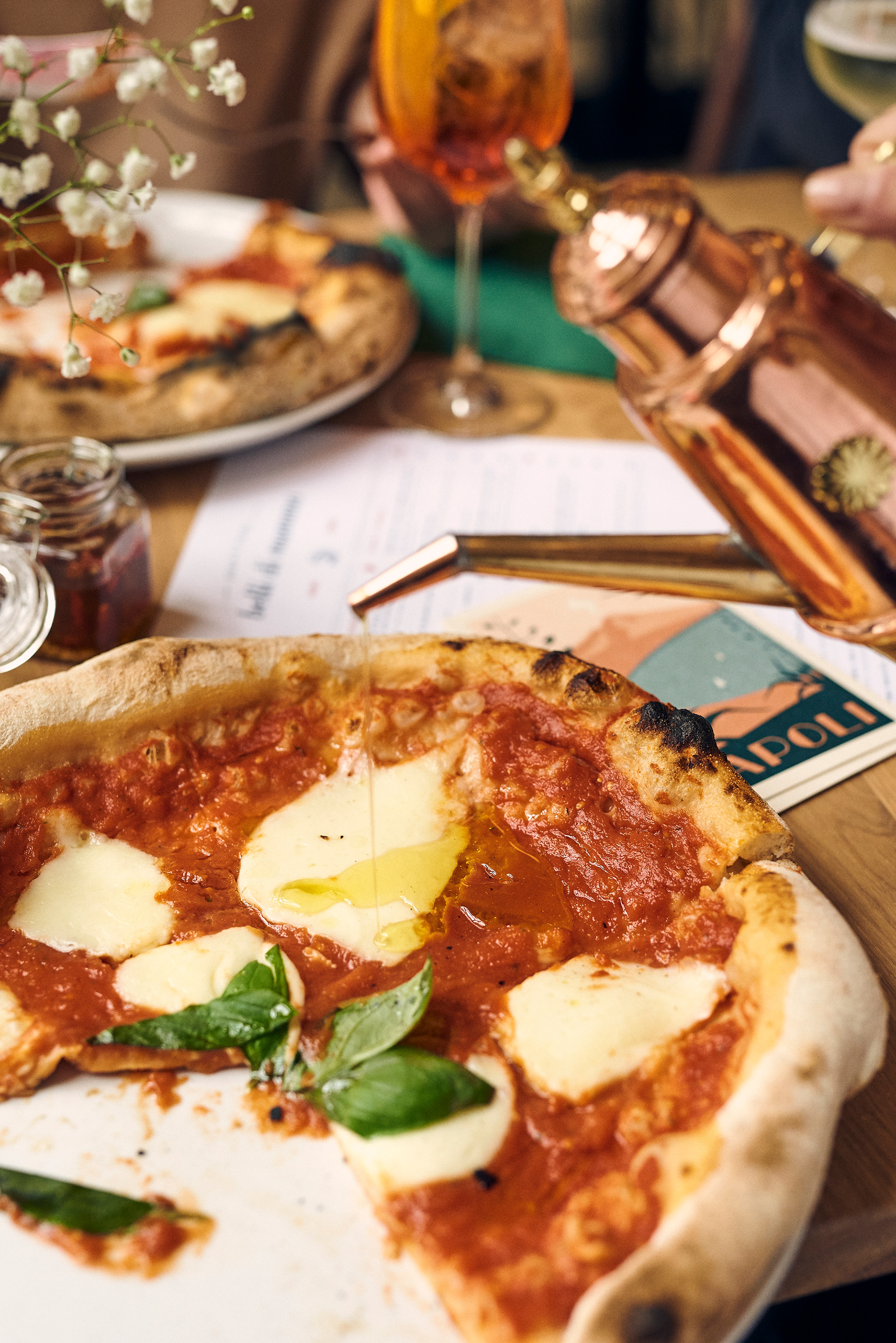
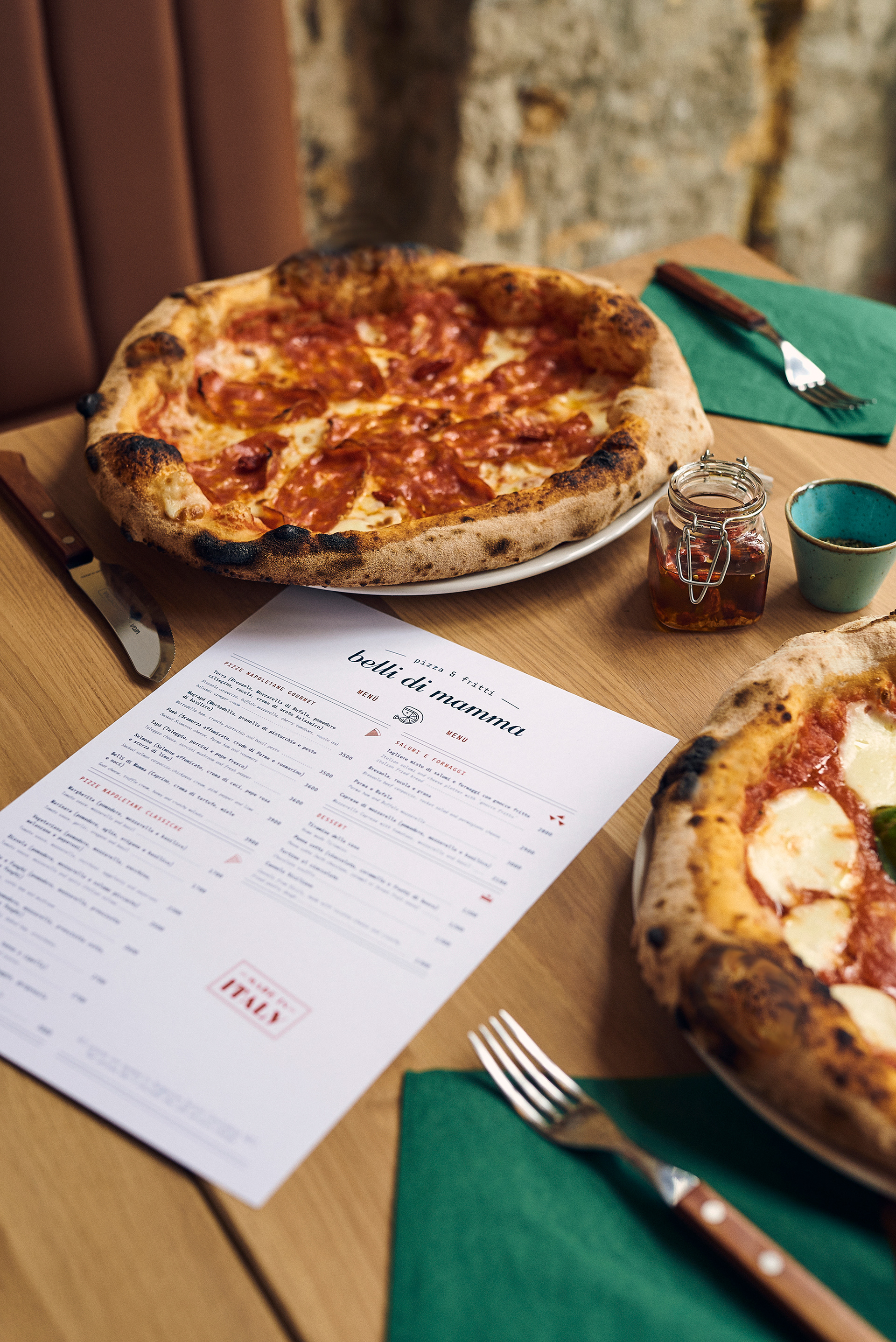
Napoletana restaurant Belli di Mamma opens its doors in Budapest to bring us deeply comforting southern-Italian street food. Belli di Mamma serves up classical Napoletana and gourmet pizzas and the utterly satisfying crunch of deep-fried fritti. Hailing from different cities around Southern and Northern Italy, the owners bring with them a deep understanding of how to create authentic, honest food that transports you to the shores from where these delicious dishes originate.
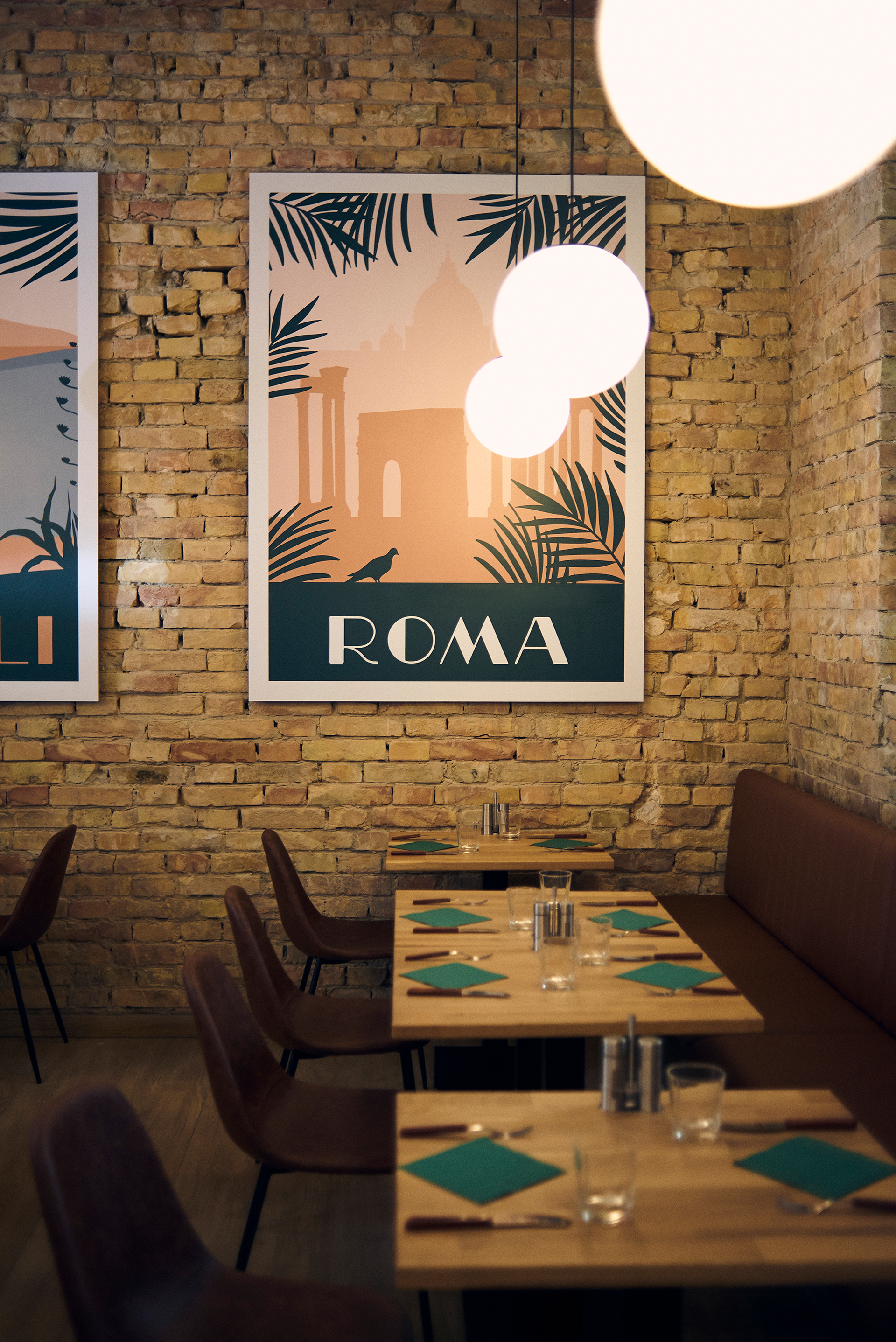
To create a setting as authentic as the dishes served in it, architect Anikó Tóth worked with the original details of the century-old building that houses the restaurant. She discovered and exposed the original structure and bricks beneath the facades that have gone up over the years, and paired them with modern elements to complement and enhance the surroundings.
Working with people who love their craft and excel at it was very inspiring for us. Our work pays tribute to their passion, talent, and of course, the delicious food and rich culture of Italia.
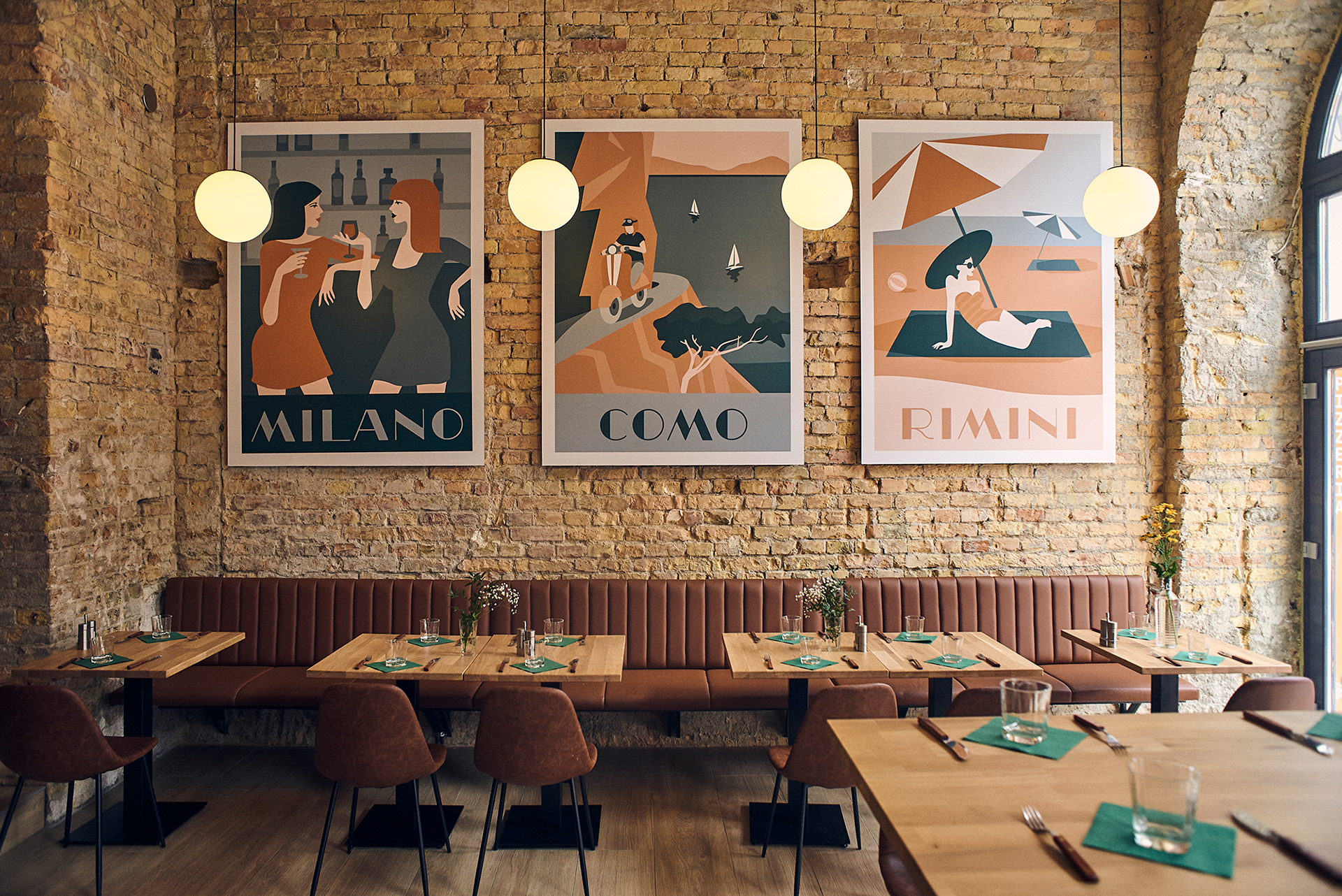
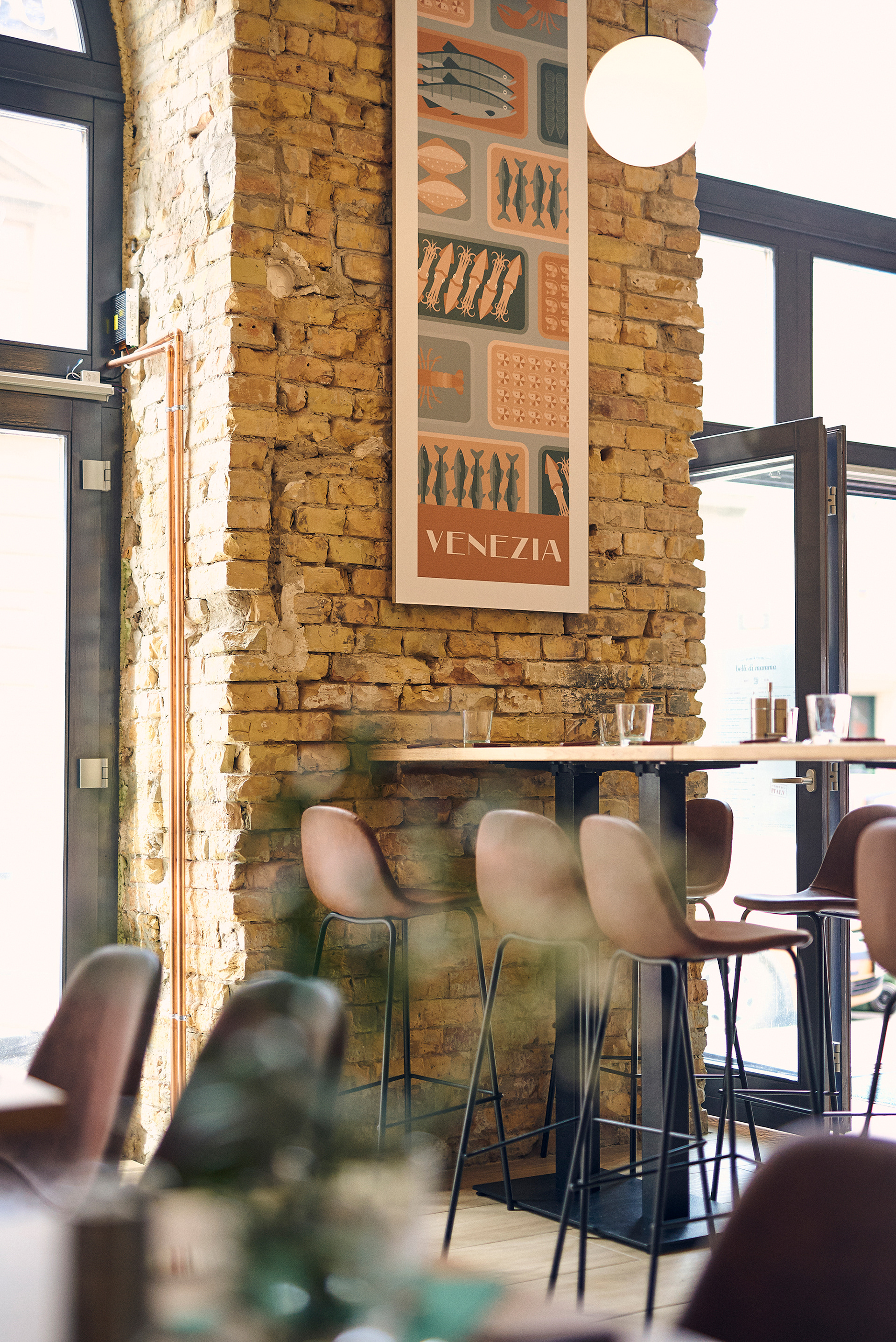
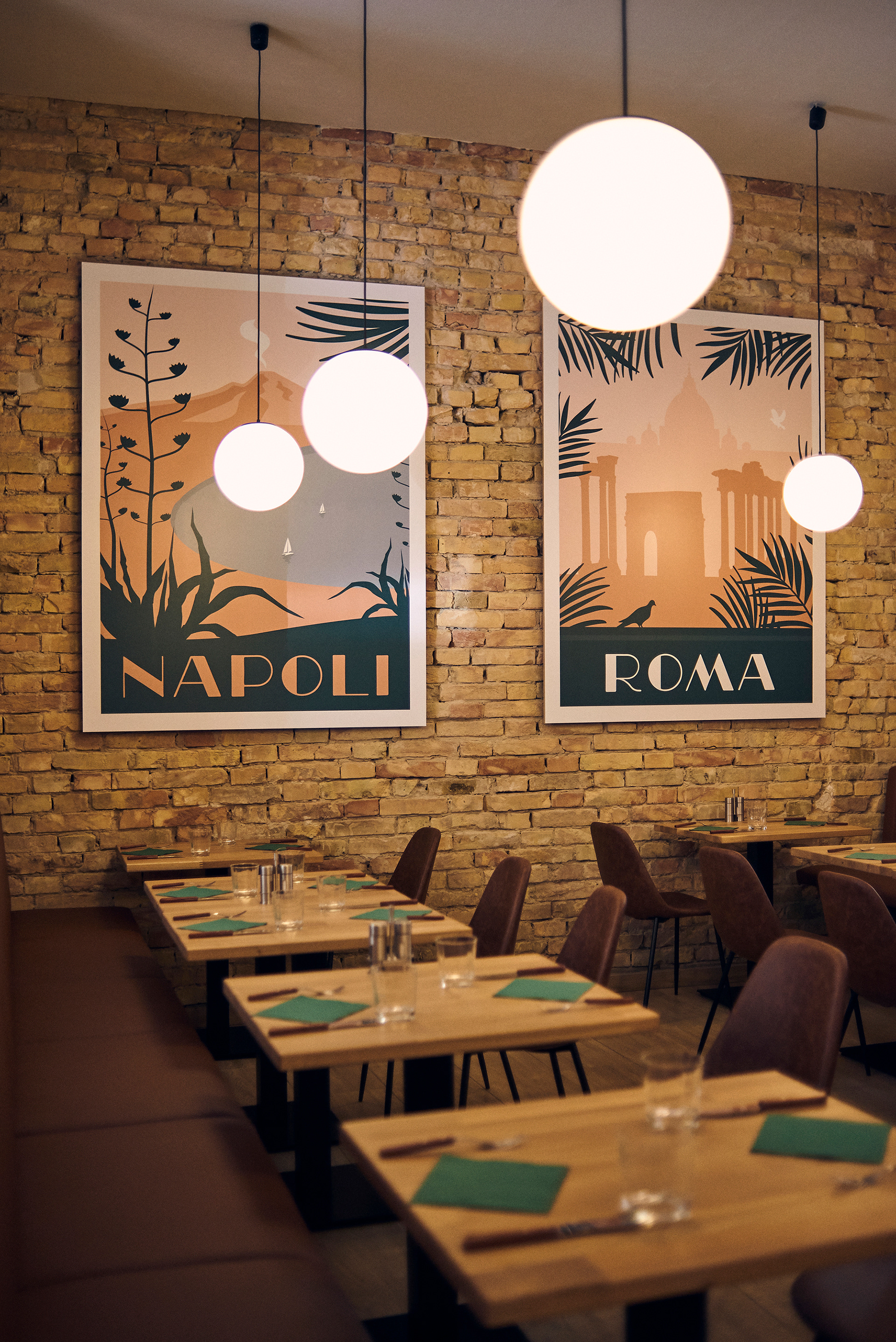
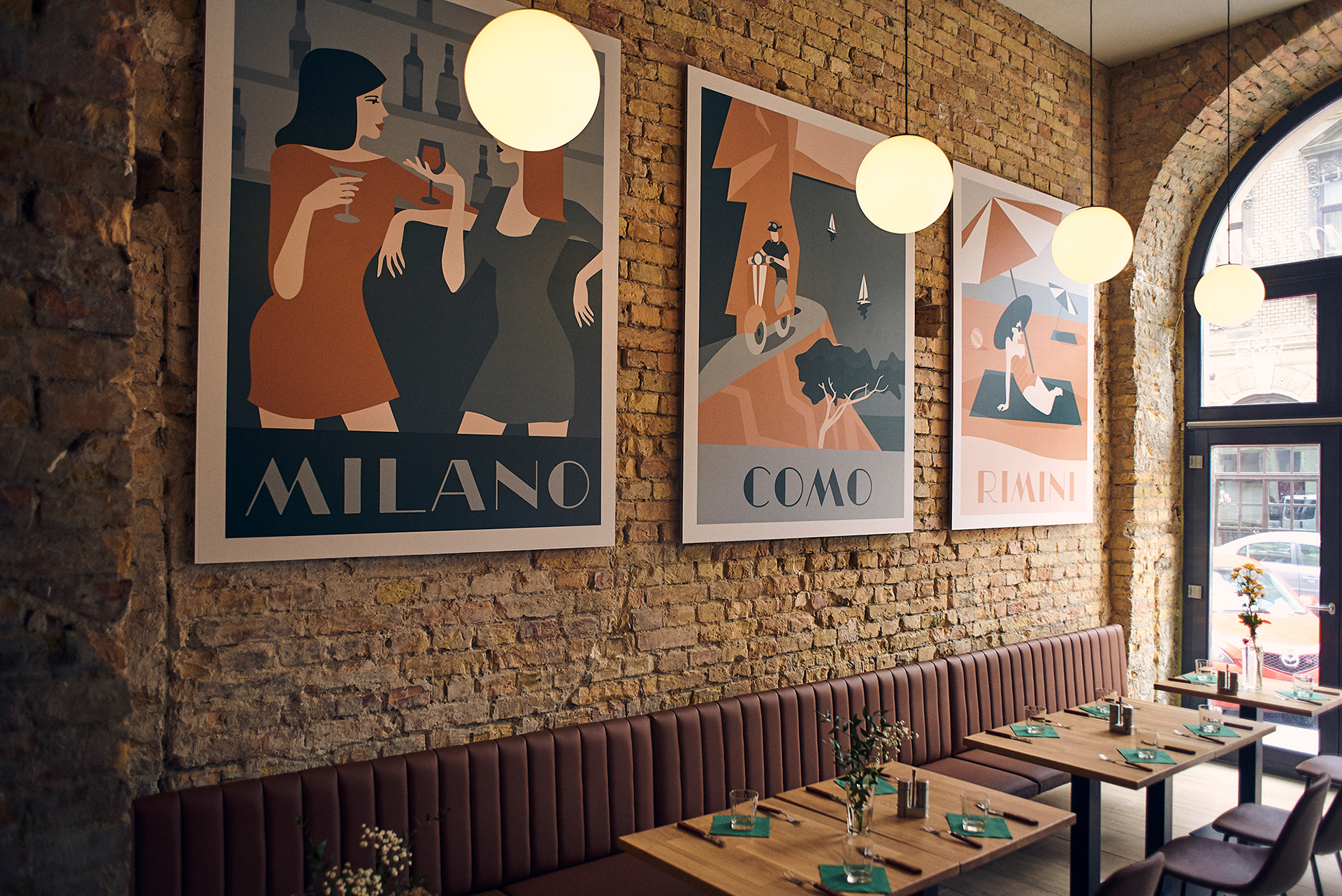
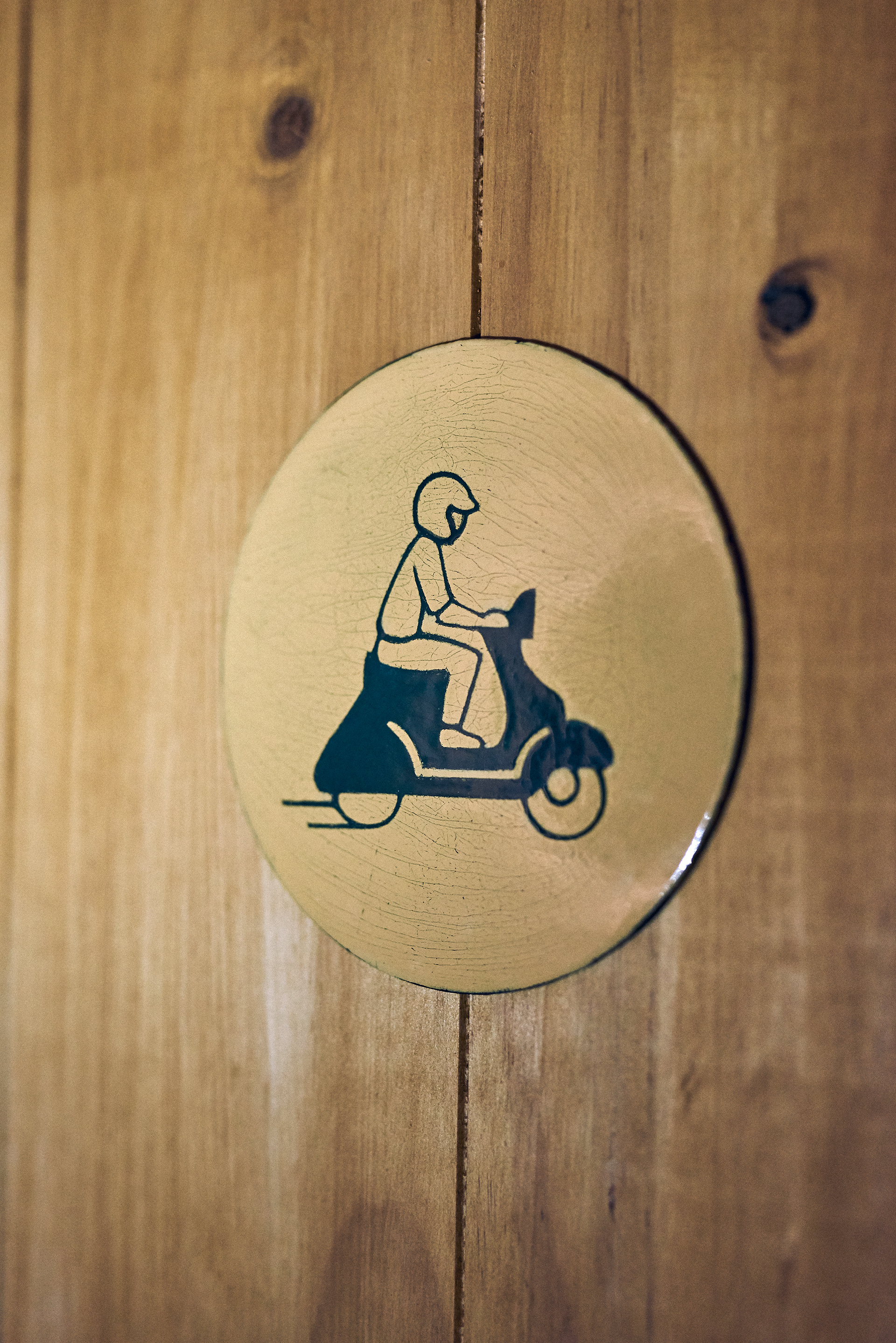
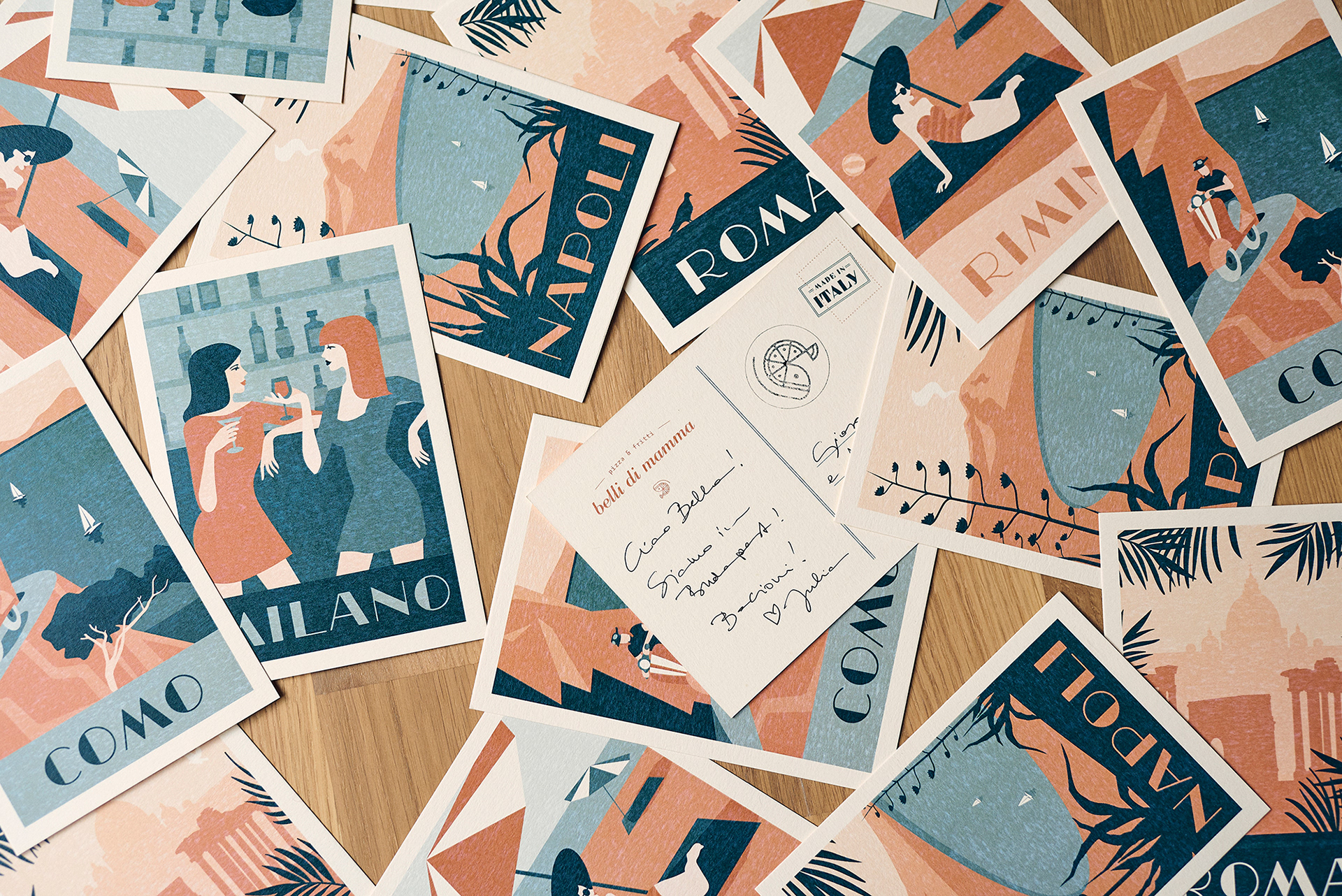
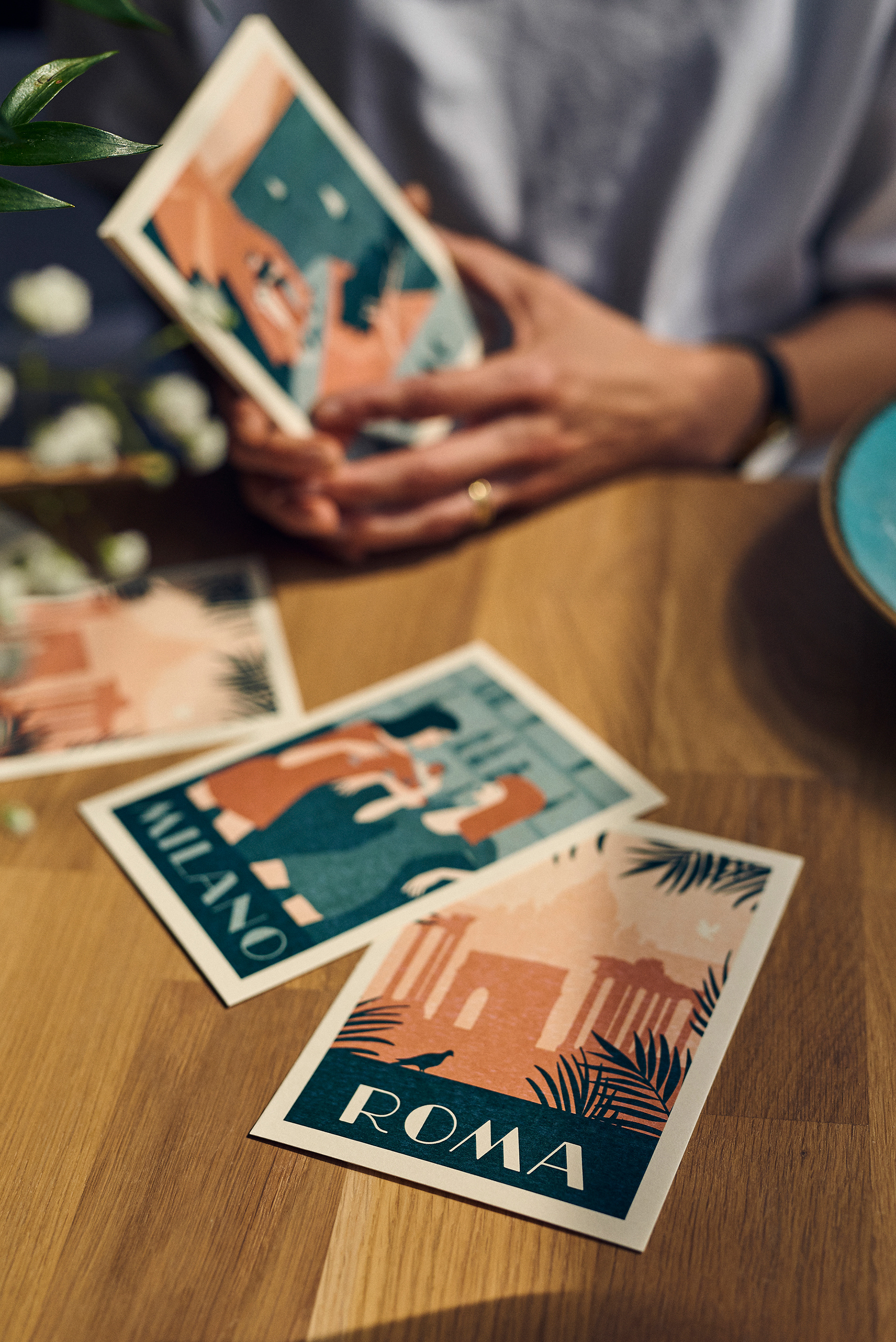
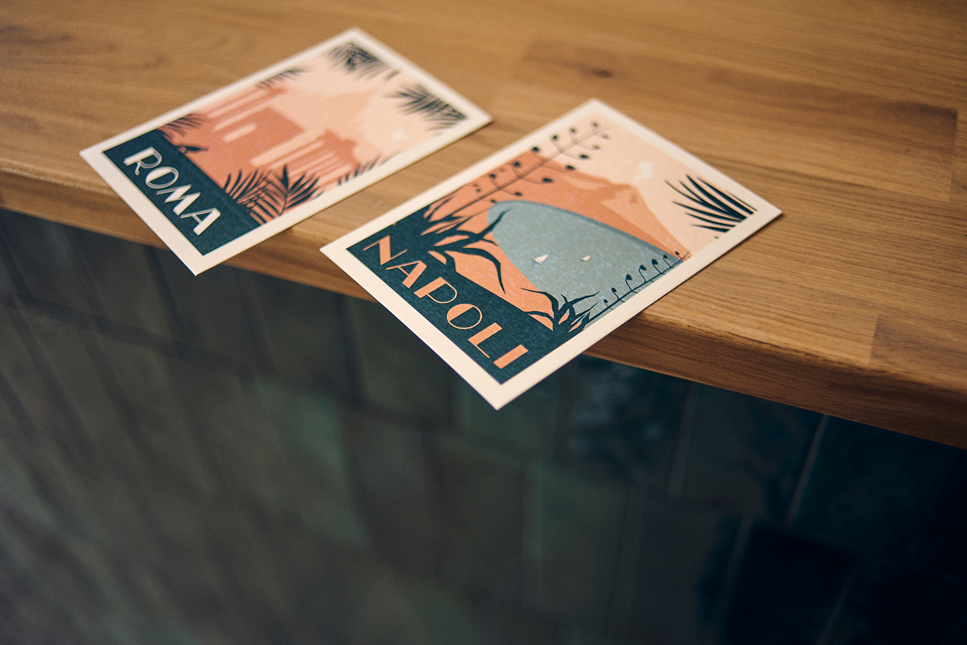
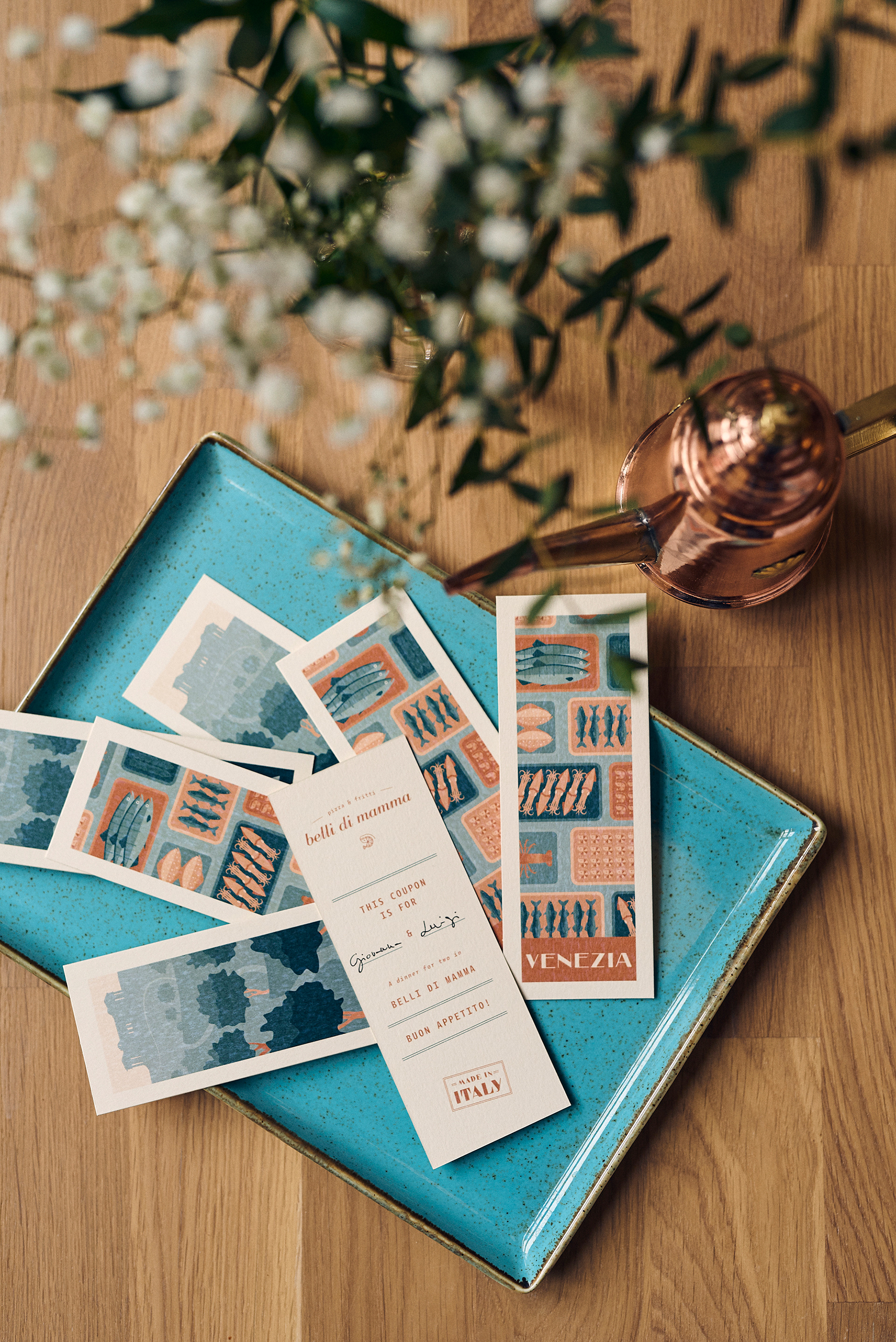
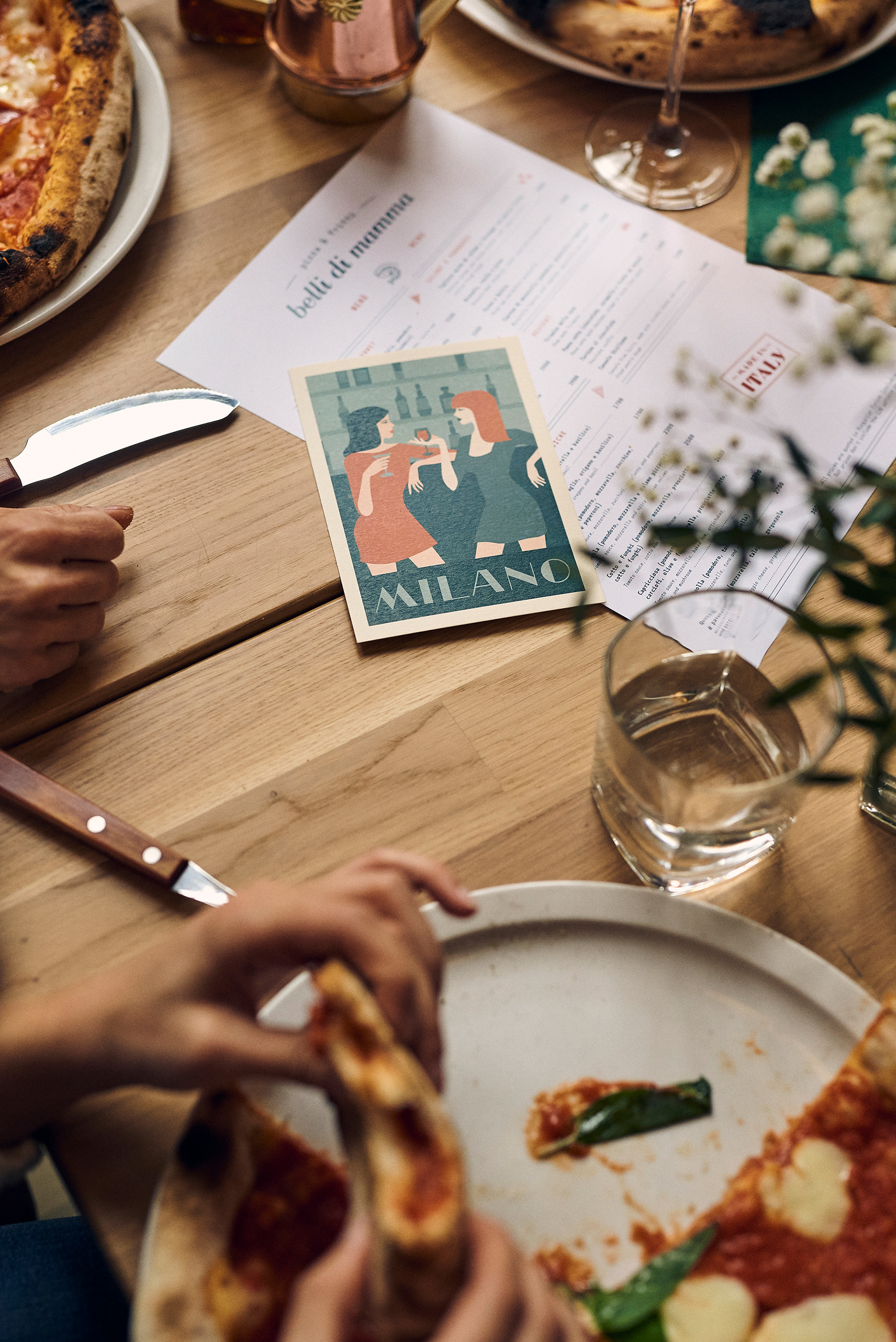
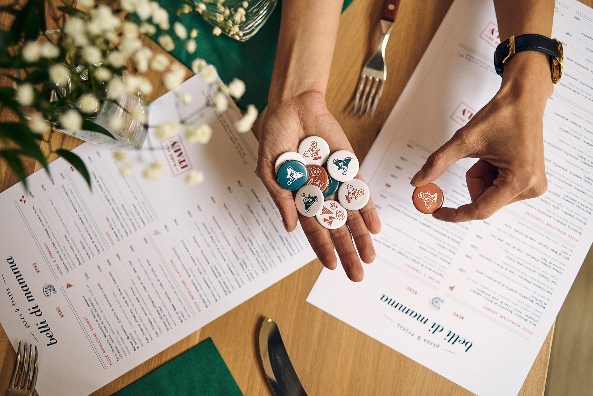
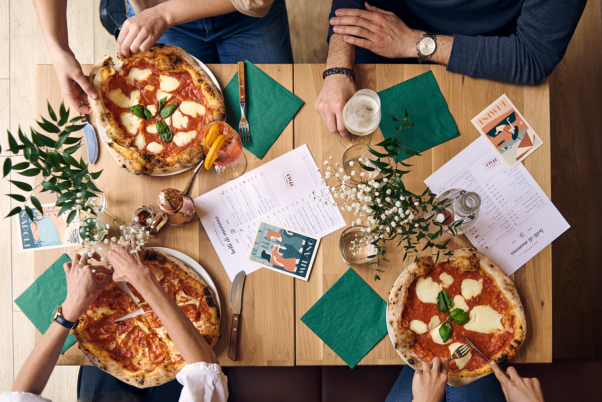
The graphic design of Belli di Mamma’s interiors was inspired by travel, comfort, and simple pleasures. The delectable food and the wholesome concept of the restaurant gave us a feeling of being whisked away on a summer holiday. Scenes from classic films and postcards, dreamy snapshots of warm days, twinkling seashores, and colourful citylife filled our heads and came through in our designs. To set the scene, we created huge city posters to display on the exposed brick walls, resulting in a beautiful contrast between the posters’ clean lines and colourful shades, and the raw walls. Inspired by classic Italian poster design, we paid homage to Milano, Sicily, Rome, Napoli, Rimini, and Venezia with illustrations of girls sipping Martinis, a man riding a vespa, and a seaside shore dotted with colourful umbrellas. After their culinary trip, customers can take home mementos in the form of postcards and coupons with the same designs as the posters, as well as colourful badges displaying the icon we created for Belli di Mamma’s logo. The journey of each element we use in our designs is an essential part of the process to realising our concepts.
We found the typeface we used for the city names in a font book published before the second World War. This gave the designs authenticity, and made us feel more connected to the time and place we are looking to convey.
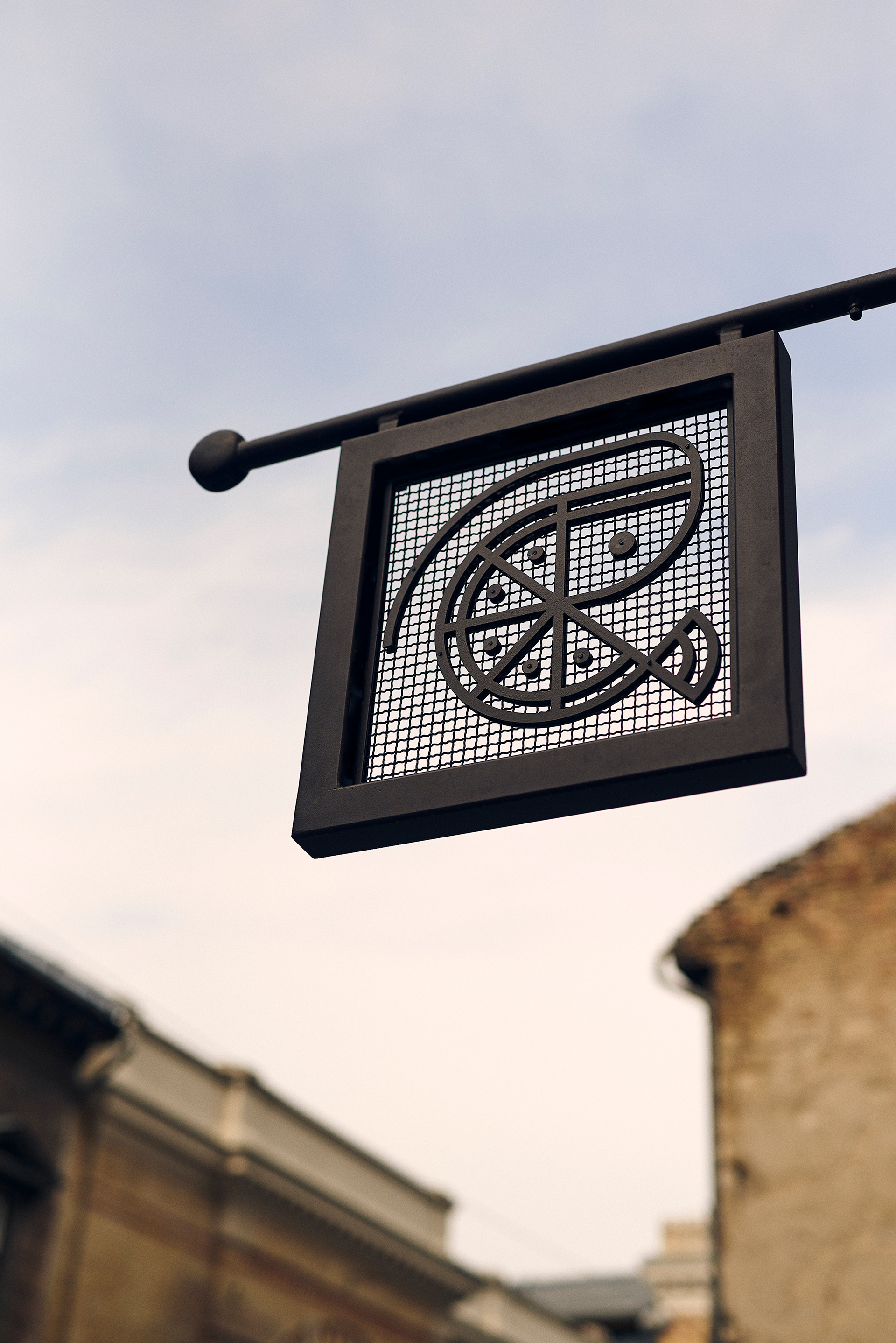
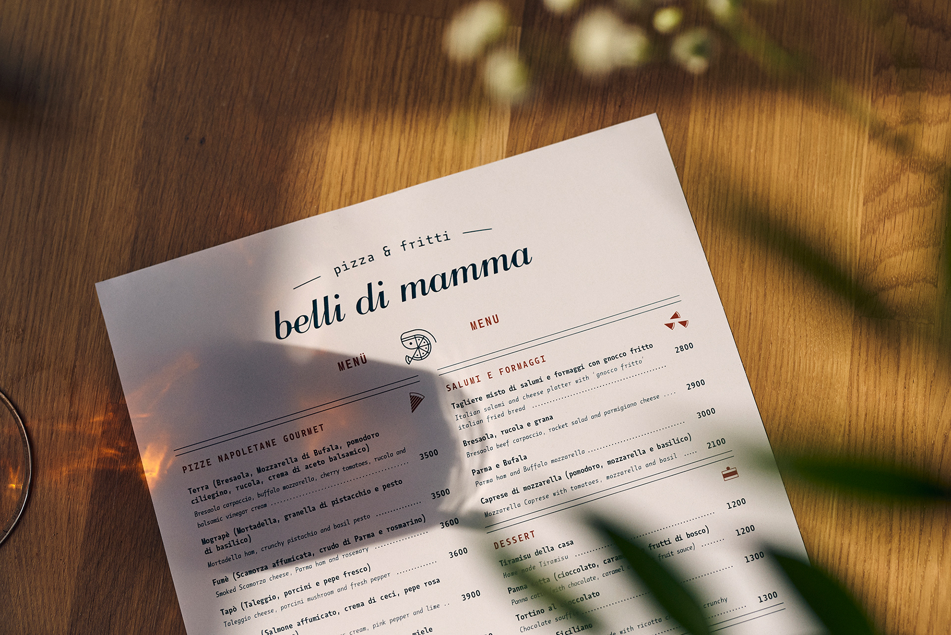
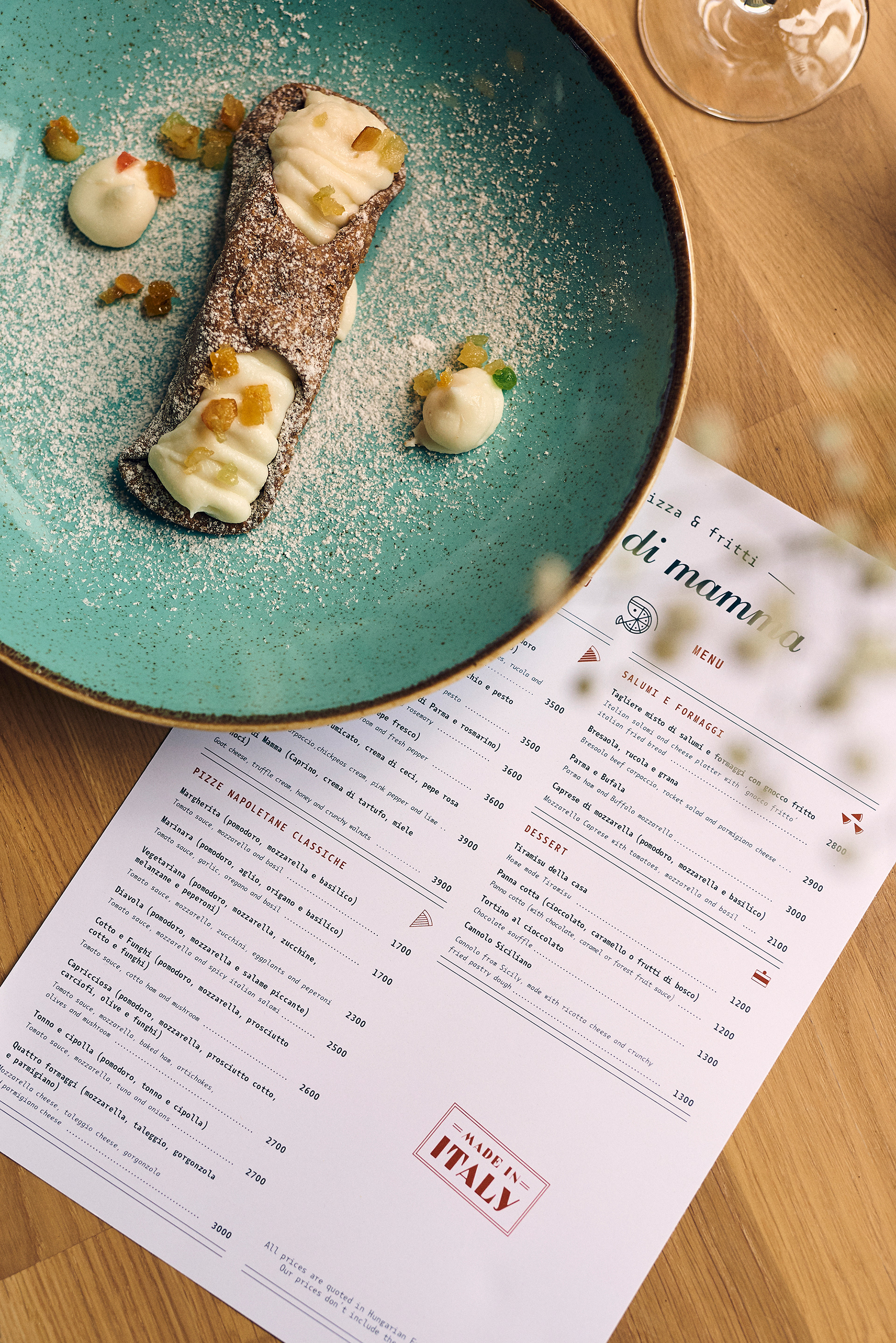
The unifying point of every branding project is of course the logo. Our aim was to represent the inspiration behind the restaurant and the food served, which of course is based on the pure joy of Mamma’s cooking. The name Belli di Mamma directly translates to “mommy’s tummy”, an Italian expression that means even bad guys love their Mamma’s food. This wholesome humour set the mood for our designs. The name Belli di Mamma is displayed in italics, in a classic Italian typographic style - both simple and elegant. Just like Mamma and the dishes she creates. Paired with the name of the restaurant is the icon we created for the logo. The icon is made of a pizza and a gambaretto; joined together they symbolise the pizza e fritti, a match made in heaven.
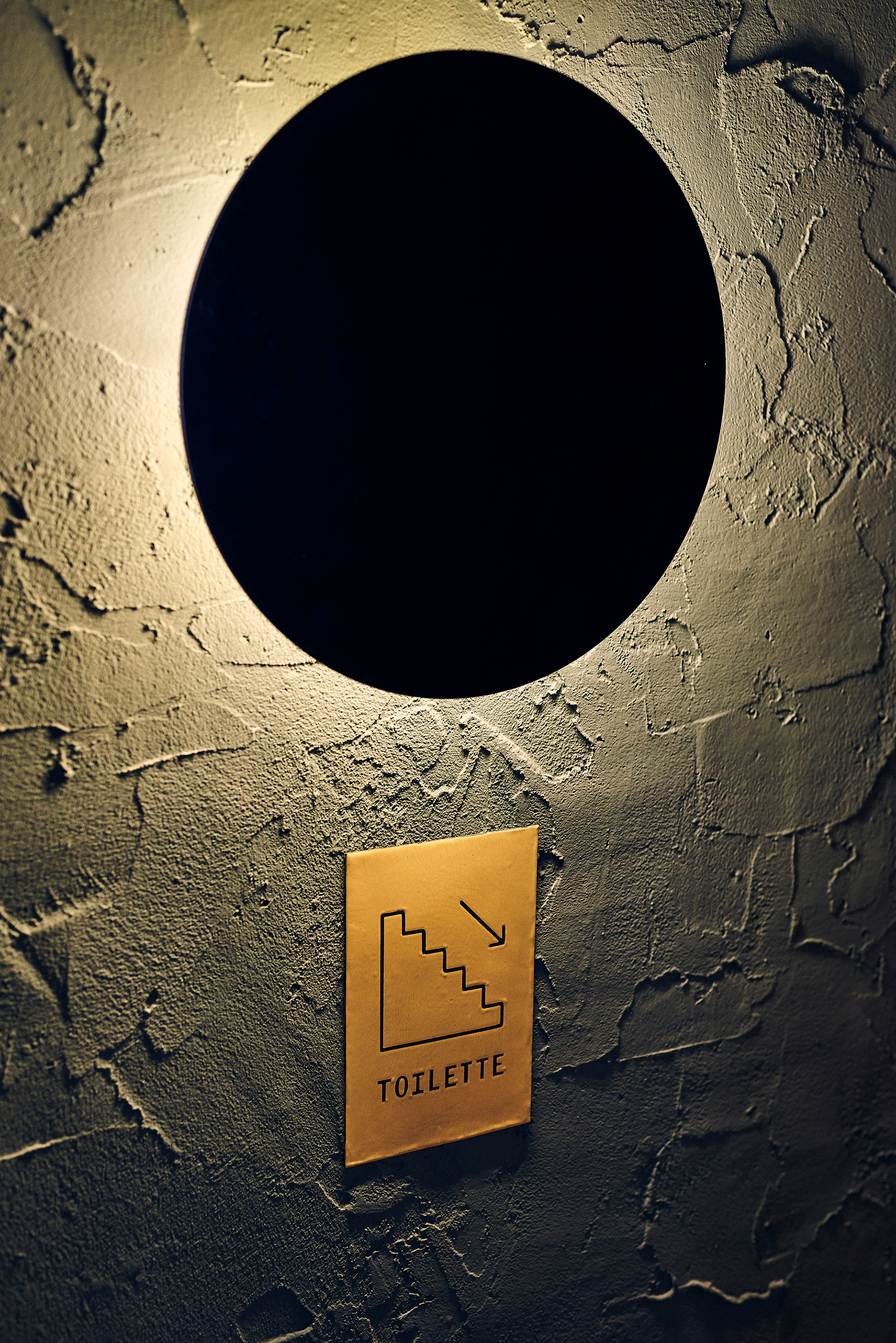
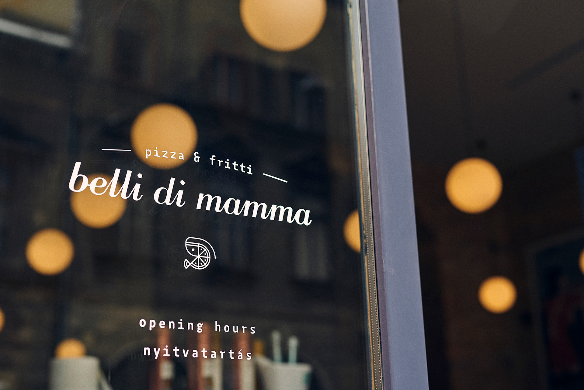
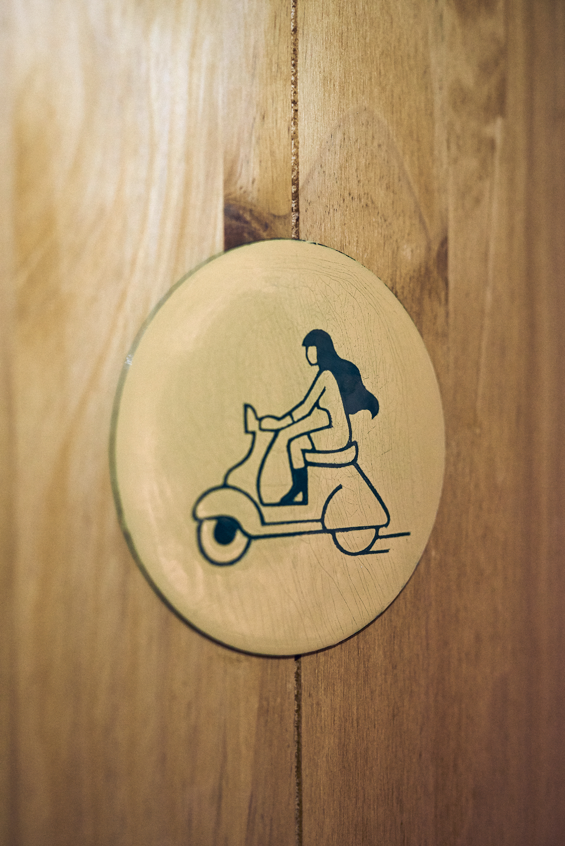
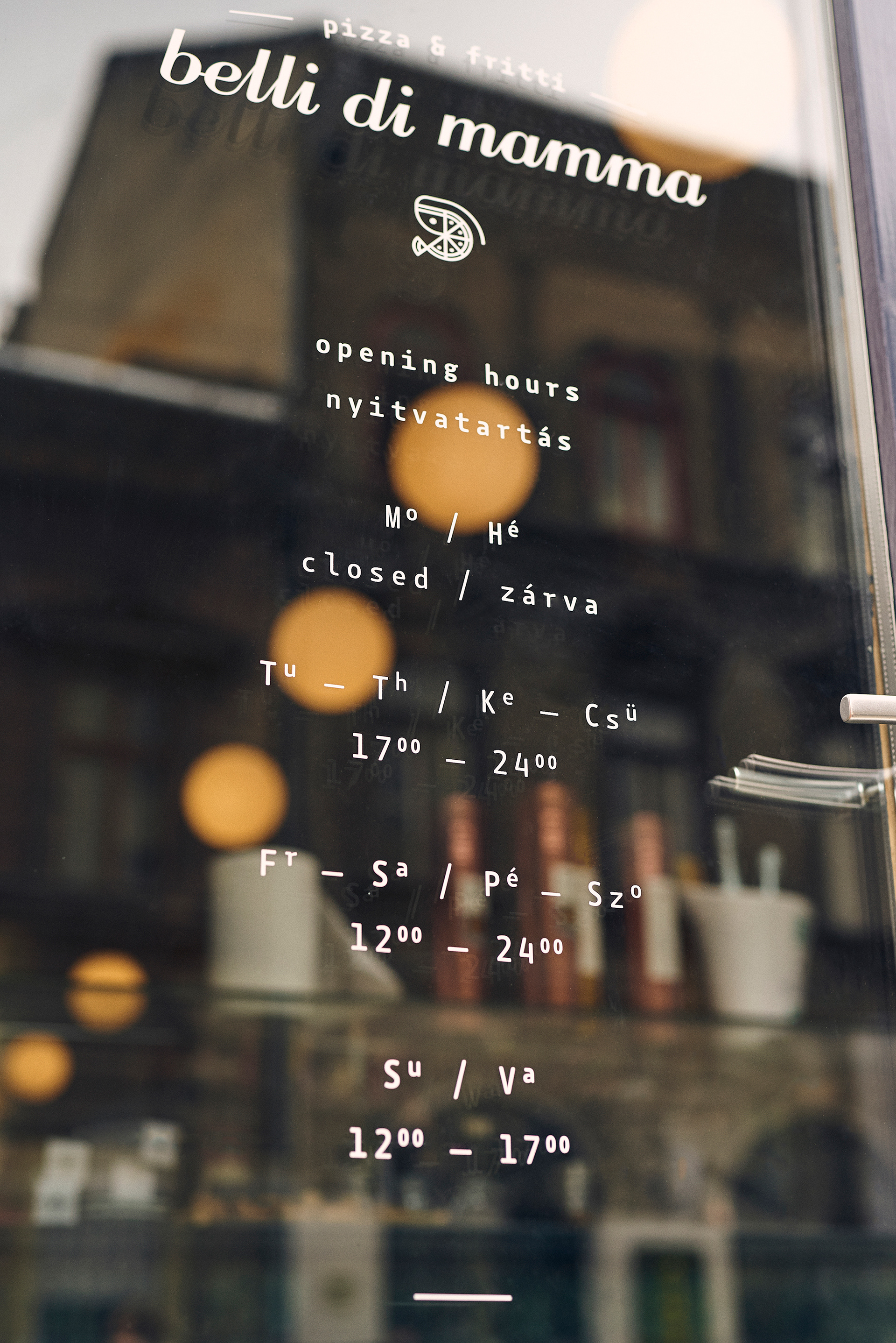
We worked with the talented enamel artist Klára Németh to create handmade porcelain enamel Ragazza and Ragazzo signs based on our drawings for the men’s and women’s restroom doors. For the exterior, we made vinyl stickers to display the opening hours, and created a large steel gambaretto sign.
Ph photography by András Zoltai
Ad art direction by Eszter Laki
Gr graphic design by Réka Imre & Eszter Laki
Id interior design by Anikó Tóth
_______