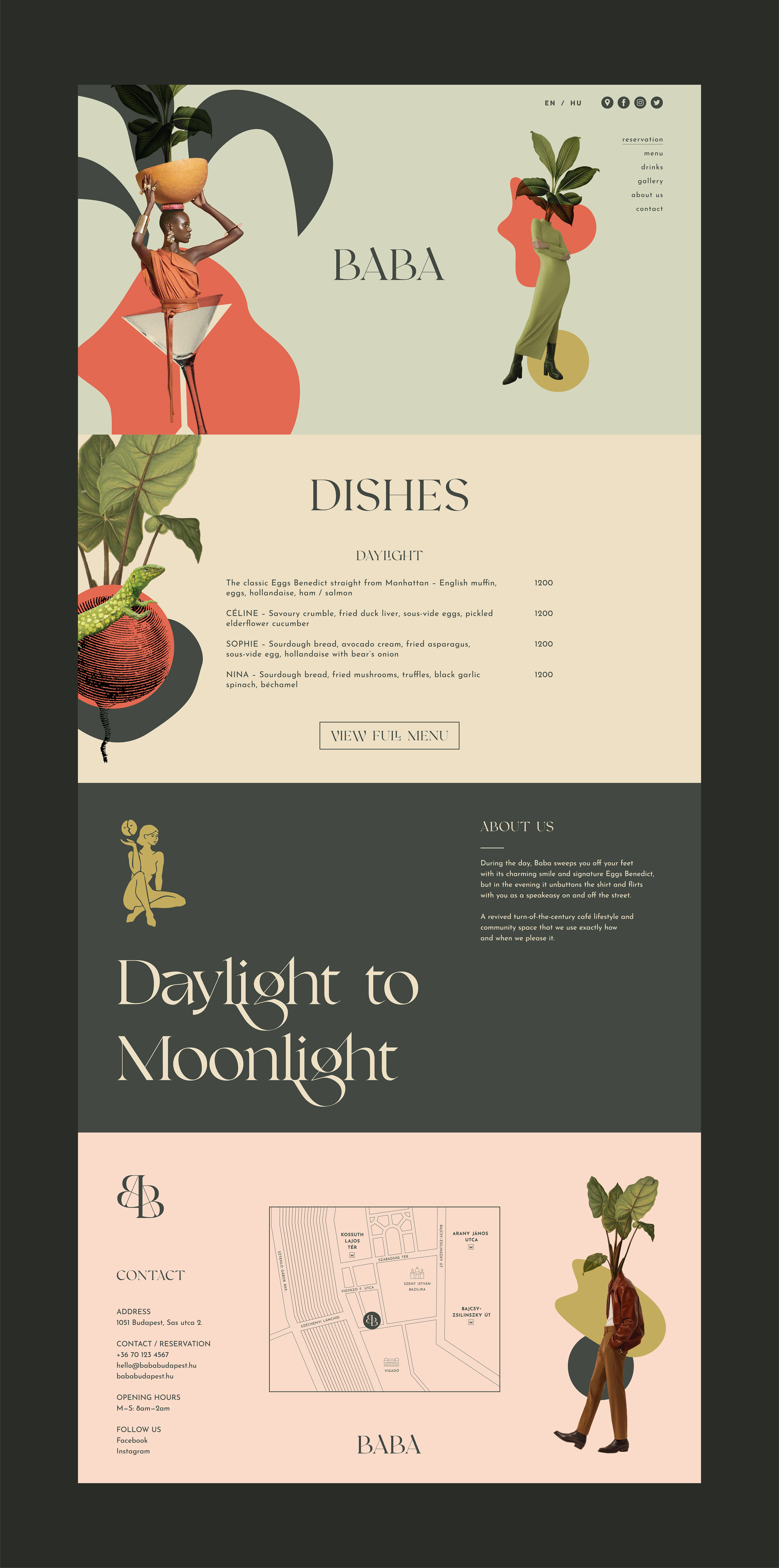
B A B A
_______
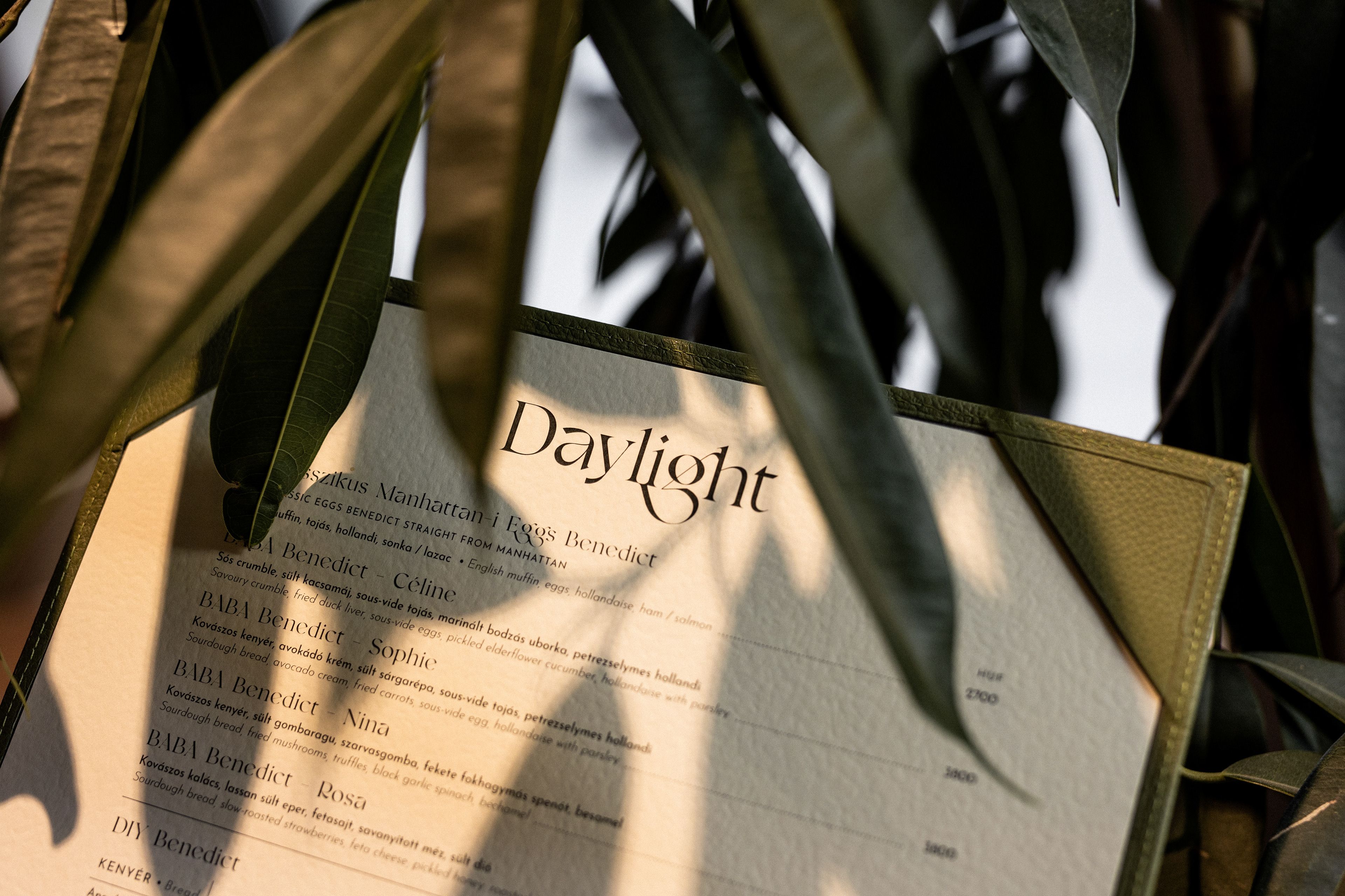
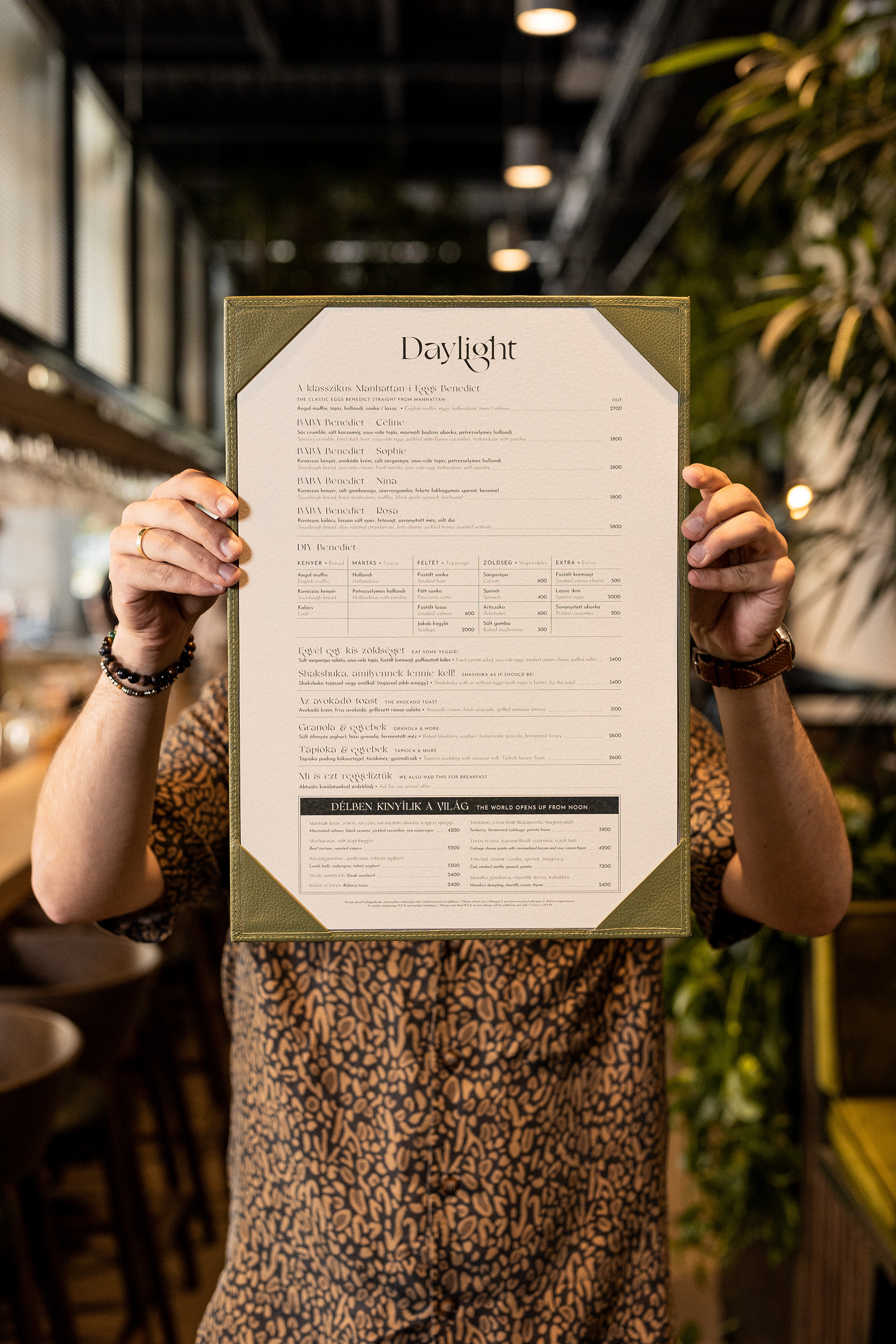
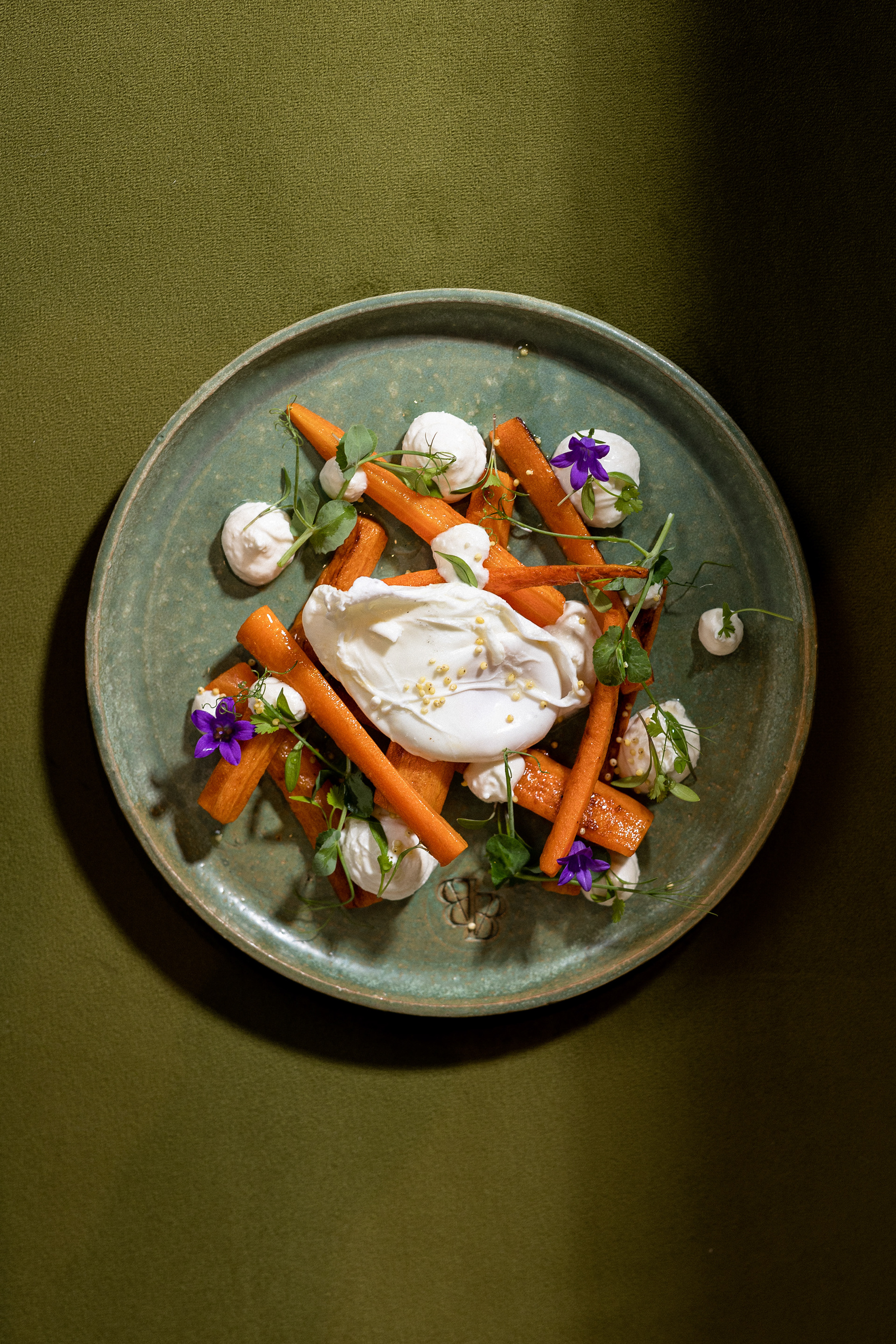
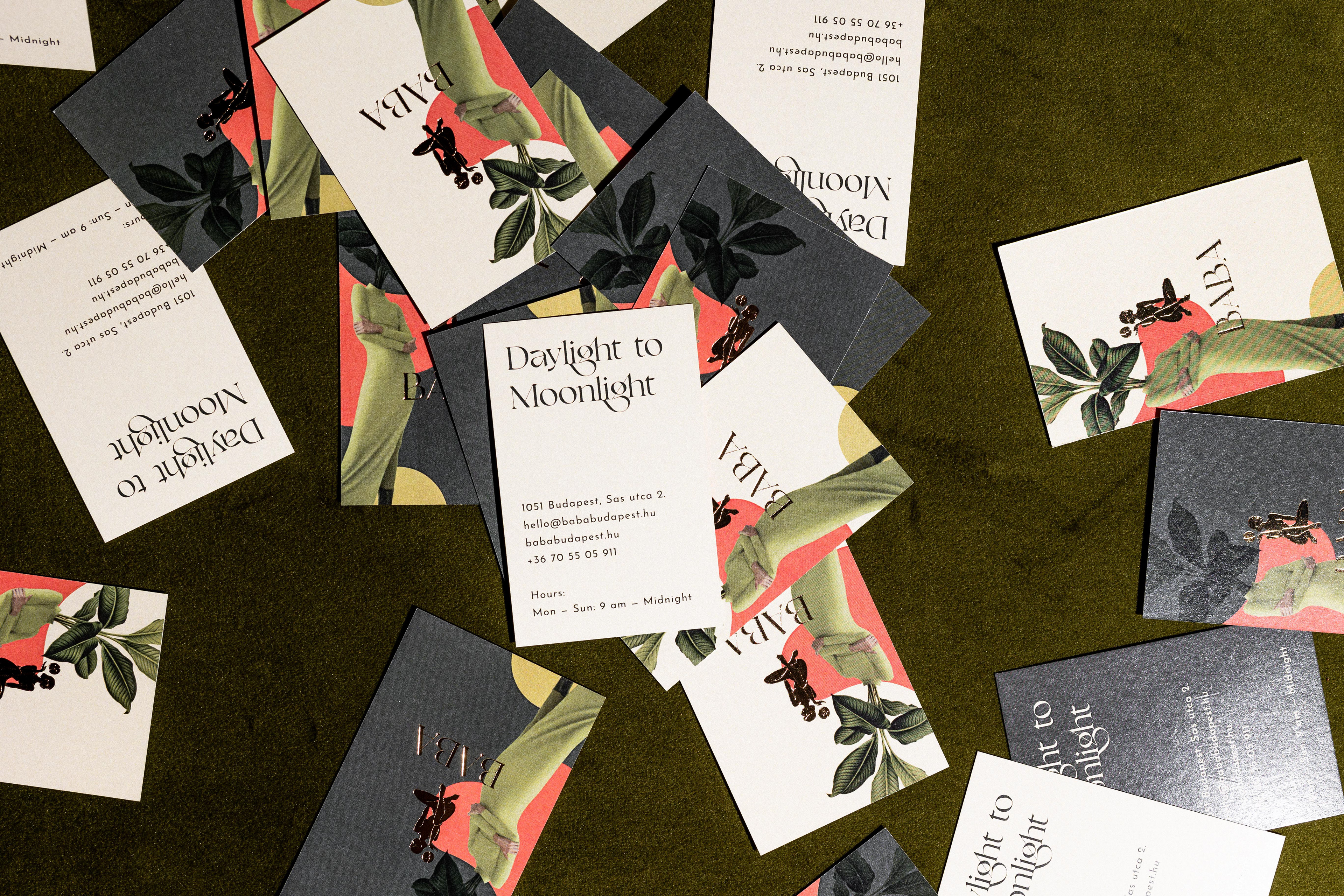
Serving breakfast, lunch, drinks, and style, Baba is a place that follows the pace of city life from “Daylight to Moonlight”, as their slogan proclaims. They welcome guests in the morning with a wide selection of delicious breakfast foods, including their signature Eggs Benedict, and a heavy dose of charm. In the evening, a lively and flirtatious mood takes over the place, with live music and cocktails warming the mood. Baba has revived the turn-of-the-century cafe lifestyle, with all the style, charm, and versatility that entails.
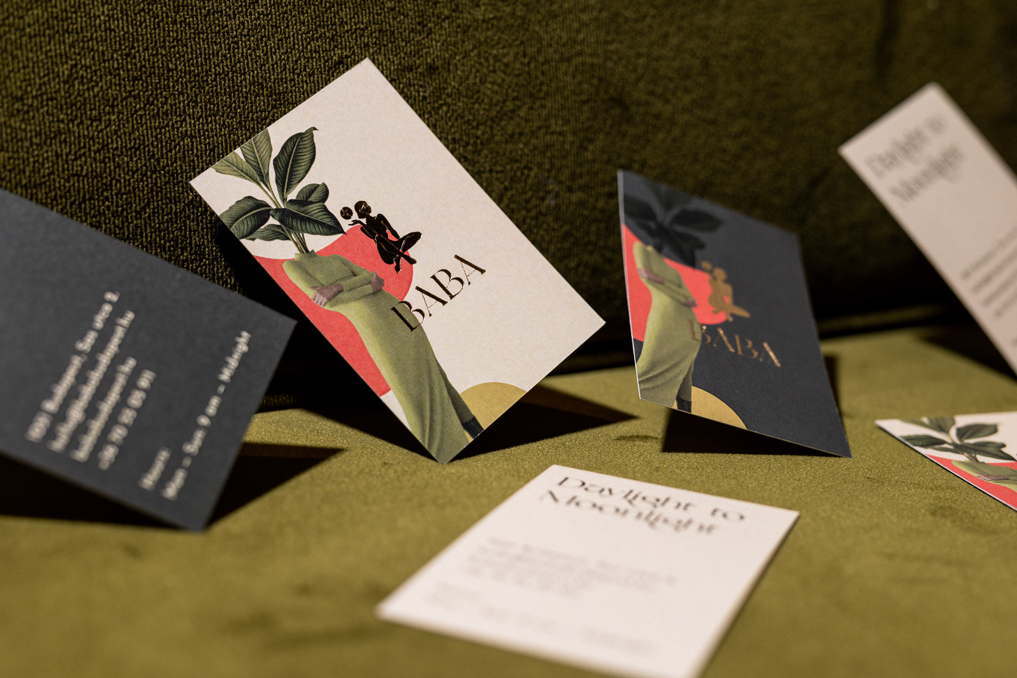
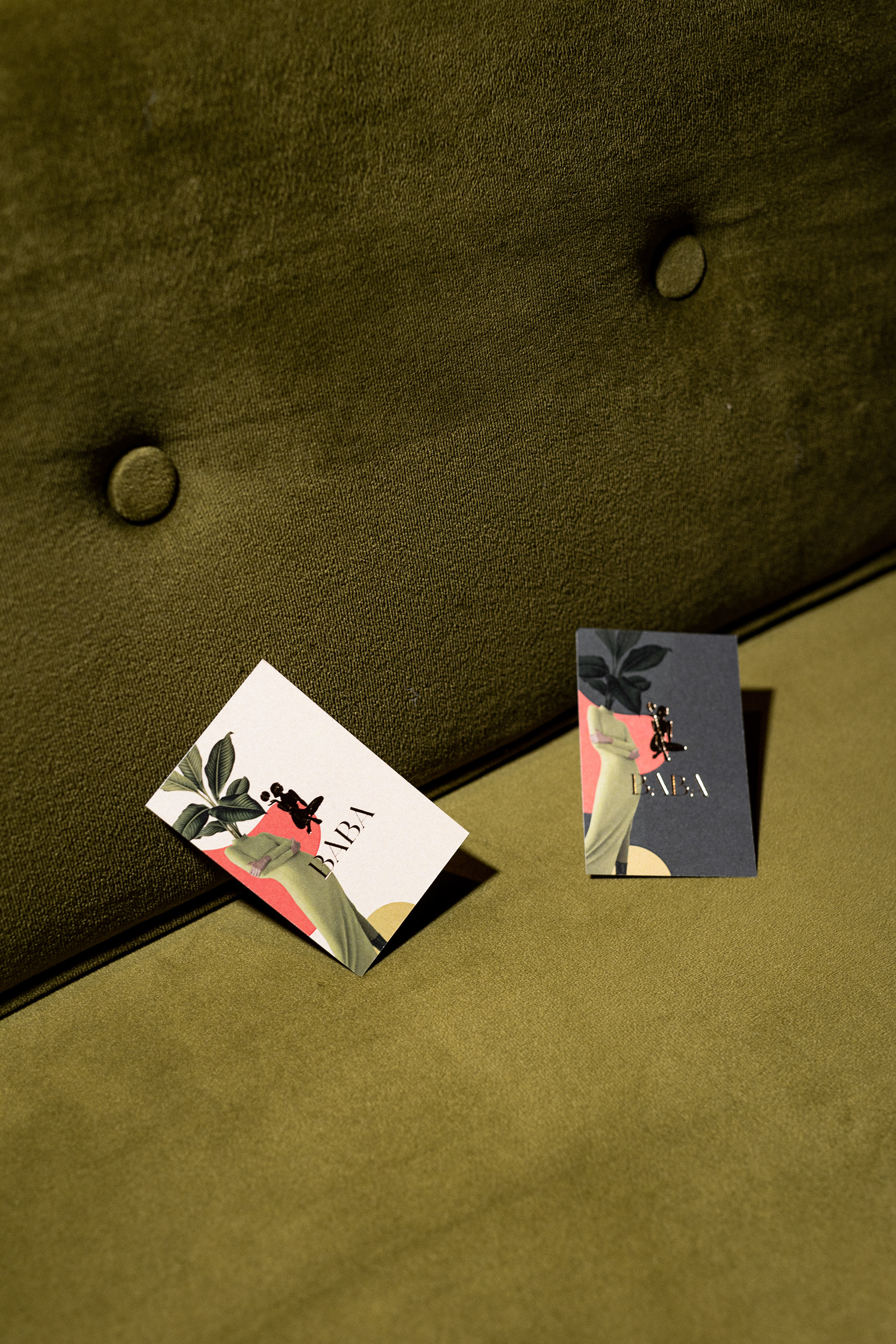
The name fits the identity of the place perfectly, as “Baba” means “doll” in Hungarian, but also recalls the saying “Ez nagyon baba”, which means that something is hot and awesome. The owners come from a model agency background, so “Baba” may also refer to another meaning of the word, “beautiful girls”.
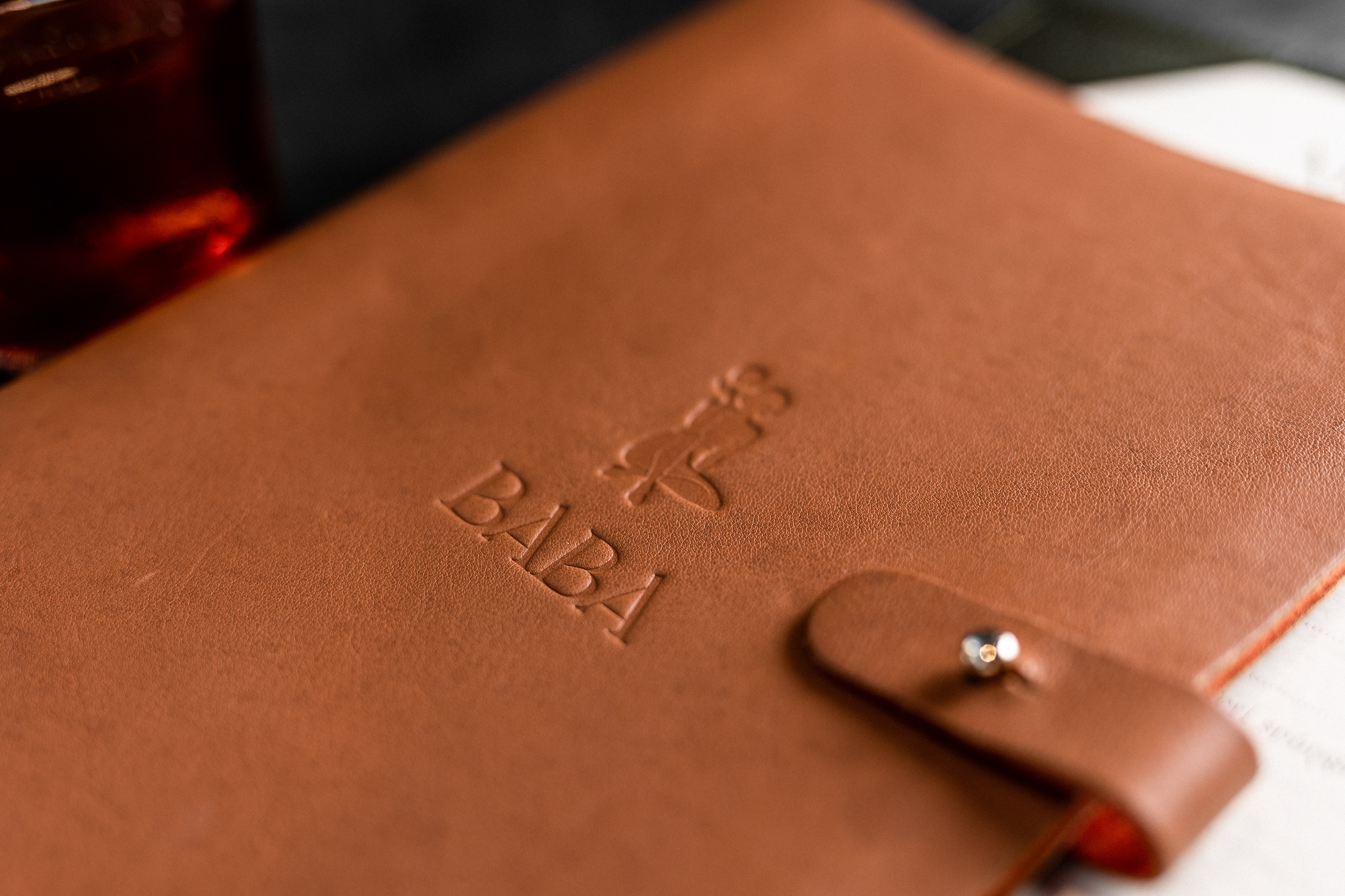
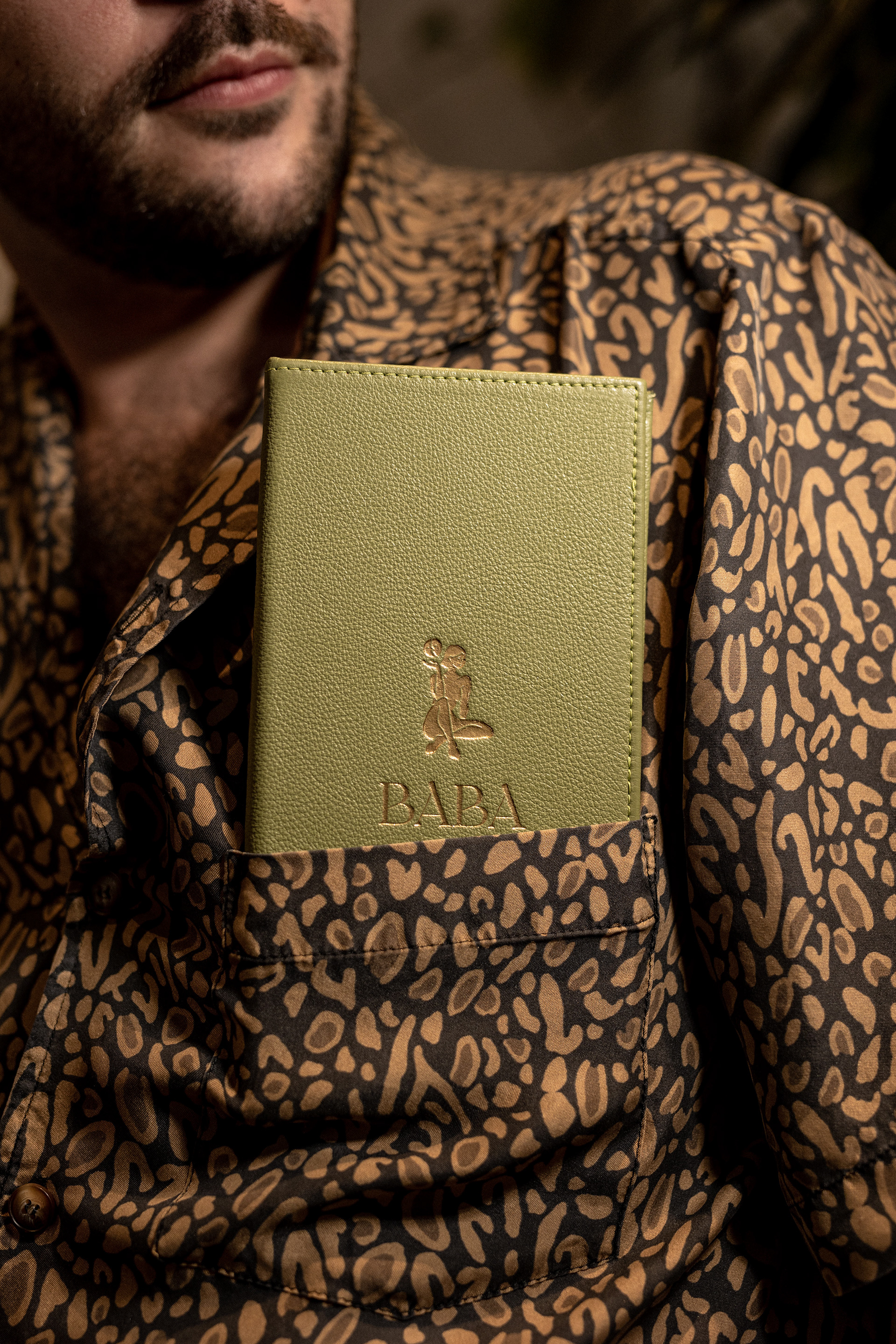
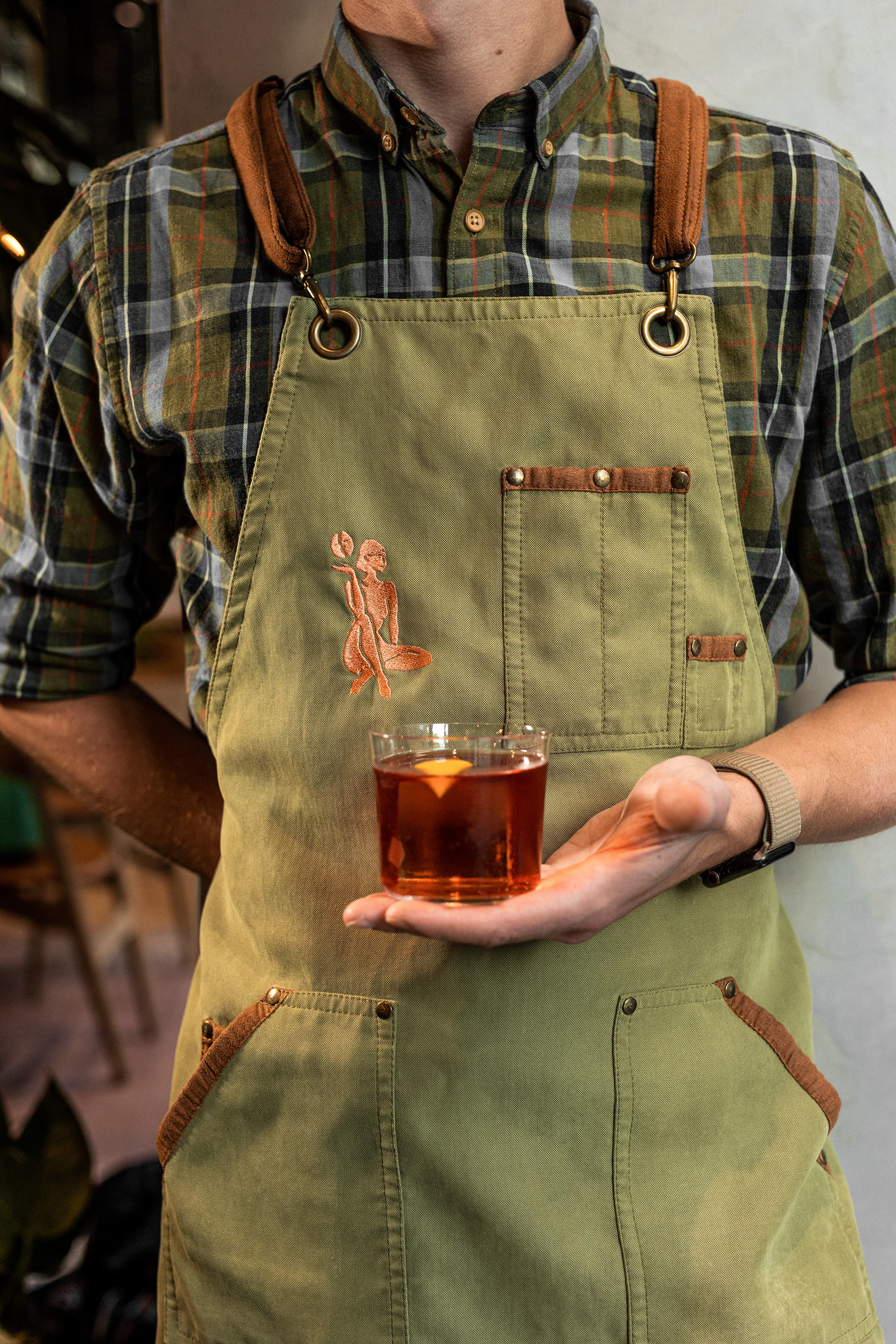
Taking our inspiration from the various meanings of the name, as well as the fun, lively, and coquettish vibe of the place, we designed a logo and emblem which features an ethereal woman, seated, holding the sun and the moon, to refer to their slogan. The logotype is also very feminine and cool, and can be used as a playful monogram.
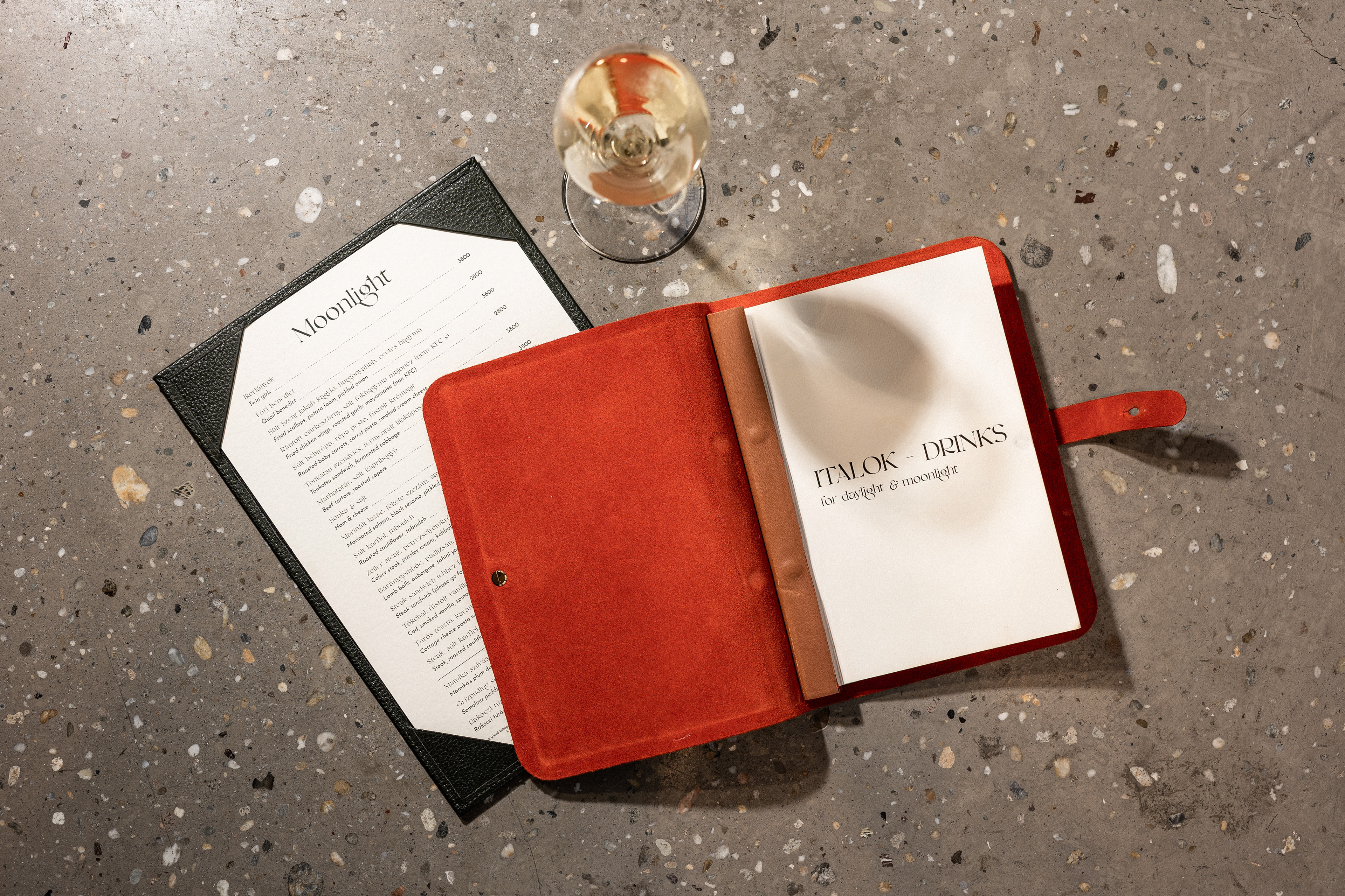
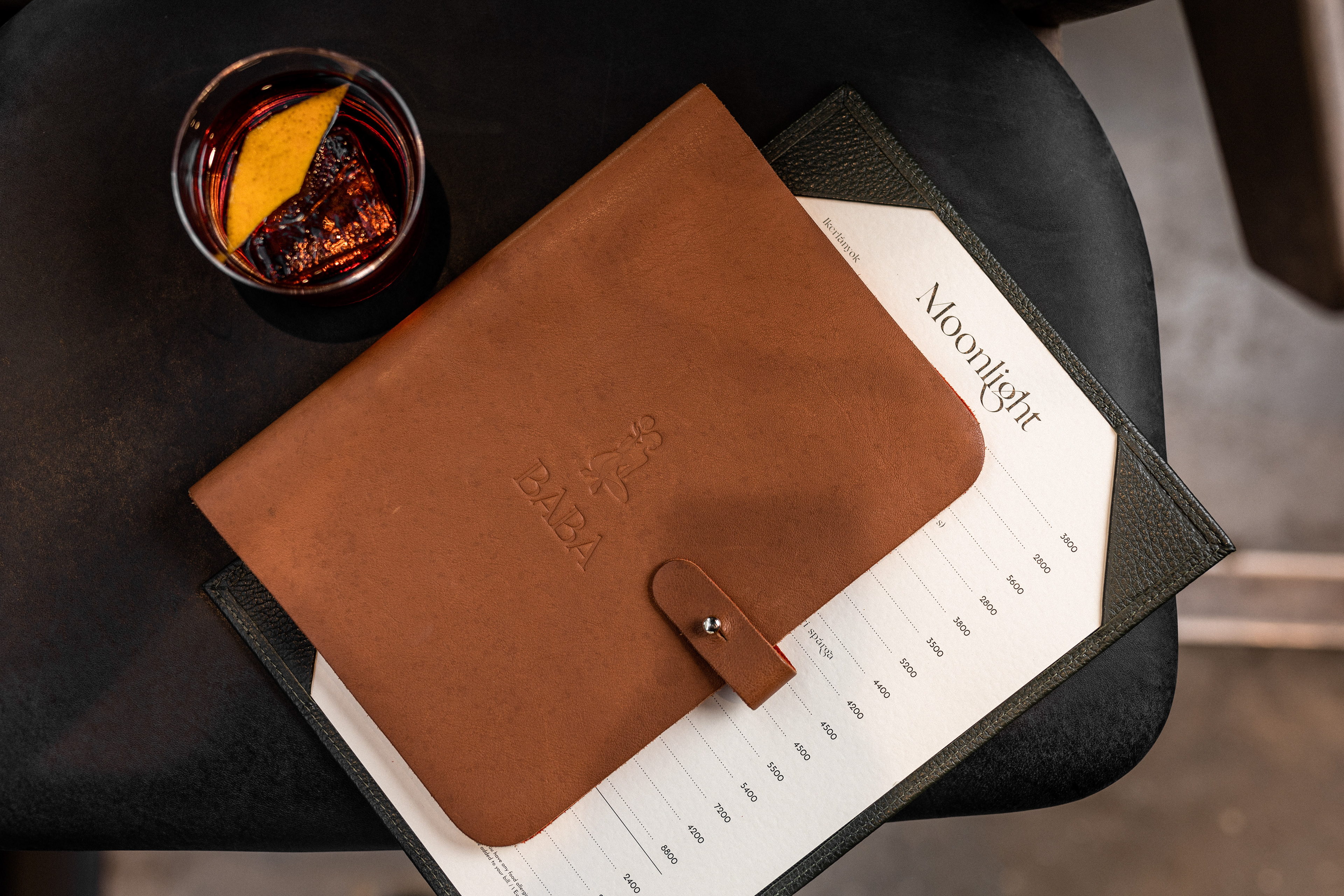
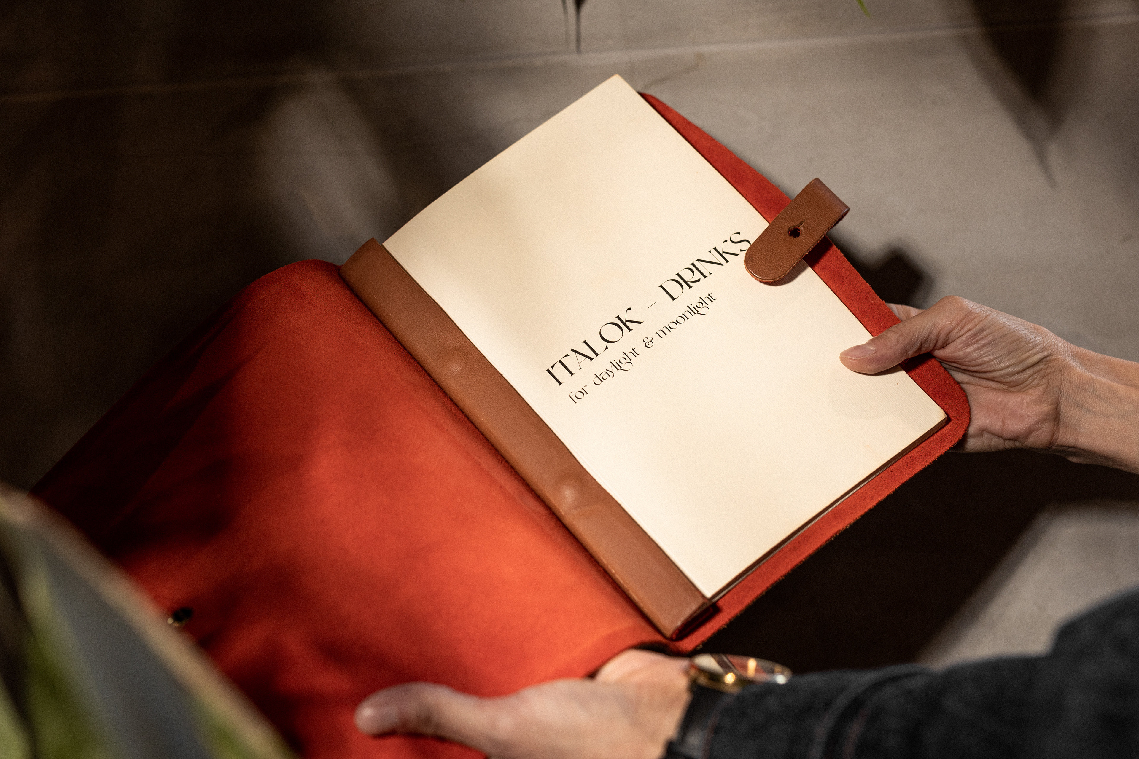
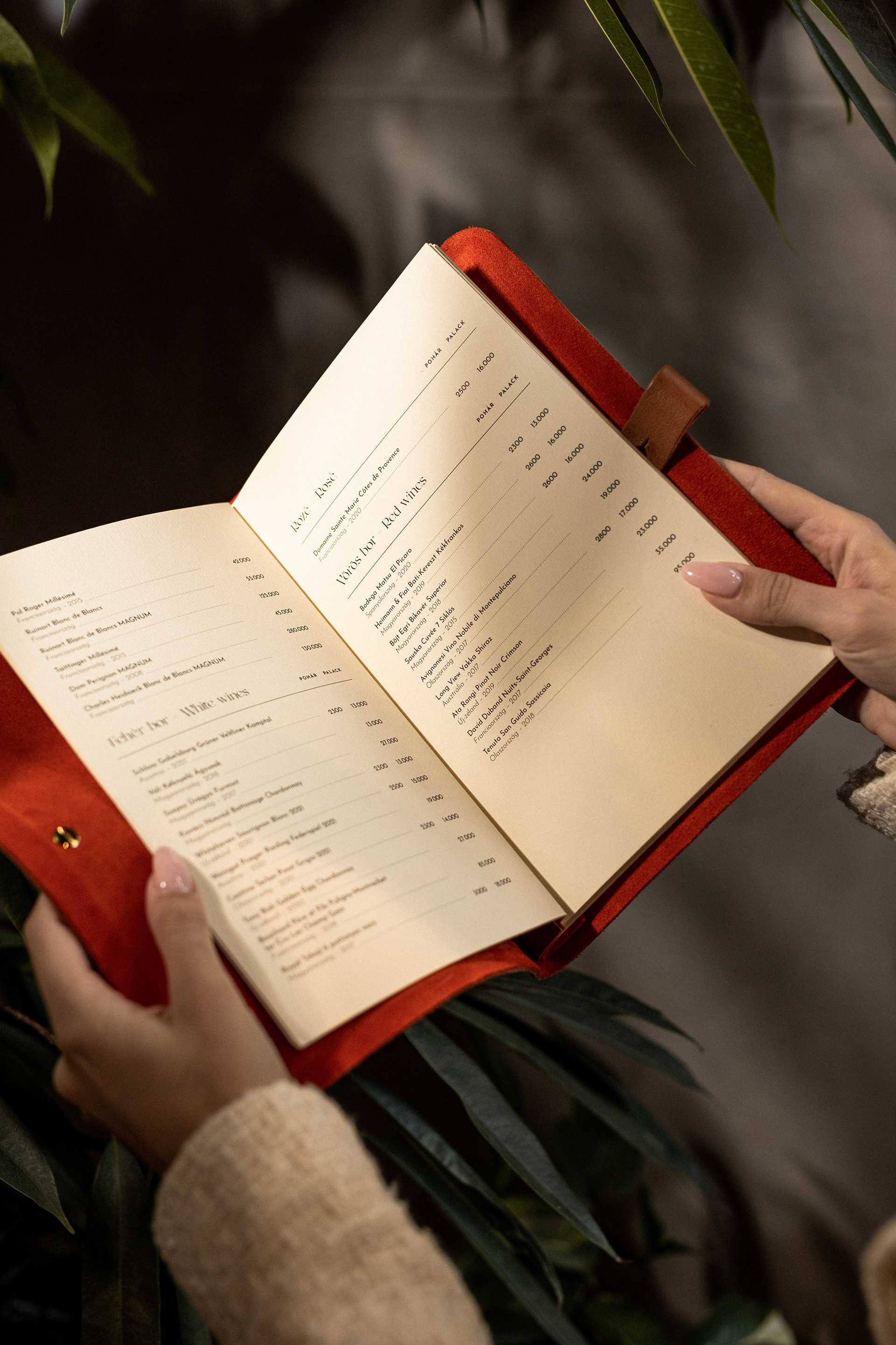
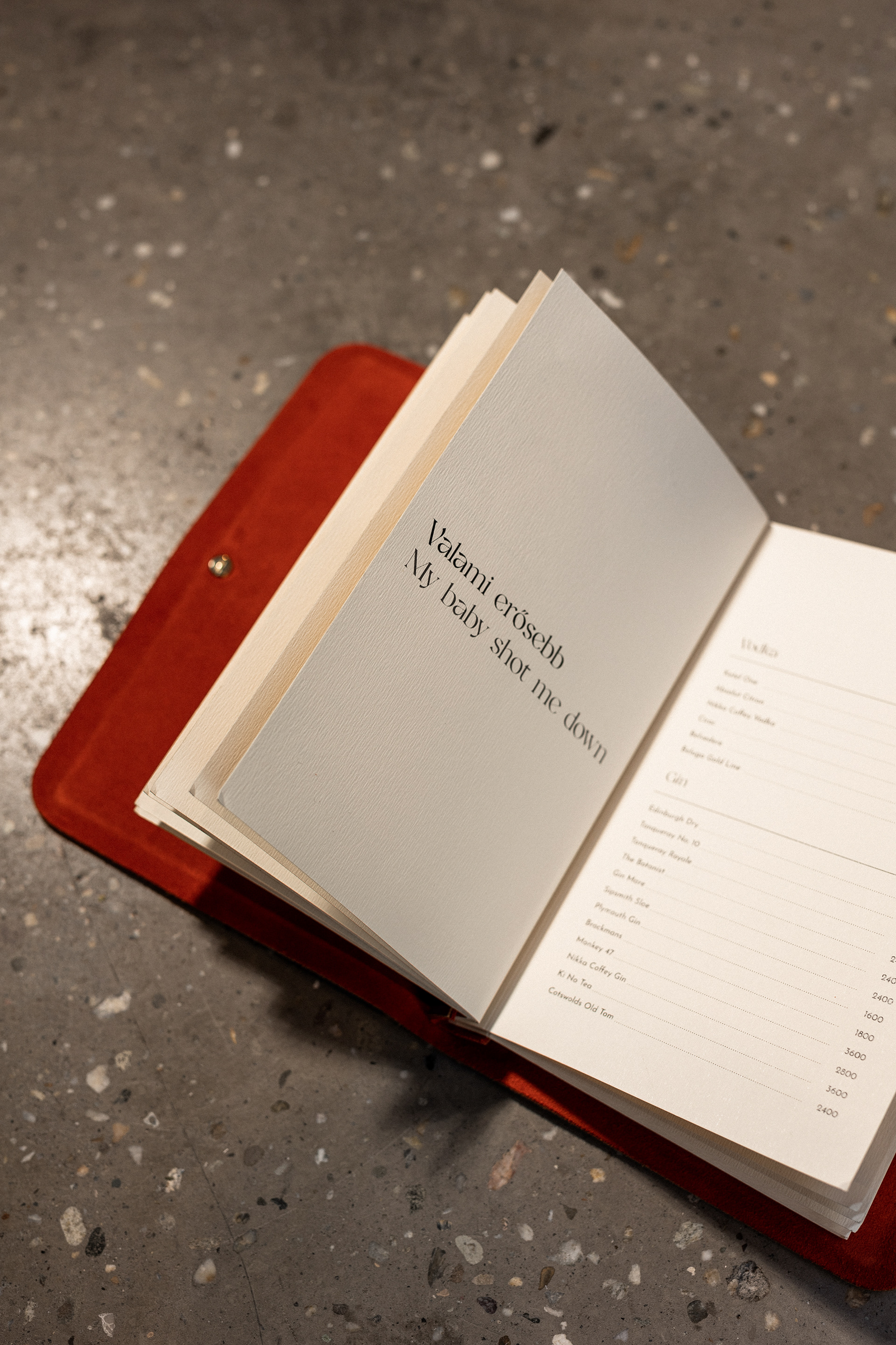
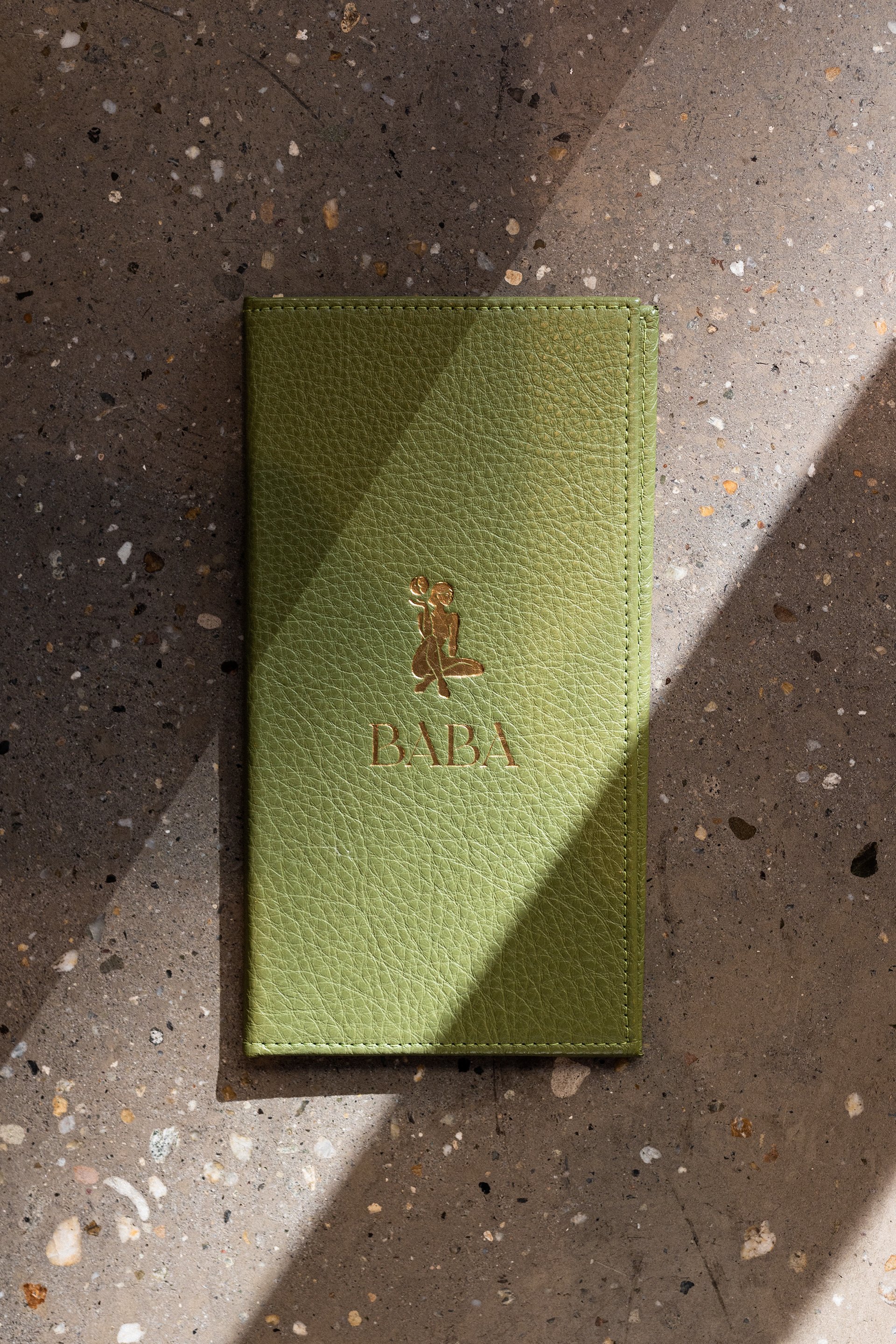
In addition to the main identity, we designed their drink menu (dubbed “The Bible”), food menu, and payment folder, all in hotprinted leather, as well as their business cards and outdoor signage.
We enjoyed working on this charming project for all the thought and care put into every detail of the place, and because it is so inspiring to see new cafes and community spaces open up in our city, with its long history of characteristic pubs, cafes, and bars that always brought together the most lively and diverse crowds. We highly recommend you check out Baba soon, whether in daylight or moonlight.
graphic design by Eszter Laki & Réka Imre
photography by Dániel Molnár
printing by Inkredible Letterpress
_______