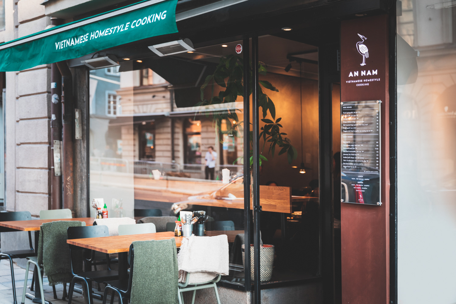
A N N A M
Branding for an authentic Vietnamese restaurant in Stockholm, Sweden
_______
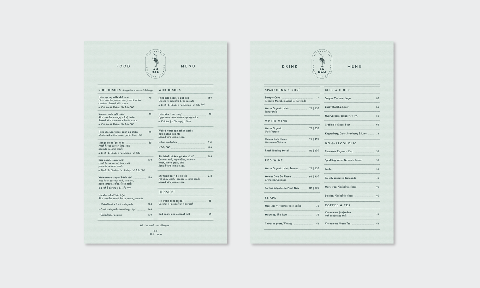
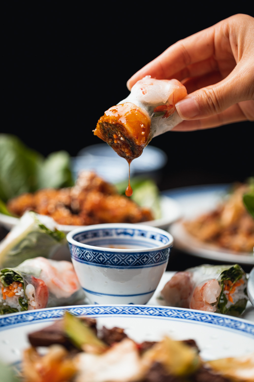
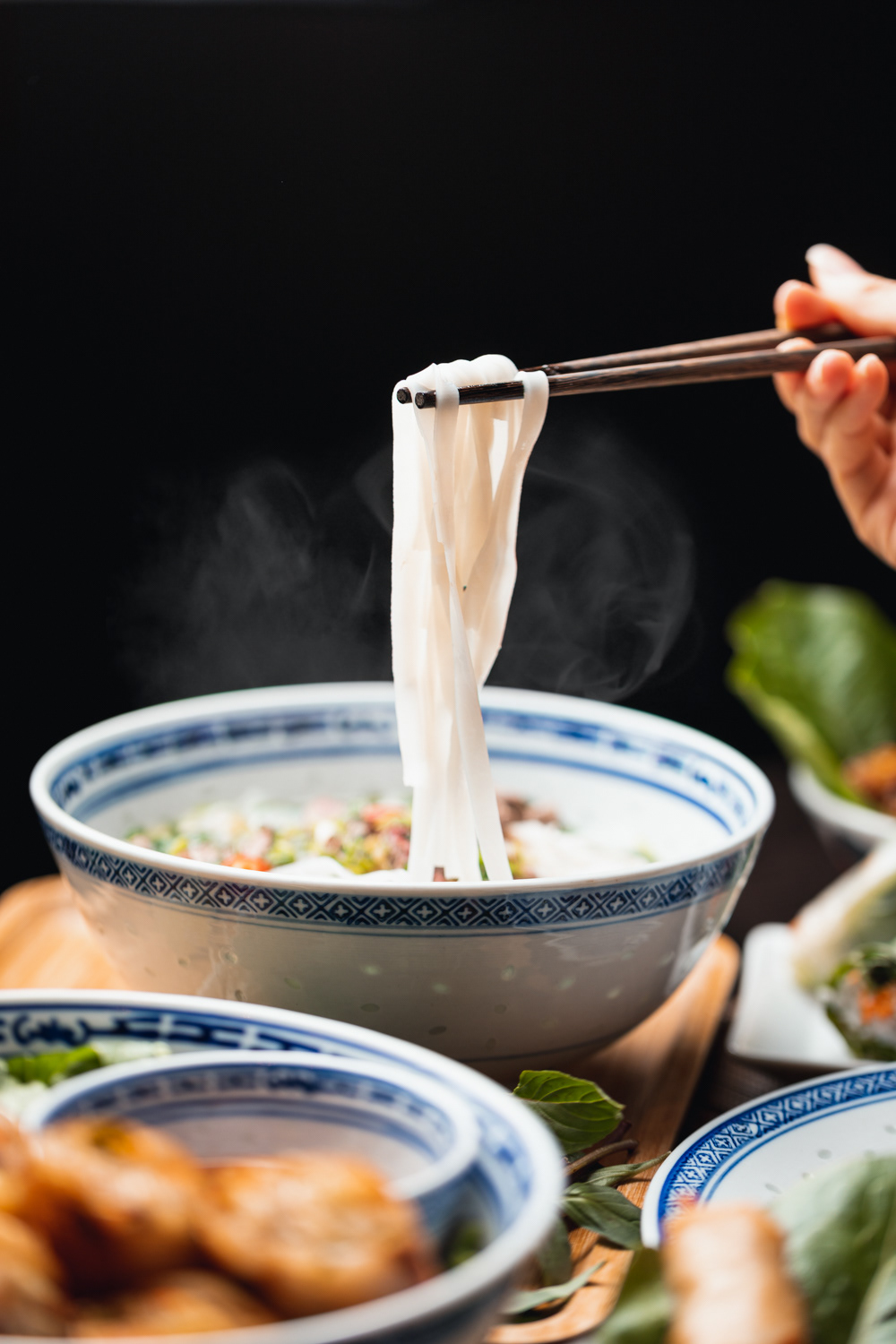
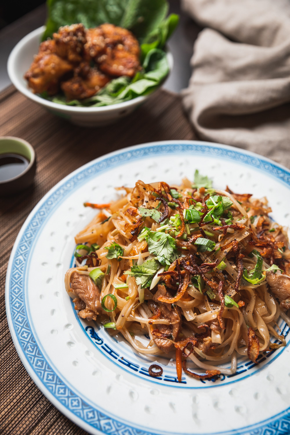
An Nam serves authentic Vietnamese homestyle cooking, with an emphasis on traditional dishes prepared with the freshest ingredients. The values and ideals behind An Nam revolve around family, friends, and tradition - with hopes to revive the Vietnamese value system and introduce it to the younger generation. In fact, the name An Nam is in reference to the original, ancient name of the region.
Much of An Nam’s culinary inspiration is drawn from the dishes served by mothers and grandmothers, always prepared with a deep intuition for a balance between the ingredients and taste, and created with care and love.
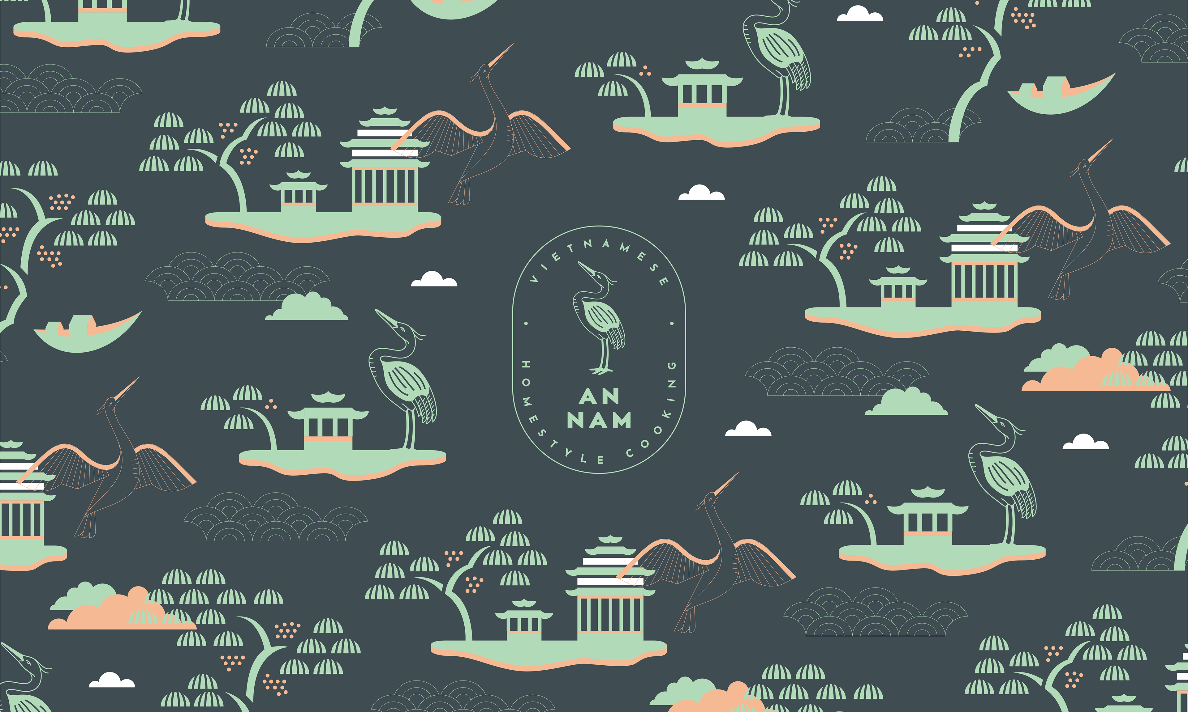
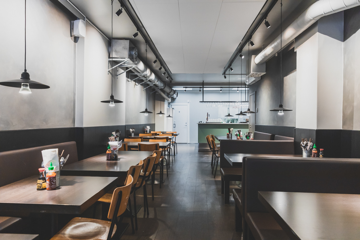
As An Nam takes its inspiration and reason for existence from traditional Vietnamese culture, naturally our design process revolved around the same. We began our research into stories and symbols that represent Vietnam and hold a special place in Vietnamese culture. The rich history and values that permeate Vietnamese culture can also be felt in the atmosphere of An Nam, and the wonderful team behind it, so our aim was to represent this visually and aesthetically. With the branding, we aimed for a balance similar to that between the richness and depth of tastes that the chef creates, and the clean, minimal environment.
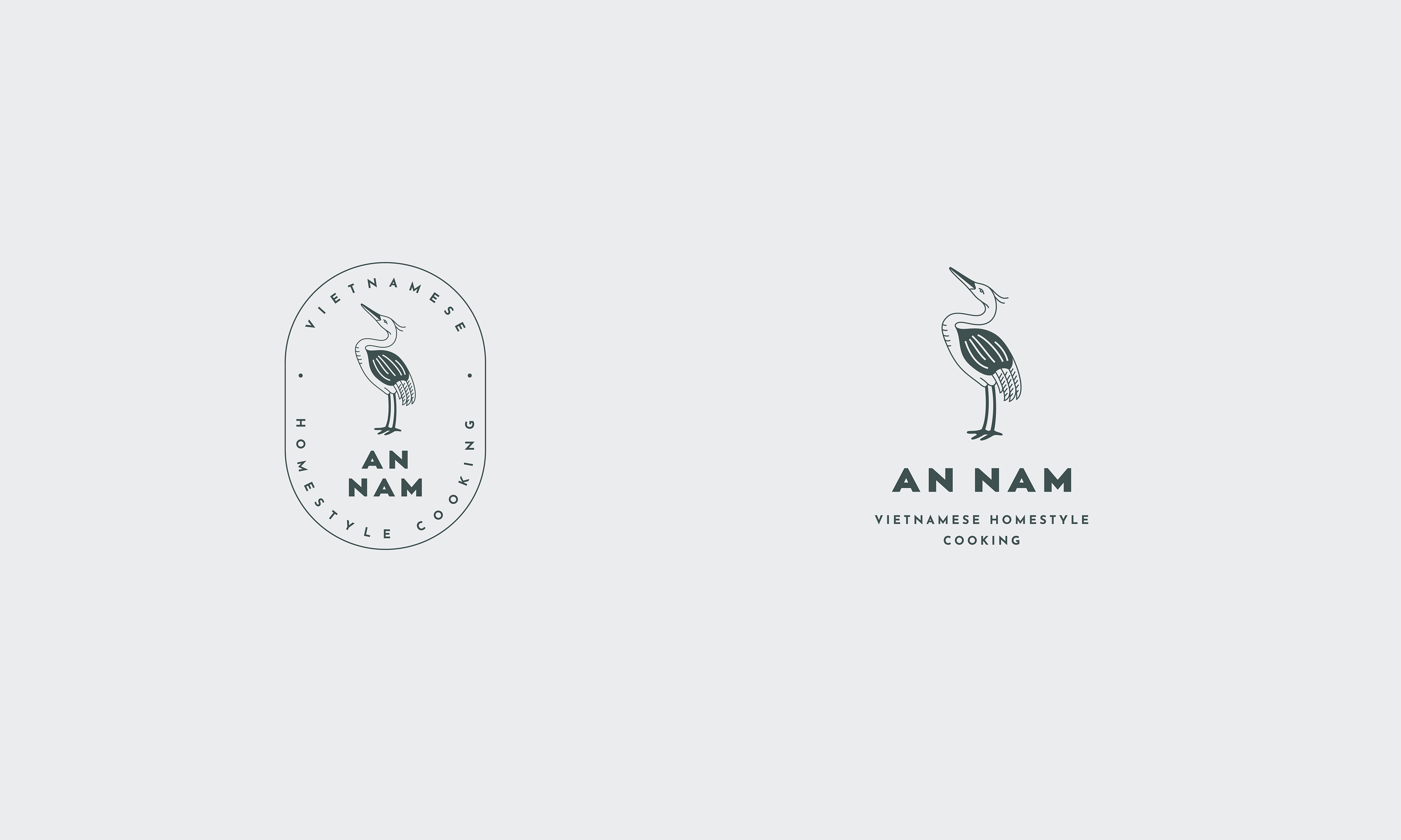
One of the first symbols we felt drawn to was Chim Lac, a bird that lives only in stories. The Chim Lac is one of the symbols found on the surface of the Bronze Drum, and was also a symbol of the Vietnamese forbidden kingdom of Lac Viet. We settled on using a bird as the focal point of the branding, and eventually decided the crane is a perfect symbol for An Nam. The crane represents family, and gives a nod to the traditional and mystical Chim Lac, while remaining down to earth and recognisable. In addition to these important symbols, we were also inspired by the style and technique of motifs from classic Vietnamese folk paintings, which we reinterpreted through our own minimalistic approach. To balance these rich traditional symbols and motifs, we decided to use an Art Deco font, for its clean, airy lines and style. These various symbols and styles came together perfectly to represent everything that An Nam is about - family, culture, tradition, simplicity, taste - all in a clean, modern, and stylish setting.
Ph photography by David Johansson
Ad art direction by Eszter Laki
Gr graphic design by Eszter Laki & Réka Imre
_______